Japanese Food Packaging
DownloadTopics
Details
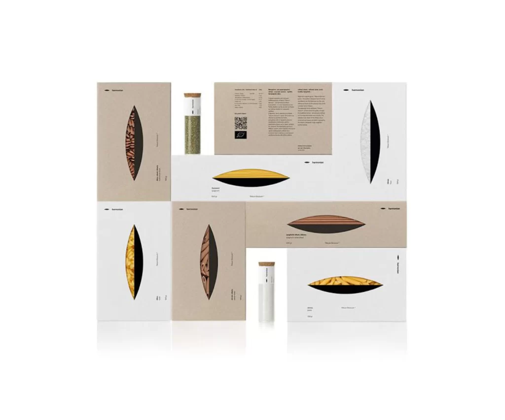
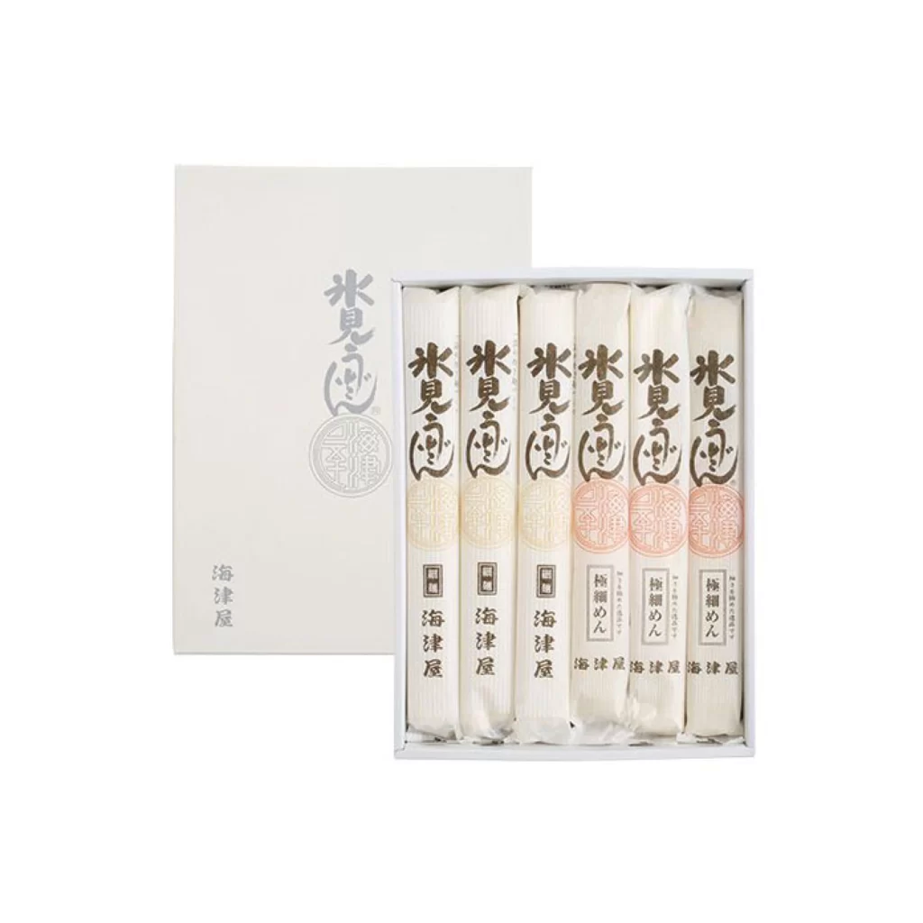
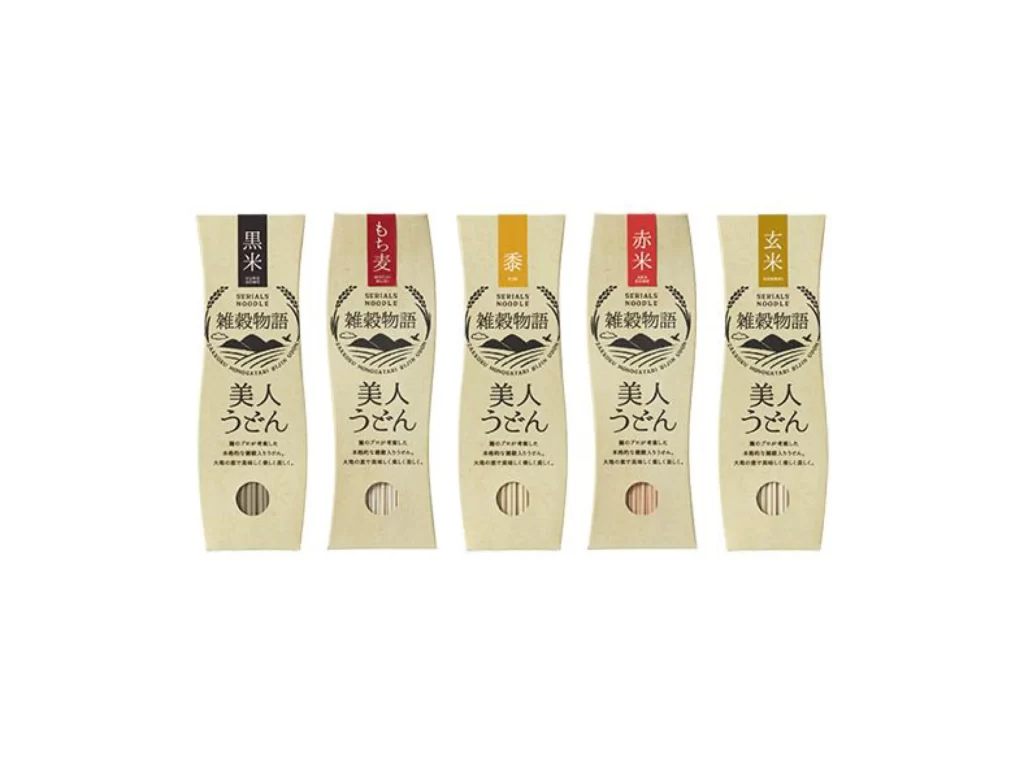
Five slender noodle packages stand in a neat row, each crafted from unbleached kraft paper with a distinctive hourglass silhouette that narrows at the center. Vertical color bands in black, crimson, amber, scarlet, and gold crown the tops, displaying Japanese characters for varieties like black rice, barley, millet, red rice, and brown rice. Below a circular logo depicting mountain ranges and wheat stalks, the bold characters for "Bijin Udon" anchor each design, while small transparent windows near the bottom reveal the actual noodle strands within.
The organic curvature of these containers breaks away from conventional rectangular food packaging, creating a tactile, handcrafted impression that feels both traditional and contemporary. Muted earth tones combined with precise typographic hierarchy establish a sophisticated visual language that communicates artisanal quality without excessive ornamentation. Designers studying this composition will appreciate how minimal color accents effectively differentiate product variants while maintaining brand cohesion across the entire line.
Brand identity specialists developing premium grocery lines could analyze the balance between rustic materials and refined typography to inform their own sustainable packaging concepts. Packaging engineers might reference the structural engineering of those tapered forms when prototyping eco-friendly containers that require less material. Anyone needing to examine the intricate details of the Japanese lettering or paper texture can access the full-resolution file at no cost directly from the resource library.