Japanese Food Packaging
DownloadTopics
Details
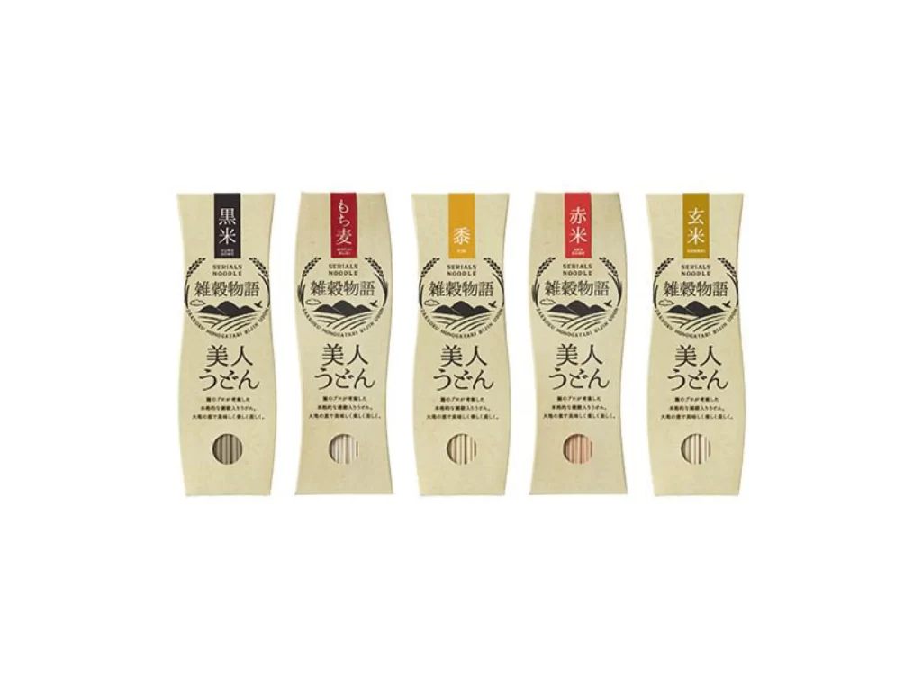
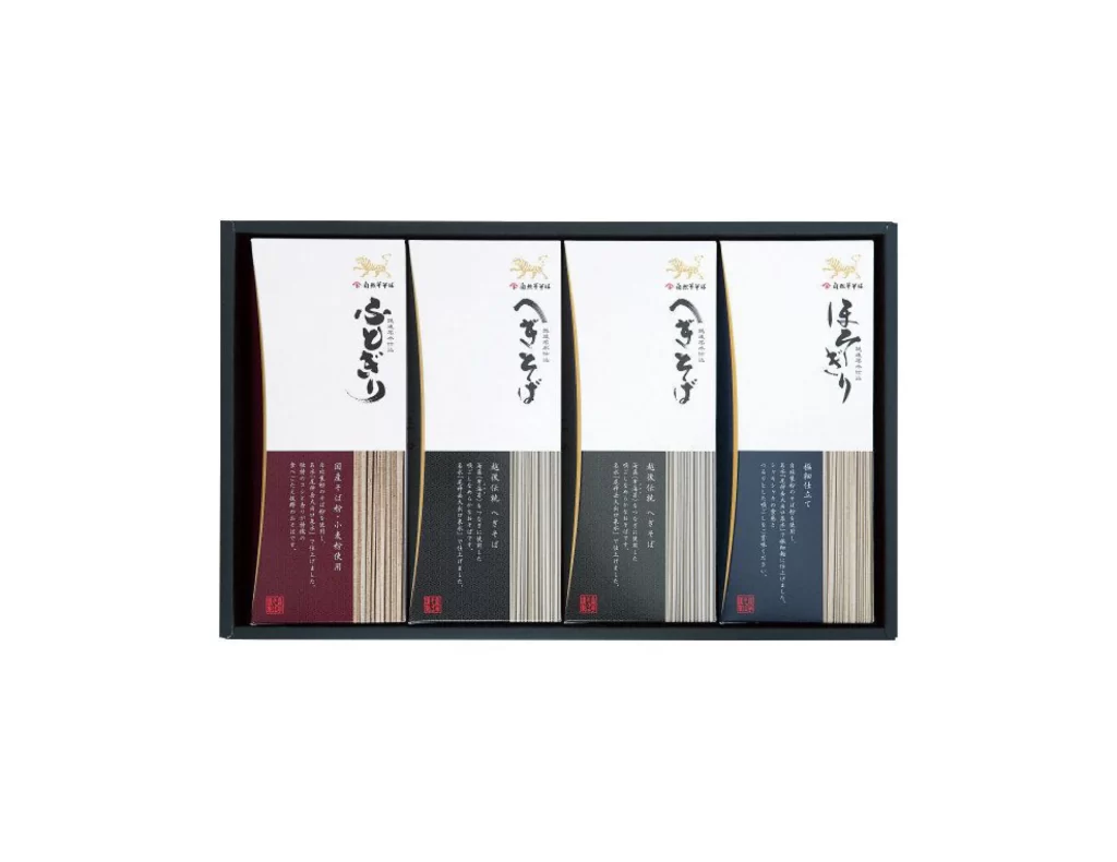
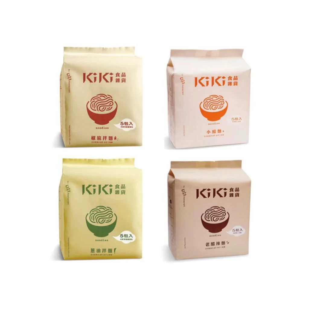
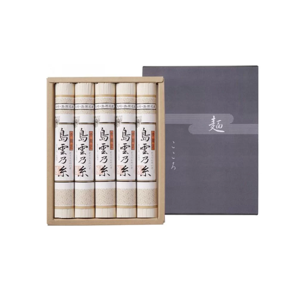
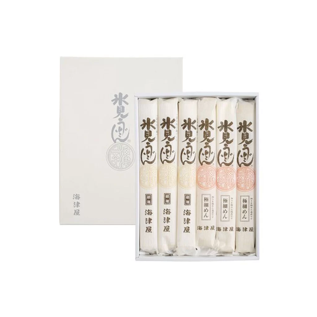
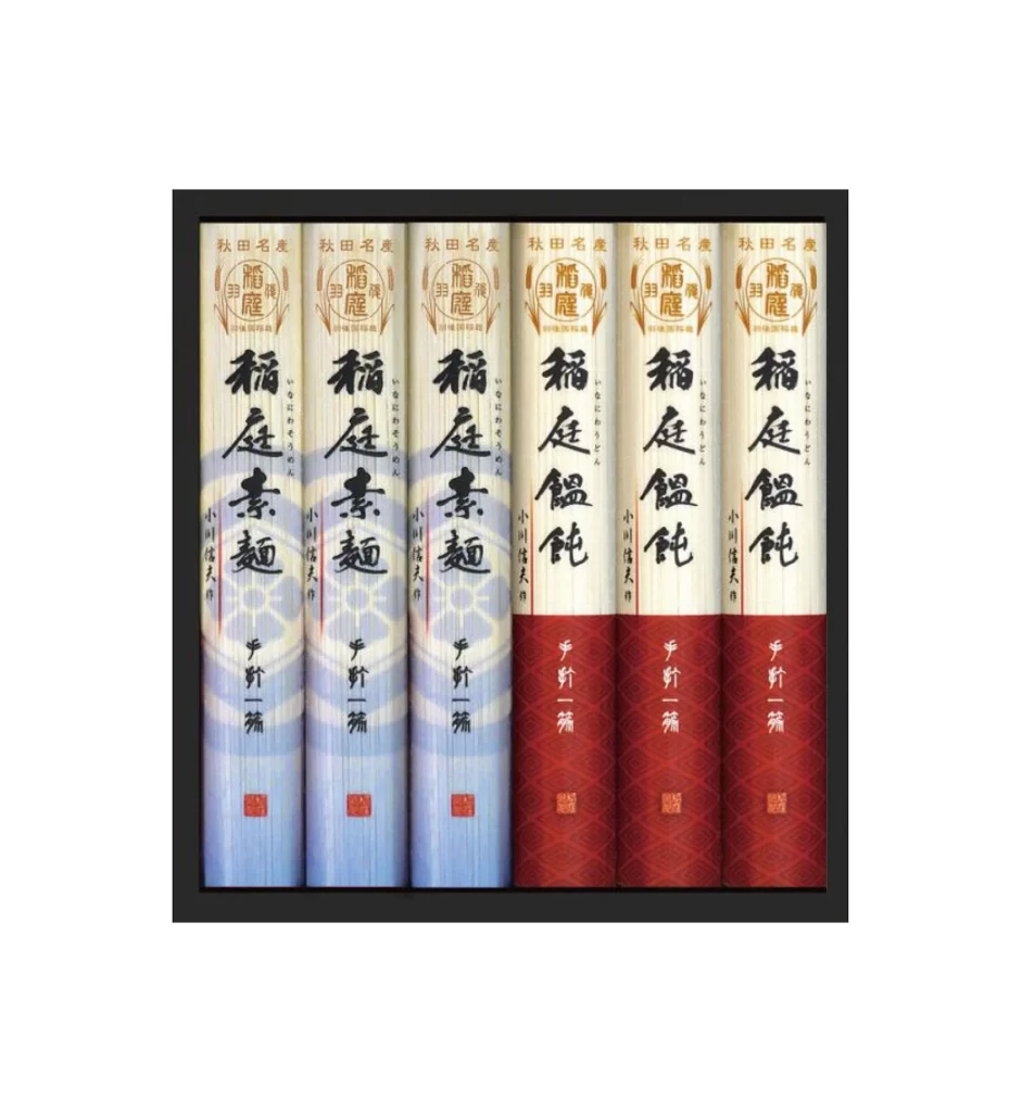
Six cylindrical containers stand in a tight row, each wrapped in paper that transitions from cream at the top to either pale blue or deep crimson at the bottom. Bold black calligraphy dominates the center of each tube, with smaller gold and red text positioned above and below the main characters. A thin black border frames the entire arrangement against a light backdrop, with the camera positioned directly in front to capture the uniform alignment and subtle vertical striations on the paper surfaces.
The visual distinction lies in the deliberate color coding that separates the set into two distinct groups of three, likely indicating different product varieties within the same brand line. Traditional Japanese typography combines with modern minimalism through the clean geometric shapes and restrained palette, while the textured paper finish adds tactile depth that flat digital renderings often lack. Designers can access the full-resolution file at no cost to examine the precise ink saturation and material interactions in greater detail.
Brand identity specialists studying East Asian packaging conventions will find this composition particularly useful for analyzing hierarchy in vertical text layouts. Illustrators requiring accurate reference for cylindrical container physics and label wrapping can study how the graphics conform to the curved surface without distortion. Product photographers might also consult this arrangement when planning similar lineup shots for catalog work.