Pasta Passion Handmade Natural Flavors
DownloadTopics
Details
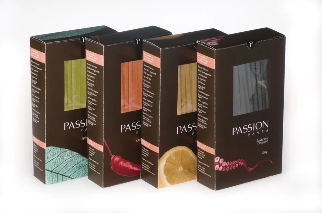
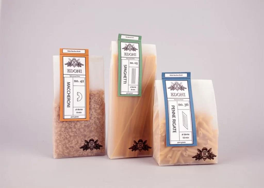
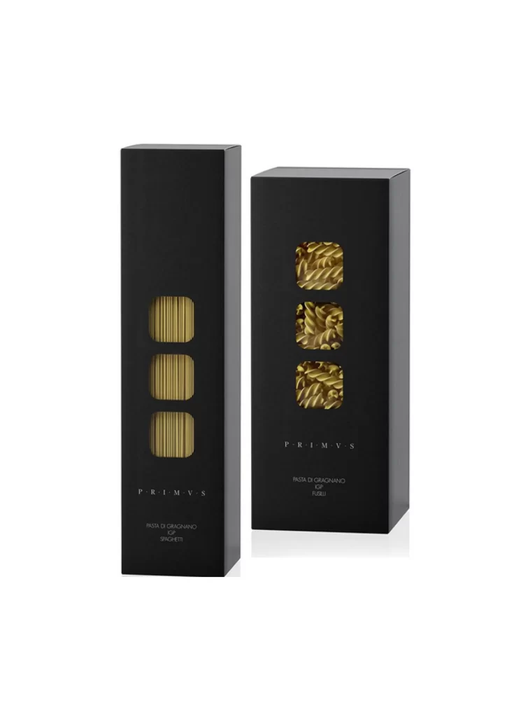
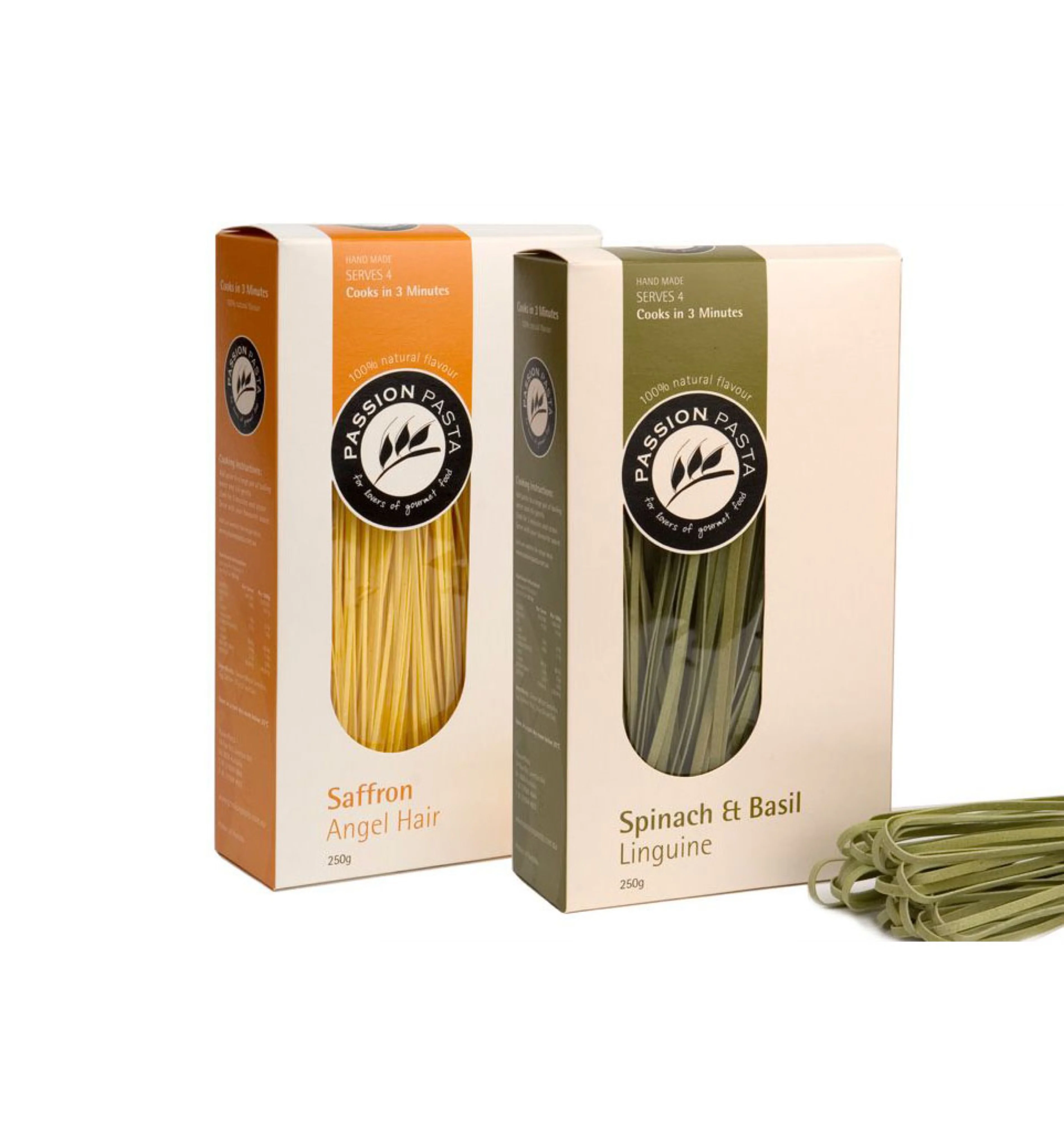
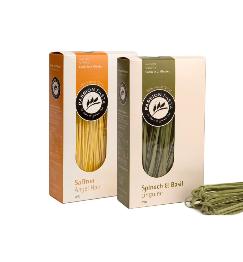
Two rectangular pasta boxes stand at a slight angle to one another, revealing the front and partial side panels of each package. The left carton features a warm orange header above a cream-colored body, while its counterpart utilizes a muted olive-green accent strip. Both containers display a central oval window exposing the dried strands within—golden-yellow angel hair on the left and deep green linguine on the right—with a small bundle of the green pasta resting on the surface in the foreground.
Color coding immediately distinguishes the flavor variants, with saffron assigned an energetic orange and spinach-basil receiving an earthy green that mirrors the actual product hue. The circular black logo containing wheat stalks creates a strong focal point that anchors the typographic hierarchy, while the transparent windows serve as both functional elements and textural breaks against the flat cardboard surfaces. Designers studying this composition can access the full-resolution file without cost to examine how the brand balances artisanal cues with modern minimalism.


Packaging architects might reference these boxes when developing color-coded systems for food product lines, particularly where the accent shade must correlate with ingredient identity. Photographers setting up e-commerce shoots could analyze the soft, even lighting and the deliberate placement of loose product outside the primary frame to add organic depth. Brand strategists evaluating premium positioning will find useful data in how 'handmade' and 'natural flavour' claims integrate with the clean layout without cluttering the visual field.