Pasta Delysoy Soya Nudeln Illustration Colorful
DownloadTopics
Details
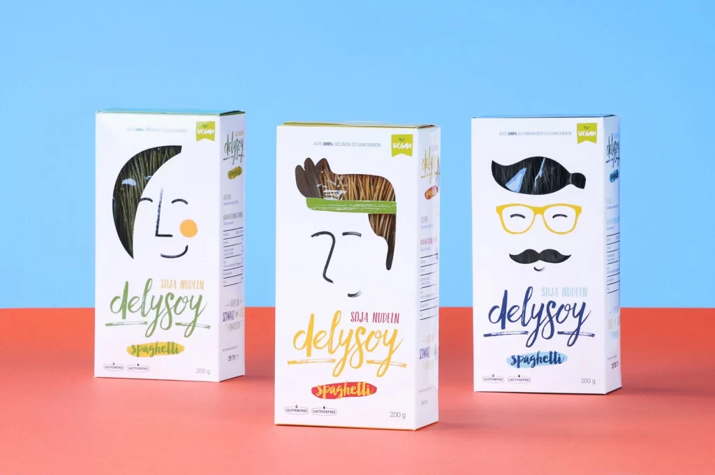
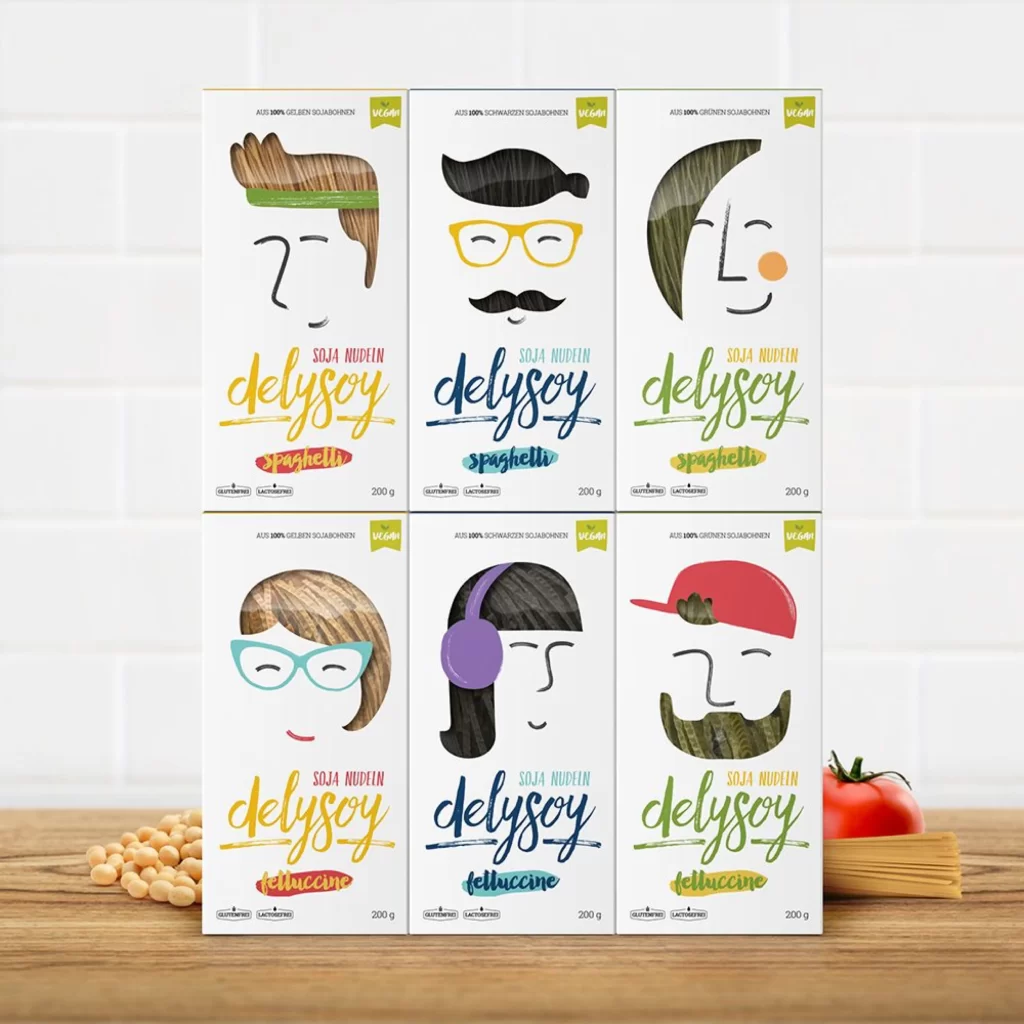
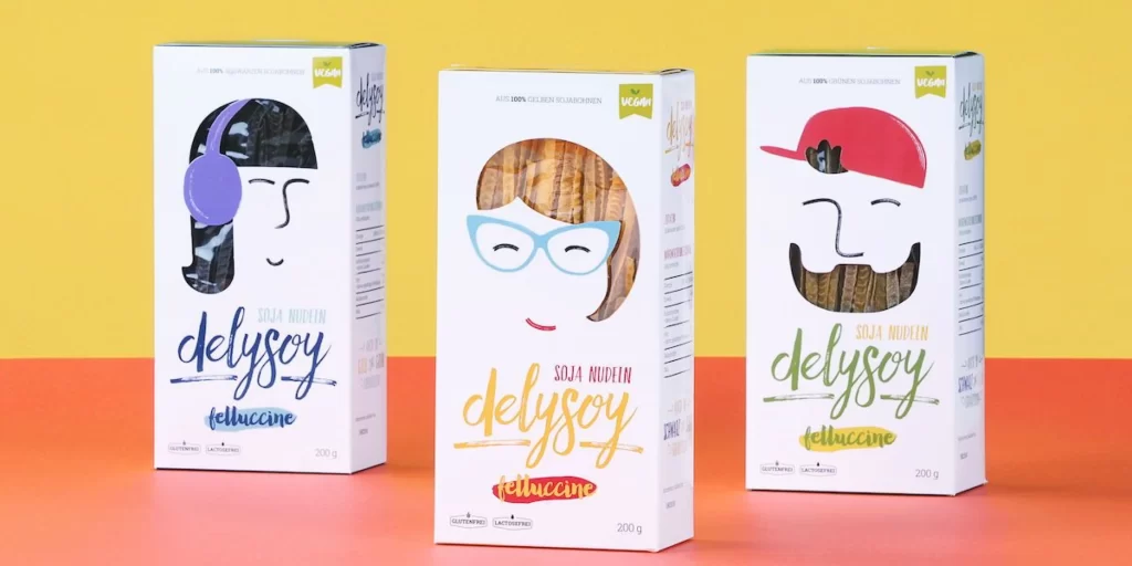
Three rectangular white cartons stand in a row, each featuring a distinct hand-drawn character face that doubles as a transparent window revealing the pasta inside. The left box displays a figure with a purple bob and lavender headphones framing dark noodles, the center shows a smiling face with cyan spectacles and brown hair surrounding lighter pasta, while the right presents a bearded character in a crimson cap with darker contents. Bold cursive lettering spells 'delysoy' across the middle of each package in navy, amber, and emerald respectively, with 'SOJA NUDeln' and 'felluccine' printed below in smaller type. A vibrant yellow wall transitions into a coral surface beneath the products, illuminated by even studio lighting from a straight-on camera perspective that keeps all typographic elements perfectly legible.
Character illustration functions as the primary structural device here, transforming standard packaging into a playful identity system where hair and facial features cleverly frame the product visibility window. The deliberate color coding—purple, cyan, and red—creates immediate visual differentiation between variants while maintaining brand cohesion through consistent typography and layout architecture. Such anthropomorphic design strategies effectively humanize commodity goods, making the vegan labeling and nutritional information feel integrated rather than obligatory. Designers seeking to study this specific approach can access the complete high-resolution file at no cost directly from the resource archive.
Packaging professionals analyzing contemporary food branding trends would benefit from examining how illustration style interacts with transparency requirements in regulated product categories. Art directors developing character-based visual systems for health-food lines could reference the specific balance between whimsical facial features and clean informational hierarchy demonstrated here. Students of commercial illustration might deconstruct the color psychology behind assigning specific hues to different noodle textures within a unified product family. The composition also serves as a practical case study for photographers arranging multiple SKUs in lifestyle-oriented product photography sessions.