Fatso Peanut Butter Jar View
Topics
Details
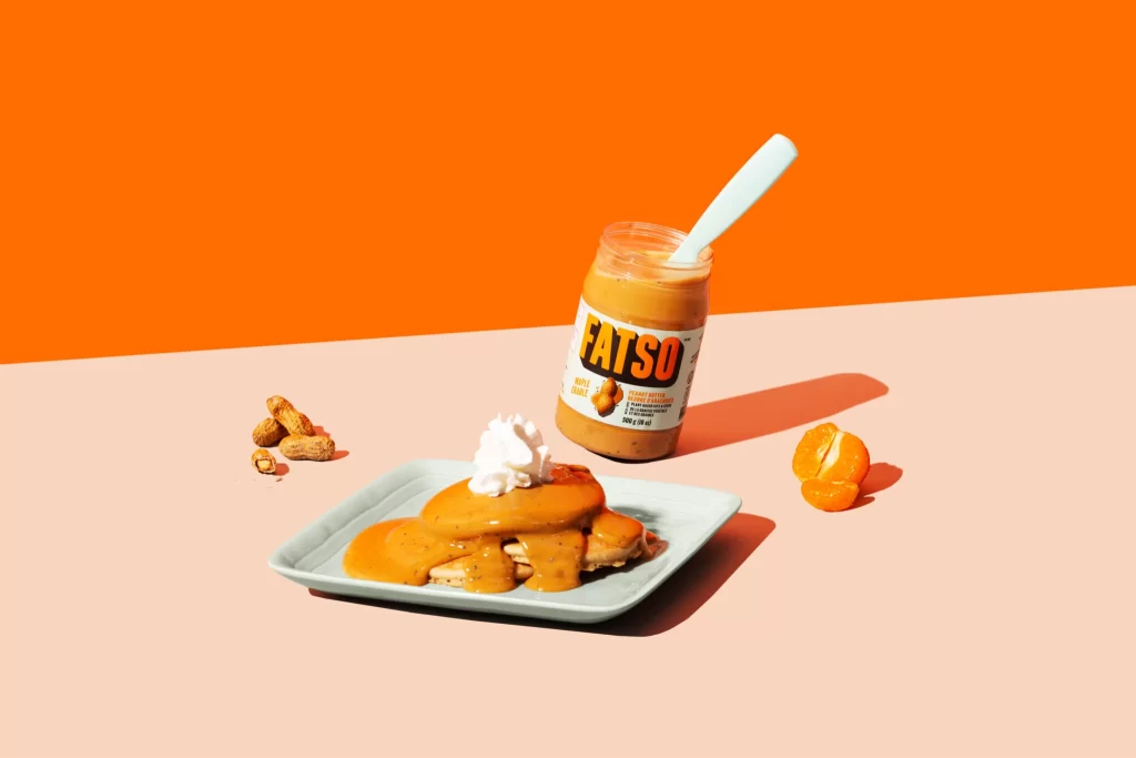
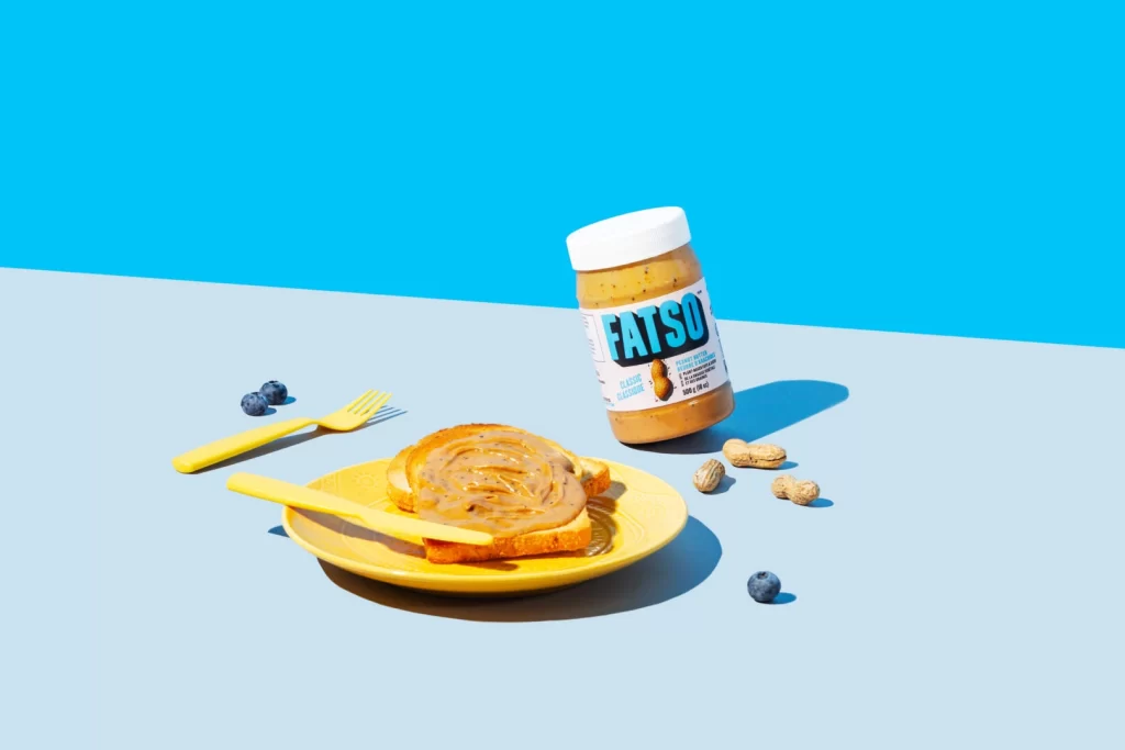
Against a split background of vivid cyan and pale blue, a jar of FATSO Classic Peanut Butter leans slightly to the right, its white lid and bold teal lettering catching the light. In the foreground, a yellow ceramic plate holds two slices of toast swirled with the nut butter, accompanied by a matching yellow plastic fork and knife. Scattered around the composition are three blueberries, several peanuts in their shells, and sharp shadows indicating strong directional lighting from the upper left.
The visual appeal lies in the high-contrast color palette, where the warm yellows of the dishware pop against the cool blue backdrop. The spiral application of peanut butter on the toast adds textural interest that contrasts with the smooth glass jar and matte plastic utensils. This particular arrangement balances product branding with lifestyle context, making the packaging legible while suggesting an appetizing use case.
Food photographers might study this setup to understand how complementary colors enhance appetite appeal in commercial shoots. Packaging designers could examine how the label's typography remains readable at this specific angle and distance. Art directors planning breakfast-themed campaigns will find the spatial relationships between the main product and its ingredients useful for storyboarding similar scenes.