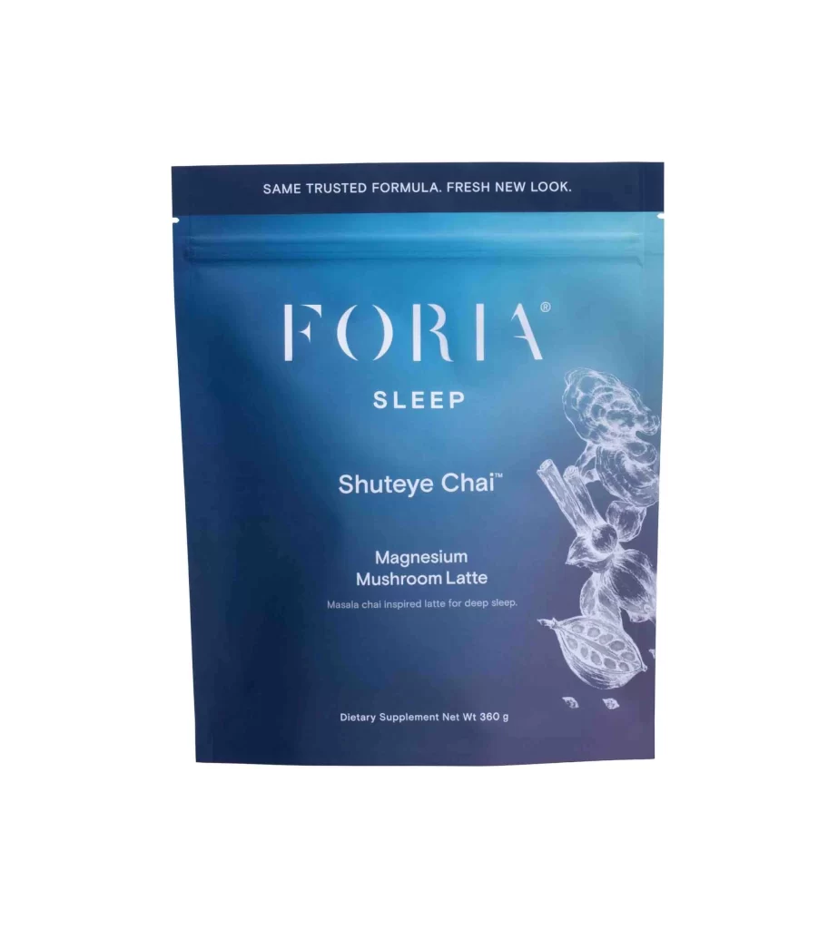
Foria Shuteye Chai Wellness Supplement Packaging
Topics
Details
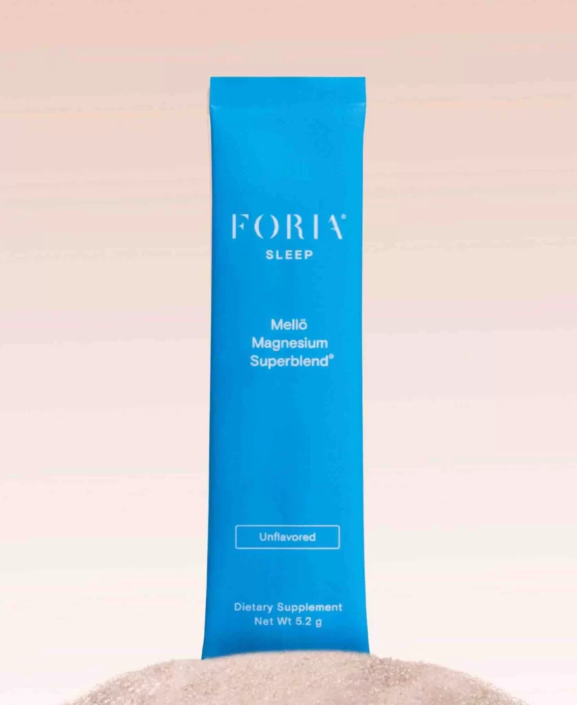
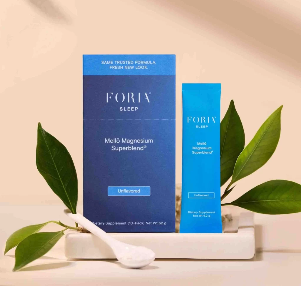
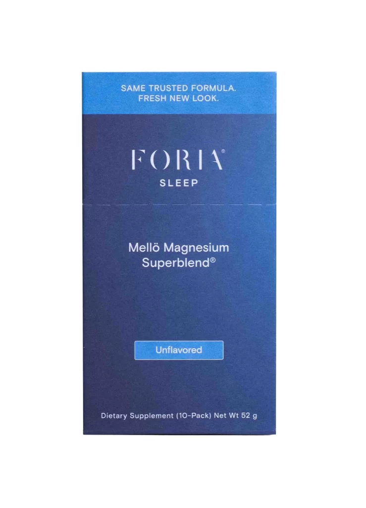
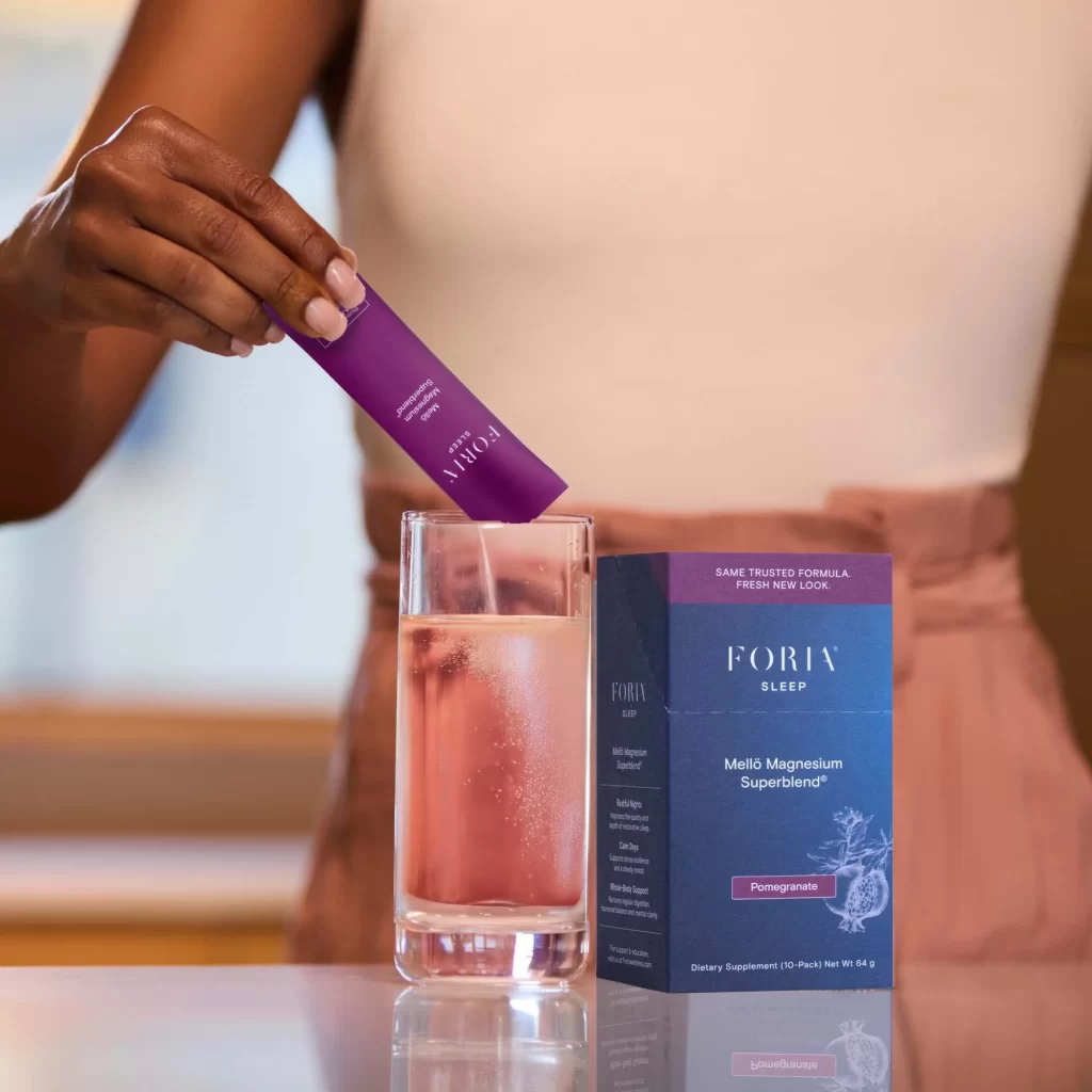
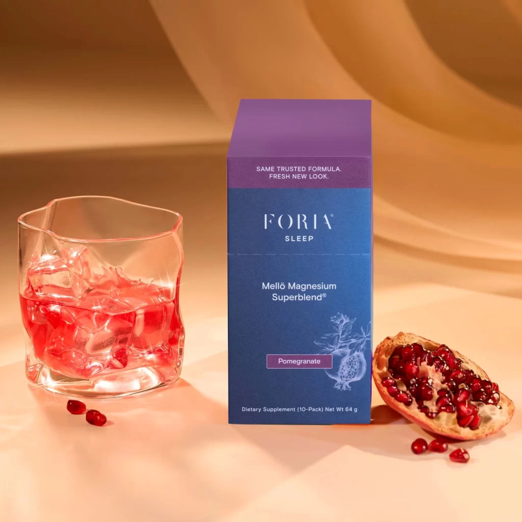
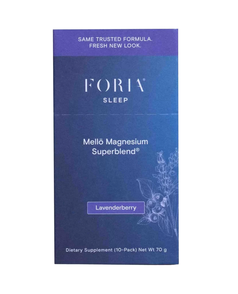
A vertical rectangular pouch dominates the frame, featuring a smooth gradient that transitions from a bright cyan at the top to a deep navy blue at the bottom. The composition is centered and frontal, displaying the brand name 'FORIA' in large, elegant white serif lettering above the word 'SLEEP' in a smaller sans-serif font. To the right, delicate white line-art illustrations of botanical elements, resembling mushrooms and seed pods, provide an organic contrast to the solid color field, while the net weight of 360g is noted in small text at the base.
Visual interest is generated through the sophisticated interplay between the modern, airy typography and the traditional, hand-drawn aesthetic of the botanical sketches. The dark header band creates a distinct anchor for the packaging, separating the 'SAME TRUSTED FORMULA' messaging from the main product identity. This specific iteration balances clinical wellness terminology with artistic flair, using the cool-toned palette to evoke a sense of nighttime calm and restorative rest.
Brand strategists might analyze this layout to understand how color psychology supports sleep-aid marketing, while illustrators could study the integration of line art into digital gradients. Packaging engineers may reference the spatial arrangement of text hierarchy to optimize readability on similar supplement containers. Furthermore, art directors could utilize this as a case study for maintaining brand consistency during a visual refresh, noting how the core identity remains legible despite the updated aesthetic.