Foria The Quickie Set Beauty Set Packaging
Topics
Details
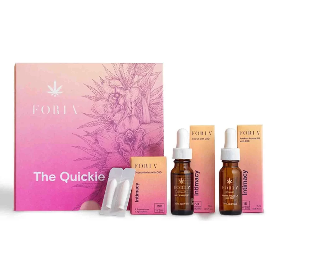
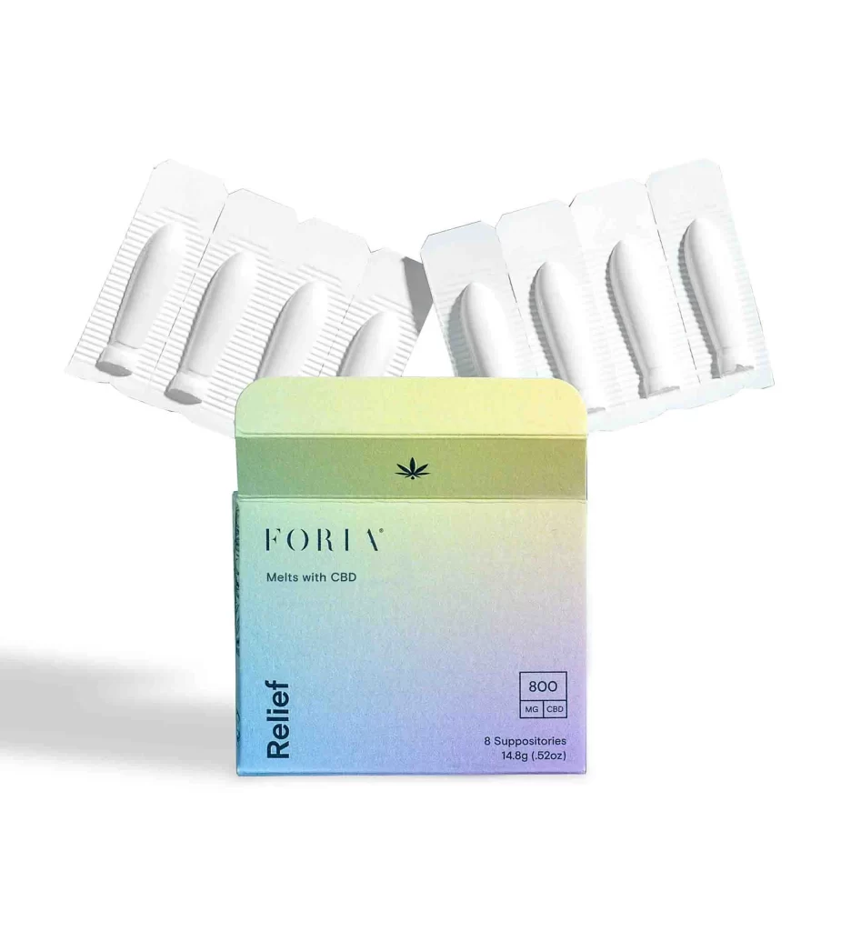
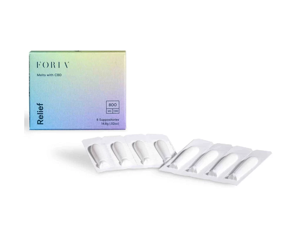
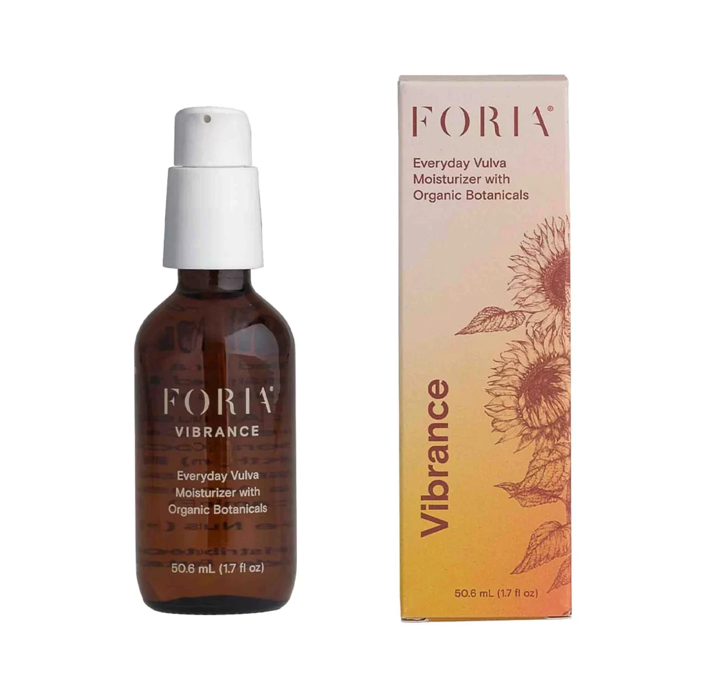
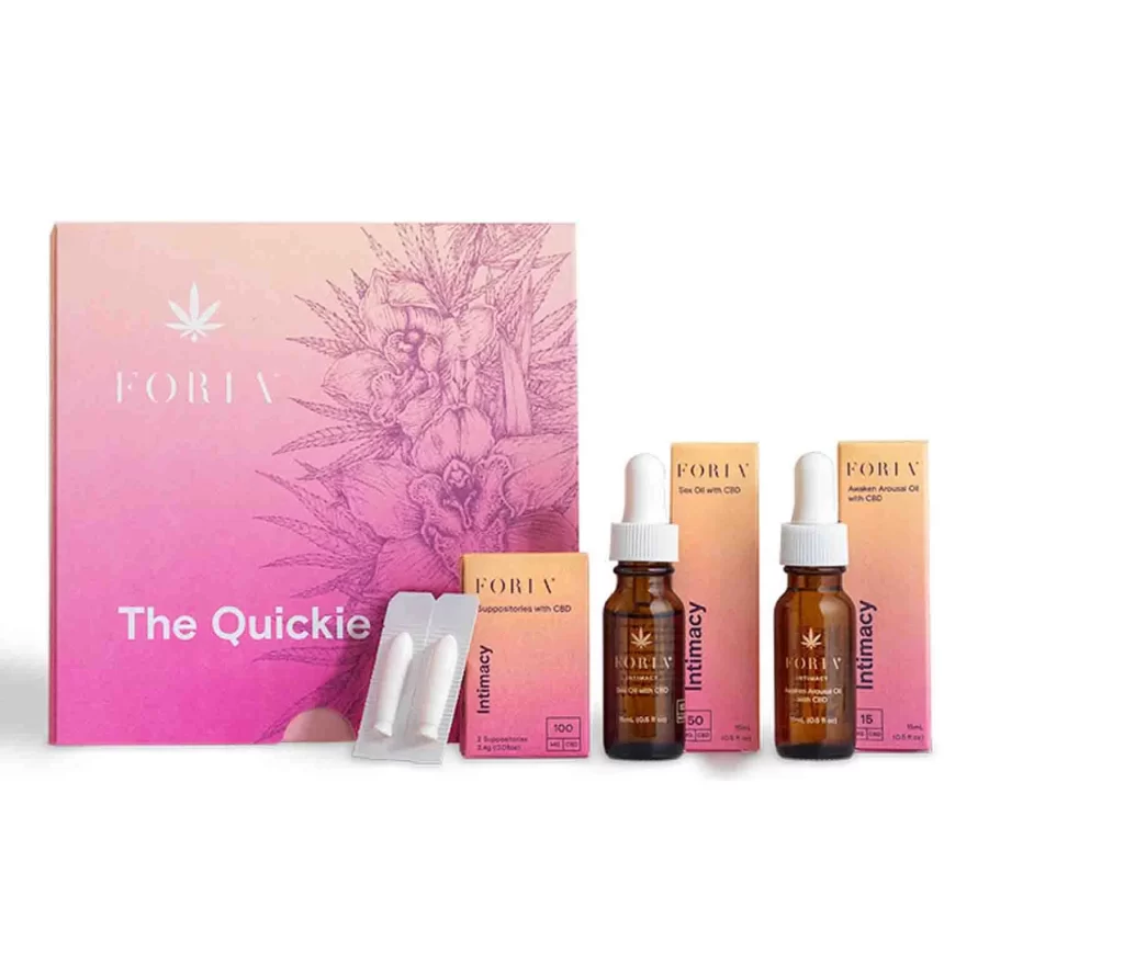
A large rectangular box dominates the Foria 'The Quickie' collection with its striking pink-to-peach gradient and delicate botanical line art, where the brand name appears in a clean serif font above the product title. Amber glass dropper bottles with white caps stand alongside smaller cardboard cartons labeled for intimacy products on a white surface.
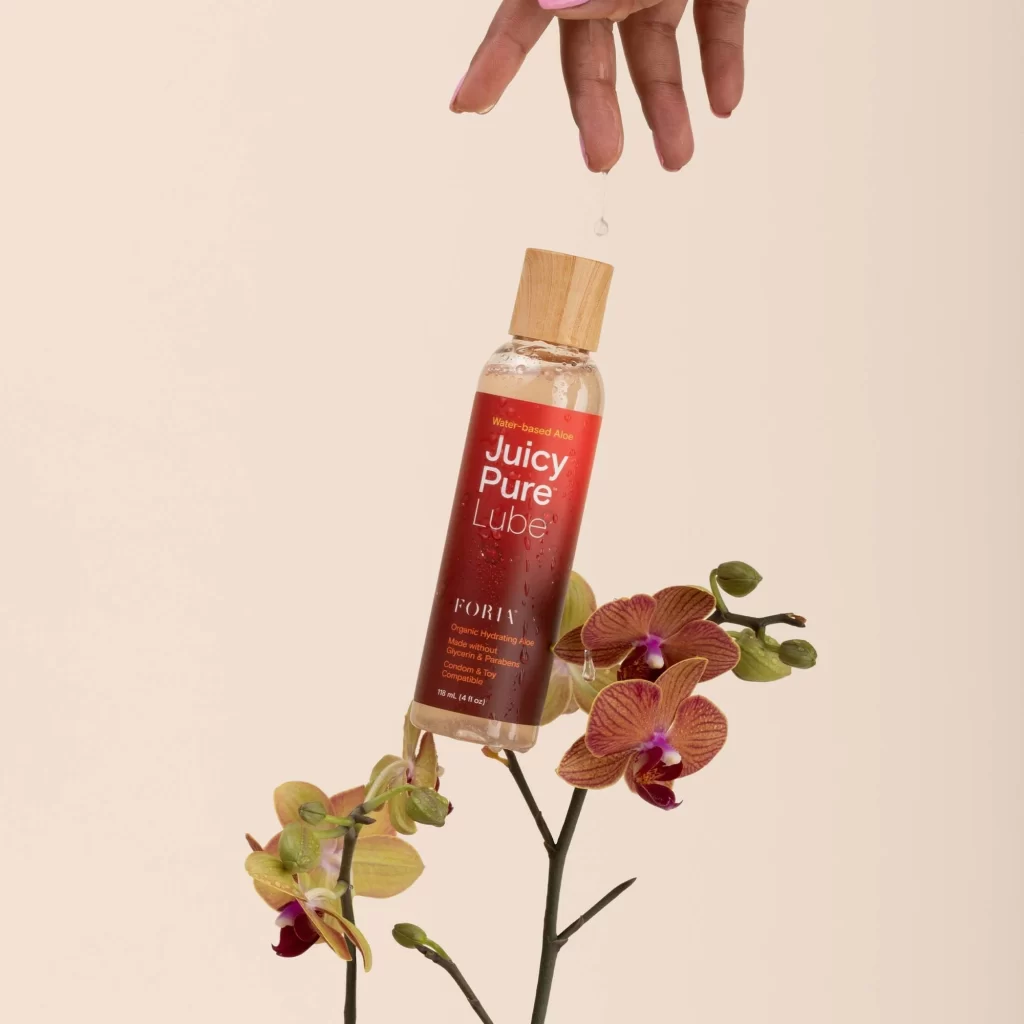
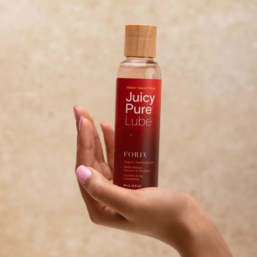
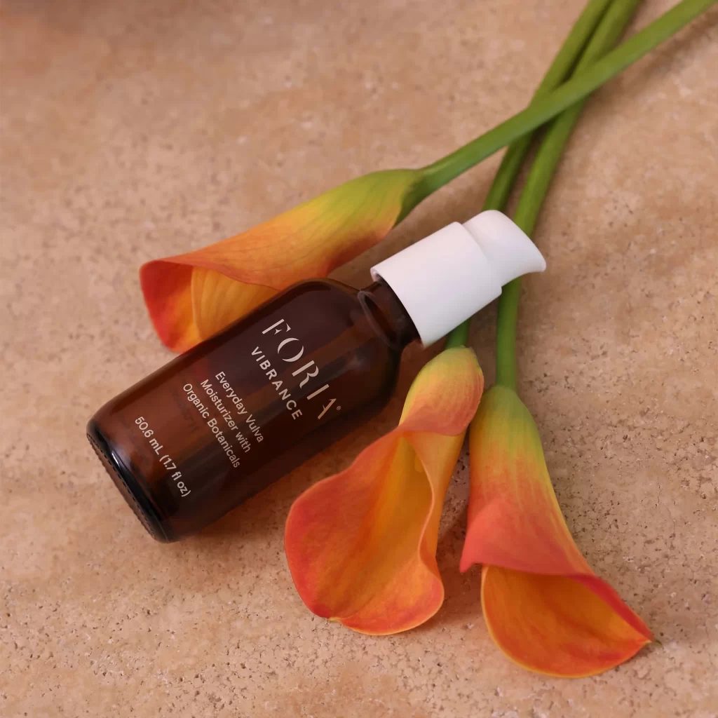
What distinguishes this packaging is its sophisticated use of ombré coloring combined with scientific illustration, creating a premium yet approachable aesthetic for wellness products. The consistent visual language across different container types—from the bold box to the slender oil bottles—demonstrates how cohesive branding can unify varied product shapes while maintaining clarity through strategic text placement and color coding.
Brand strategists developing luxury wellness lines could study this composition to understand how gradient backgrounds soften clinical product presentations. Packaging designers working on CBD or supplement ranges might reference the balance between botanical imagery and modern typography when creating their own visual systems. Art directors planning e-commerce photography shoots could adopt this flat-lay arrangement to showcase complete product sets effectively.