Foria The Quickie Set Beauty Set Packaging
Topics
Details
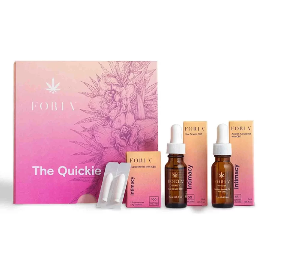
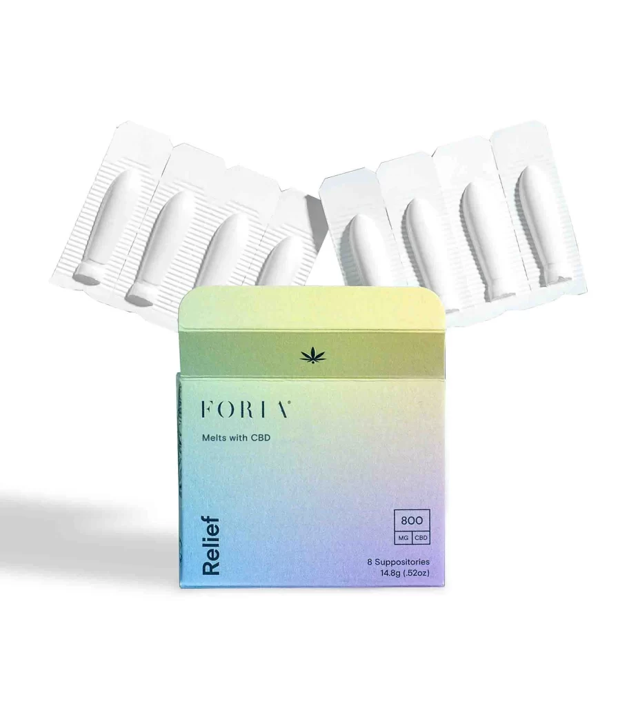
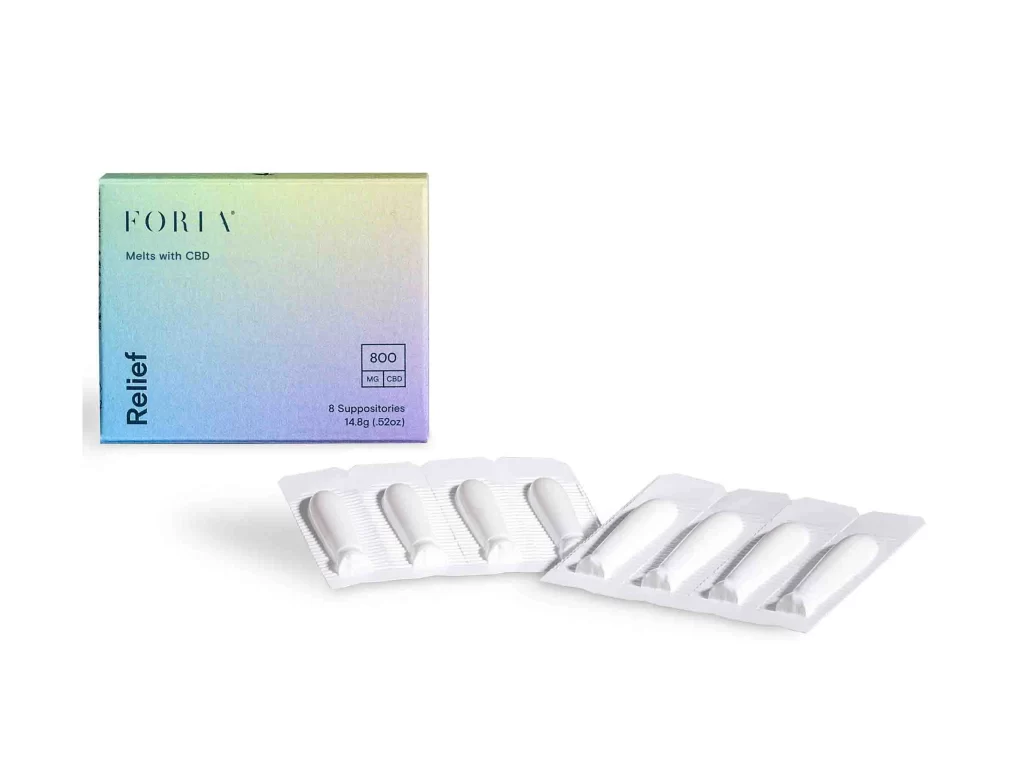
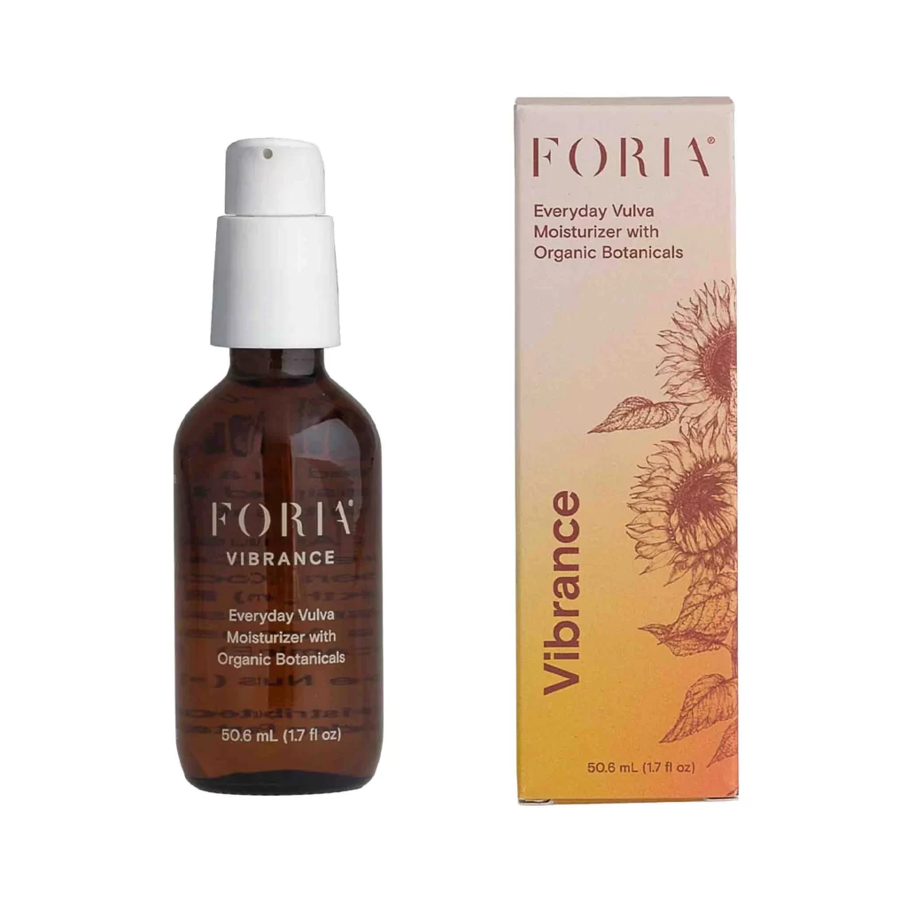
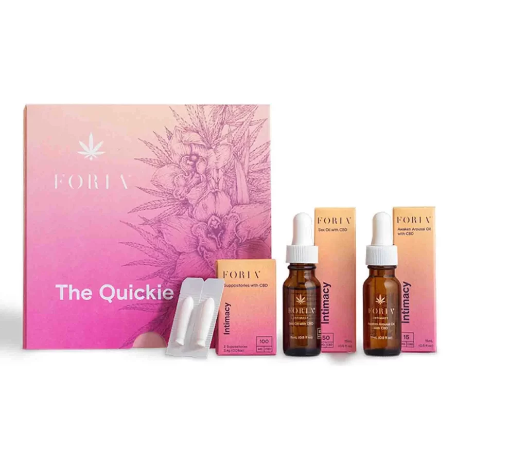
A gradient of warm pinks and peaches washes across the primary box of the Foria 'The Quickie' collection, which features delicate botanical line art and a minimalist cannabis leaf icon above bold white text. Two amber glass dropper bottles with white rubber caps stand beside their respective tall rectangular cartons labeled for 'Intimacy' products, while a small blister pack of white capsules rests near a smaller peach-to-pink box on a clean white surface.
Visual hierarchy emerges through the sophisticated ombre treatment on the master packaging, transitioning from pale blush to saturated magenta while maintaining legible white typography. The juxtaposition of pharmaceutical-grade amber glass against the soft, organic color palette creates a compelling tension between clinical wellness and sensual branding. Botanical illustrations rendered in fine-line etching style add textural depth without overwhelming the clean, modern sans-serif wordmarks that anchor each individual component.
Brand strategists developing premium wellness or cannabis-adjacent product lines would examine this layout to understand how to balance explicit product categorization with aspirational lifestyle positioning. Packaging engineers could reference the material contrast between the matte paper goods and the glossy glass vessels when constructing cohesive unboxing experiences. Art directors tasked with photographing multi-SKU collections might study the spacing and alignment here to achieve similar clarity in their own commercial still-life compositions.