Heineken City Edition Bottles
Topics
Details
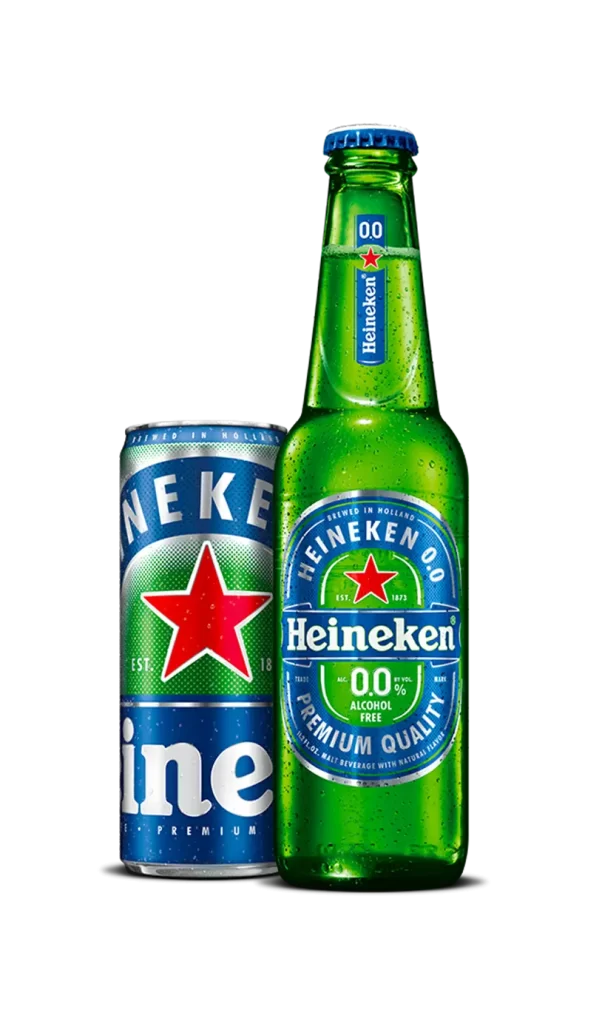
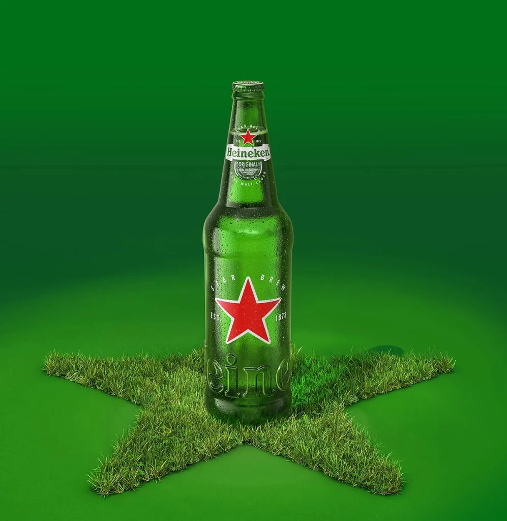
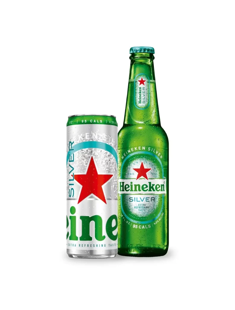
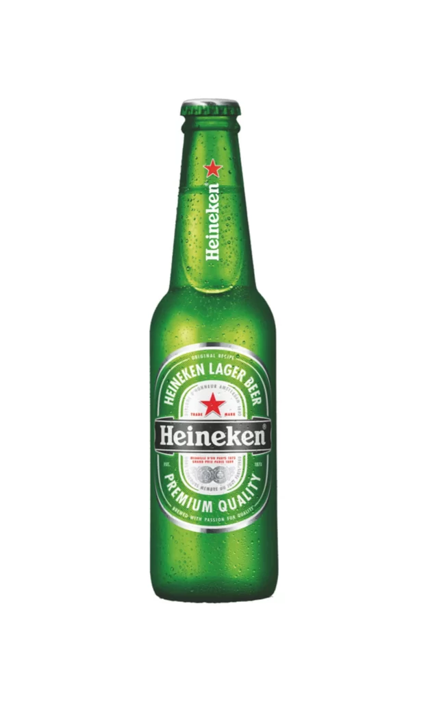
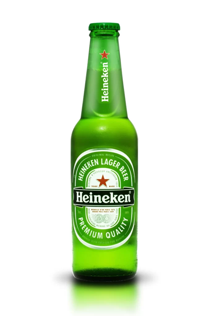
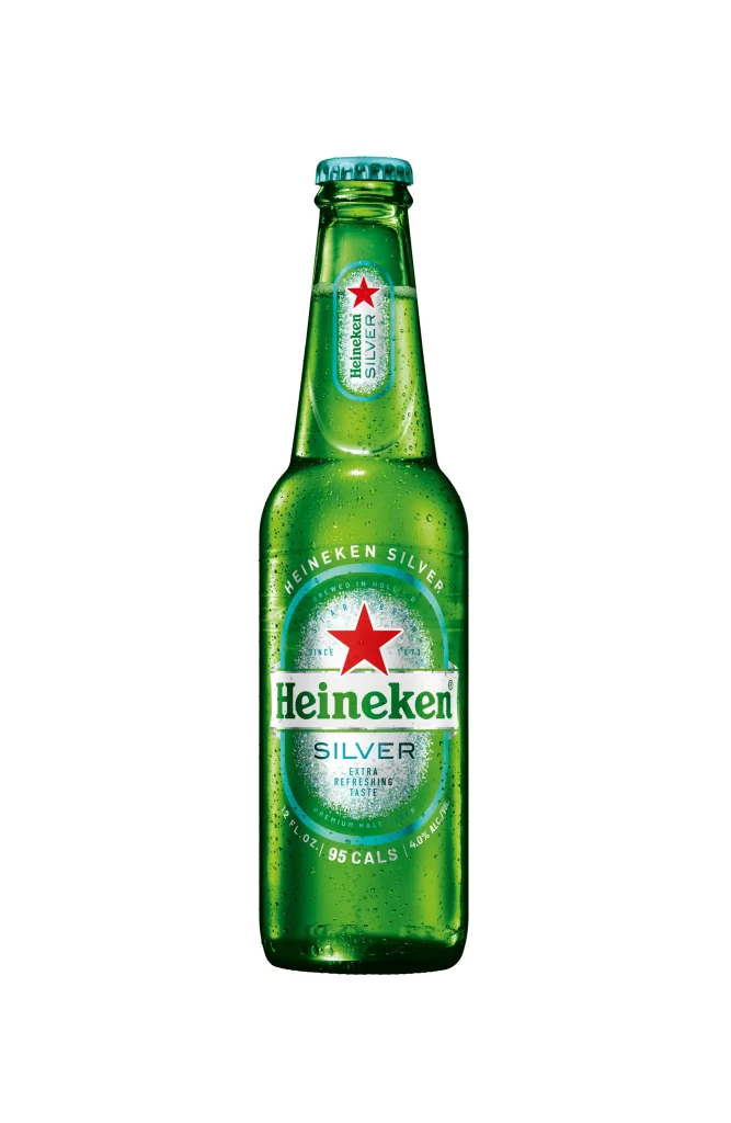
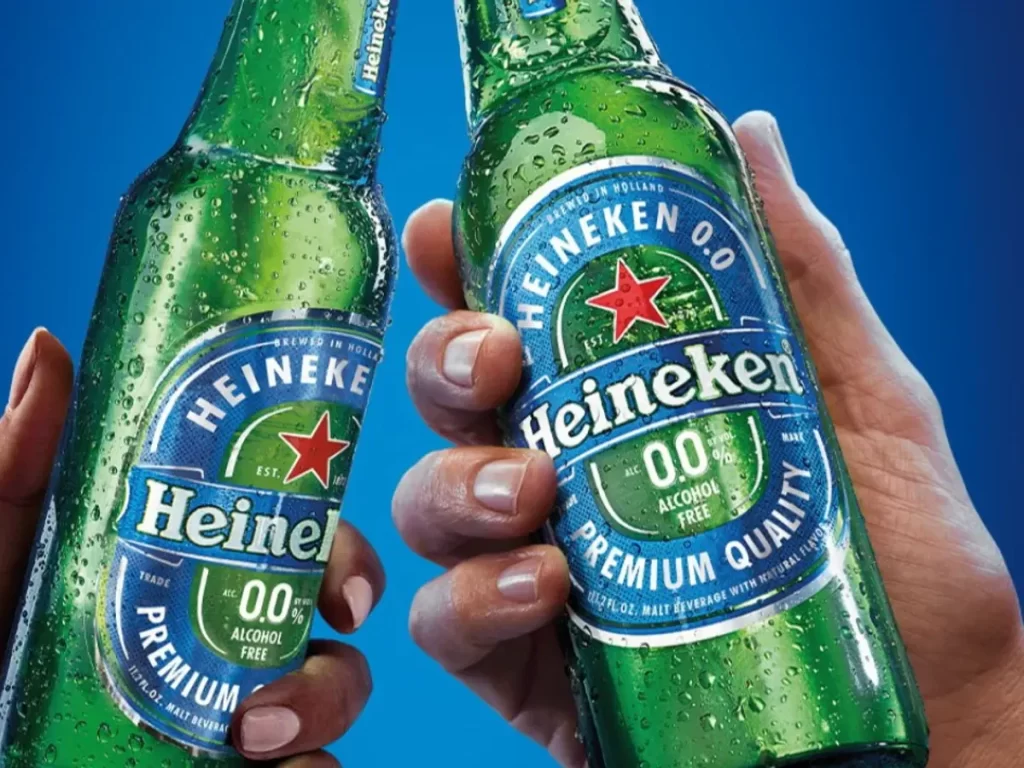
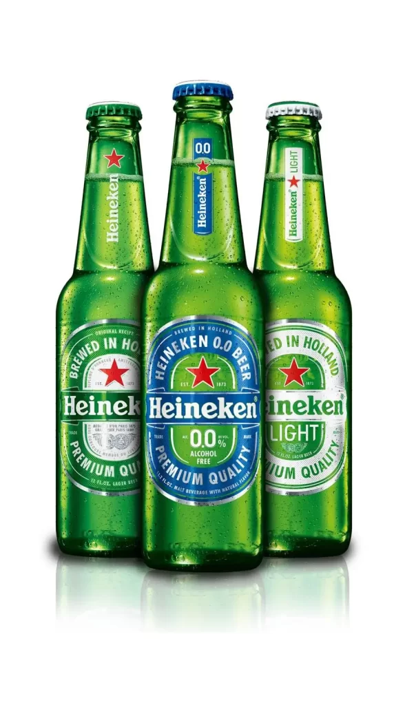
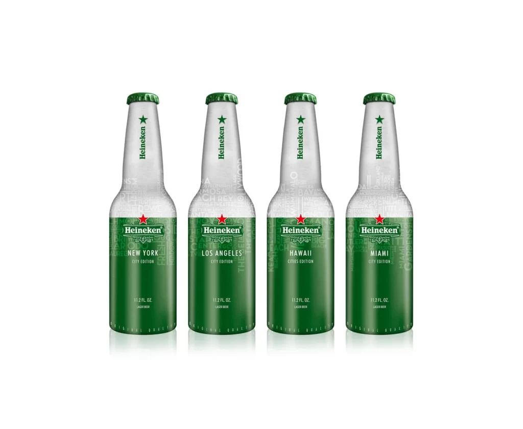
The Heineken City Edition Bottles asset showcases a four special edition bottles lineup. Featuring New York, Los Angeles, Hawaii, and Miami city names, each bottle displays distinct typographic labels. They are arranged neatly against a pure white studio background, beautifully capturing soft reflections that emphasize the sleek glass and liquid, resulting in a crisp and highly polished visual presentation.
From a design perspective, the collection relies on bold typography to differentiate the locations while maintaining unified brand identity. The stark contrast of the black text and green hues against a pure white studio creates striking visual clarity. Soft reflections ground the bottles, adding depth without distraction. This minimalist approach ensures the distinct typographic labels remain the absolute focal point of the composition.
Graphic designers, packaging specialists, and beverage marketers need this reference for inspiration. It demonstrates how to balance regional customization with global brand consistency. Creators working on limited edition product launches will value the clean lighting techniques and typographic execution. Students studying commercial photography can also learn from the expert use of soft reflections within a controlled pure white studio environment.