Heineken Lager Beer Bottle Packaging
Topics
Details
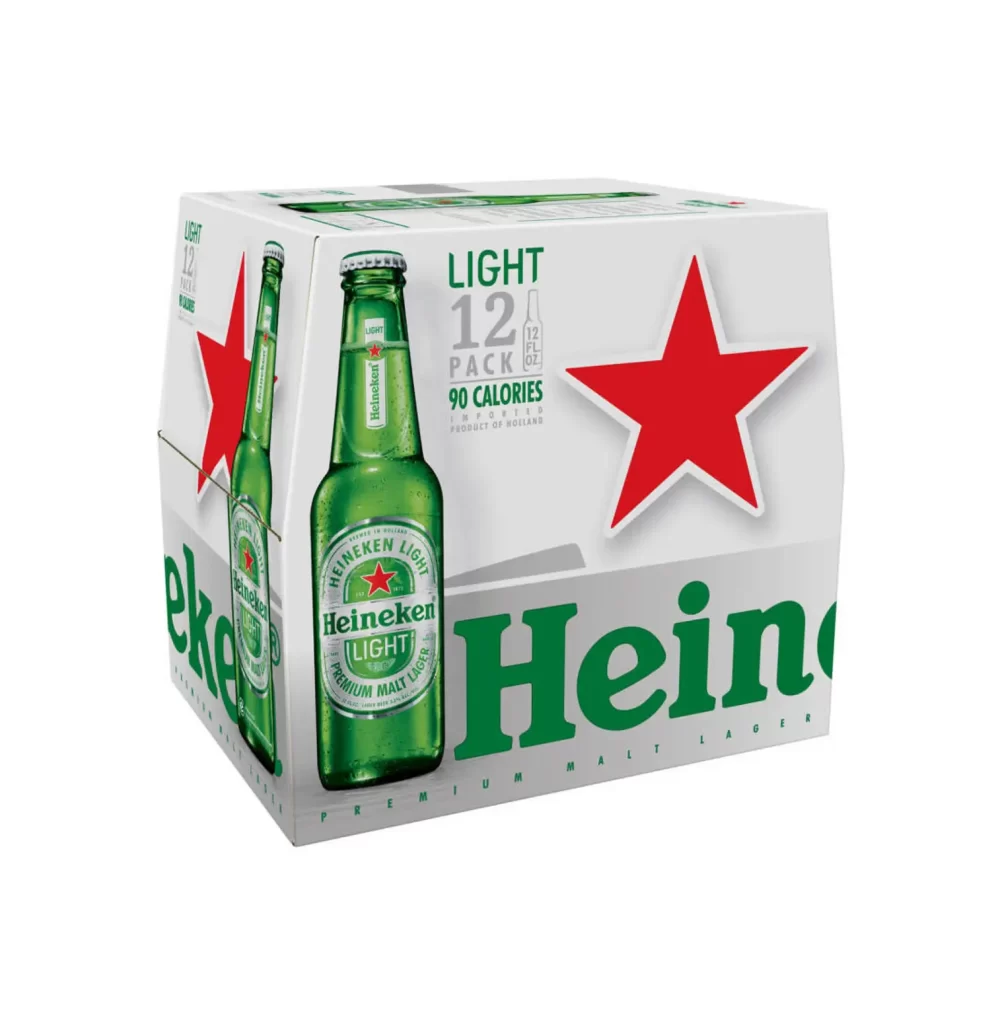
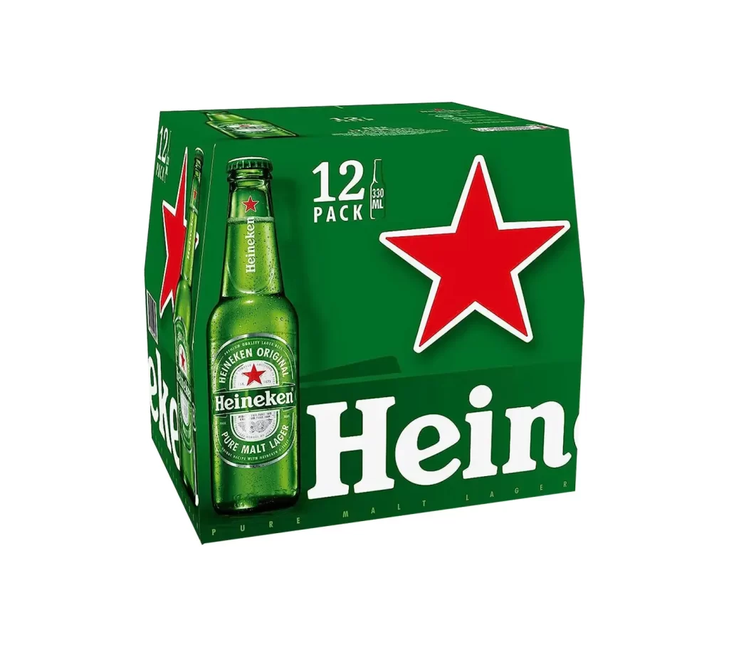
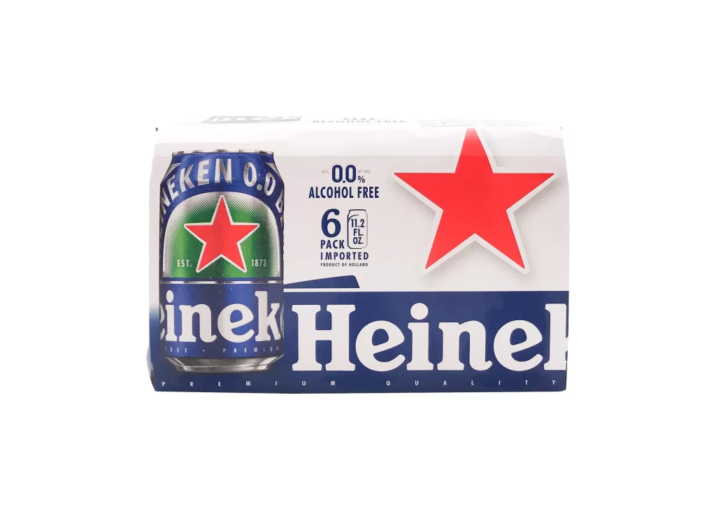
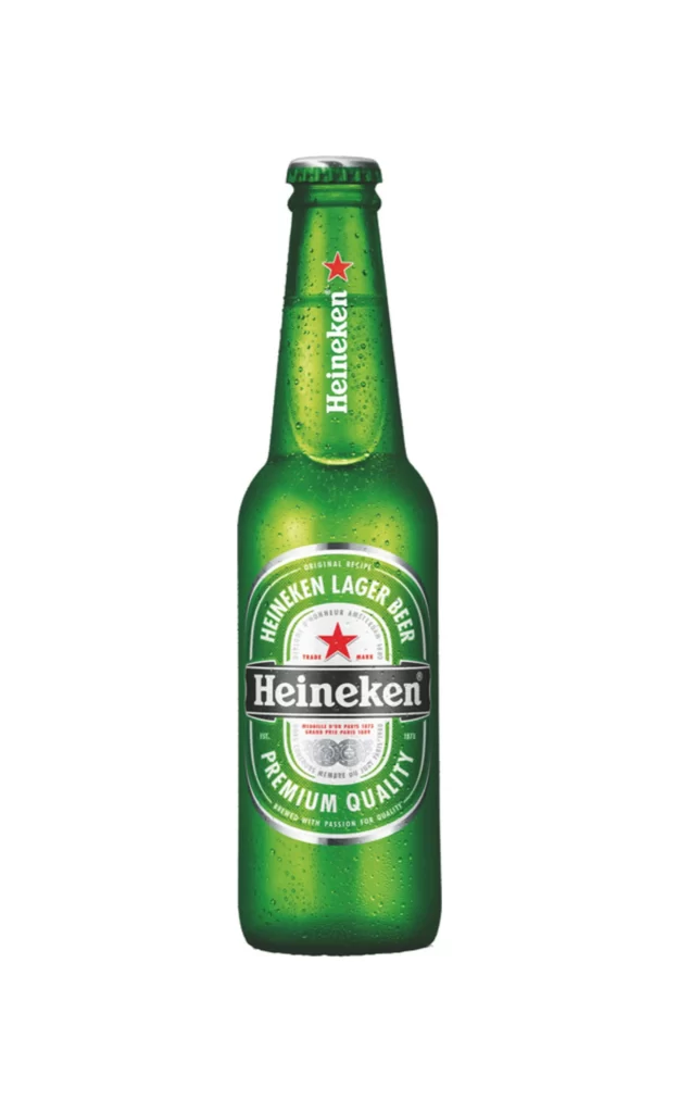
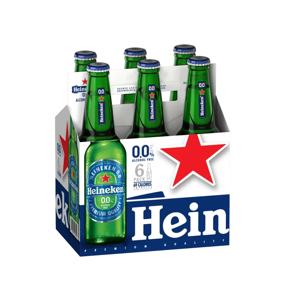
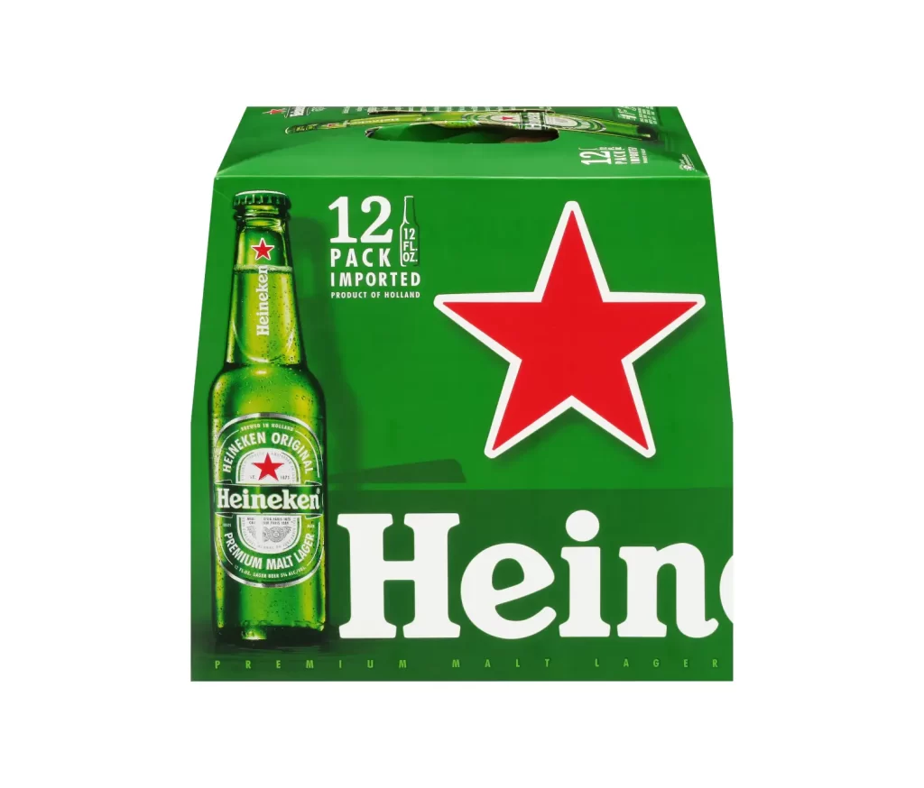
Vibrant emerald green cardboard forms the six-pack carrier, its surface dominated by a massive white Heineken wordmark and the brand's iconic red star positioned in the upper right quadrant. A single chilled glass bottle stands prominently at the front left, revealing condensation droplets on its shoulder and displaying the circular green label with silver accents that reads 'Heineken Lager Beer' and 'Premium Quality.' The packaging indicates a quantity of six 330ml bottles with 5% alcohol volume, while two additional bottle necks peek through die-cut openings at the top of the carrier, all photographed from a slight three-quarter angle against a neutral light backdrop.
Visual hierarchy drives immediate recognition through the strategic interplay of the oversized typography and the singular red star, which creates a focal point that balances the heavy text block. The transparent window showing the actual glass bottle adds tactile authenticity to the presentation, allowing viewers to perceive the liquid's color and the physical texture of the condensation. Subtle shadows beneath the carrier suggest dimensionality and weight, while the consistent application of the brand's signature color palette ensures the product maintains its premium market positioning even in this standard retail configuration.
Brand strategists analyzing competitive packaging layouts would examine how the logo scaling relates to the product photography within the confined carrier space. Packaging engineers might reference the structural folds and bottle insertion points when developing similar multi-unit carriers for beverage clients. Retail merchandising teams could study the shelf presence created by the bold contrast between the green substrate and white lettering to optimize their own product visibility strategies.