Heineken Light Lager Packaging
Topics
Details
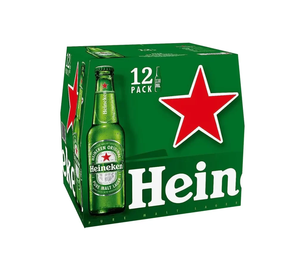
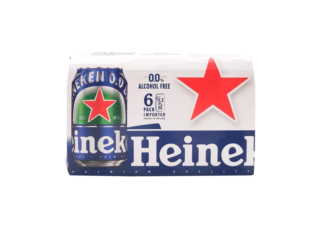
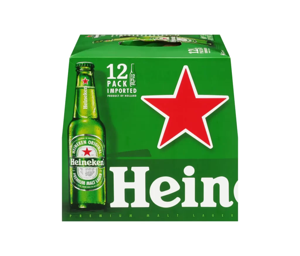
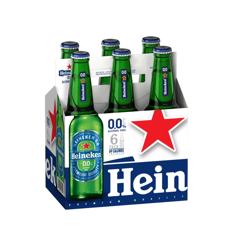
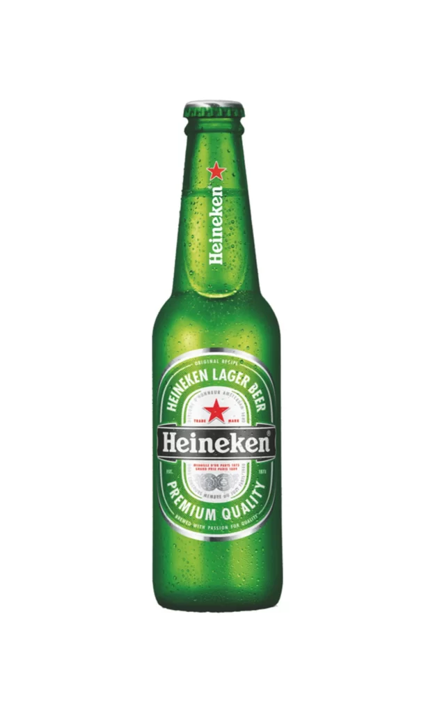
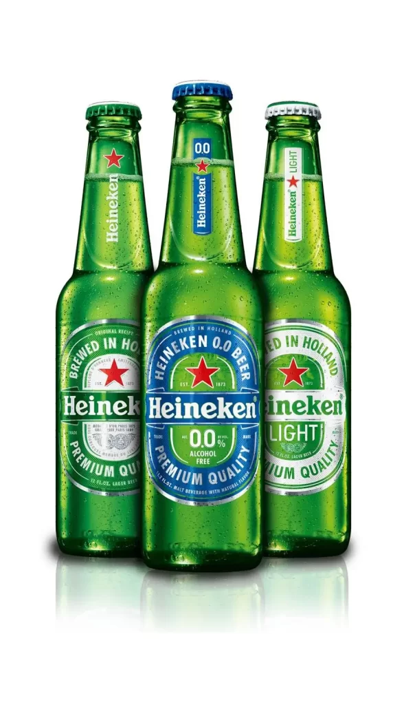
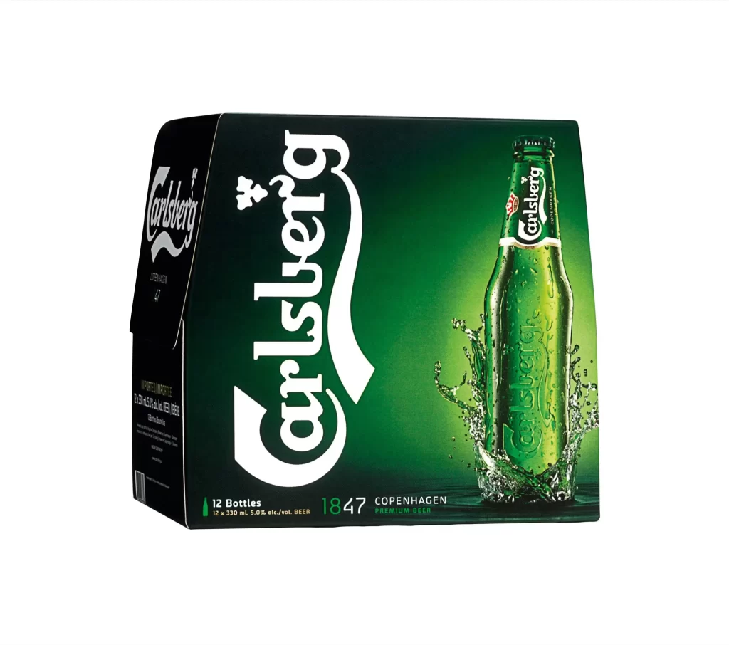
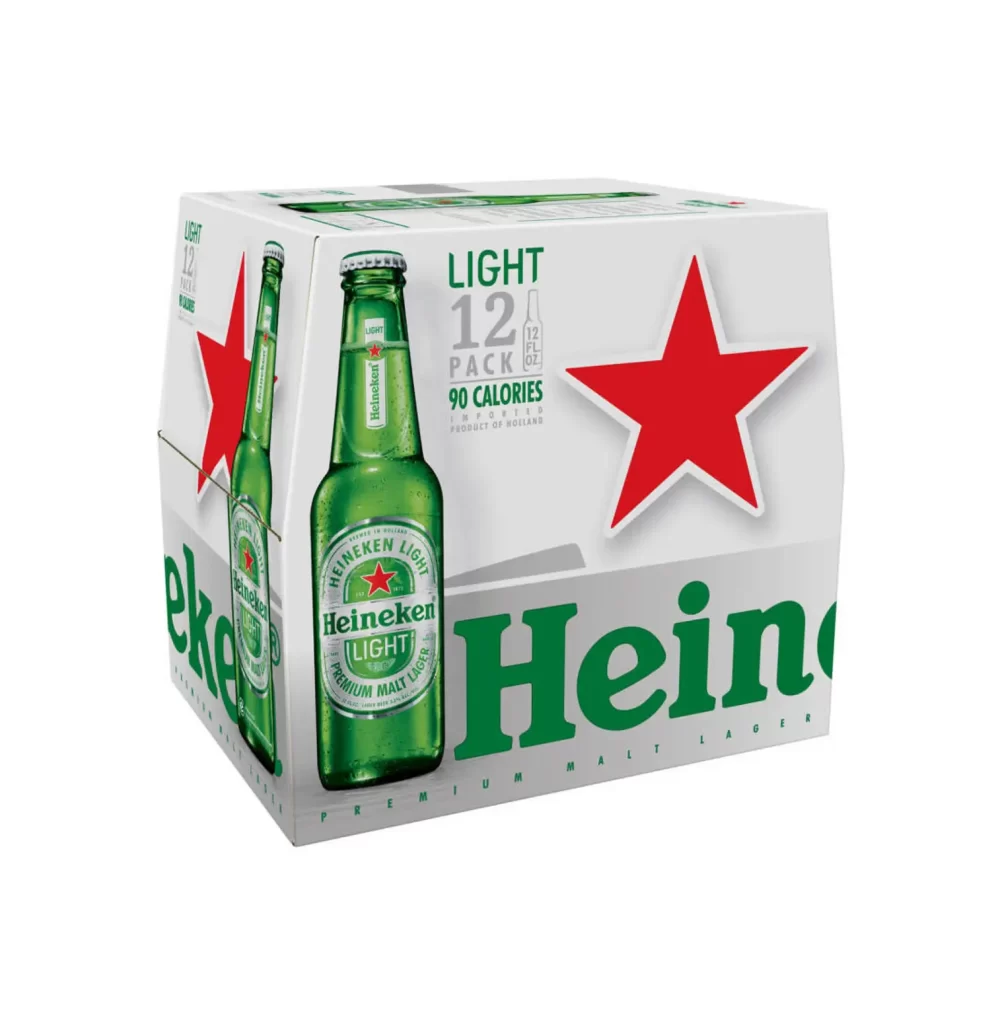
A twelve-pack of Heineken Light sits at a three-quarter angle, revealing the front and left side panels against a white background. The packaging features a crisp white cardboard base accented by the brand's signature forest green typography and a large, solid red five-pointed star on the right. A high-resolution photograph of a chilled green glass bottle with condensation droplets dominates the front panel, showcasing the Heineken Light label with its red star emblem.
Visual interest in this specific layout stems from the strategic use of negative space, which allows the vibrant red star and green bottle graphic to command immediate attention without clutter. The design effectively balances product information with brand identity by maintaining the classic Heiken color palette while introducing lighter grey tones for nutritional data. Furthermore, the realistic rendering of the glass texture and moisture on the bottle provides a tangible sense of freshness that contrasts sharply with the flat, matte finish of the box material.
Brand managers analyzing competitive beverage packaging can utilize this visual to study how light beer variants differentiate themselves through minimalist color blocking and calorie-conscious typography. Packaging engineers might examine the structural folds visible on the side panel to understand how carrier boxes are constructed to hold weight securely. Additionally, 3D artists requiring accurate reference for commercial product renders will find the specular highlights on the green glass and the specific proportions of the label elements particularly useful for modeling.