Heineken Original Lager Beer Can
Topics
Details
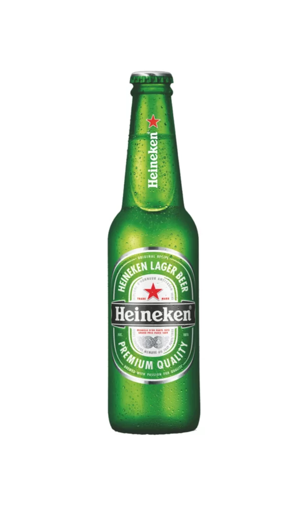
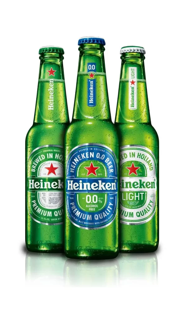
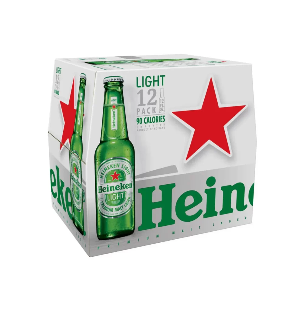
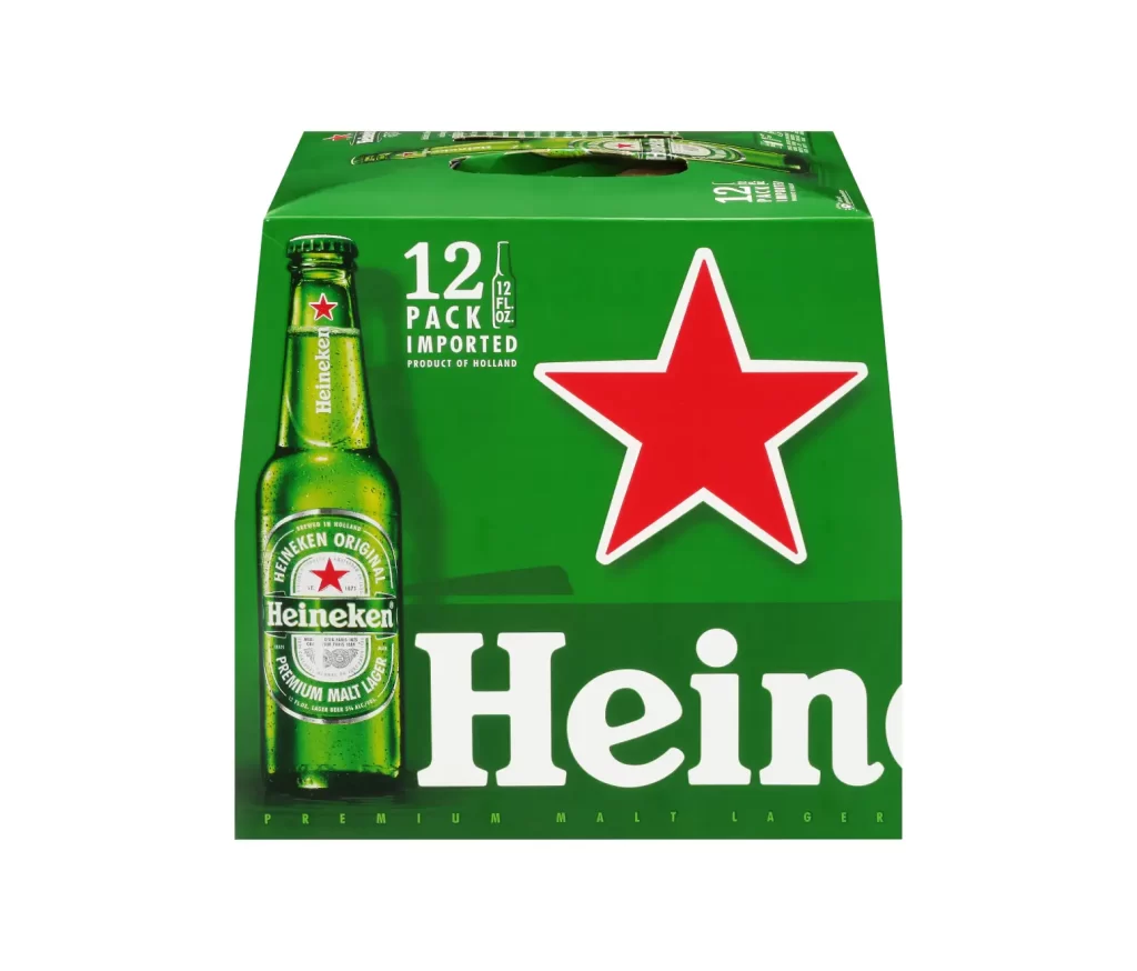
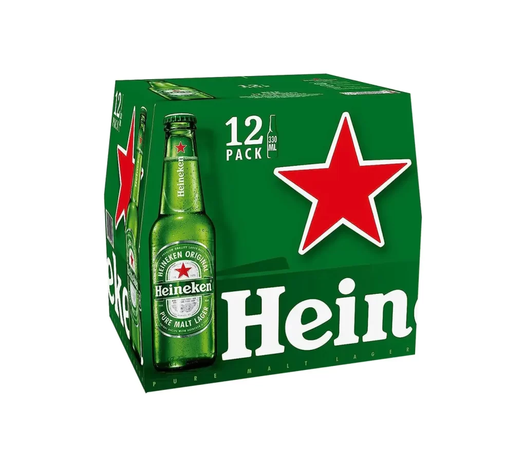
A 500ml aluminum Heineken can stands vertically, its cylindrical body wrapped in the brand's signature emerald green with silver accents at the rim and base. The iconic red five-pointed star anchors a white circular badge above the bold white 'Heiken' wordmark, while curved text reading 'HEINEKEN ORIGINAL' and 'PURE MALT LAGER' traces the upper and lower arcs of the central emblem. Even studio lighting eliminates harsh shadows across the metallic surface, presenting the object in sharp frontal perspective against an unobtrusive light backdrop that emphasizes the can's industrial form.
The visual hierarchy relies on concentric circular geometry that draws the eye inward toward the red star, creating a target-like focal point within the rectangular constraints of the aluminum container. Silver foil bands at the top and bottom edges provide structural framing that contrasts with the saturated green field, while the typographic arrangement balances arched uppercase lettering with the heavy horizontal weight of the primary logo. Subtle embossed details within the lower circular seal add tactile depth to the flat printed surface, demonstrating how premium beverage packaging combines minimal color palettes with intricate graphic layering.
Brand historians analyzing global packaging evolution would examine this specific iteration to trace typographic refinements in Heineken's identity system across different markets. Packaging engineers might study the relationship between the printed graphic zones and the physical can dimensions to optimize label placement for automated filling lines. Marketing teams could deconstruct the color psychology of the green-and-red combination when developing seasonal variations or limited-edition releases that must maintain core brand recognition while introducing new visual elements.