Heineken Packaging Green Bottle Lager Beer
Topics
Details
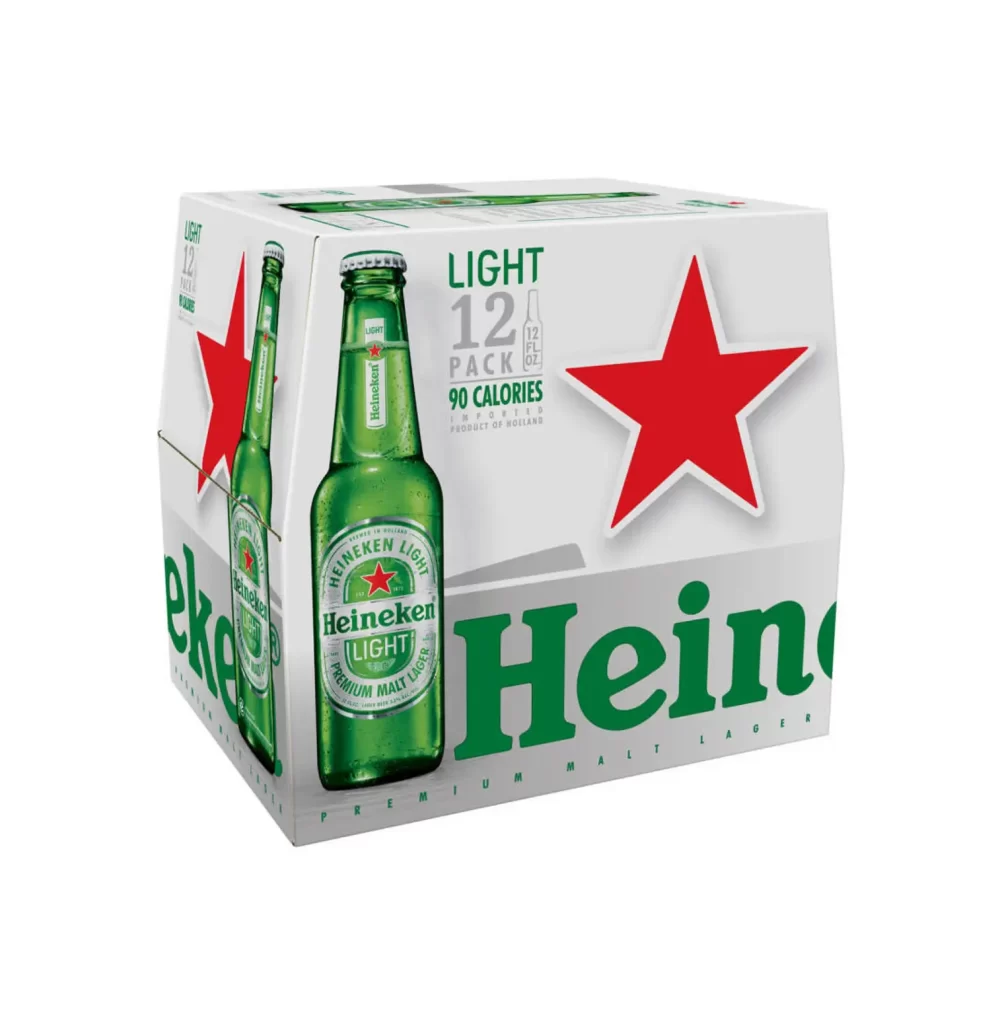
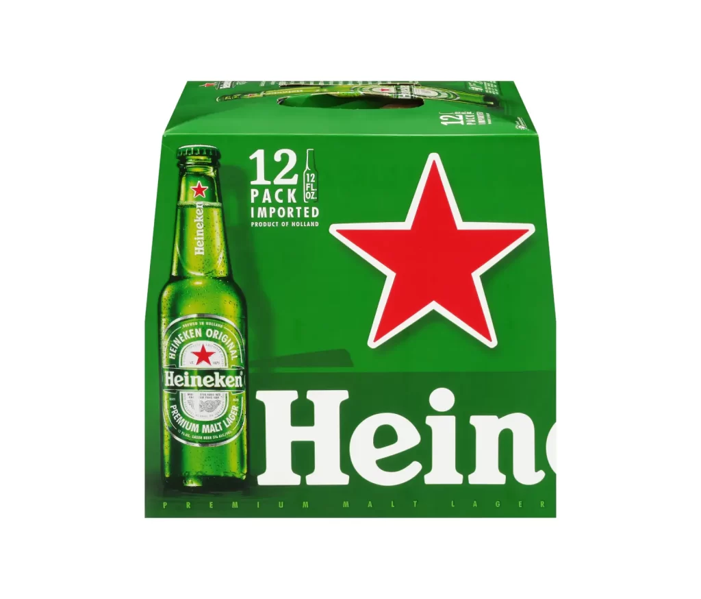
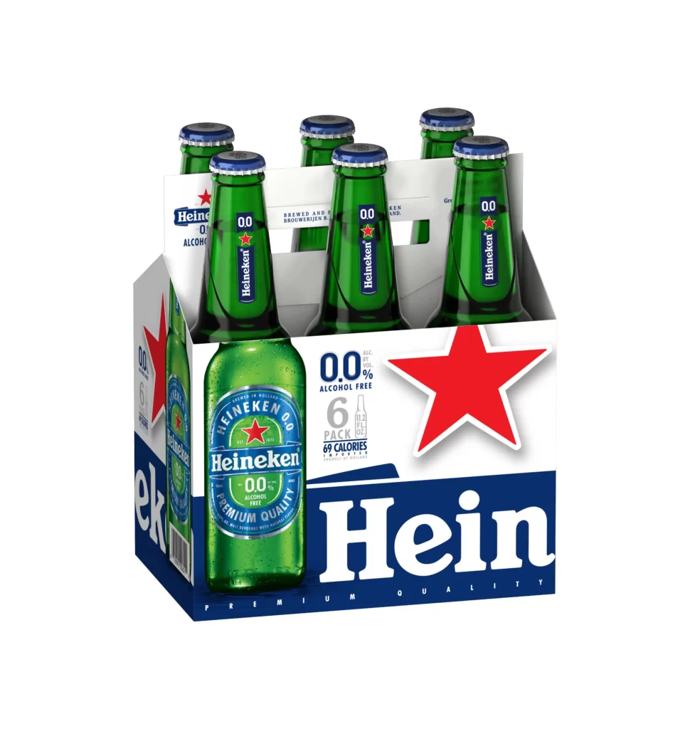
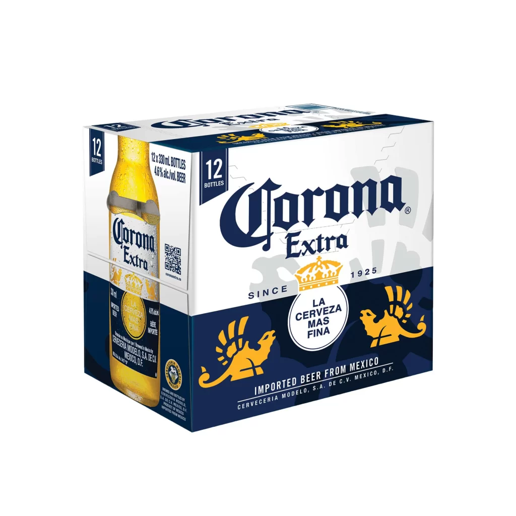
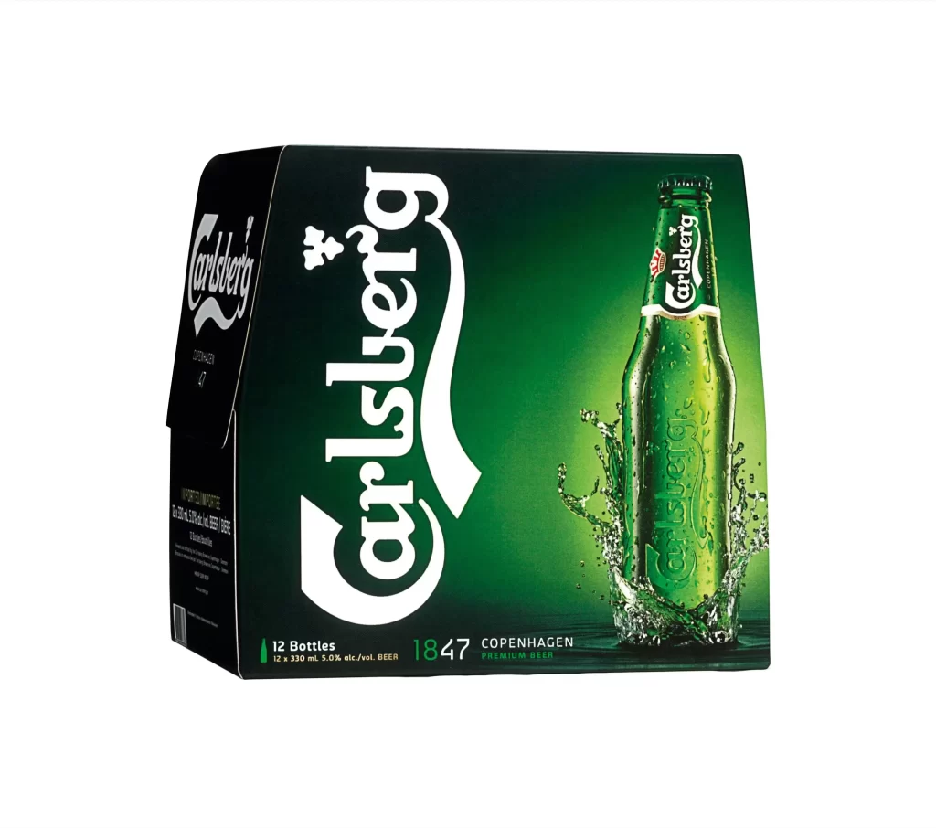
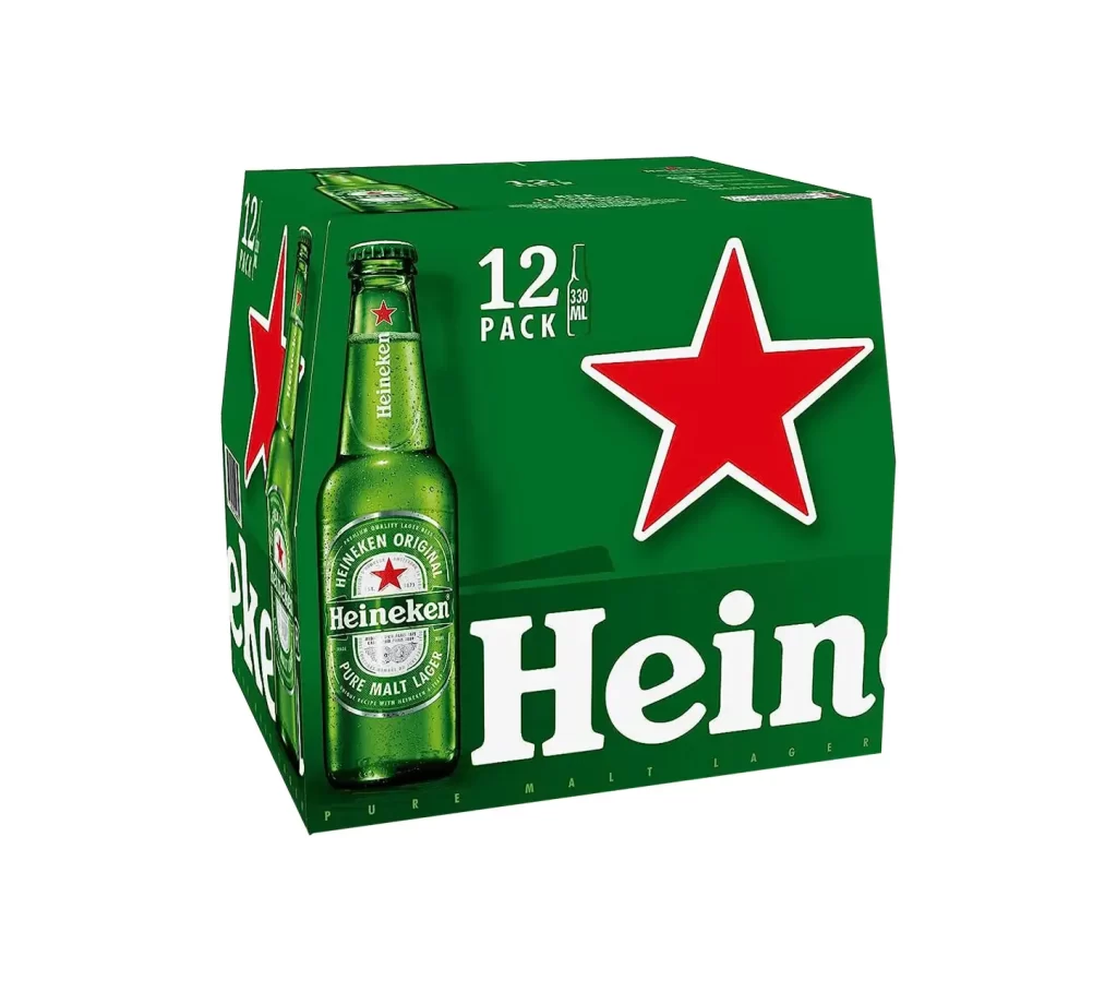
A twelve-pack of Heineken lager beer sits in a three-quarter perspective, revealing the front and left side panels against a white background. The packaging features the brand's signature emerald green color, punctuated by a large, five-pointed red star with a crisp white outline positioned to the right of center. A photographic rendering of a chilled, condensation-beaded green bottle anchors the left side of the carton, displaying 'Heineken Original' and 'Pure Malt Lager' text on its label.
Visual hierarchy is strictly enforced through scale and contrast, ensuring the red star acts as an immediate focal point against the deep green substrate. The interplay between the realistic bottle texture—complete with droplets and glass reflections—and the flat graphic elements creates a layered commercial aesthetic typical of premium beverage branding. Subtle gradients on the cardboard edges suggest a matte finish that absorbs light differently than the glossy label depicted on the bottle graphic.
Brand strategists might utilize this composition to analyze color balance in retail environments where shelf presence is critical. Packaging engineers could study the structural folds and panel proportions required for a stable twelve-bottle carrier. Furthermore, typographers examining the specific weight and kerning of the Heineken wordmark would find this a clear example of logo application within constrained spatial layouts.