Heineken Beer Can Green Star Brand
Topics
Details
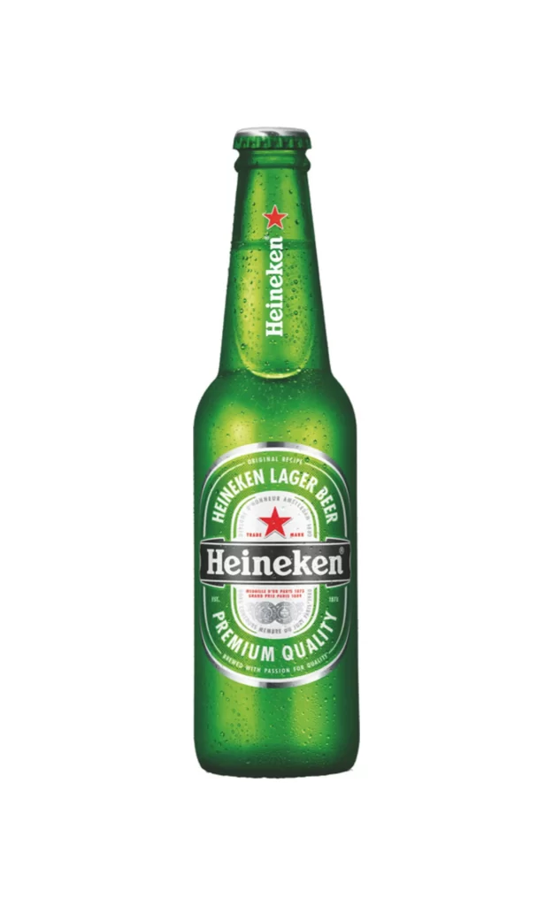
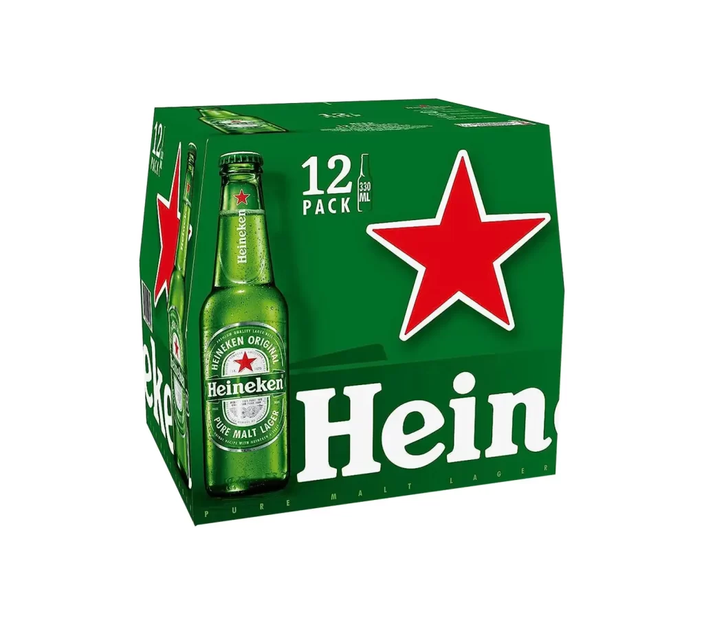
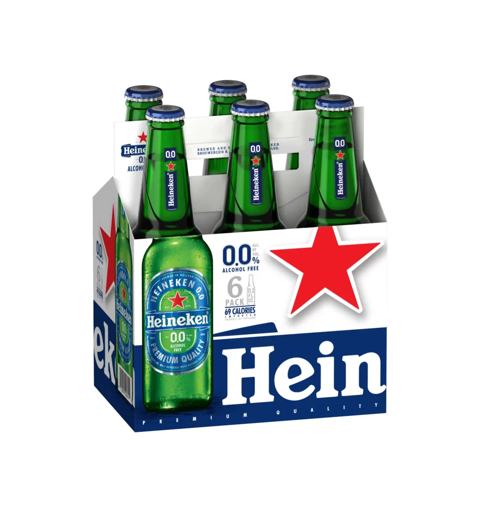
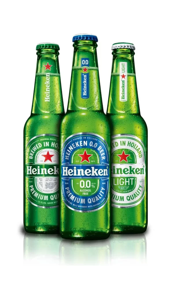
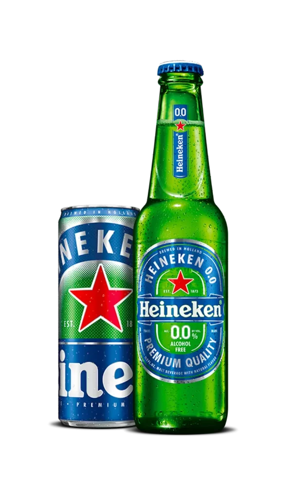
A cylindrical aluminum beverage container displays a deep emerald green finish with a silver metallic rim at the top opening. The front surface features bold white sans-serif typography reading 'HEINEKEN ORIGINAL' in an arc above a centered five-pointed red star, while 'eineken' appears in large lowercase letters below. Curved text framing the star includes 'DIPLOME D'HONNEUR AMSTERDAM EN 1883' and 'EST. 1873', with 'PREMIUM MALT LAGE' printed at the bottom edge, all set against a neutral light backdrop with even frontal illumination.
Visual hierarchy relies on the contrast between the saturated green substrate and the crimson star emblem, creating immediate brand recognition through color blocking alone. The circular typographic arrangement around the central icon establishes a seal-like quality that suggests heritage and certification, while the mix of uppercase and lowercase letterforms adds rhythmic variation to the label composition. Metallic reflections along the can's curved shoulders indicate a standard pressurized aluminum construction typical of carbonated lager packaging.
Brand historians analyzing trademark evolution across packaging formats would examine this specimen for typographic consistency with bottle labels and signage. Packaging engineers studying structural integrity of pressurized containers might reference the shoulder curvature and rim dimensions visible from this orthogonal perspective. Marketing teams developing visual identity guidelines could extract exact hex values for the green field and red star to ensure reproduction accuracy across print and digital touchpoints.