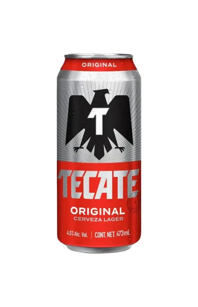
Tecate Lager Can
Topics
Details
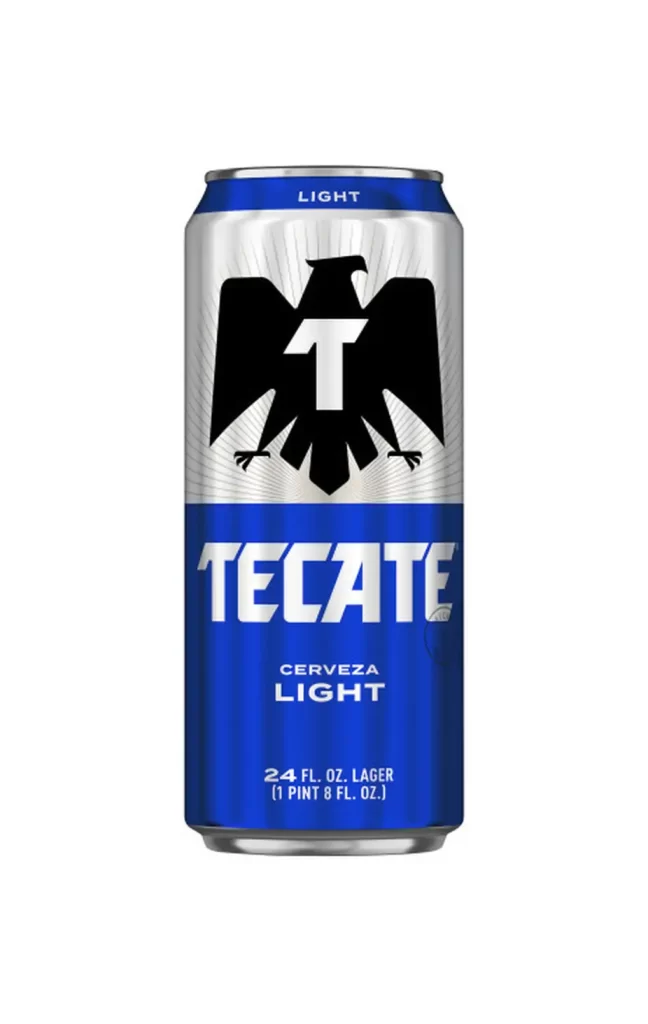
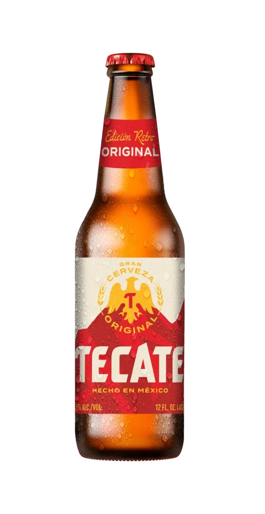
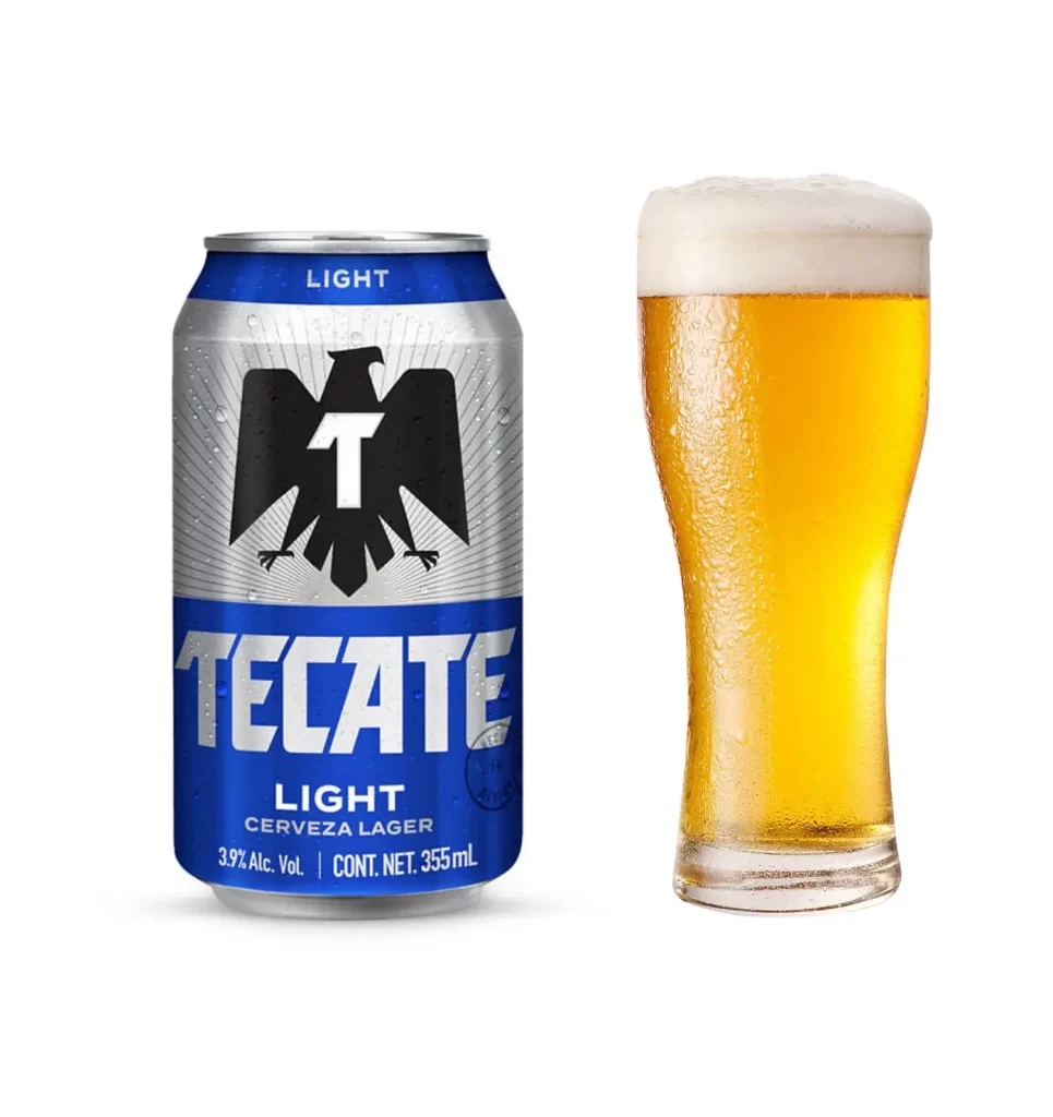
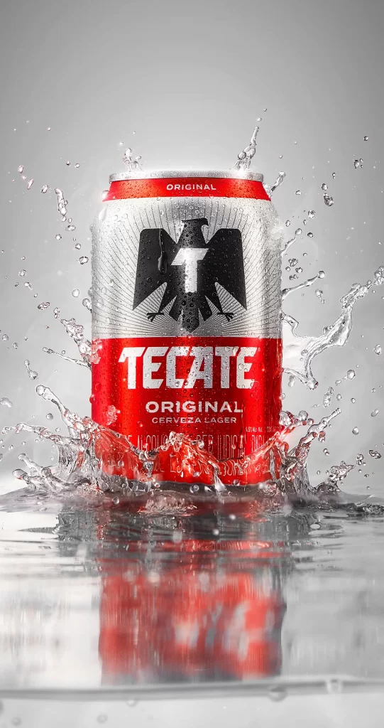
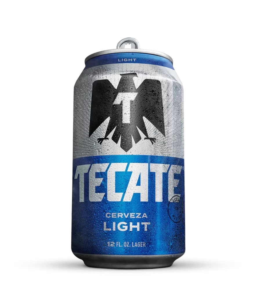
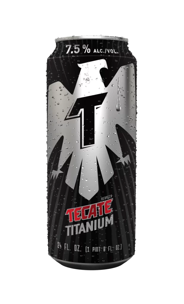
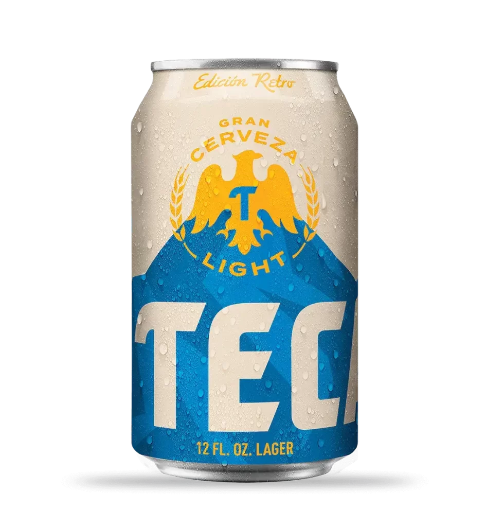
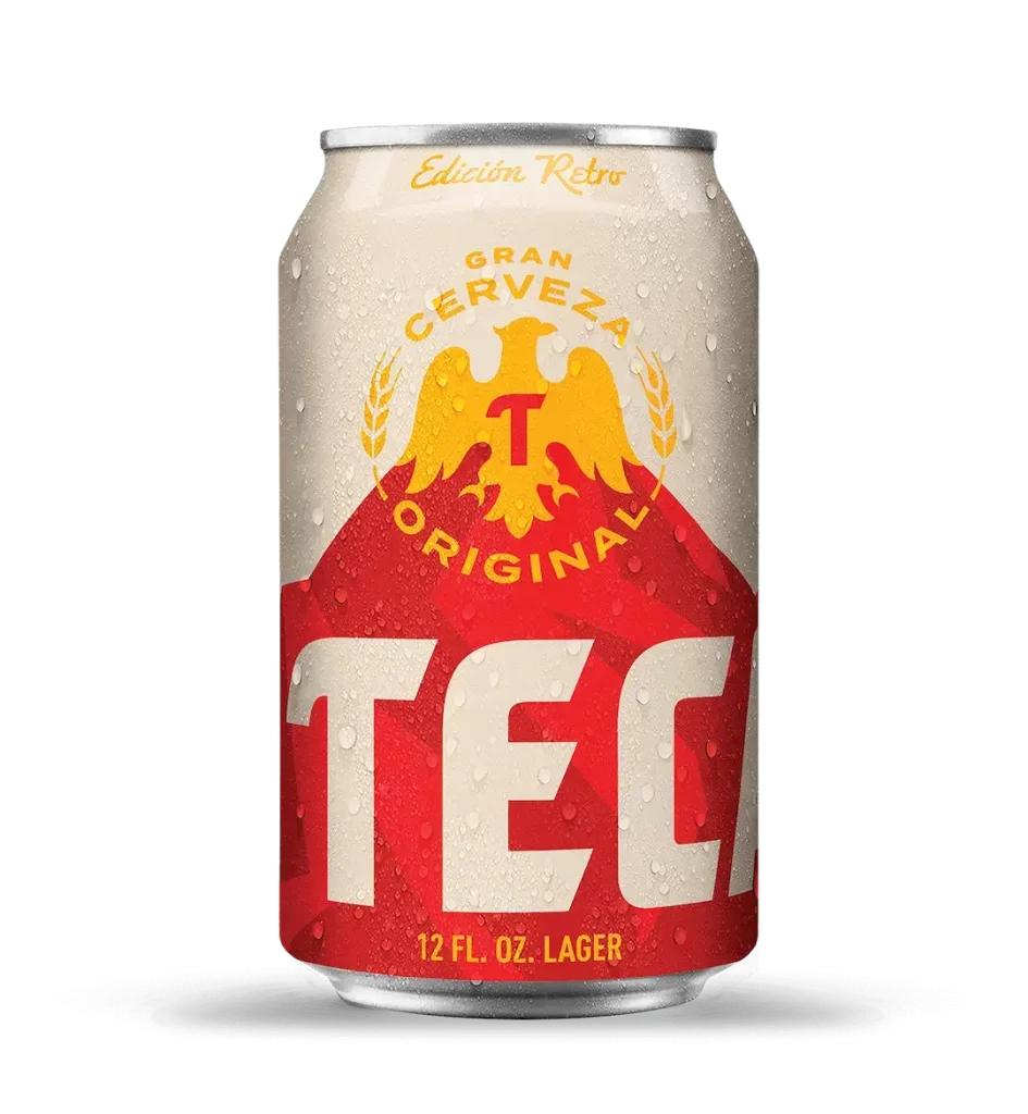
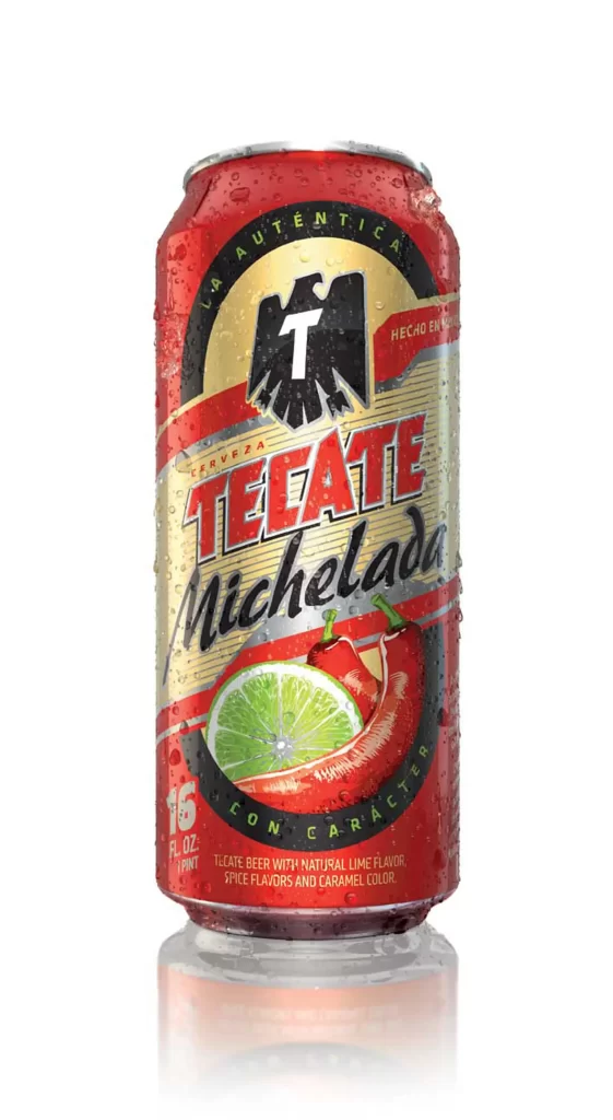
Tecate Original Cerveza Lager fills a 473 mL aluminum can whose cylindrical body is divided horizontally into contrasting color fields. Bold brewery lettering repeats the wordmark along the upper crown and lower rim, while fine condensation-free edges keep the studio rendering crisp. The vertical axis stays strictly symmetrical, giving the package a formal, poster-like poise.
Visual hierarchy operates through aggressive color blocking and iconic symbolism, where the eagle motif functions as both brand identifier and compositional anchor. The typographic treatment of the primary name employs a heavy, industrial sans-serif with dimensional shading that creates tactile depth against the flat red ground. Radial line work emanating from behind the avian graphic introduces subtle dynamism to an otherwise static, symmetrical layout, while the repetition of ‘ORIGINAL’ at both the crown and base reinforces brand heritage through textual redundancy.
Packaging analysts and beverage industry researchers would examine this artifact to study contemporary lager branding strategies within the Mexican import market. Three-dimensional artists requiring accurate surface reflection data for metallic substrates could utilize the specular highlights visible on the curved aluminum body. Typography specialists might deconstruct the letterform construction of the proprietary logotype to understand weight distribution in condensed display faces.