Tecate Light Beer Cans
Topics
Details
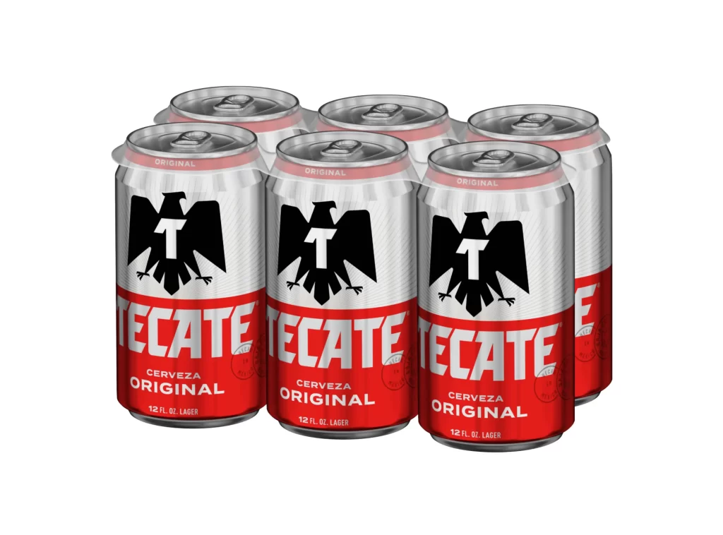
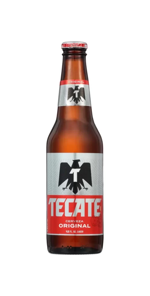
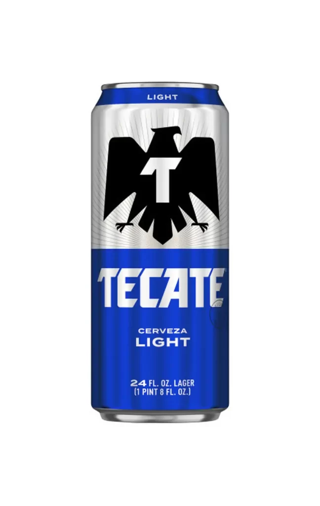
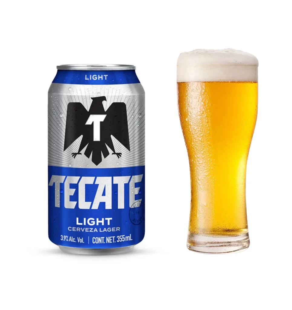
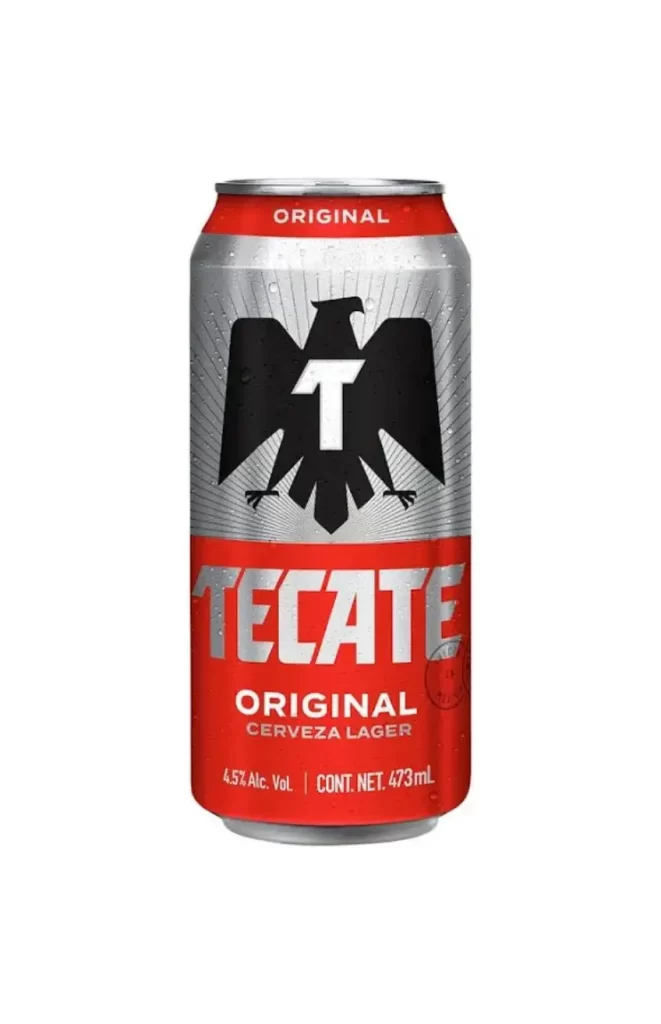
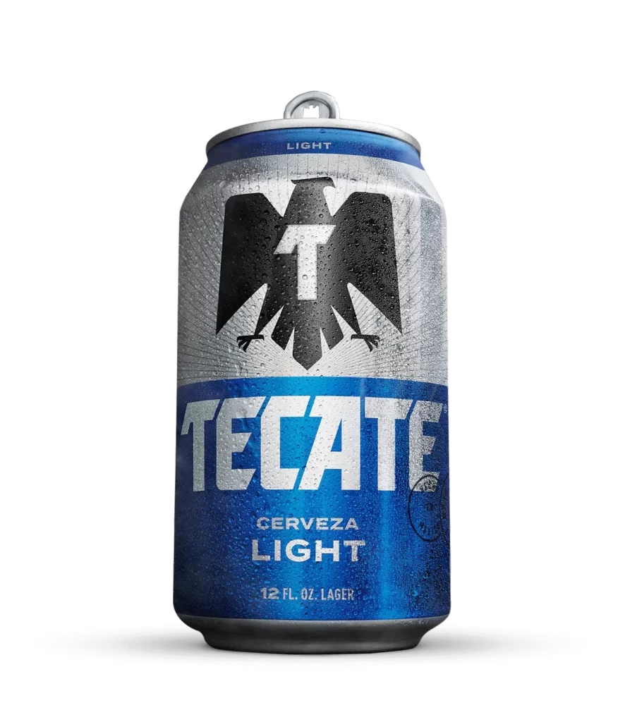
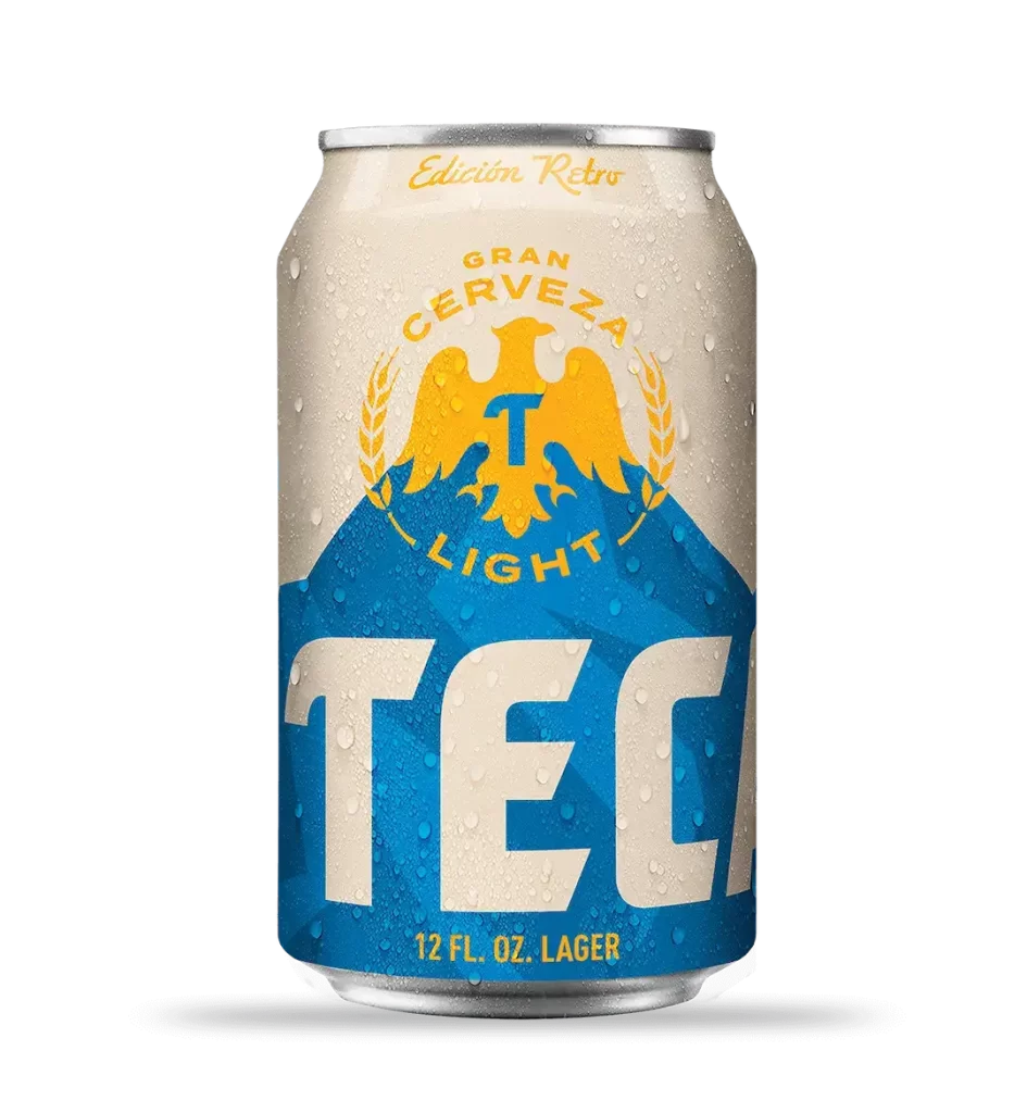
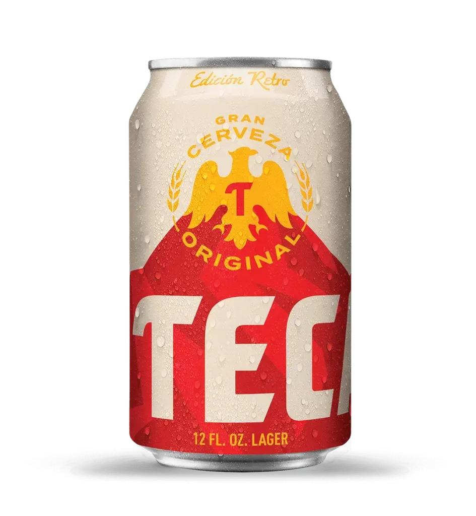
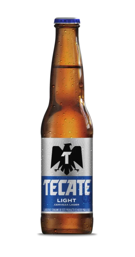
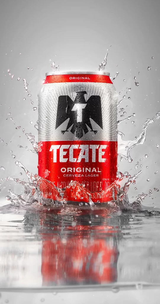
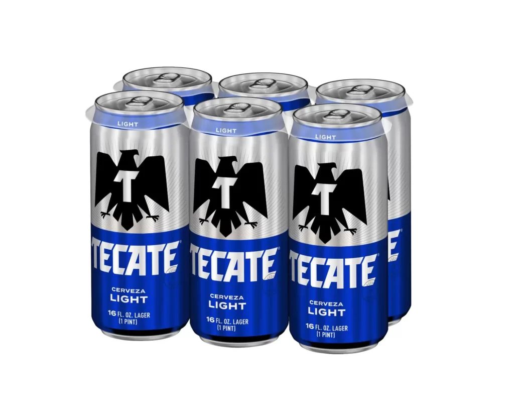
Sixteen fluid ounces of silver aluminum form the primary structure of this six-pack arrangement, each vessel crowned with a pull-tab mechanism and a pale blue band inscribed with 'LIGHT' in white sans-serif type. A bold black eagle emblem, wings fully extended and clutching a stylized white 'T' at its center, dominates the upper silver field of every visible can. Below this avian graphic, a deep cobalt blue band anchors the composition with 'TECATE' rendered in heavy white lettering, followed by smaller text specifying 'CERVEZA LIGHT', '16 FL. OZ. LAGER', and '(1 PINT)'. The cans are clustered in a staggered two-by-three formation against a seamless white void, illuminated by diffuse studio lighting that creates soft specular highlights along the cylindrical shoulders while maintaining a direct, eye-level orthogonal perspective.
Visual hierarchy within this packaging relies on a strict tripartite color division—silver, black, and blue—that creates immediate brand recognition even at a distance or in peripheral vision. The eagle motif functions as a potent heraldic signifier, its geometric simplification lending a modern, aggressive edge to traditional Mexican brewing iconography. Typography throughout employs a compressed, athletic weight that suggests motion and efficiency, reinforcing the 'light' product positioning through visual lightness and verticality.
Product photographers studying beverage packaging will find value in analyzing how metallic substrates interact with matte ink zones under controlled lighting conditions. Industrial designers examining mass-market lager branding can reference the specific proportions between logotype and illustrative elements for comparative market analysis. 3D environment artists constructing convenience store interiors or bar scenes require accurate surface reflectivity data and label topology to achieve photorealistic material definition in their renders.