Alcohol-Free Heineken 0.0 Pack
Topics
Details
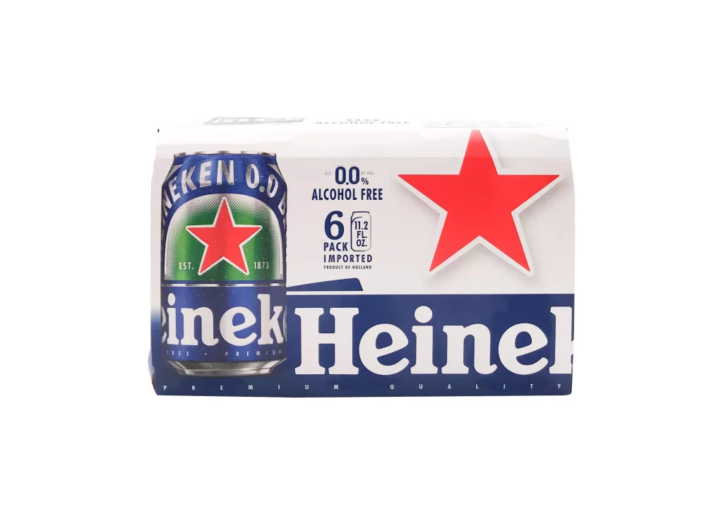
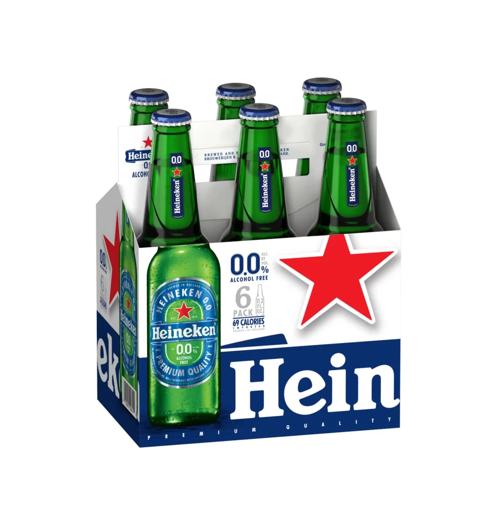
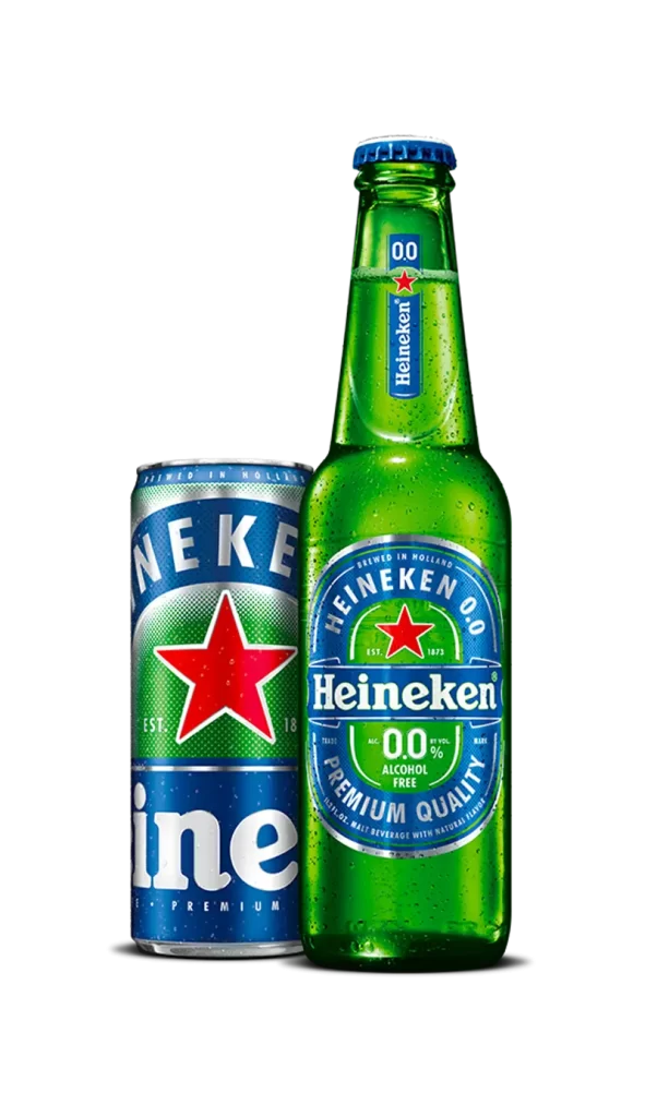
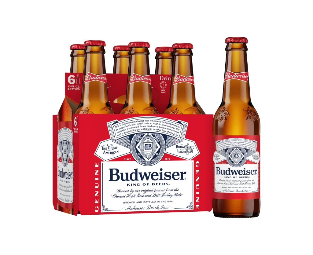
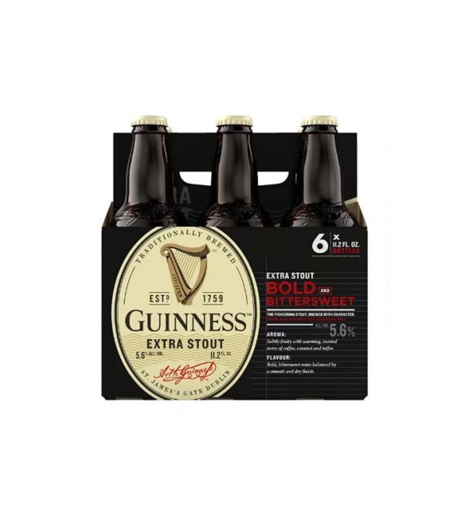
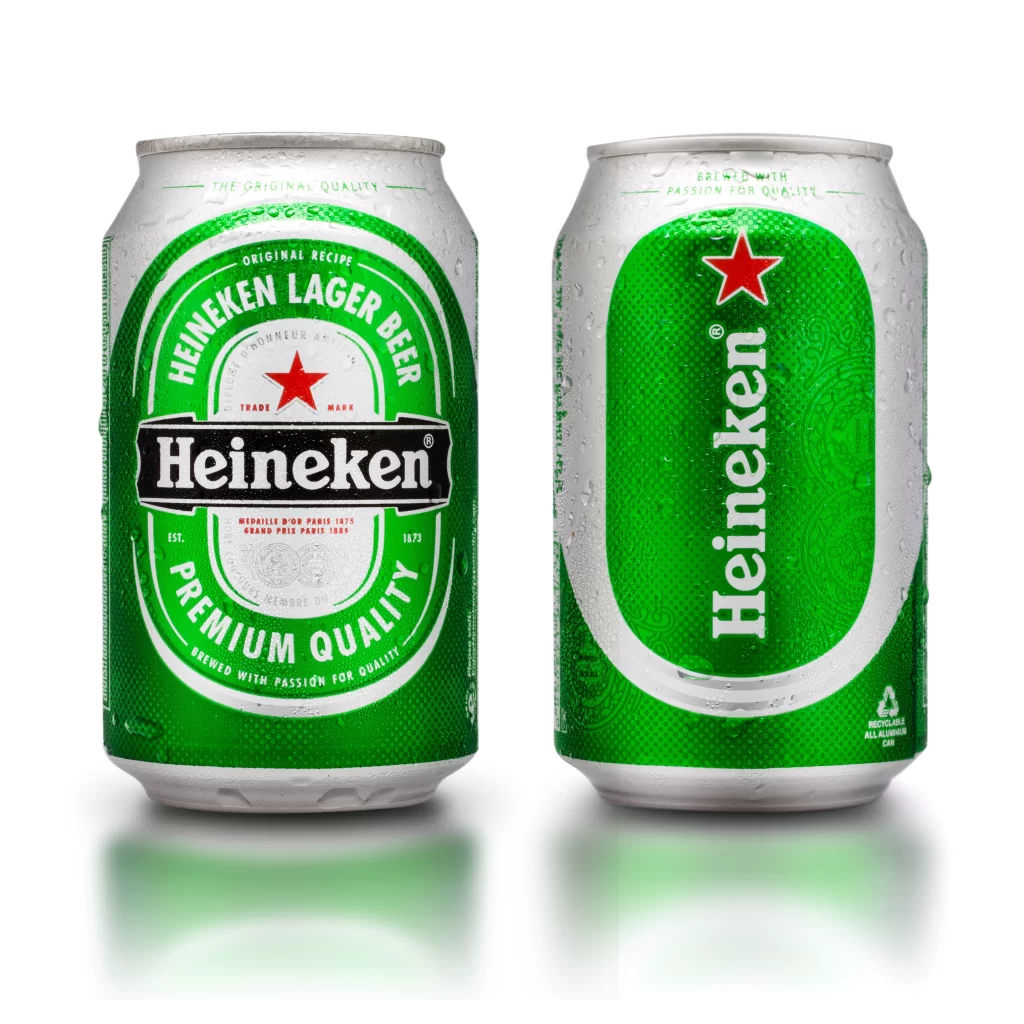
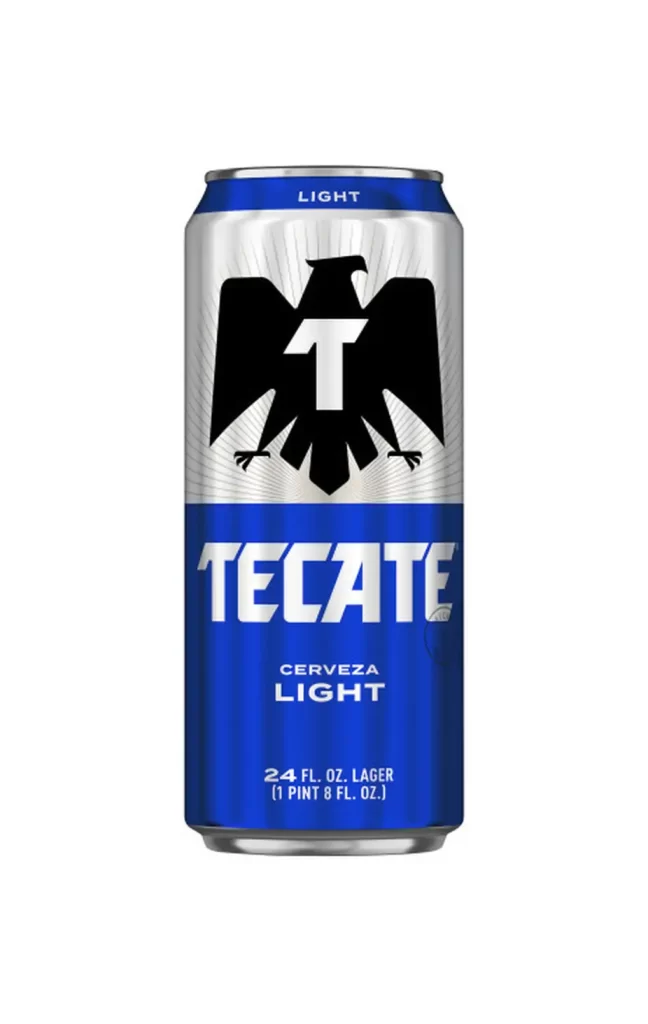
A six-pack of Heineken 0.0 alcohol-free lager stands beside a single detached can, both showcasing the brand's signature deep cobalt blue and vibrant emerald green palette with the iconic crimson star centered on each label. The packaging displays bold white serif typography spelling 'Heineken' alongside '0.0' and 'ALCOHOL FREE' lettering, while the carton indicates a 6-pack of 33cl cans containing 69 calories per can. These elements rest on a clean white surface that provides neutral contrast to the metallic finishes and printed graphics.
Visual interest lies in the subtle tension between traditional branding cues and the modern ‘Alcohol Free’ classification, which necessitates a clear typographic hierarchy to distinguish this variant from the original. The metallic sheen on the aluminum surface interacts with the studio lighting to create soft specular highlights that emphasize the cylindrical form and the tactile quality of the condensation droplets rendered on the blue lower band. Furthermore, the repetition of the circular green badge across both the individual unit and the multipack creates a rhythmic visual consistency that anchors the product’s identity.
Product photographers might utilize this arrangement to study the standard conventions of beverage packaging photography, specifically how to balance a group shot with a detailed hero shot of a single unit. Packaging engineers could analyze the structural layout of the cardboard carrier to understand how graphic elements wrap around 3D forms without losing legibility. Additionally, brand strategists may find value in examining how legacy visual assets are adapted to communicate new product attributes like zero alcohol content without alienating the core consumer base.