Heineken Packaging Green Bottle Lager
Topics
Details
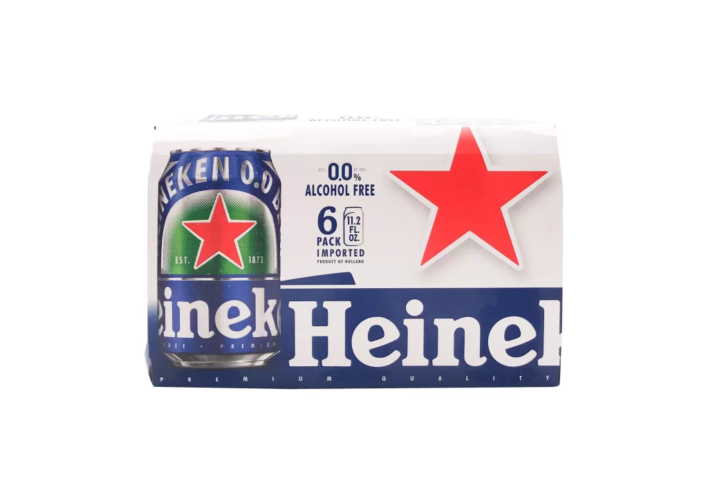
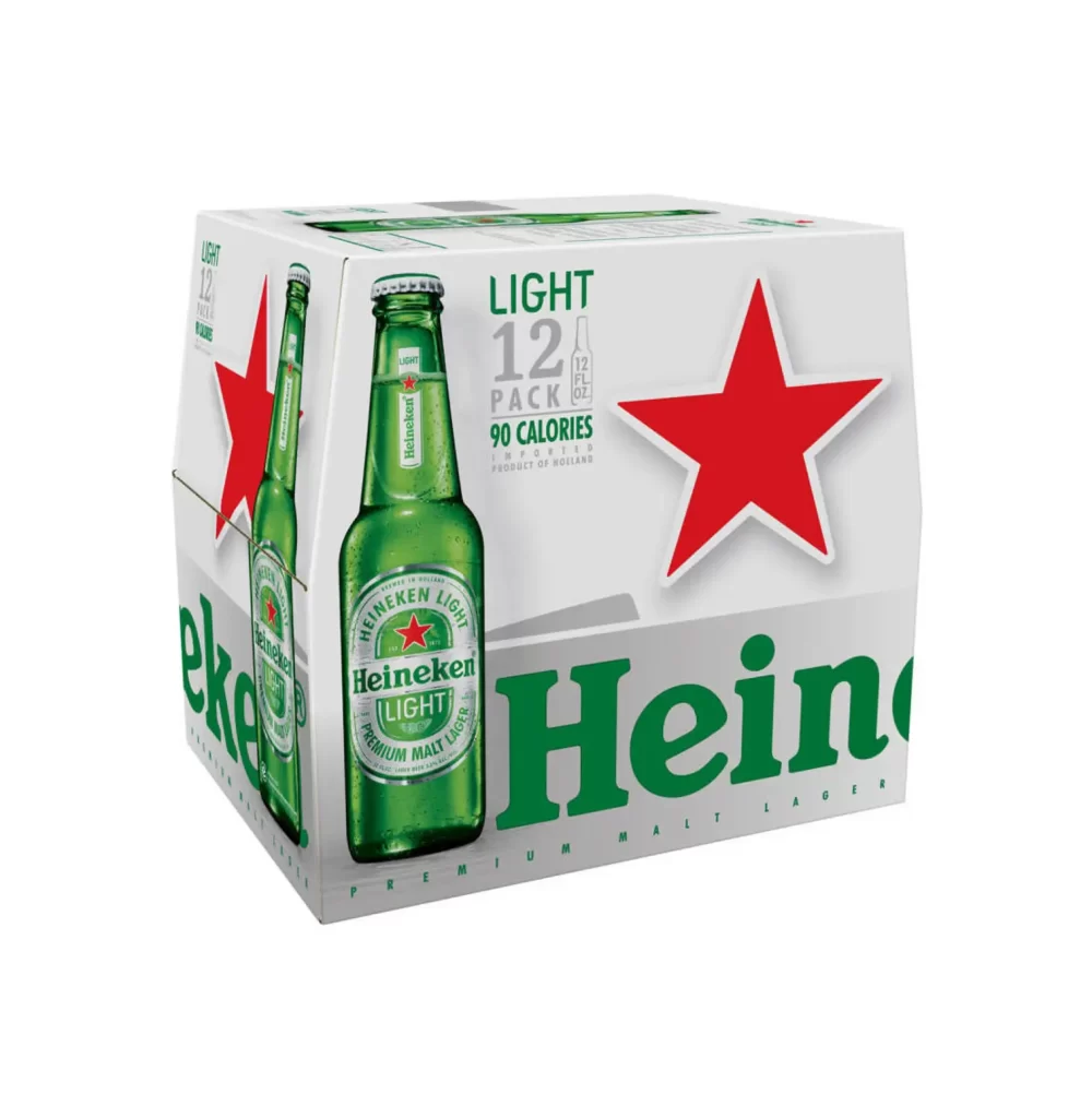
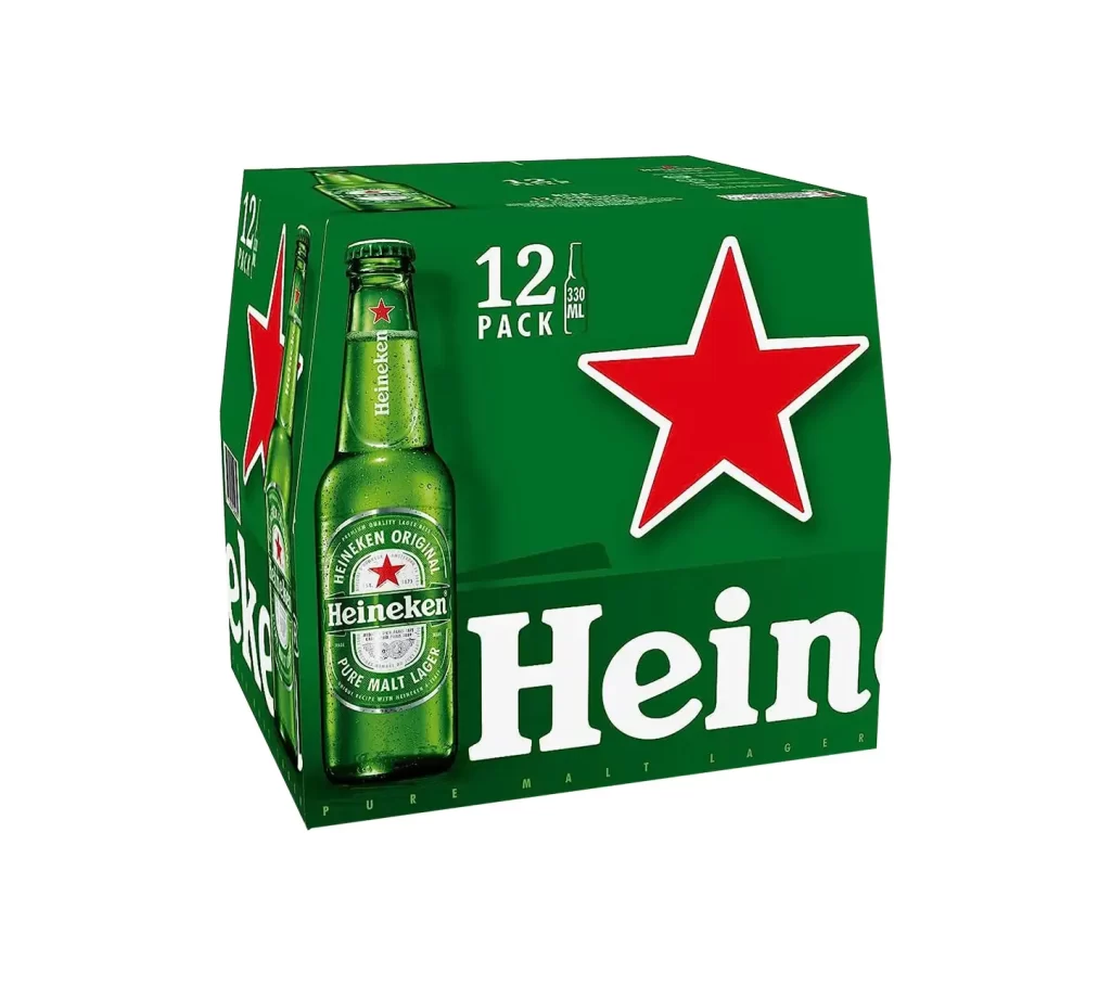
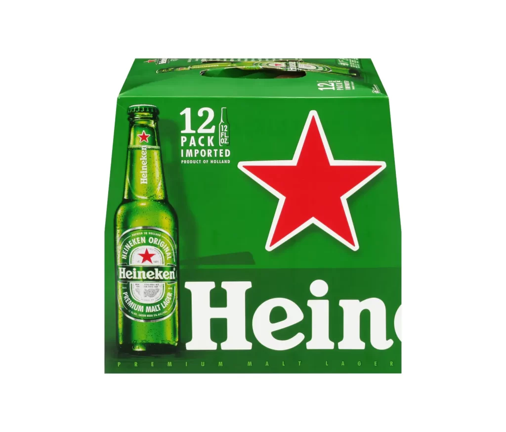
Dominating the frame is a twelve-pack carrier of Heineken Premium Malt Lager, rendered in the brand's signature emerald green. The composition centers on a single green glass bottle with a metallic cap, positioned to the left of a large, five-pointed red star with a crisp white outline. White sans-serif typography announces '12 PACK' and 'IMPORTED' above the iconic 'Heinen' wordmark, while the background remains a neutral white that emphasizes the product's vivid color palette.
Visual hierarchy is established through the stark contrast between the saturated green substrate and the primary red star symbol. The carrier features a die-cut handle at the top and displays partial imagery of additional bottles along the upper edge, suggesting volume. Typography varies in scale from the delicate 'PRODUCT OF HOLLAND' text to the bold, oversized brand name at the base, creating a structured yet dynamic layout typical of mass-market beverage packaging.
Brand historians and packaging analysts might examine this configuration to study the evolution of Heineken's global visual identity. Industrial designers could utilize these proportions and color specifications when developing carrier systems for similar bottled goods. Marketing teams reviewing this reference would likely focus on the strategic placement of import status indicators and premium quality claims within the limited real estate of retail shelving.