Heineken Can
Topics
Details
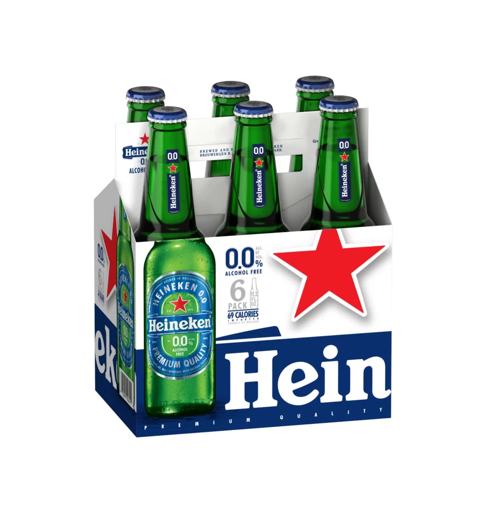
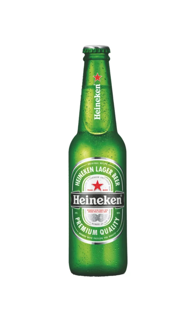
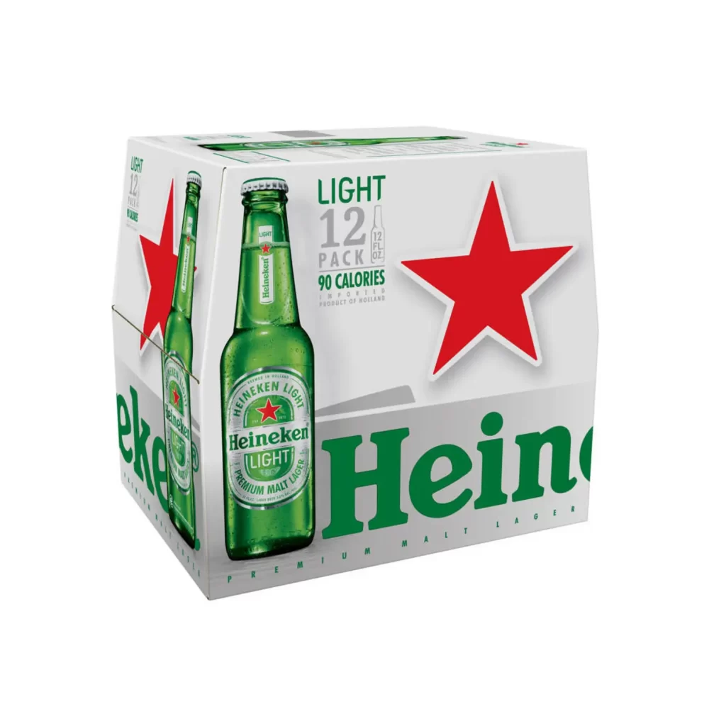
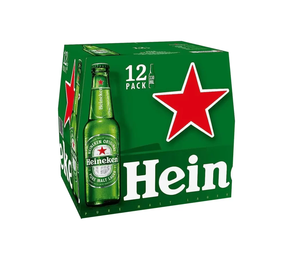
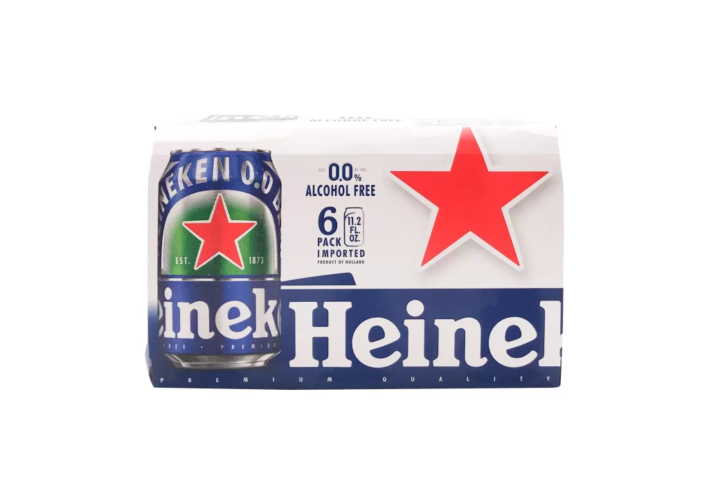
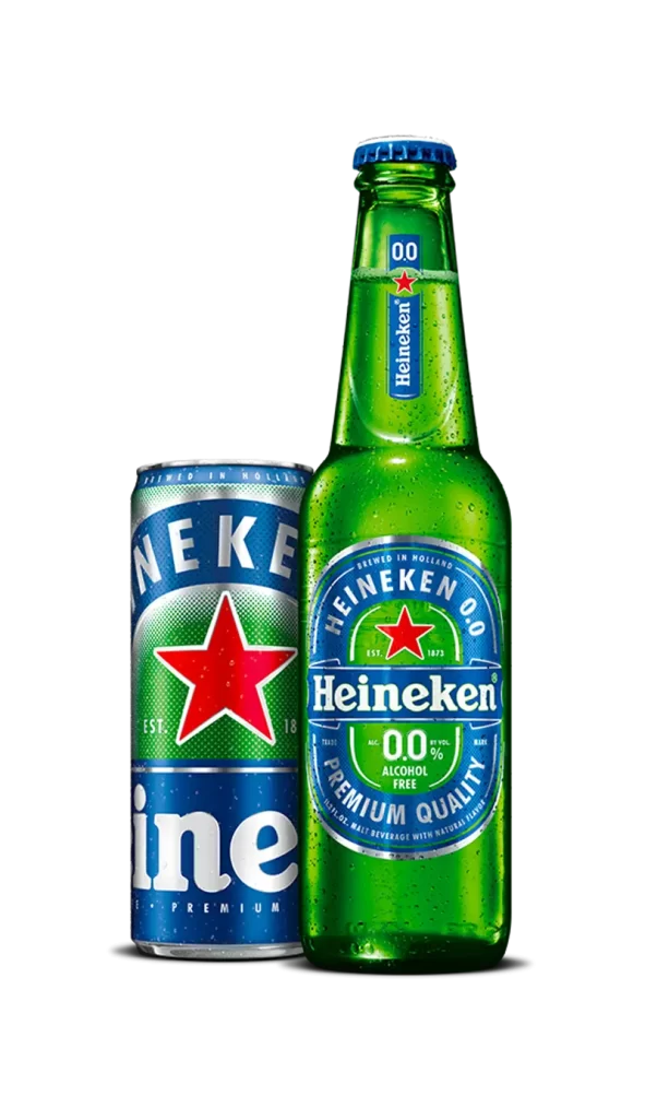
A chilled aluminum cylinder showcases the iconic Heineken 0.0 branding with crisp clarity against a white void. The upper half features the brand name arched over a green shield containing a bold red five-pointed star, flanked by 'EST. 1873' in white sans-serif type. Below this emblem, the word 'inek' appears in large white letters on a deep blue field, while
Visual interest stems from the precise interplay between the brand’s signature color palette—vivid red, emerald green, and royal blue—and the realistic texture of moisture beading on cold metal. The partial text visibility creates an intriguing compositional crop that draws focus to the central star logo while maintaining product recognition through distinctive typography. Subtle halftone dot patterns within the green background add depth and tactile quality to the flat graphic elements.
Product photographers might study the lighting setup used to highlight condensation without creating harsh glare on curved surfaces. Packaging designers could analyze how the brand maintains visual identity even when text is partially obscured by angle or cropping. 3D artists seeking to render realistic beverage containers will find valuable reference material in the way light interacts with wet aluminum and printed graphics.