Heineken Silver Can Refreshing Taste
Topics
Details
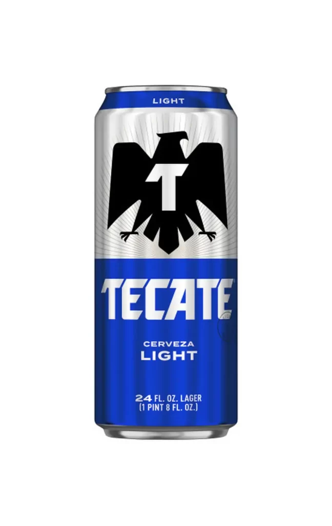
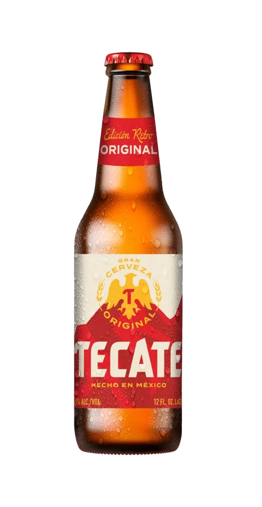
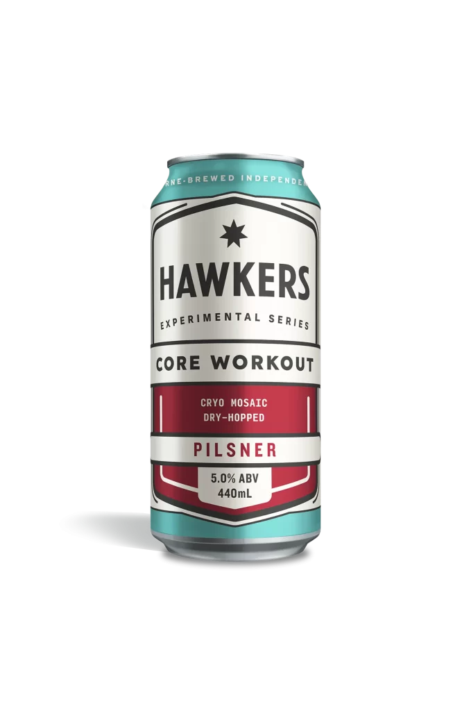
The Heineken Silver can stands in a centered, straight-on perspective that emphasizes its cylindrical geometry, with an aluminum surface gleaming in metallic silver and punctuated by condensation droplets that suggest a chilled temperature. A vibrant red five-pointed star dominates the upper-middle section, framed by a sweeping teal arc and the word 'SILVER' running vertically along the left edge. The lower portion features bold green lettering spelling out part of the brand name above smaller text reading 'EXTRA REFRESHISHING TASTE', all set against a clean white background.
Visual distinction emerges from the interplay between the brand’s traditional green palette and the cool, modern silver and teal accents introduced for this specific variant. The vertical orientation of the product name creates dynamic movement, contrasting with the static boldness of the central star emblem. Subtle textural details, including the frosted background pattern and realistic water beading, elevate the object from simple packaging to a study in material rendering and color theory.
Product photographers might analyze the lighting setup required to achieve such crisp highlights on curved metal without losing detail in the shadows. Brand strategists could examine how the established visual identity adapts to new product lines while maintaining instant recognition. Packaging designers would benefit from studying the typographic hierarchy and spatial relationships between the logo, variant name, and descriptive tagline.