Beer Bottle Tecate Label Eagle Mexico
Topics
Details
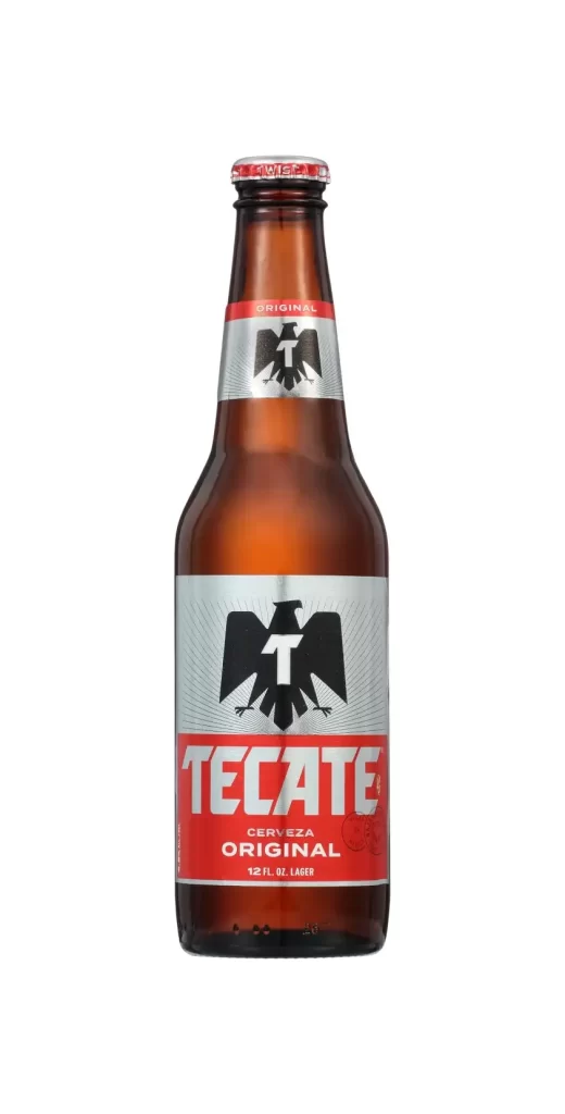
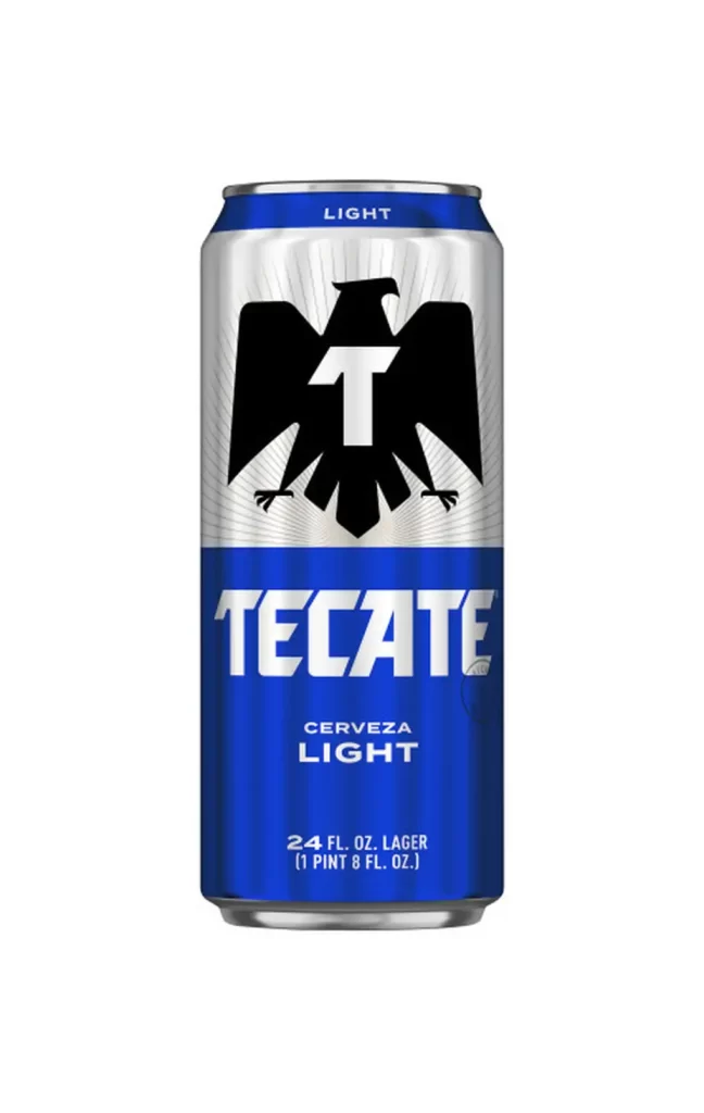
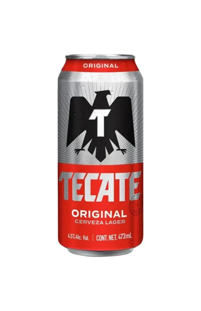
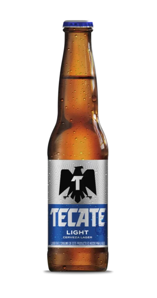
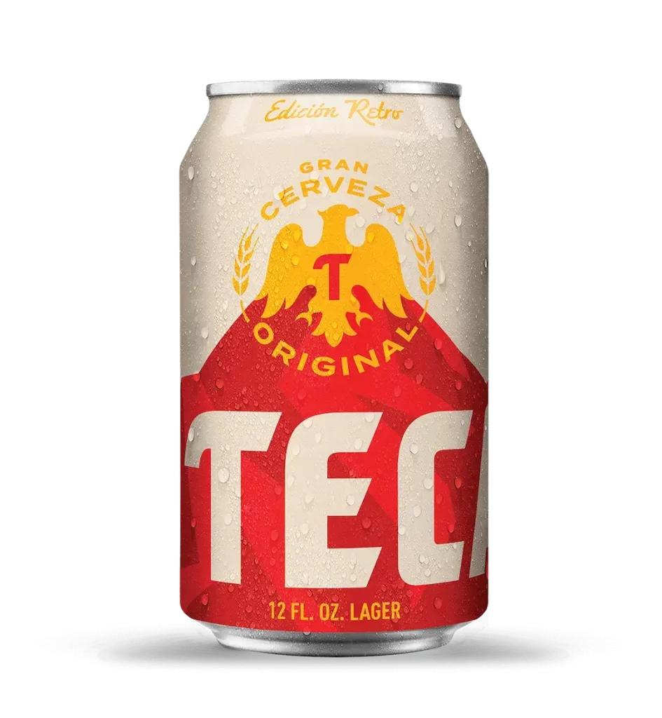
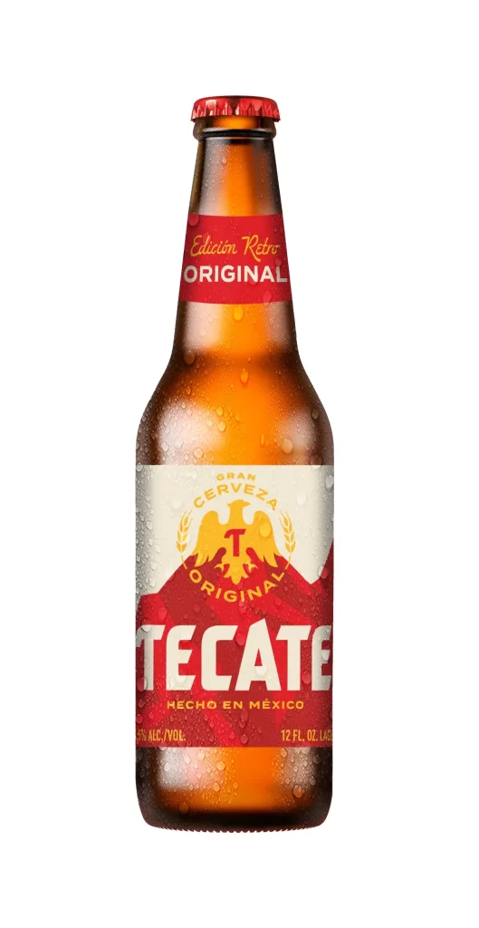
A chilled brown glass bottle of Tecate beer stands upright, its surface beaded with fine condensation droplets that catch the light. A vibrant red neck band wraps the upper portion, bearing the gold cursive script 'Edición Retro' above the bold white word 'ORIGINAL'. The main label below features a cream-colored upper field dominated by a golden eagle emblem with a red 'T' on its chest, encircled by the text 'GRAN CERVEZA ORIGINAL', while a bold red lower field displays 'TECATE' in large white letters above 'HECHO EN MÉXICO'.
Visual distinction emerges from the deliberate retro aesthetic that merges heraldic symbolism with mid-century commercial typography. The eagle icon, rendered in metallic gold with outstretched wings, anchors the composition as a nationalistic signifier, while the stark color blocking between cream and crimson creates immediate shelf presence. Typography choices oscillate between elegant script for heritage cues and industrial boldness for brand recognition, establishing a layered visual hierarchy that feels both nostalgic and assertively modern.
Brand historians analyzing Mexican brewing traditions would find this specimen invaluable for tracing packaging evolution across decades. Packaging designers developing beverage identities could study the interplay of emblematic imagery with typographic weight to balance cultural authenticity with market visibility. Illustrators seeking to master condensation rendering on curved glass surfaces might examine how the water droplets interact with underlying color fields to create realistic texture without obscuring critical label information.