Tecate Light Beer Can
Topics
Details
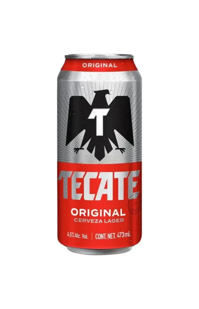
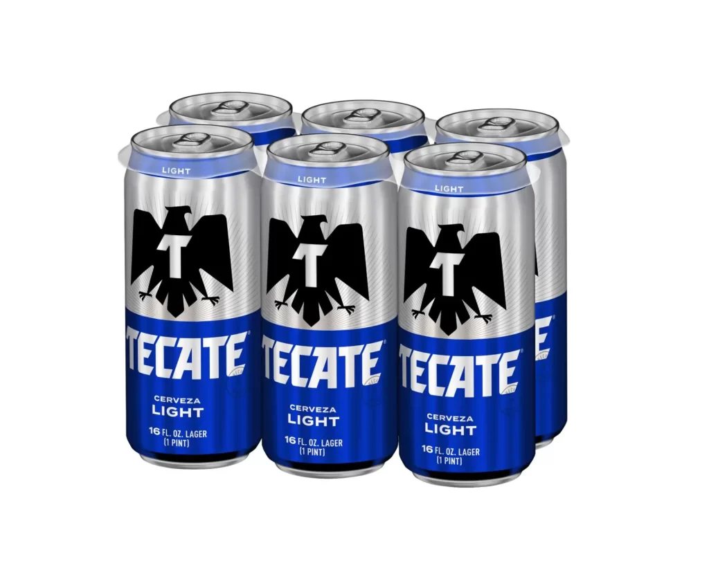
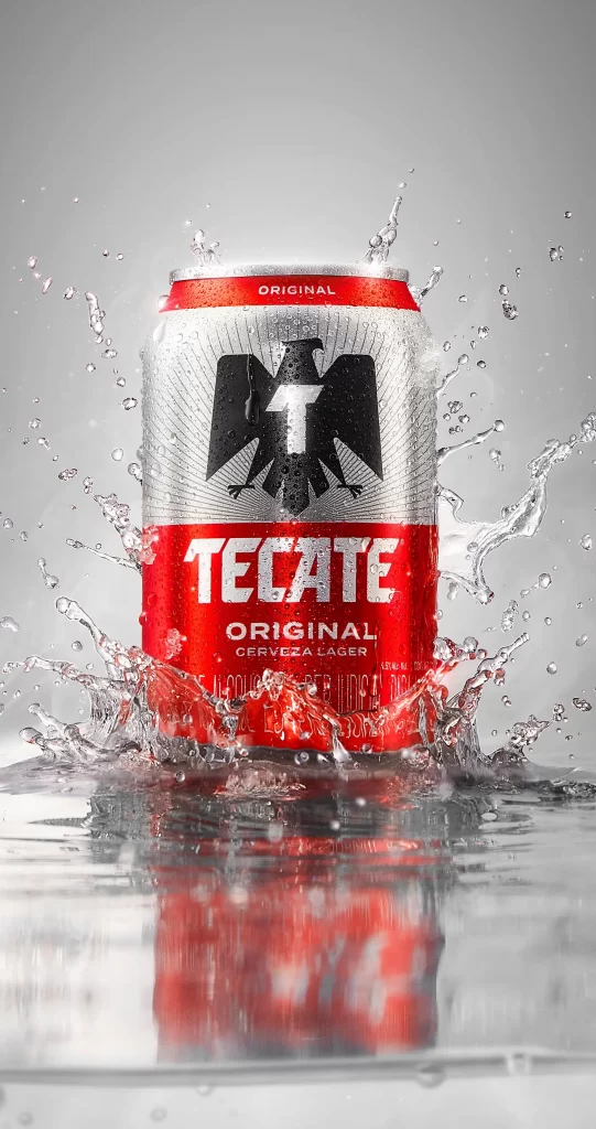
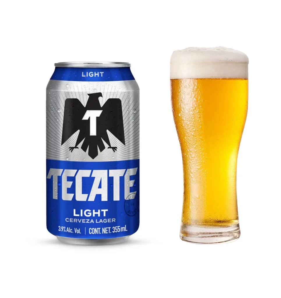
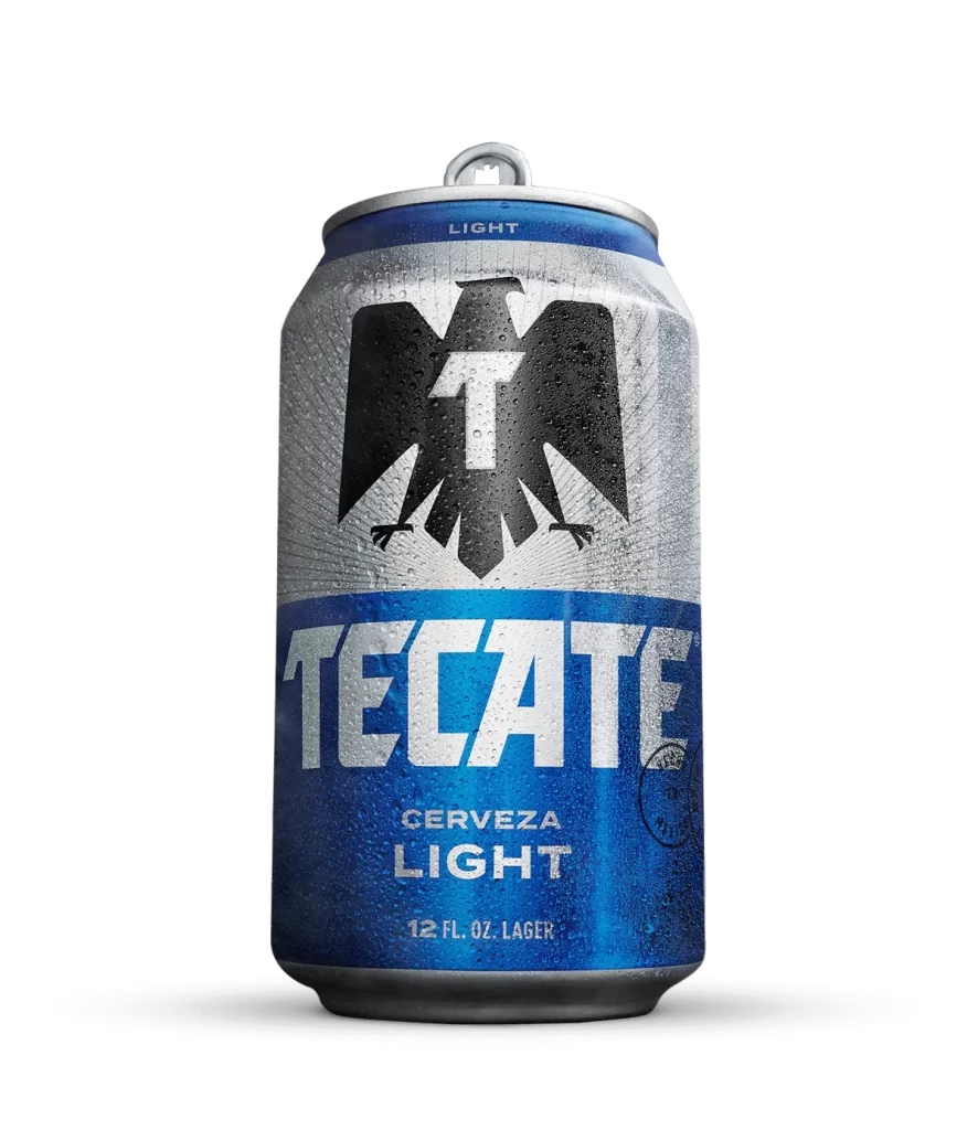
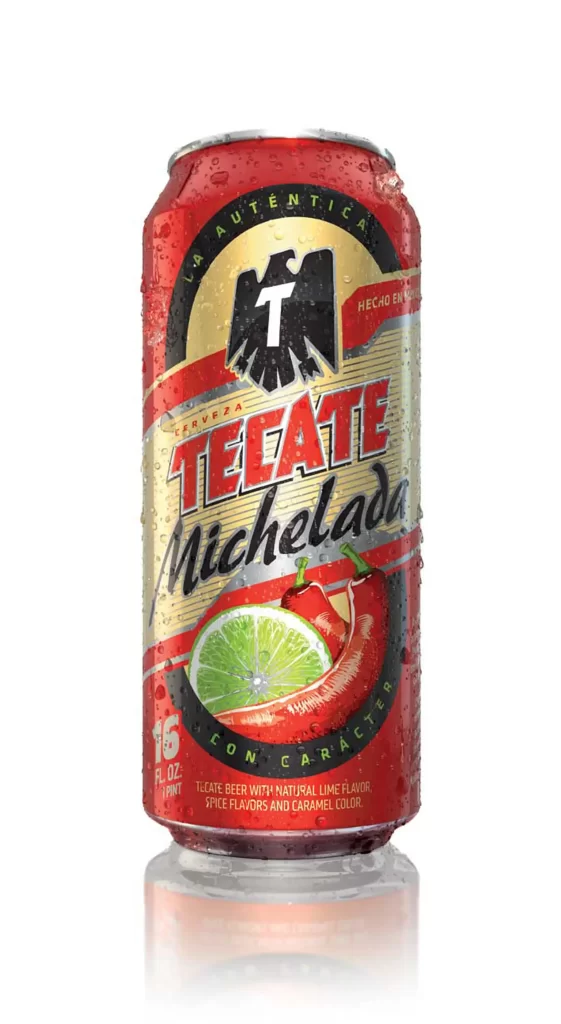
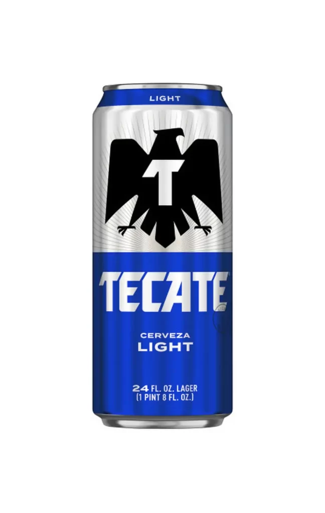
A twenty-four-ounce aluminum can of Tecate Light dominates the frame with its signature two-tone palette. The upper half features a brushed silver finish radiating from behind the brand's iconic black eagle, which spreads its wings to cradle a bold white 'T' in its chest. Below this avian emblem, the lower section plunges into a deep royal blue where 'TECATE' appears in large white block letters above 'CERVEZA LIGHT', with volume information printed at the bottom.
Visual hierarchy on this packaging relies heavily on the stark contrast between the metallic upper register and the saturated blue base, creating an immediate split-screen effect that guides the eye downward. The eagle logo acts as the central anchor, utilizing negative space within the bird’s silhouette to make the ‘T’ pop with aggressive clarity. Such a layout balances traditional heraldic symbolism with modern typographic weight, resulting in a look that feels both established and energetic.
Product photographers might study the even, shadowless lighting setup used here to replicate similar studio conditions for their own beverage catalogs. Brand strategists could analyze how the specific placement of the ‘LIGHT’ descriptor at both the very top rim and near the bottom reinforces the low-calorie positioning without cluttering the main logo. 3D texture artists will find the subtle radial lines of the silver background particularly useful for mapping realistic metal sheen onto digital can models.