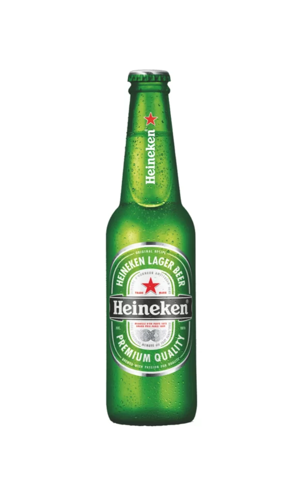
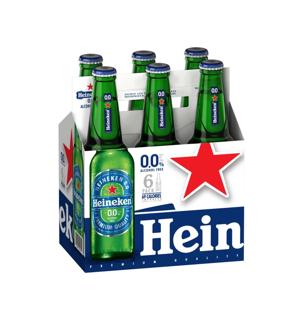
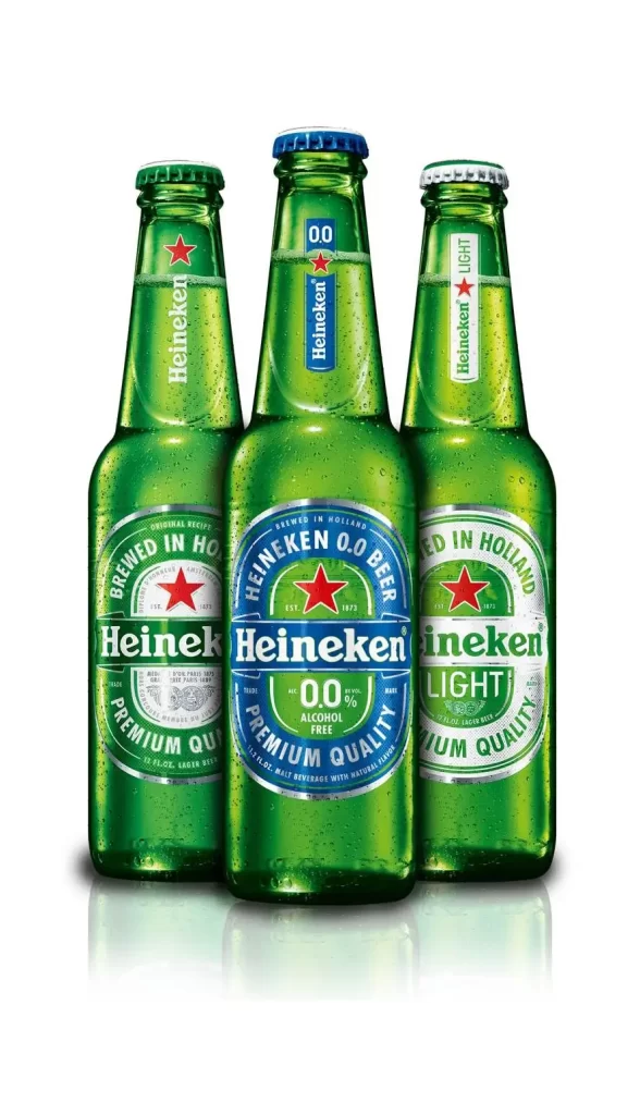
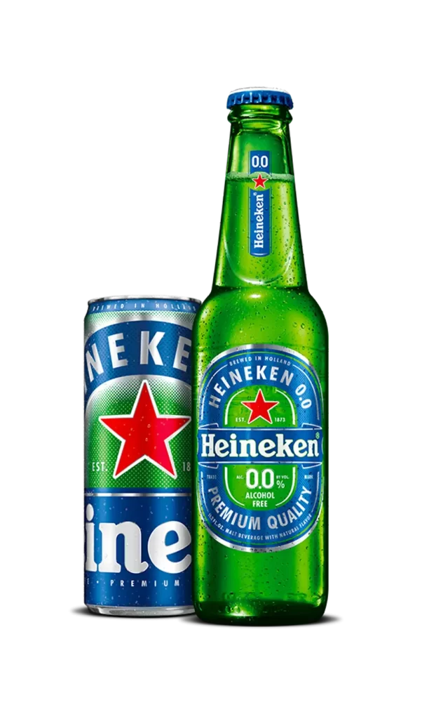
Heineken Beer Packaging Green Star Slim
Topics
Details
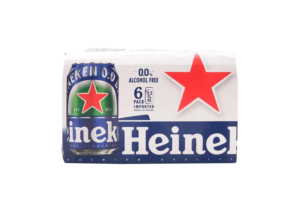
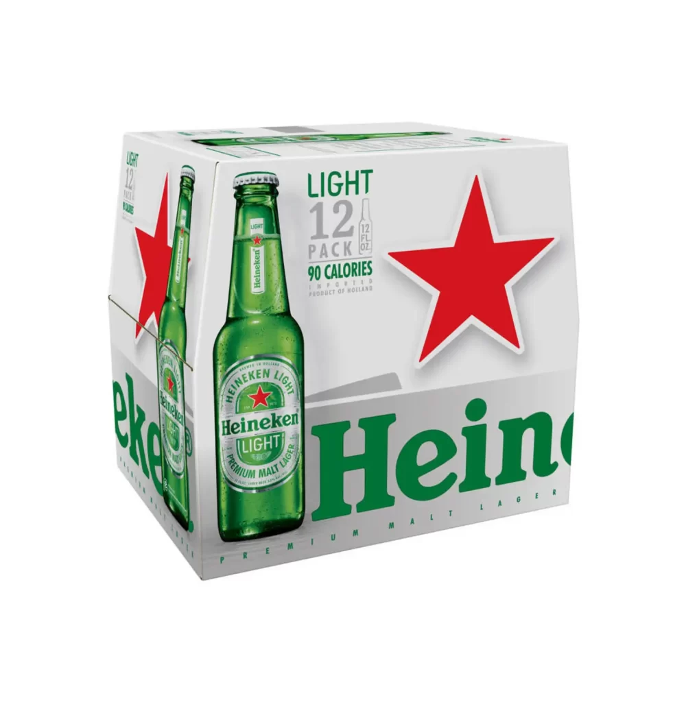
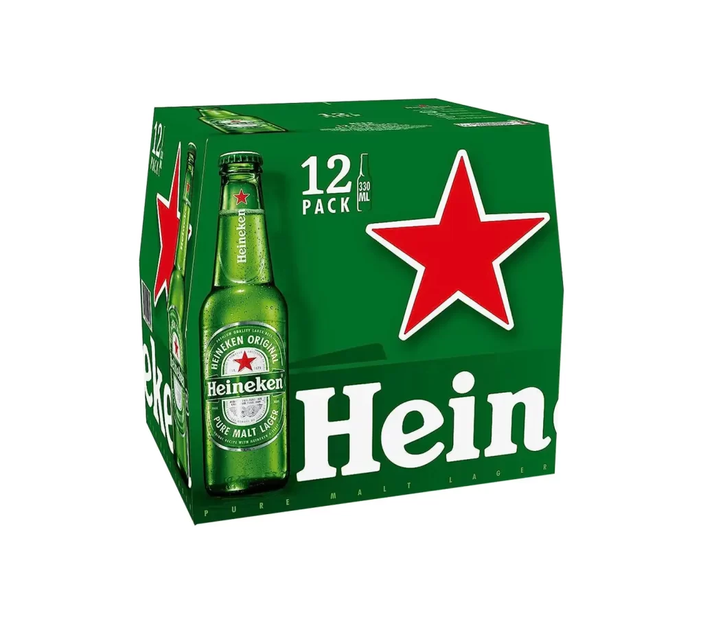
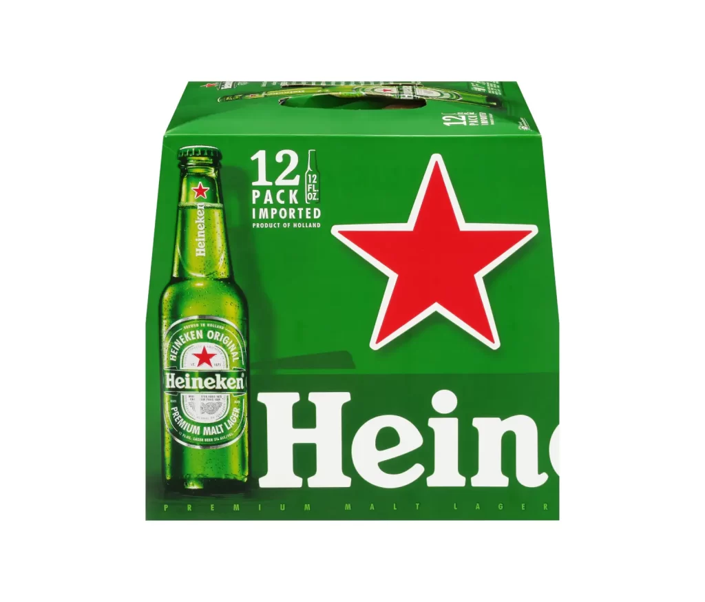
A twelve-pack of Heineken slim cans sits at a three-quarter angle, showcasing the brand's signature emerald green cardboard and the iconic red star logo. The packaging features crisp white typography spelling out 'Heineken' in bold serif letters alongside smaller text indicating '12 PACK', '12 FL OZ', and 'IMPORTED'. A single aluminum can with its metallic green finish and red star emblem is prominently displayed on the front panel, while the entire product rests on a clean, bright surface that emphasizes the vivid color contrast.
What sets this particular packaging apart is the elongated slim can format, which creates a more elegant silhouette compared to standard beer containers. The design leverages the classic green-and-red color scheme with remarkable consistency across both the cardboard carrier and the individual cans, reinforcing brand recognition through repetition. Large-scale typography on the box sides ensures visibility from multiple angles, making it a masterclass in cohesive visual identity systems for beverage products.
Brand strategists studying color psychology in consumer goods will find this example particularly useful for analyzing how specific hues trigger immediate product association. Packaging engineers examining structural designs for multi-pack carriers can reference the way the cardboard folds around slender cylindrical shapes. Marketing teams developing refresh campaigns for alcoholic beverages might study the hierarchy of text elements to understand how import status and volume information are visually prioritized alongside the primary brand mark.