Alcohol-Free Beer Heineken 330Ml Red Star
Topics
Details
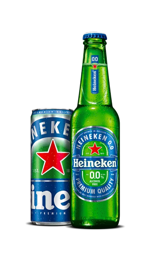
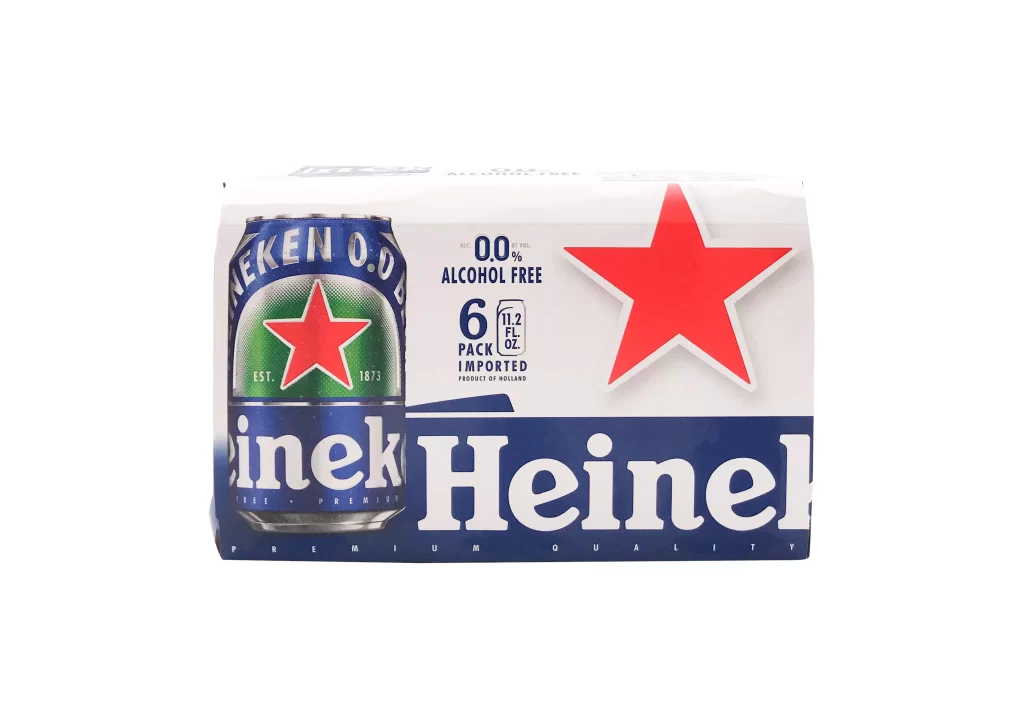
A cylindrical aluminum can stands in direct frontal alignment, its surface dominated by a saturated cobalt blue field. A vibrant emerald green arch, textured with a fine halftone dot pattern, frames the central five-pointed crimson star, which is outlined by a thin white stroke. Silver-toned typography arcs across the upper rim reading 'SANS AL' and 'AVEC ARÔMES NATURELS', while 'EST. 1873' flanks the star on either side.
Visual hierarchy operates through strict chromatic contrast between the cool blue substrate and the warm red stellar emblem, creating immediate focal anchoring. The inclusion of French terminology alongside the establishment date ‘1873’ signals a specific regional market adaptation, distinguishing this zero-alcohol variant from standard global packaging through its bilingual text strategy. Notably, the partial cropping of the brand name at the can’s edge introduces an unconventional compositional tension that breaks the typically symmetrical balance of beverage branding.
Packaging analysts examining localization strategies for non-alcoholic beverage lines would find this specimen particularly relevant for studying typographic integration within constrained cylindrical geometries. Color theorists documenting the psychological impact of primary triads in commercial contexts could utilize the precise relationship between the green field and red star as empirical evidence. Additionally, industrial designers researching halftone texture applications on metallic substrates might reference the dot-pattern execution within the green arch for technical specification comparisons.