Alcohol Free Heineken 0.0 Pack
Topics
Details
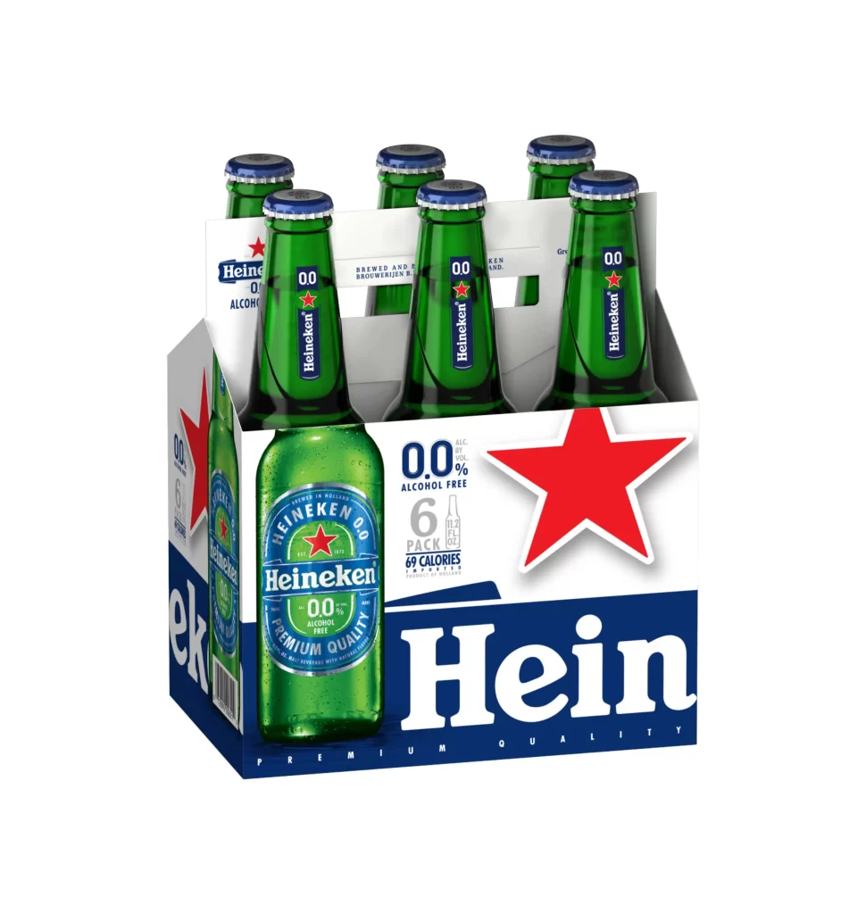
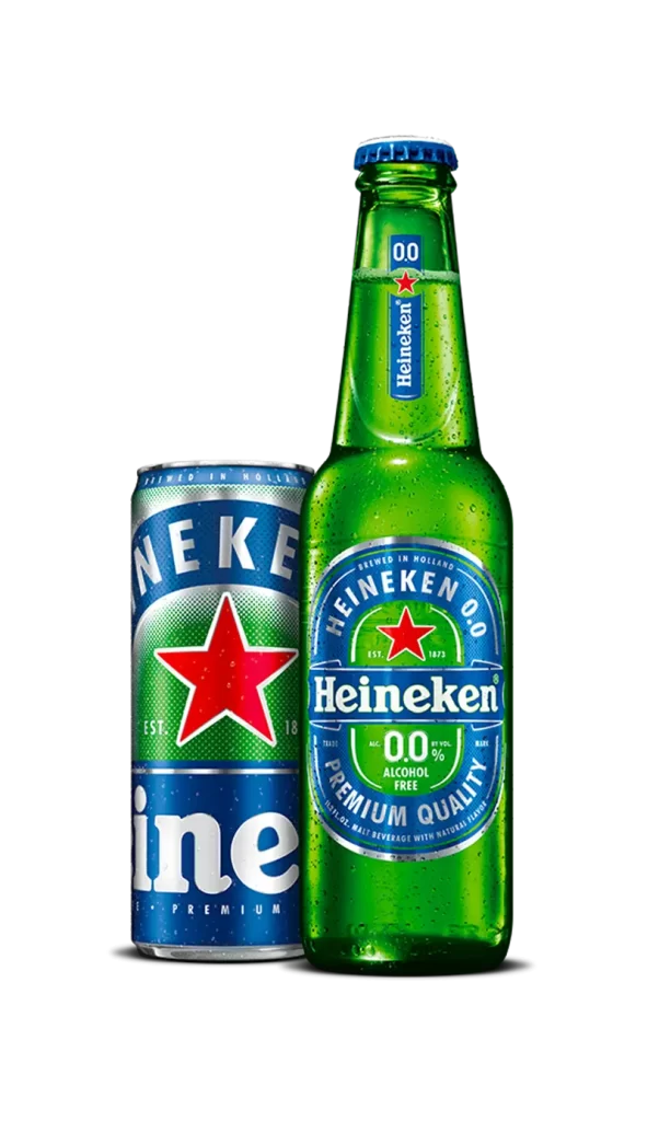
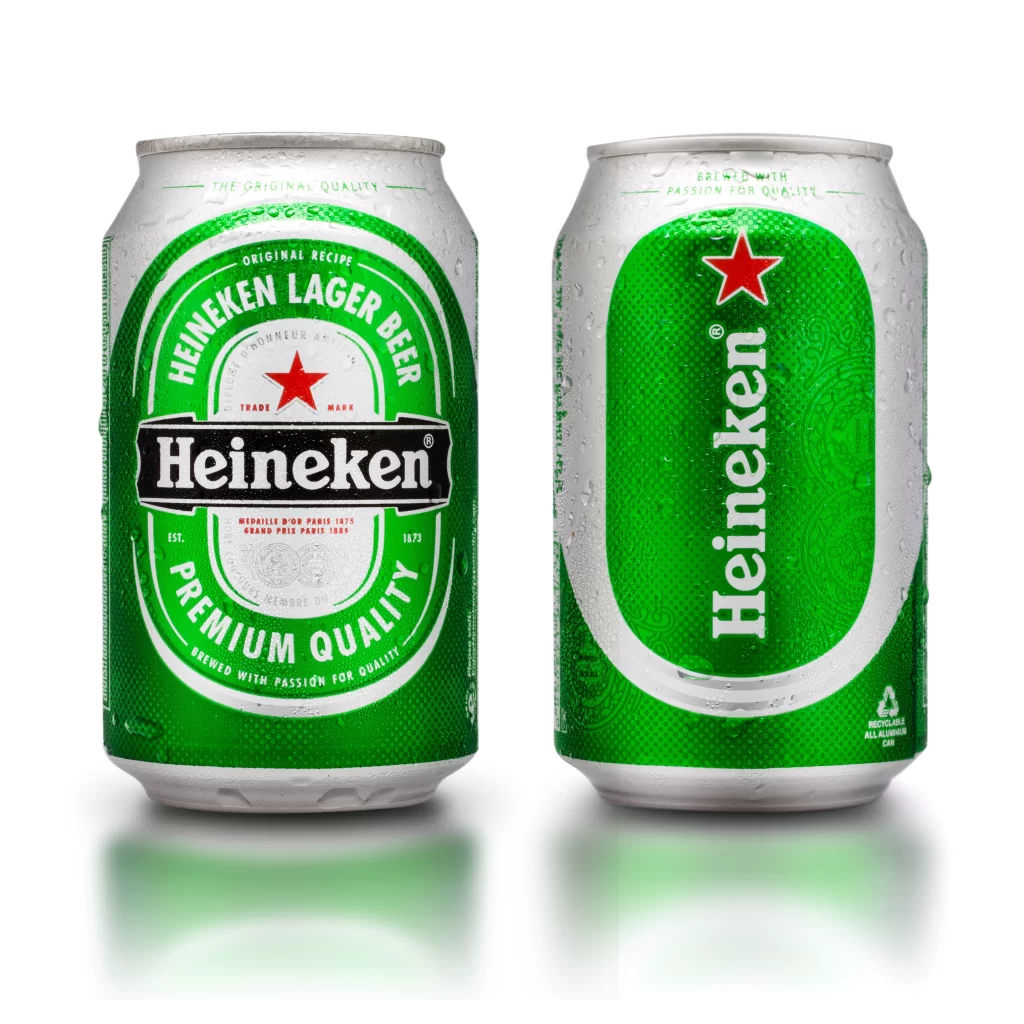
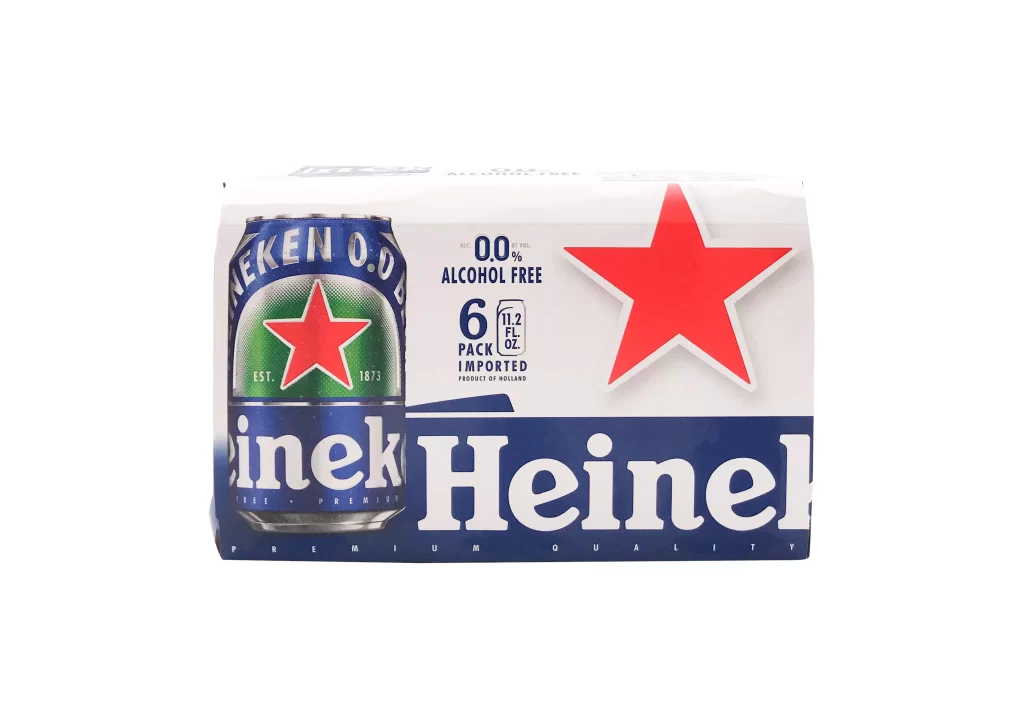
A six-pack of Heineken 0.0 alcohol-free beer sits in a clean, frontal view, its packaging dominated by the brand's signature palette of deep navy blue, crisp white, and that unmistakable bright red star. The left side features a rendered can displaying the green label with 'HEINEKEN 0.0' arched above the five-pointed star and the founding year '1873' tucked into the corners. To the right, an oversized red star commands attention against the white field, while bold typography announces '0.0% ALCOHOL FREE' alongside specifications for a six-pack of 11.2 fluid ounce cans imported from Holland.
Visual hierarchy here relies on the dramatic scale difference between the product replica and the branding elements, creating a dynamic tension across the cardboard surface. The oversized star acts as a graphic exclamation point, immediately signaling the zero-alcohol variant while maintaining the iconic identity drinkers recognize. Subtle details like the metallic sheen on the can illustration and the precise weight of the Heineken wordmark demonstrate how premium positioning persists even when the alcohol content disappears.
Packaging designers studying non-alcoholic beverage branding would find this composition useful for analyzing how established beer brands adapt their visual language for sober alternatives. Marketing teams could reference the layout when planning point-of-sale materials or digital campaigns targeting health-conscious consumers. Anyone documenting contemporary beverage packaging trends would appreciate how this example balances tradition with the specific communication needs of the alcohol-free category.