Tecate Beer Cans Lager Eagle Logo
Topics
Details
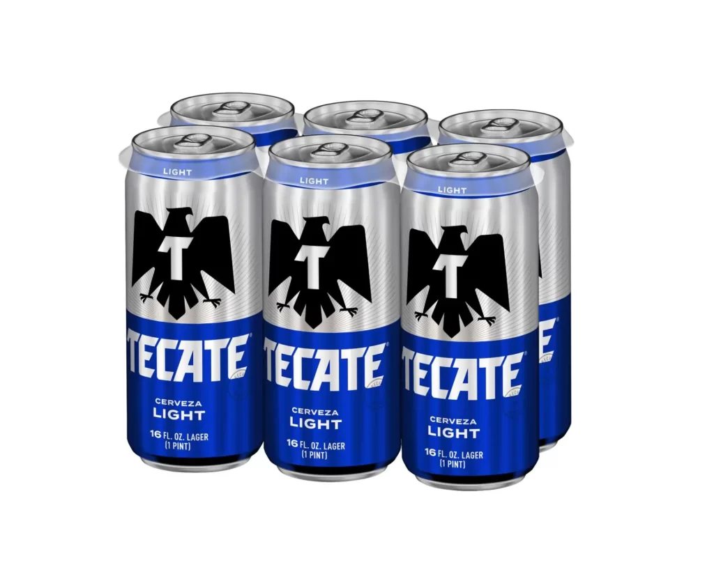
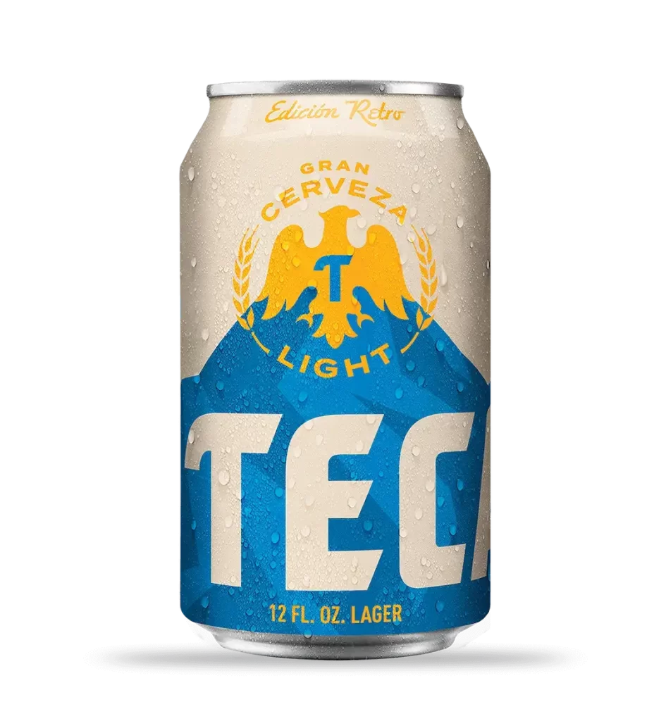
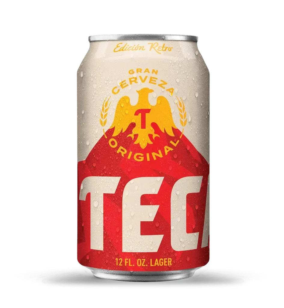
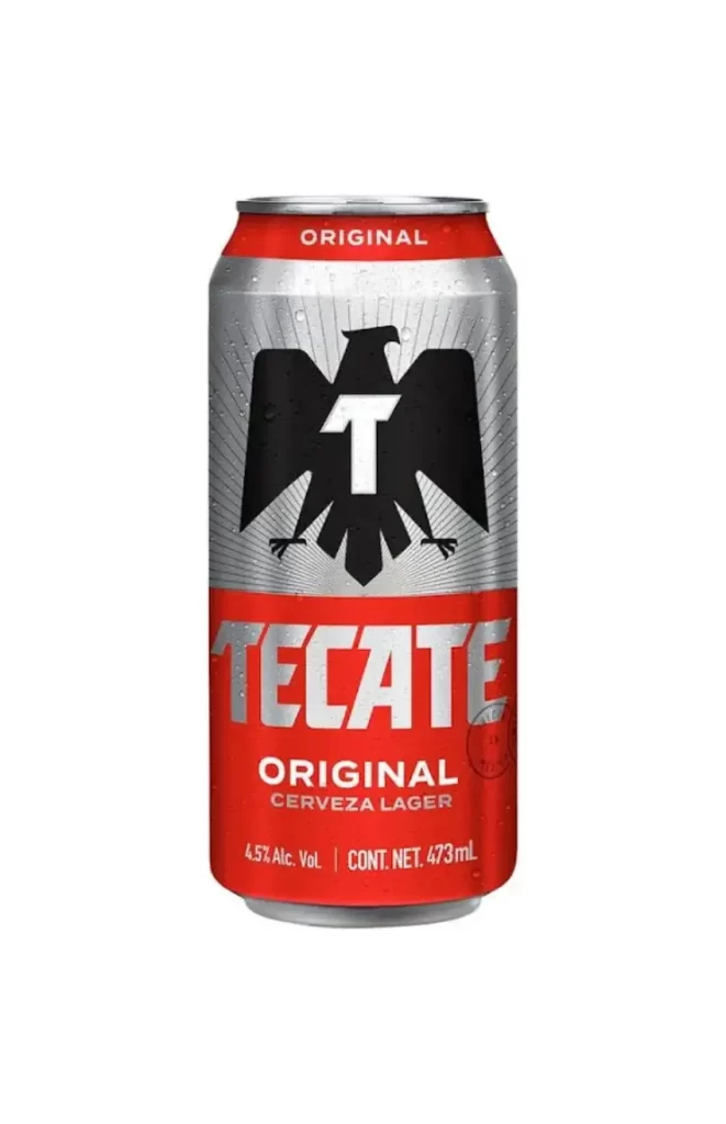
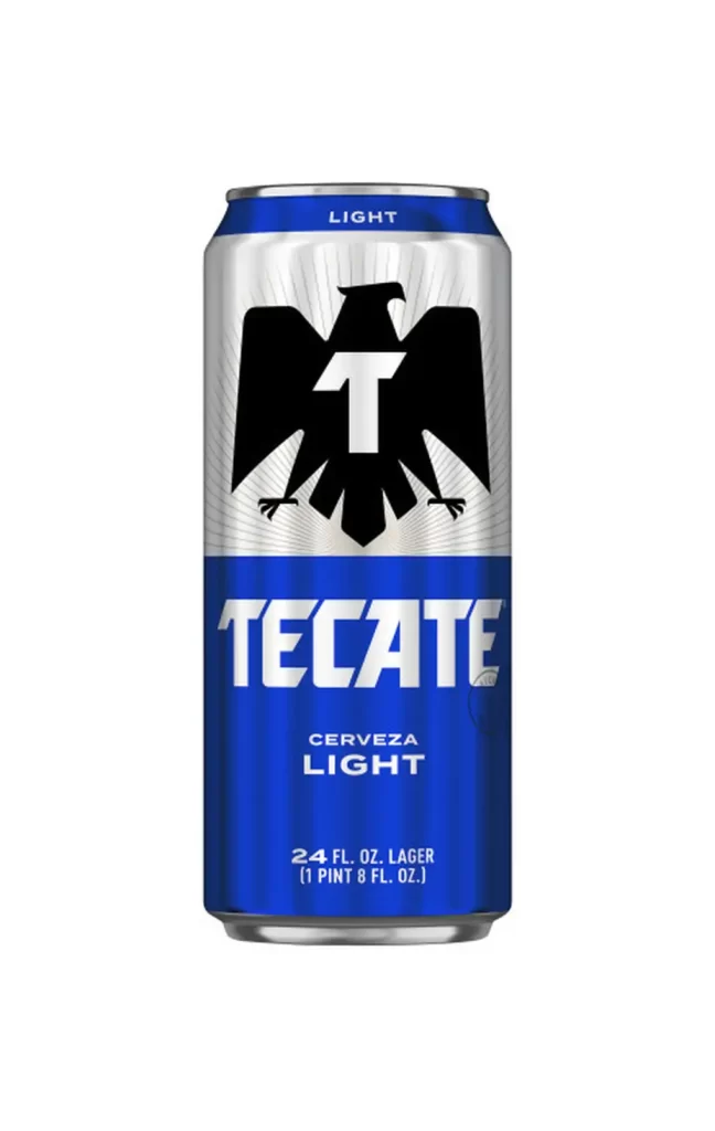
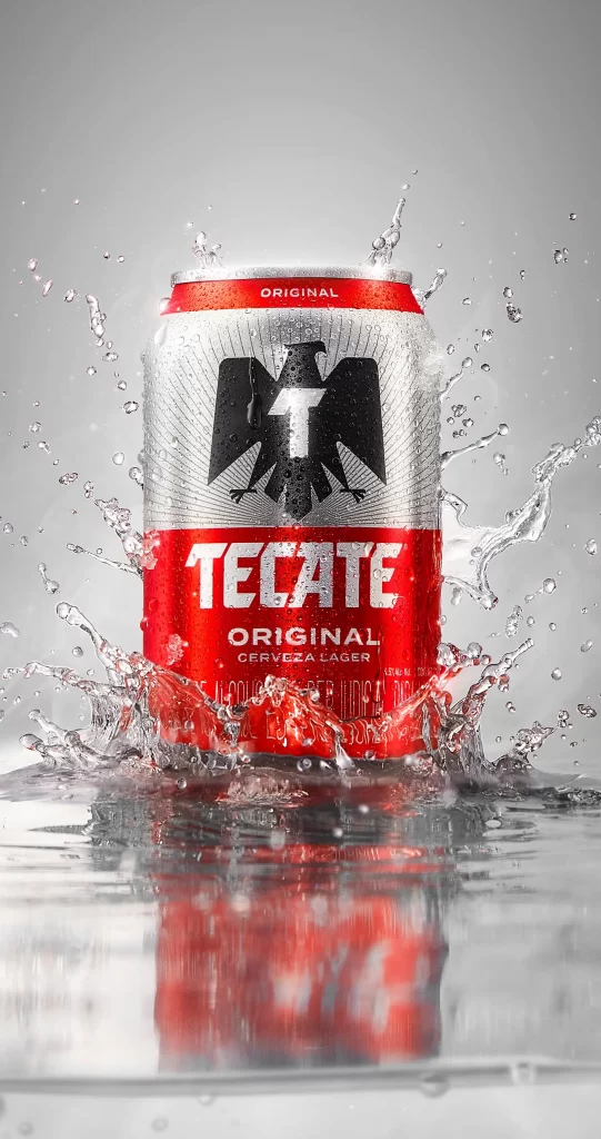
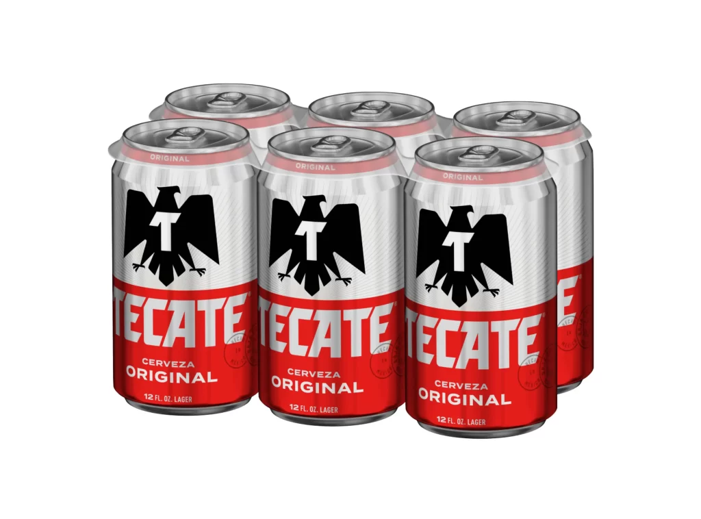
Six aluminum cans of Tecate Cerveza Original lager sit arranged in a standard plastic carrier, presented against a seamless white background. Each twelve-ounce container features a bold two-tone color scheme with a silver upper half and a vibrant red lower section. A black eagle emblem containing a white 'T' dominates the center of the can, positioned directly above the brand name rendered in large white sans-serif lettering. The composition captures three full front-facing cans in the foreground with three additional cans partially visible behind them, all illuminated by even studio lighting that eliminates harsh shadows.
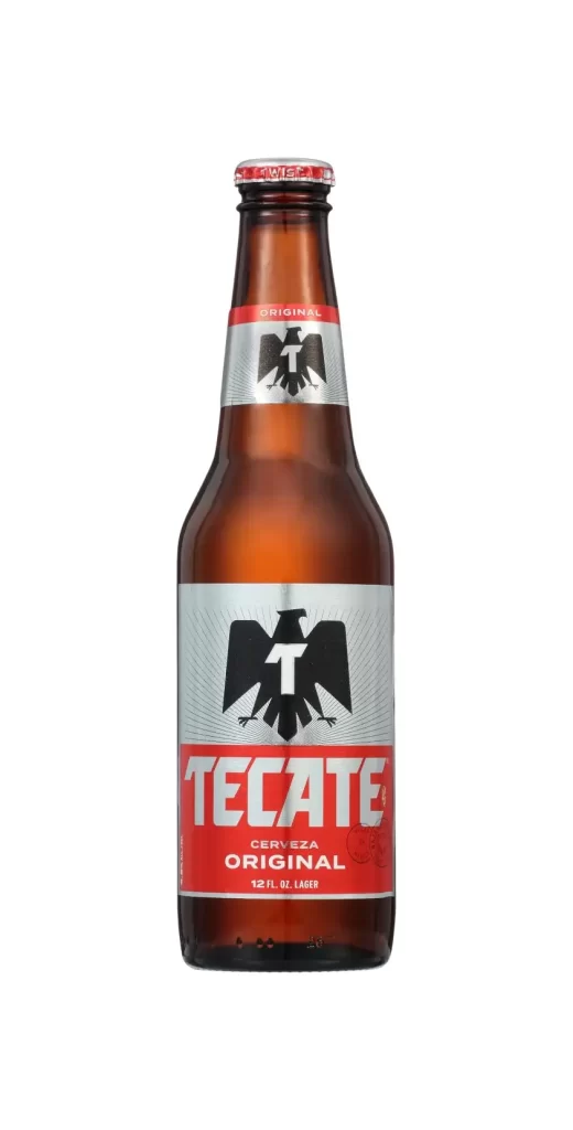
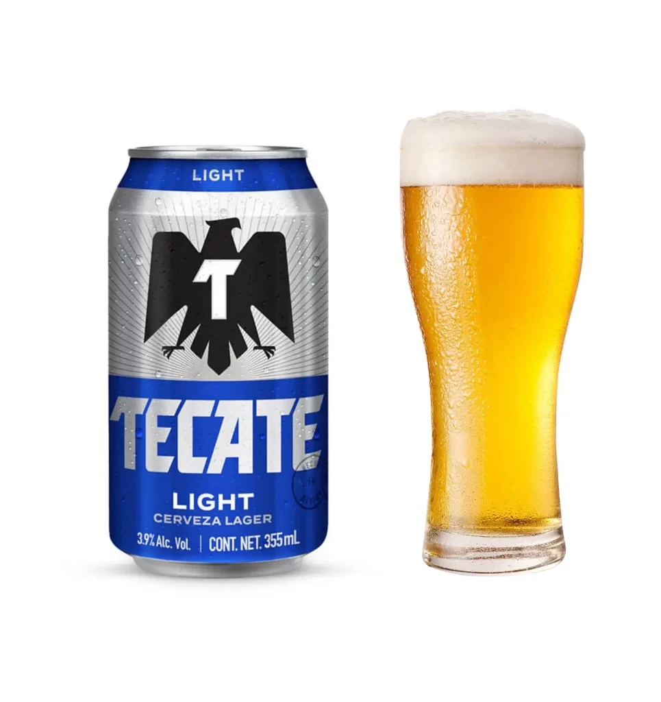
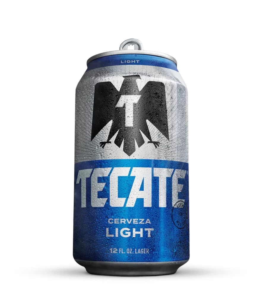
Visual interest stems from the high-contrast graphic identity that balances industrial metallic textures with aggressive branding elements. The stark black silhouette of the eagle creates immediate recognition against the silver and red fields, while the horizontal division between colors provides a clear structural anchor for the typography. Subtle details like the raised pull-tab texture and the thin red band near the rim add physical authenticity to the digital representation of this specific packaging variant.
Product photographers and packaging designers can utilize this reference to study how reflective surfaces interact with printed graphics under controlled lighting conditions. Brand strategists might examine the hierarchy between the icon, wordmark, and product descriptors to understand effective label real estate allocation. 3D artists working on beverage visualization projects will find value in observing the precise curvature of the cylindrical form and how the carrier wrap conforms to the grouped geometry.