Tecate Lager Bottle
Topics
Details
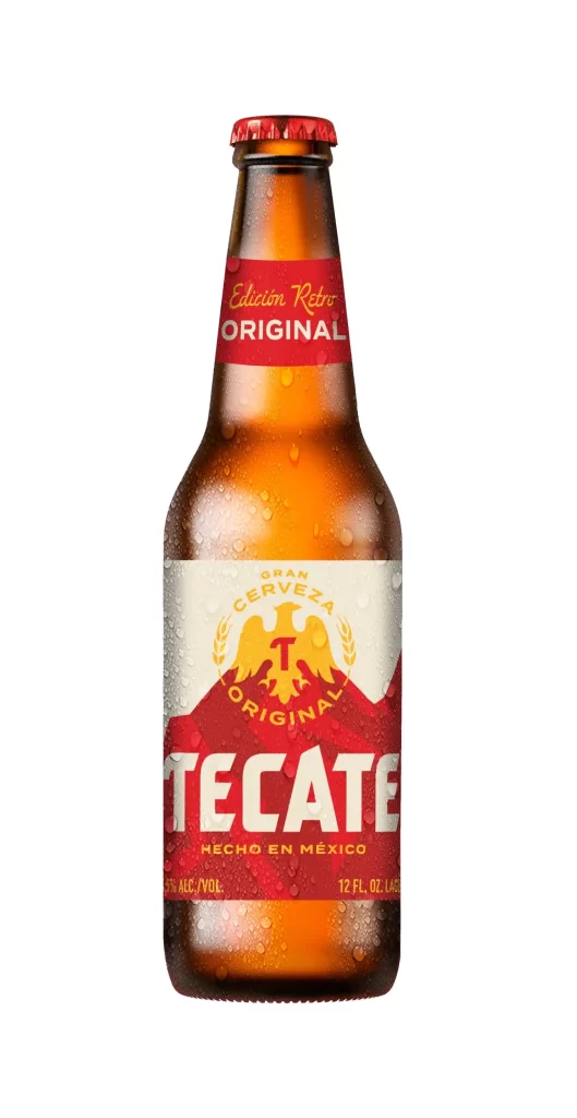
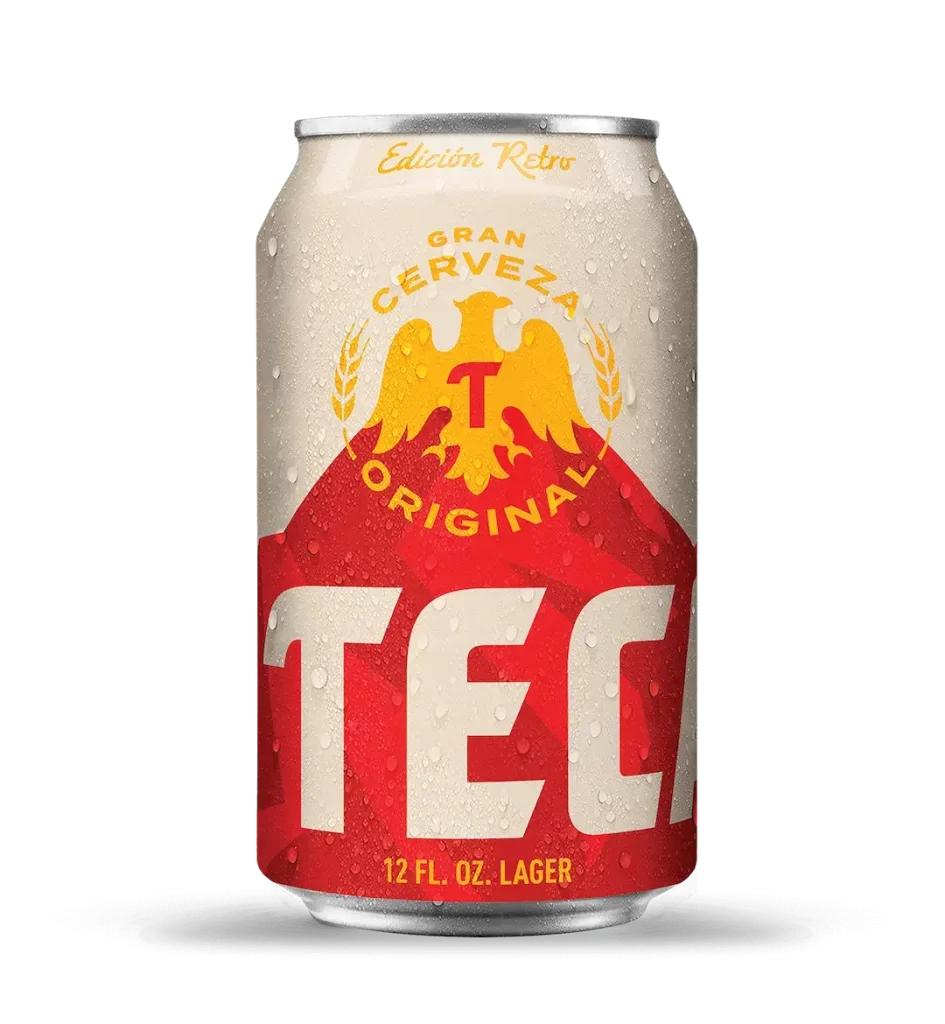
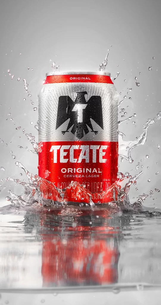
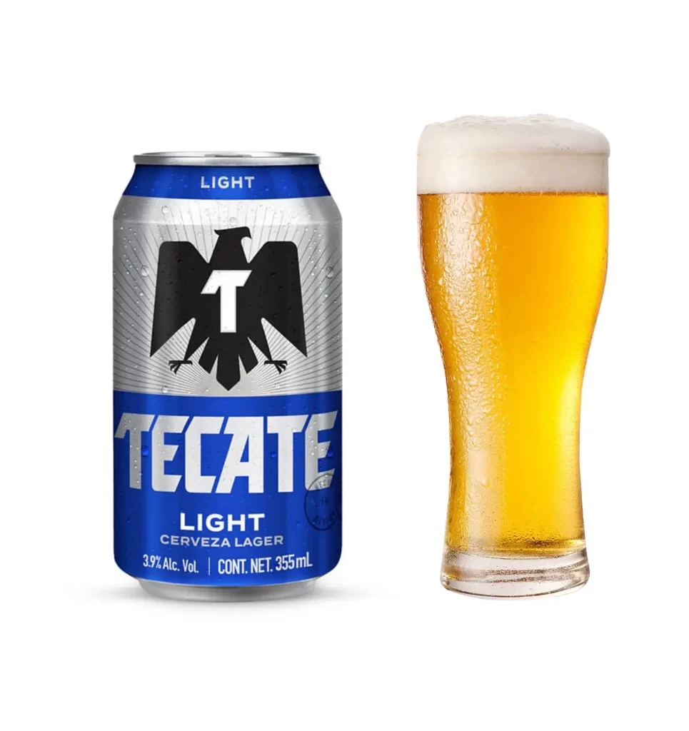
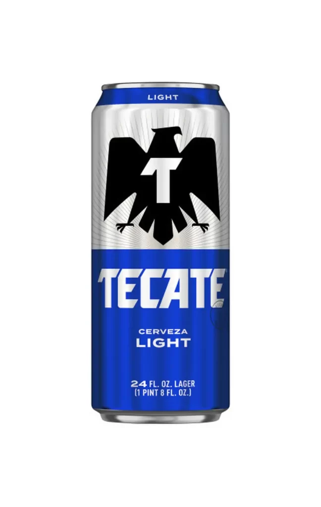
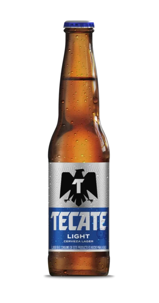
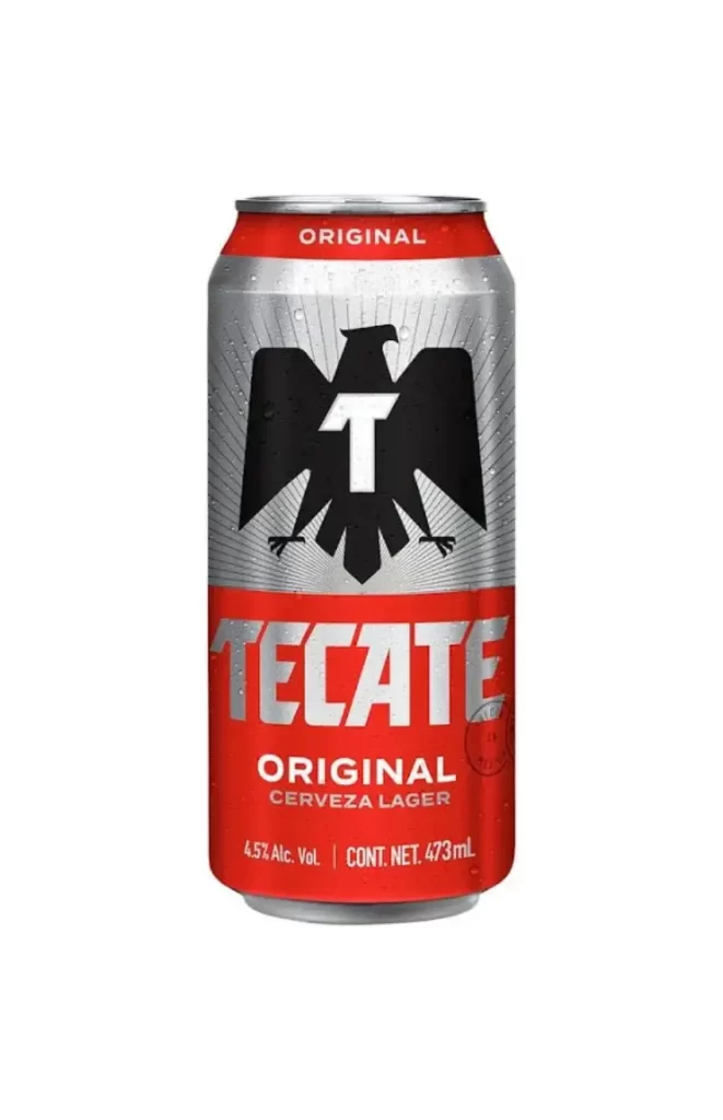
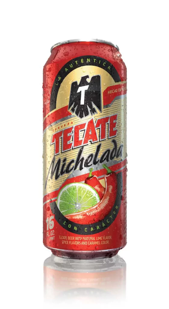
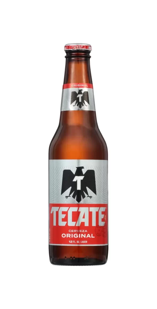
Amber glass forms the tall, straight-sided body of this Tecate lager bottle, captured in a direct, eye-level view with even lighting that reveals every surface detail. A red crown cap with white lettering seals the top, while the neck features a silver band emblazoned with a black eagle silhouette containing a white 'T' above the word 'ORIGINAL'. The main label displays a larger version of the same eagle emblem above bold white 'TECATE' lettering on a red field, with 'CERVEZA ORIGINAL' and '12 FL. OZ. LAGER' printed below, all set against a clean white background.
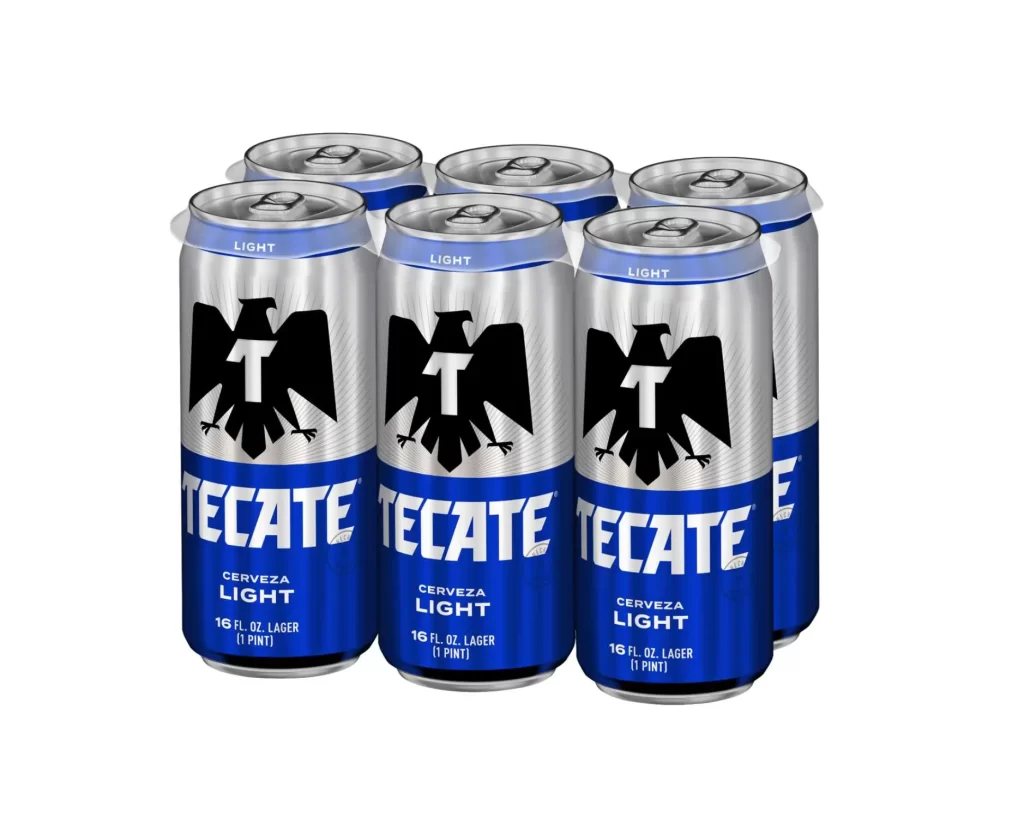
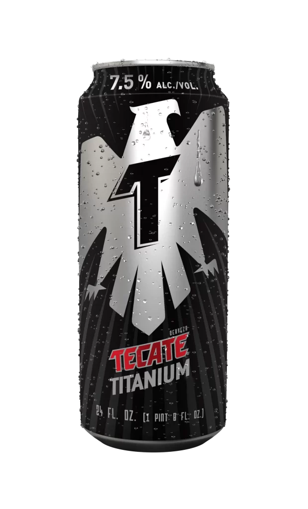
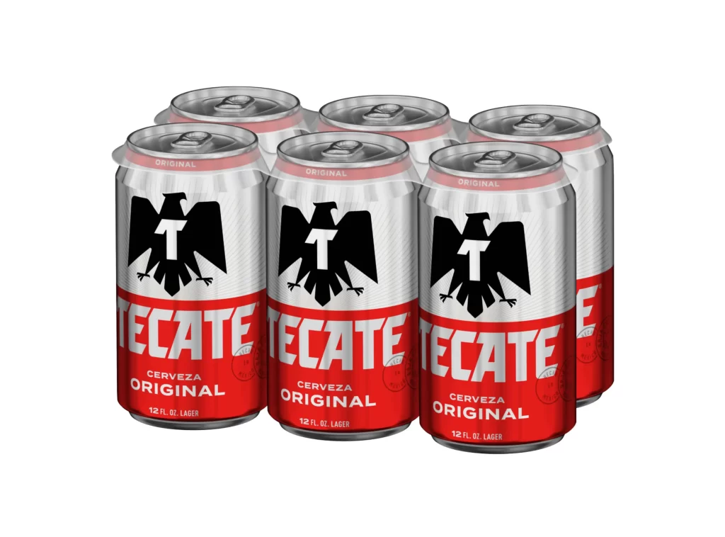
Visual distinction arises from the aggressive heraldic eagle motif that dominates both the neck and body labels, creating strong brand recognition through repeated iconography. The high-contrast palette of crimson, metallic silver, and jet black against the warm brown glass establishes immediate visual hierarchy, while the radiating sunburst pattern behind the central emblem adds subtle depth to an otherwise flat graphic composition. Typography choices balance industrial block lettering for the brand name with smaller, utilitarian text for product classification.
Packaging designers studying Mexican beer branding conventions would examine this specimen to understand color-coded market positioning within the lager category. Beverage photographers could reference the lighting setup and background treatment when planning similar product shoots requiring neutral presentation. Brand identity researchers might catalog the consistent use of the eagle crest across multiple touchpoints to analyze visual equity strategies in competitive alcoholic beverage markets.