Kirin Ichiban Beer Can
DownloadTopics
Details
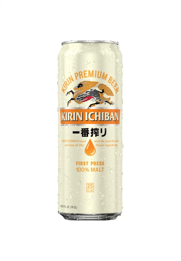
A chilled 25-fluid-ounce aluminum can of Kirin Ichiban stands vertically, its pale cream surface beaded with fine condensation droplets that catch the light. The cylindrical vessel features a silver rim at the top and displays a layered typographic hierarchy: golden-orange 'KIRIN PREMIUM BEER' arcs above an intricate Kirin creature illustration, while 'KIRIN ICHIBAN' sits in bold orange block letters on a white band. Below this, the Japanese characters 一番搾り appear prominently, followed by smaller English text explaining the first-press brewing method and a teardrop-shaped amber icon symbolizing the malt extraction process.
Visual distinction emerges from the disciplined color palette restricted to cream, metallic silver, and warm orange tones, creating immediate brand recognition without visual clutter. The mythical Kirin beast—rendered with dragon-like scales and flowing mane—serves as the central narrative anchor, bridging traditional Japanese heritage with modern industrial packaging. Designers studying beverage branding will appreciate how the bilingual text layout balances Eastern calligraphy with Western sans-serif typography while maintaining clear information hierarchy.
Product photographers and packaging students can utilize this reference to analyze condensation rendering techniques and metallic surface reflections under studio lighting conditions. Beverage industry professionals might examine the regulatory text placement and volume indicators for compliance with international labeling standards. The complete high-resolution asset is accessible at no cost for those needing detailed texture work or print-quality compositional studies.