Zero Calorie Lemon Sparkling Drink
DownloadTopics
Details
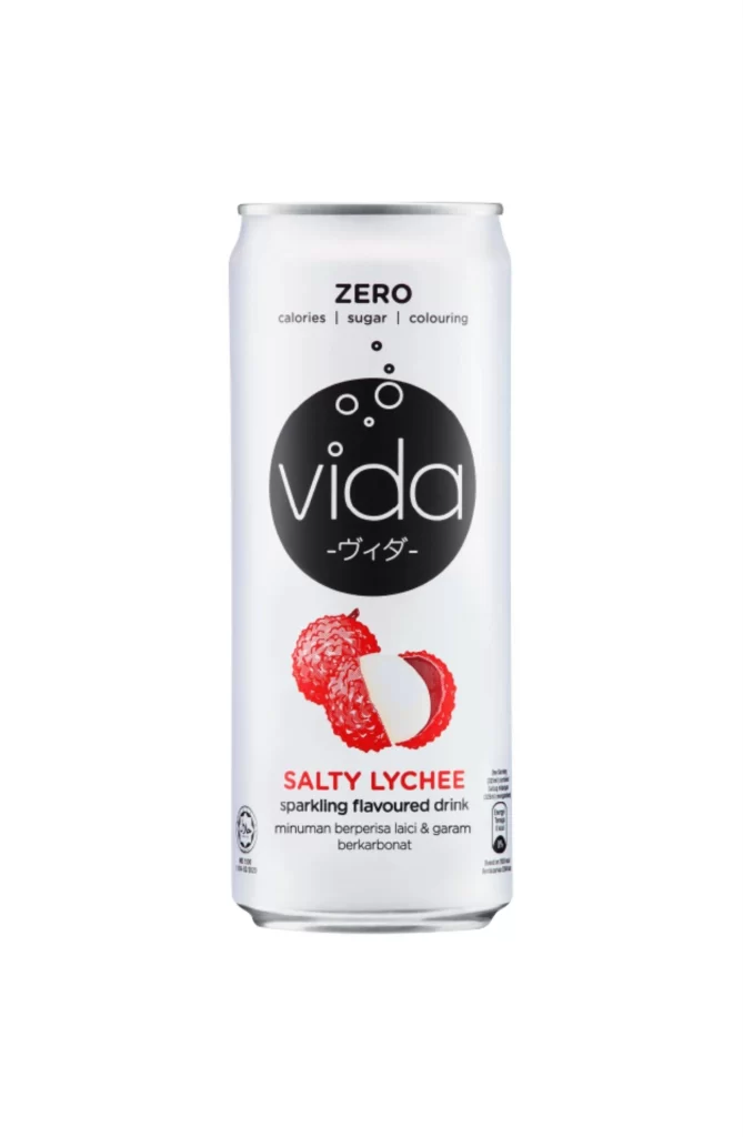
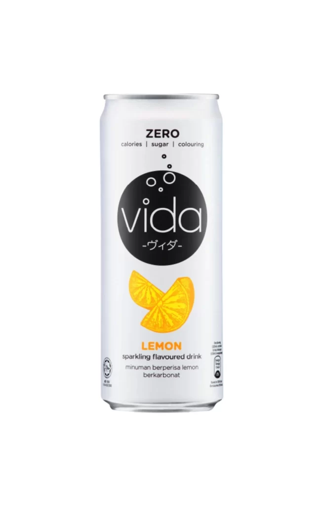
A cylindrical aluminum can with a brushed silver top presents a minimalist white label dominated by a large black circle containing the word 'vida' in lowercase white sans-serif type. Above this central logo, the text 'ZERO' appears in bold black capitals followed by smaller subtext listing 'calories | sugar | colouring', while Japanese katakana characters '-ヴィダ-' sit just beneath the brand name. Two bright yellow lemon slices with visible pulp texture overlap near the bottom, positioned above the flavor designation 'LEMON' in orange lettering and 'sparkling flavoured drink' in smaller black text, with additional Malay and Indonesian translations appearing below.
The visual hierarchy relies on high-contrast geometry, where the circular black badge creates an immediate focal point that draws the eye before allowing it to travel downward to the citrus imagery. This particular variant stands out through its trilingual labeling approach—English, Japanese, and Malay/Indonesian—which suggests a pan-Asian market positioning rarely seen on single-product packaging. Designers studying beverage branding will appreciate how the sparse composition balances negative space with essential nutritional claims without cluttering the surface.
Packaging professionals analyzing zero-sugar product aesthetics could use this as a case study for clean-label design strategies that communicate health benefits visually. Marketing teams developing campaigns for sparkling beverages might reference the color palette when creating mood boards for citrus-flavored lines. Anyone needing detailed visuals of this specific can for mockup work or comparative analysis can access the full-resolution file at no cost directly from the resource page.