Beer Can Lager Branding Eagle Logo
Topics
Details
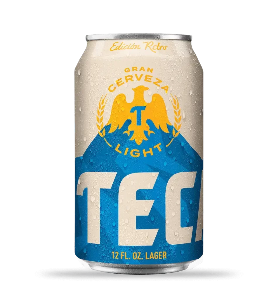
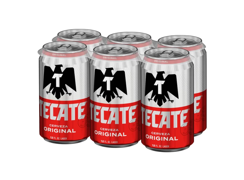
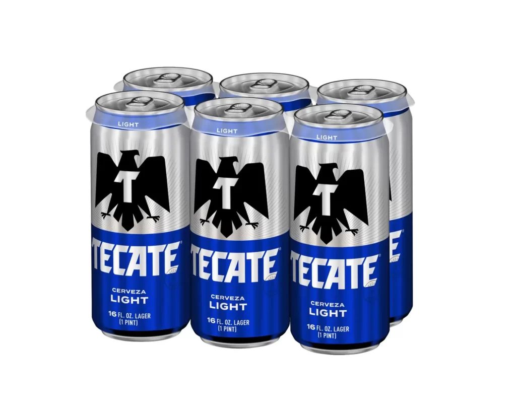
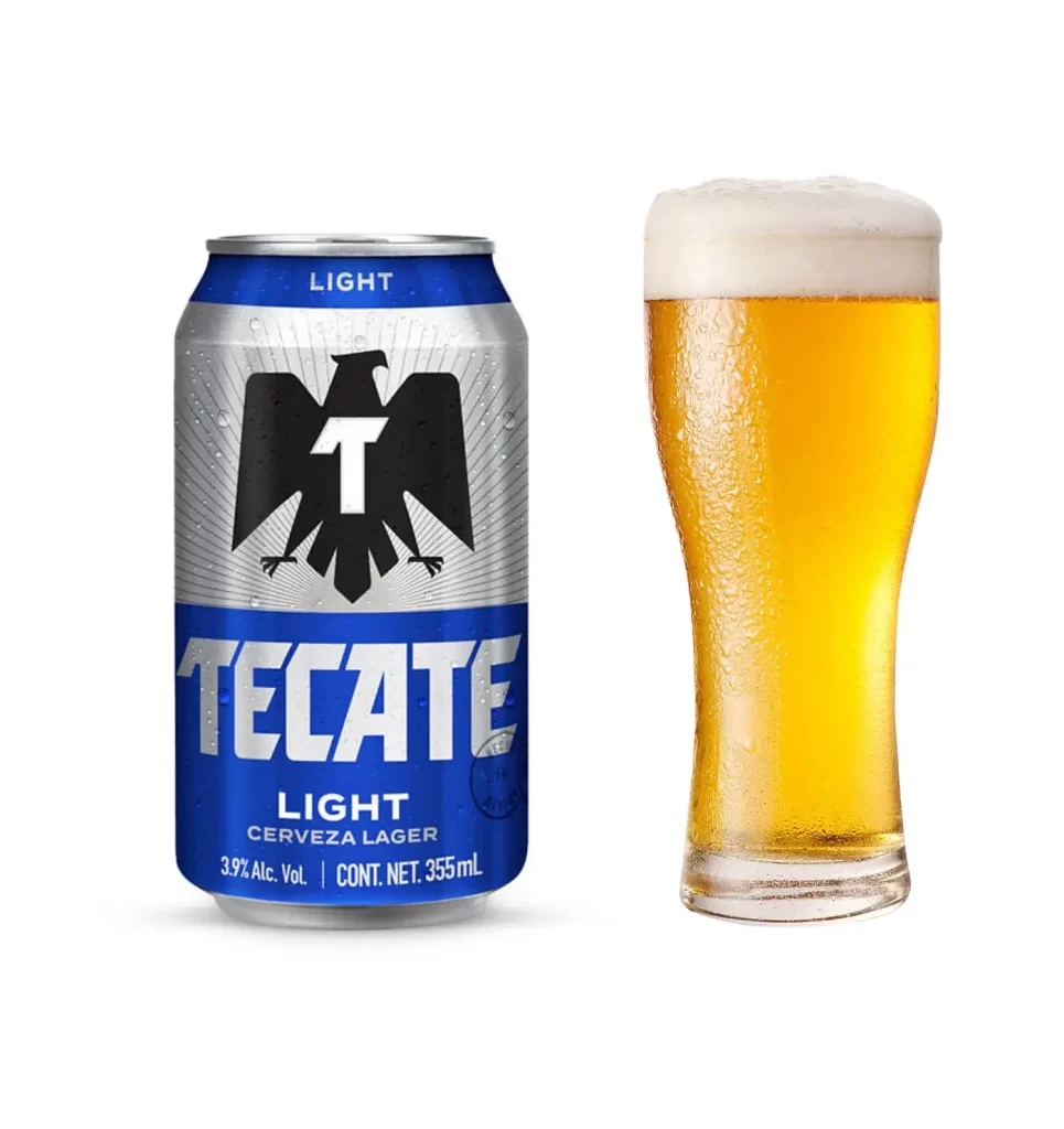
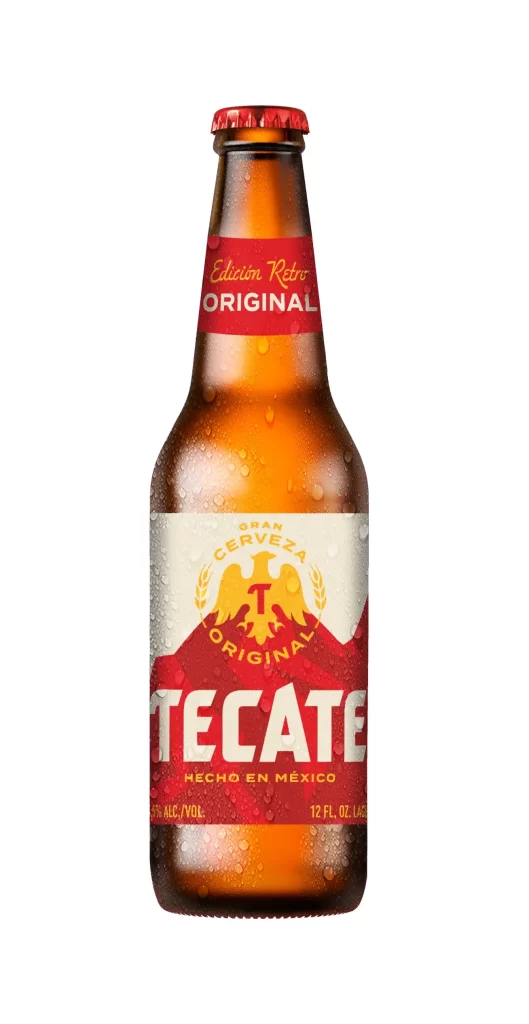
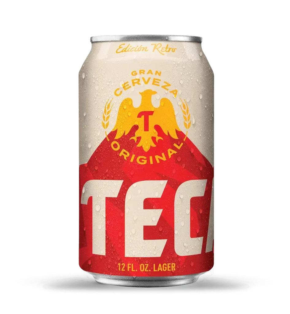
A chilled aluminum lager can glistens with condensation droplets across its metallic surface, featuring an off-white upper half that bears 'Edición Retro' in gold cursive script above a bold red lower field. The red section displays the truncated word 'TEC' in oversized cream typography, while the central emblem showcases a golden eagle with outstretched wings clutching a red letter 'T', encircled by wheat stalks and the arched text 'GRAN CERVEZA ORIGINAL'. The 12 fluid ounce container sits on a white surface with '12 FL. OZ. LAGER' printed in gold at its base.
Visual hierarchy relies on the dramatic scale contrast between the massive brand lettering and the intricate heraldic crest above it. The retro edition explicitly references heritage through its vintage-inspired color palette of crimson, gold, and cream, while the simulated moisture texture adds tactile realism to the digital presentation. Geometric division between the cream and red zones creates immediate brand recognition even when partially obscured.
Packaging designers studying beverage industry trends would examine this for typographic weight distribution and nostalgic branding strategies. Illustrators requiring reference for metallic surface rendering or condensation patterns on curved aluminum could analyze the lighting interactions here. Marketing teams developing limited-edition product lines might evaluate how historical motifs integrate with contemporary layout principles.