Heineken Can Green Red Star Amsterdam
Topics
Details
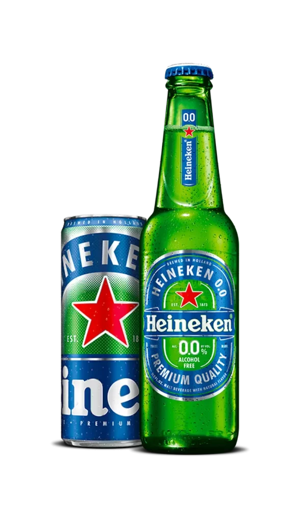
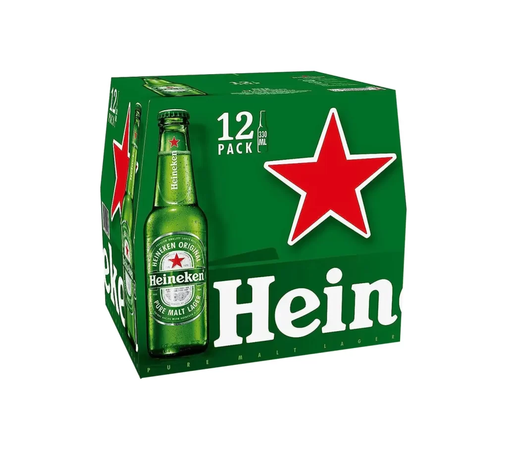
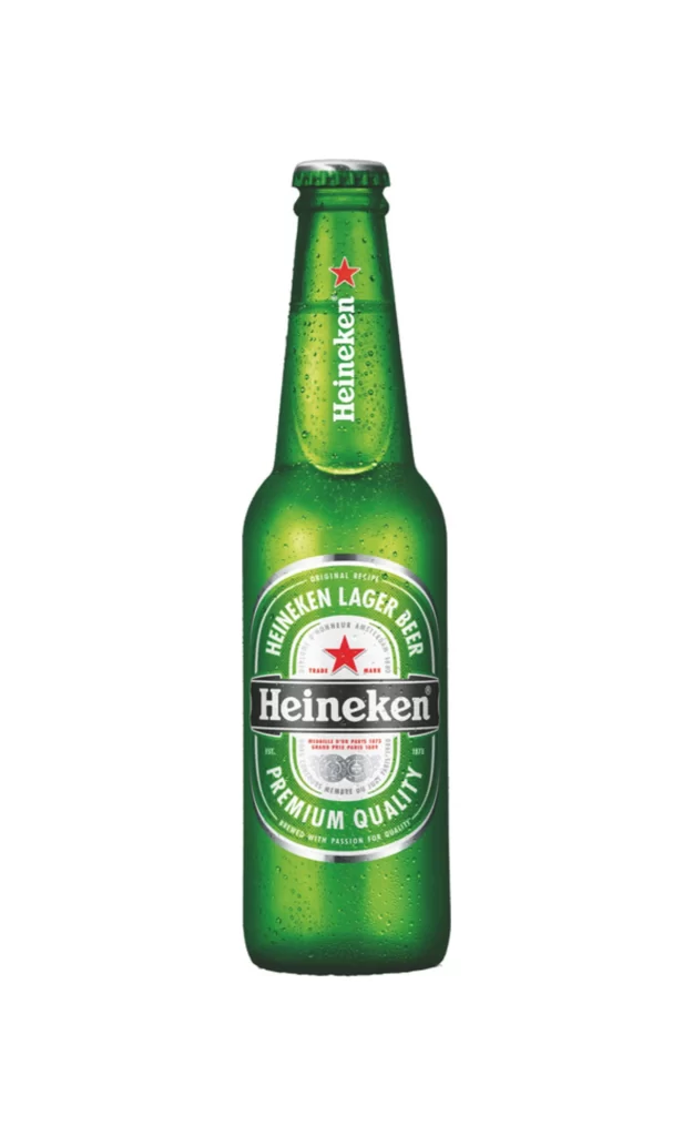
A cylindrical aluminum can showcases the iconic Heineken livery in vibrant emerald green, featuring a large, five-pointed red star that dominates the upper half. White sans-serif typography encircles the star, reading 'HEINEKEN ORIGINAL' and 'AMSTERDAM', while 'EST. 1873' anchors the composition below. The lower section displays the brand name in bold white lettering above the text 'PREMIUM MALT LAGER', all set against a white background.
Visual hierarchy is established through the stark contrast between the saturated green background and the primary red emblem, creating immediate brand recognition. The typographic arrangement utilizes varying scales to guide the eye from the heritage claims at the top down to the product classification at the base. Subtle halftone dot patterns and realistic water beading add tactile depth to the otherwise flat graphic design, distinguishing this specific packaging iteration through its clean, symmetrical layout.
Product photographers might study the lighting setup used to create even highlights along the curved metal without losing detail in the shadows. Packaging designers could analyze the kerning and weight of the custom typeface to understand how the brand maintains consistency across different container shapes. 3D artists seeking to model beverage containers will find the specular reflections on the wet surface particularly useful for understanding material properties and environmental mapping.