Heineken Lager Beer Cans Packaging
DownloadTopics
Details
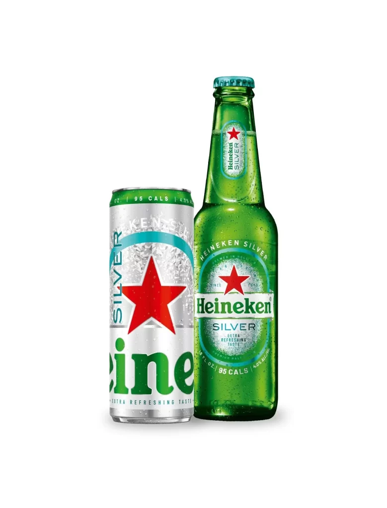
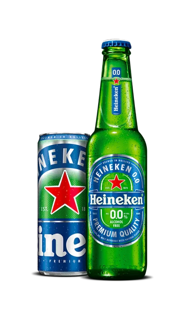
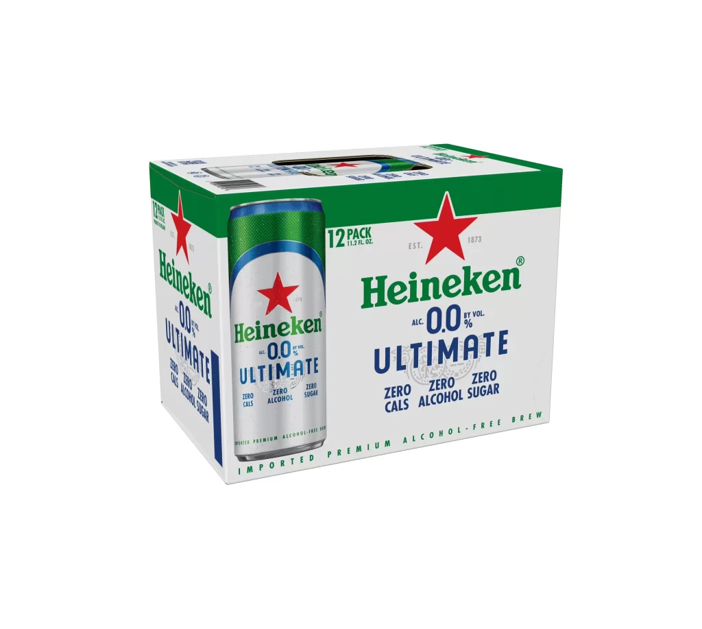
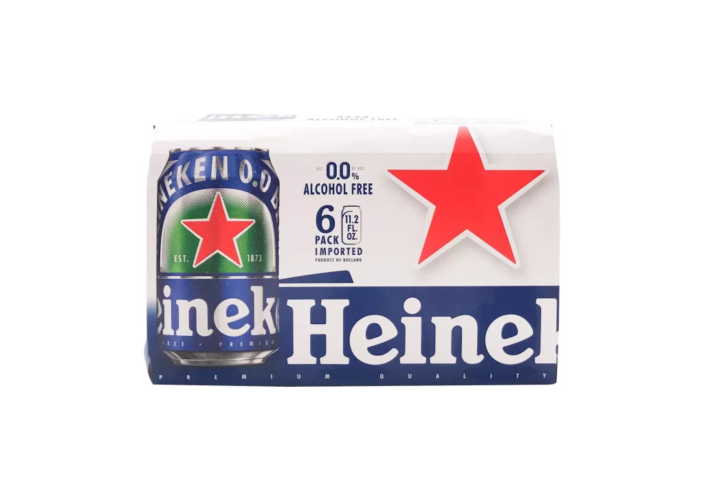
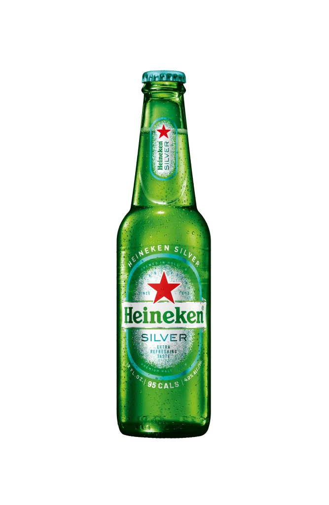
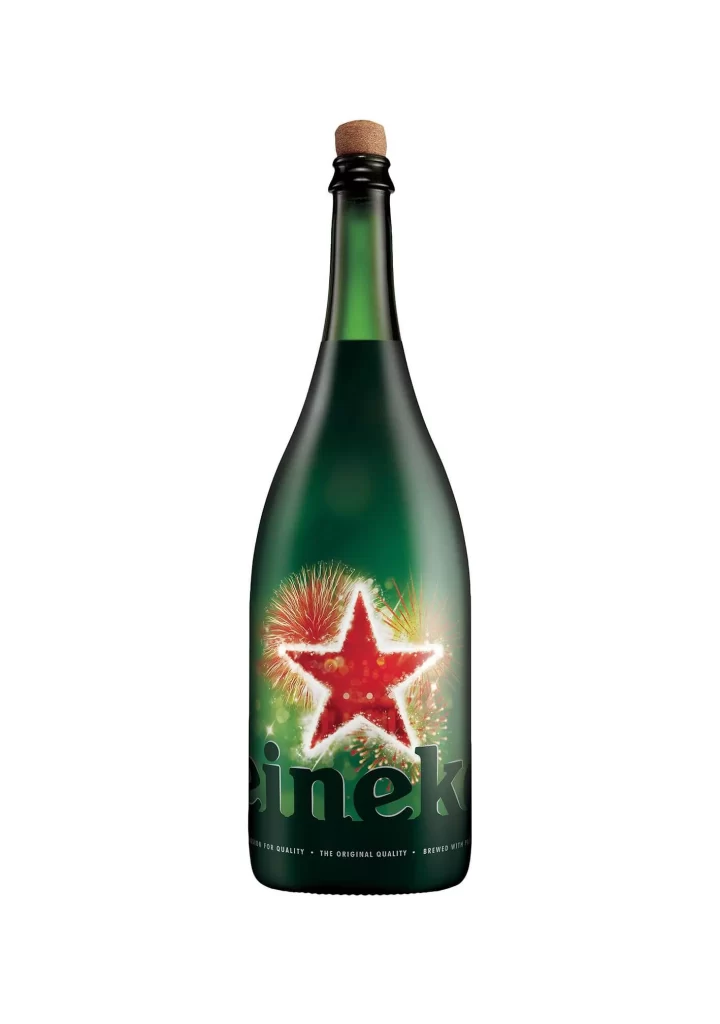
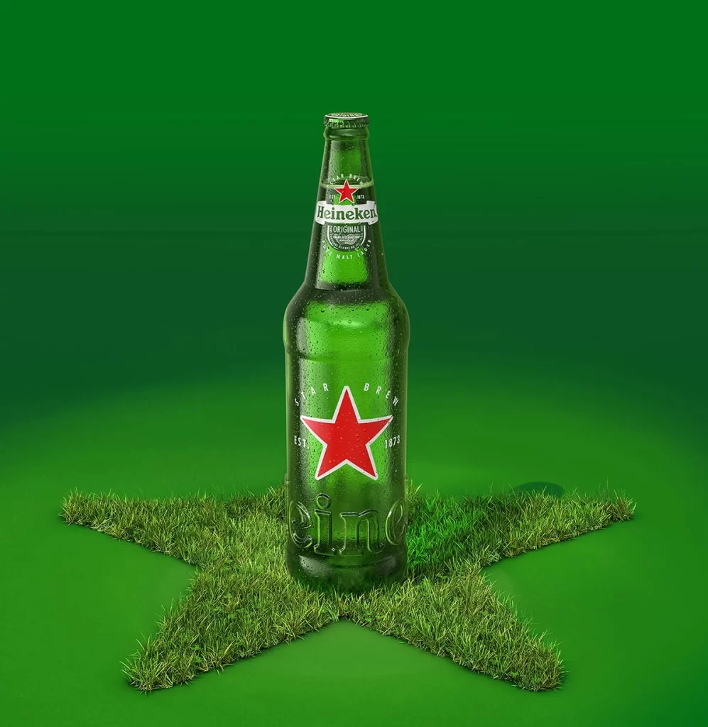
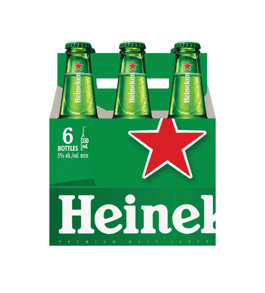
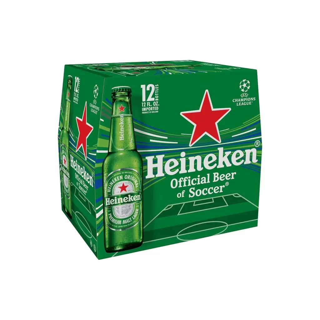
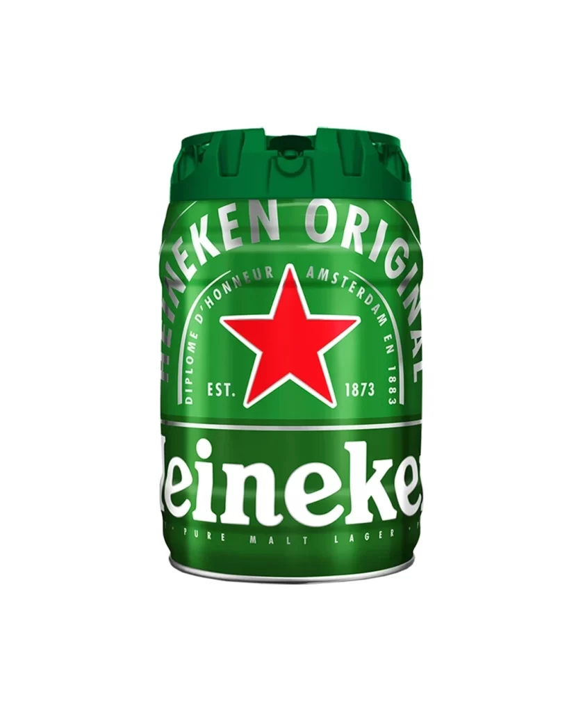
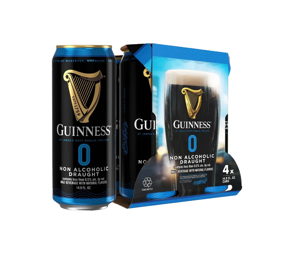
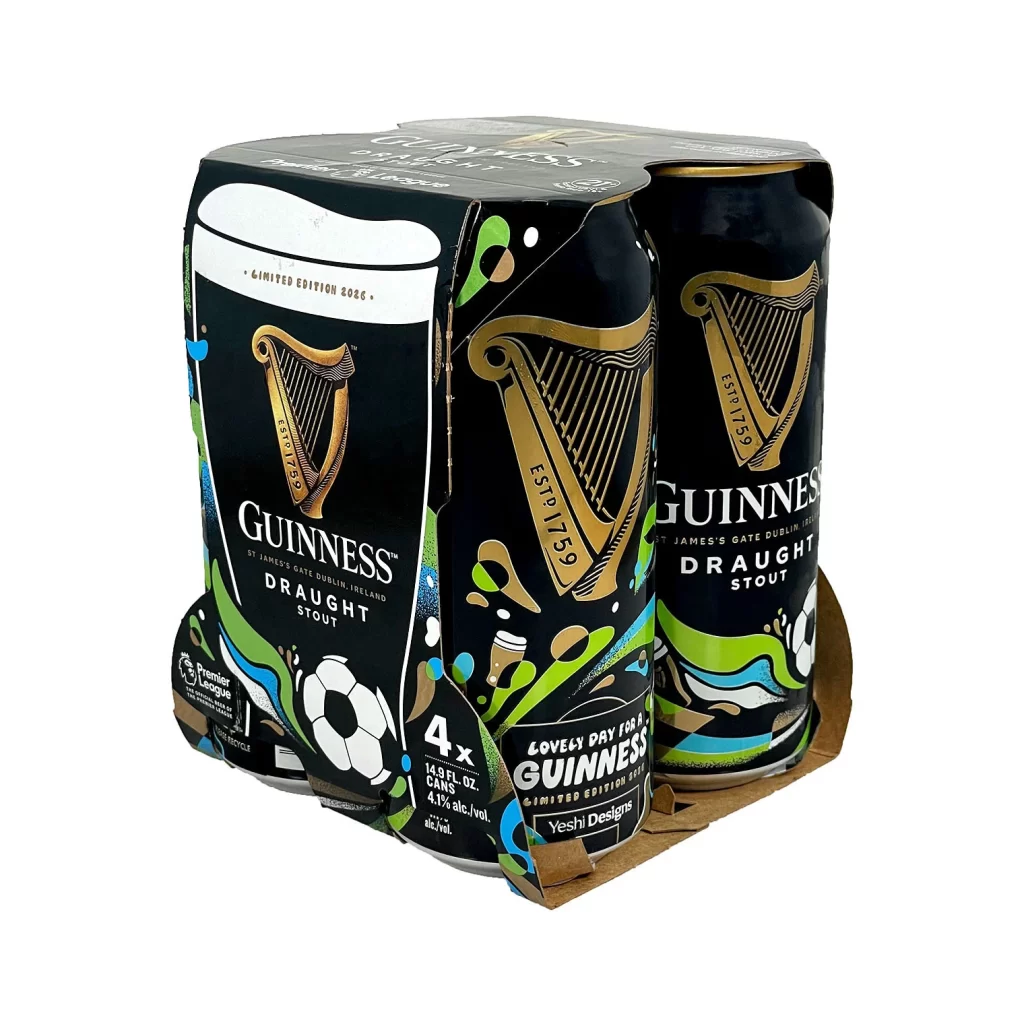
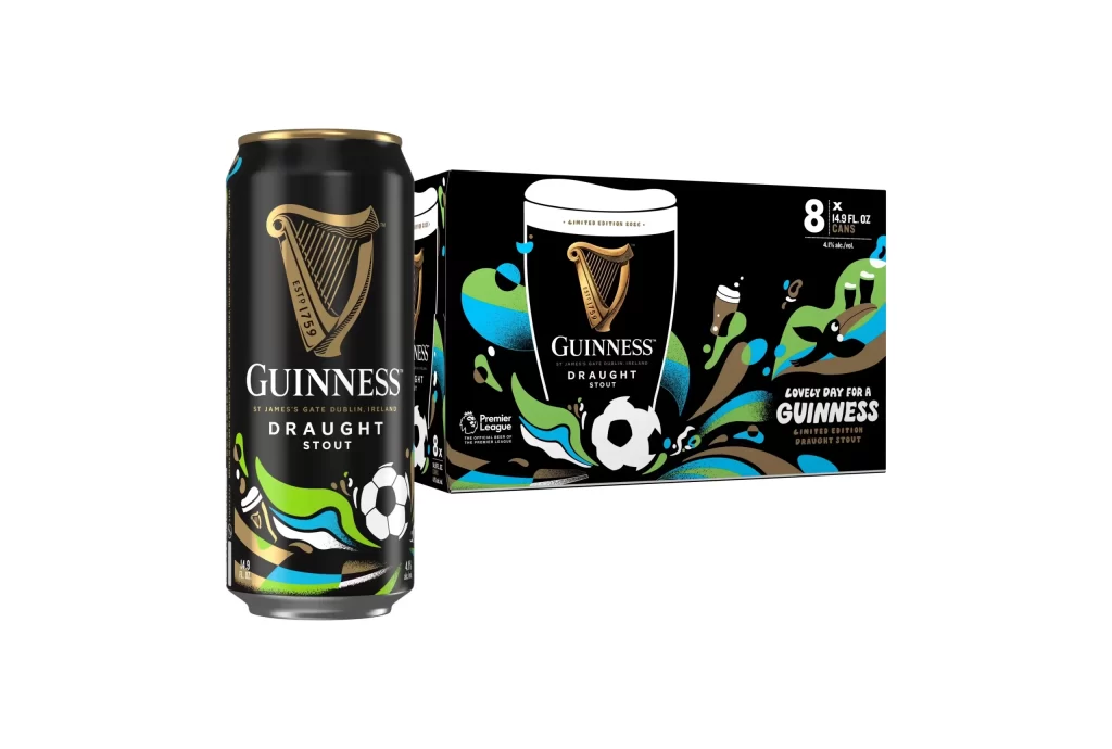
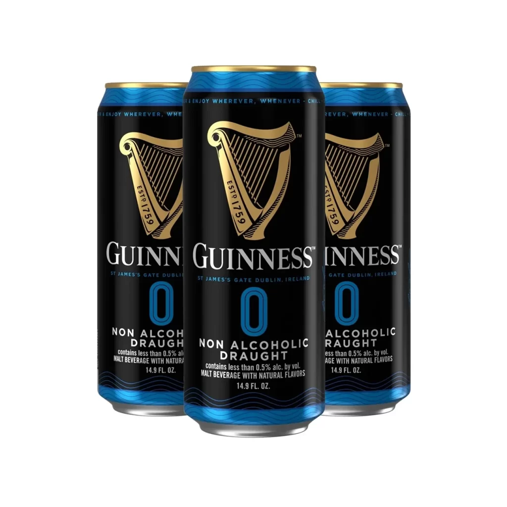
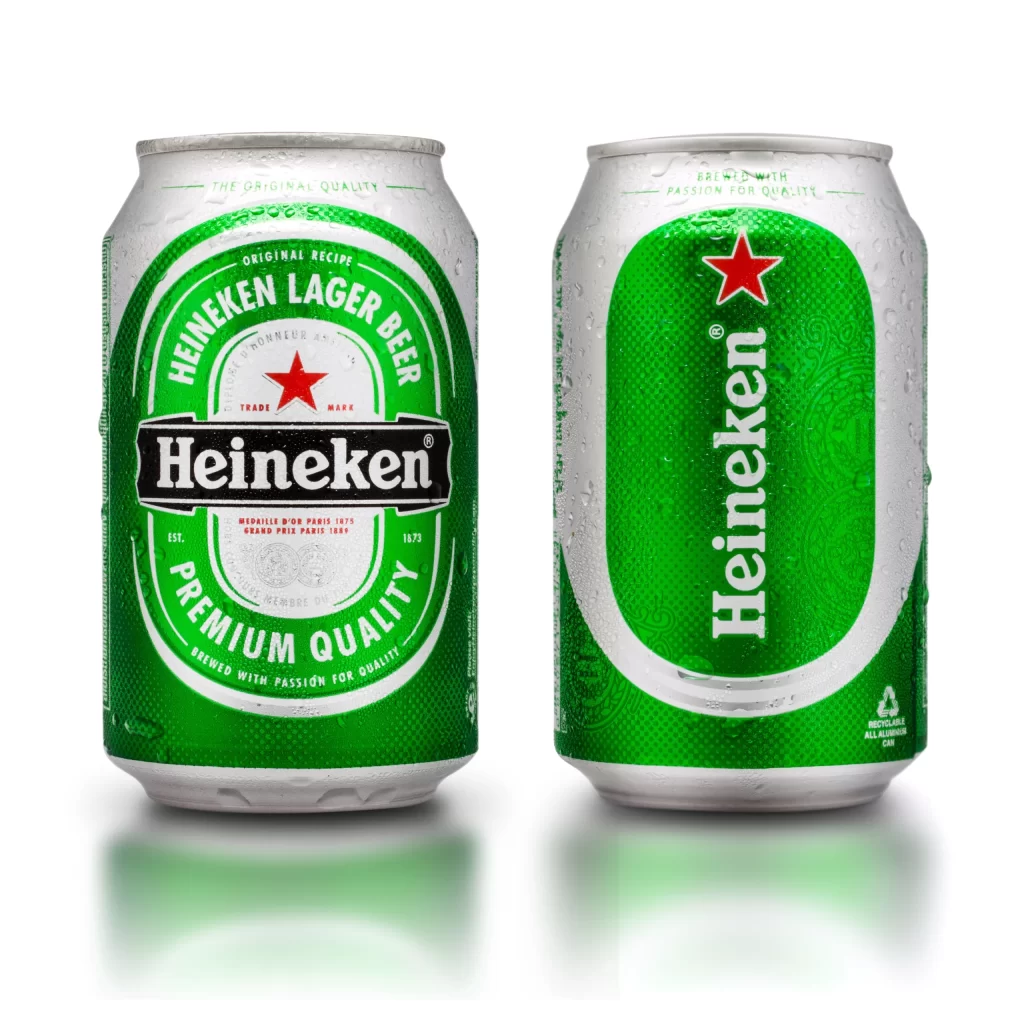
The image displays two silver aluminum Heineken beer cans side by side against a light background with soft reflections. The left can presents its front label featuring a bold red star, the Heineken logo, and the text Original Recipe Premium Quality Est 1873. The right can shows the side label with vertical Heineken text and a recycling mark. Both cans are covered in fresh condensation droplets.
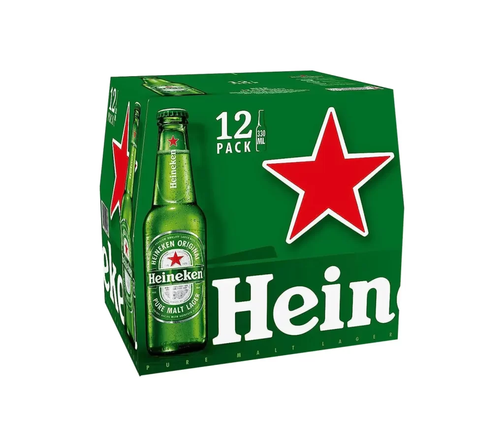
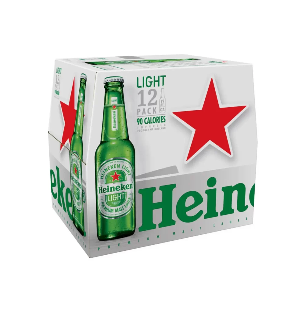
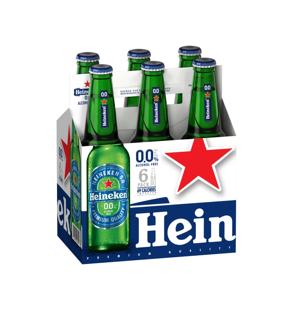
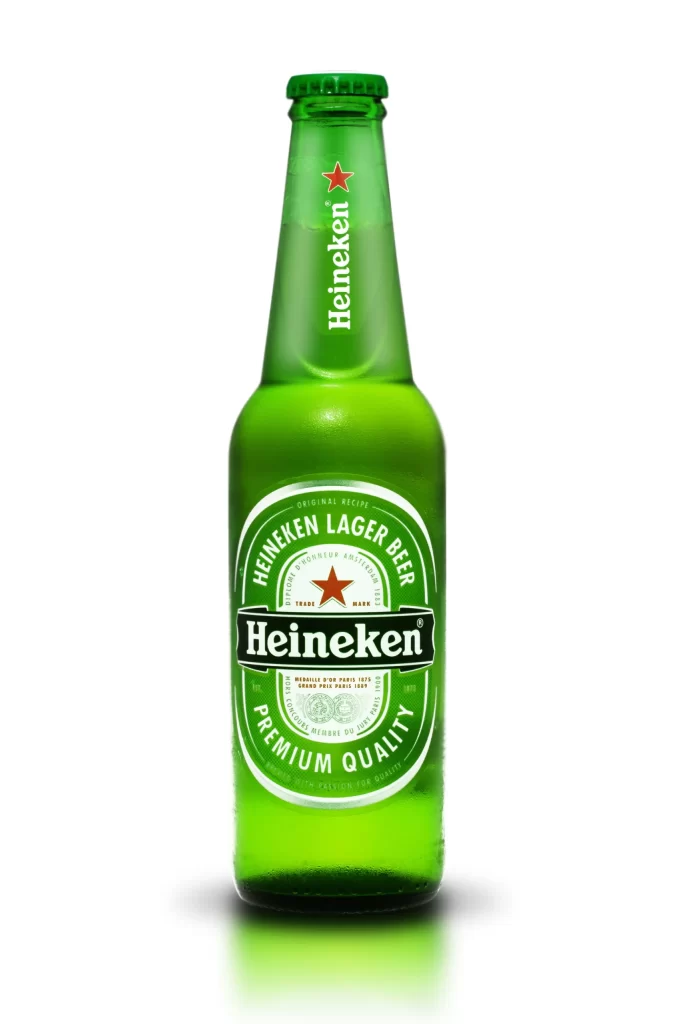
This packaging perfectly balances modern minimalism with rich brand heritage. The bright silver aluminum provides a sleek canvas, allowing the signature green label and iconic red star to command instant recognition. By prominently displaying the Est 1873 mark, the design reinforces legacy and premium quality. The vertical typography on the side label adds dynamic visual interest while maintaining clean functionality for essential consumer information.
Graphic designers and packaging specialists will find this resource highly valuable for studying beverage container aesthetics. Marketing students can analyze how visual cues communicate premium branding and heritage. Additionally, 3D artists and product visualization creators need references like this to accurately render realistic materials, including metallic surfaces, label textures, and the complex light interactions of condensation droplets on cold drink cans.