Orion The Draft Beer Can Alternate View
Topics
Details
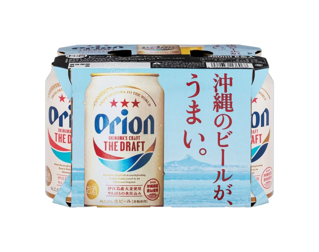
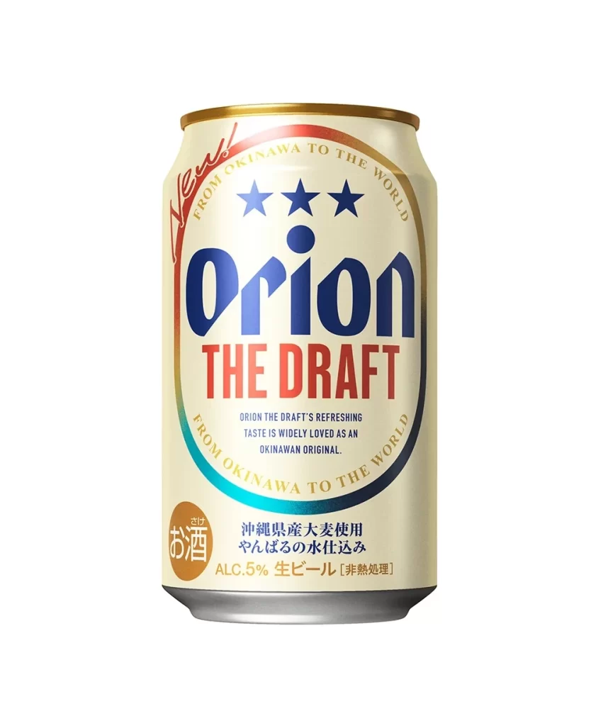
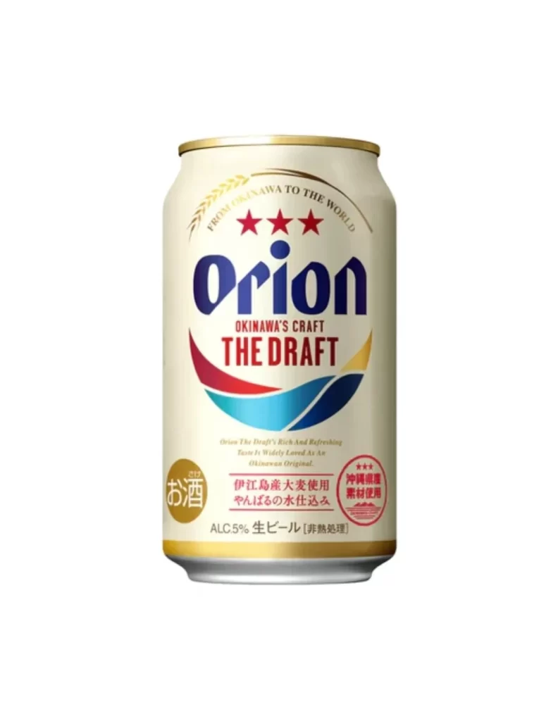
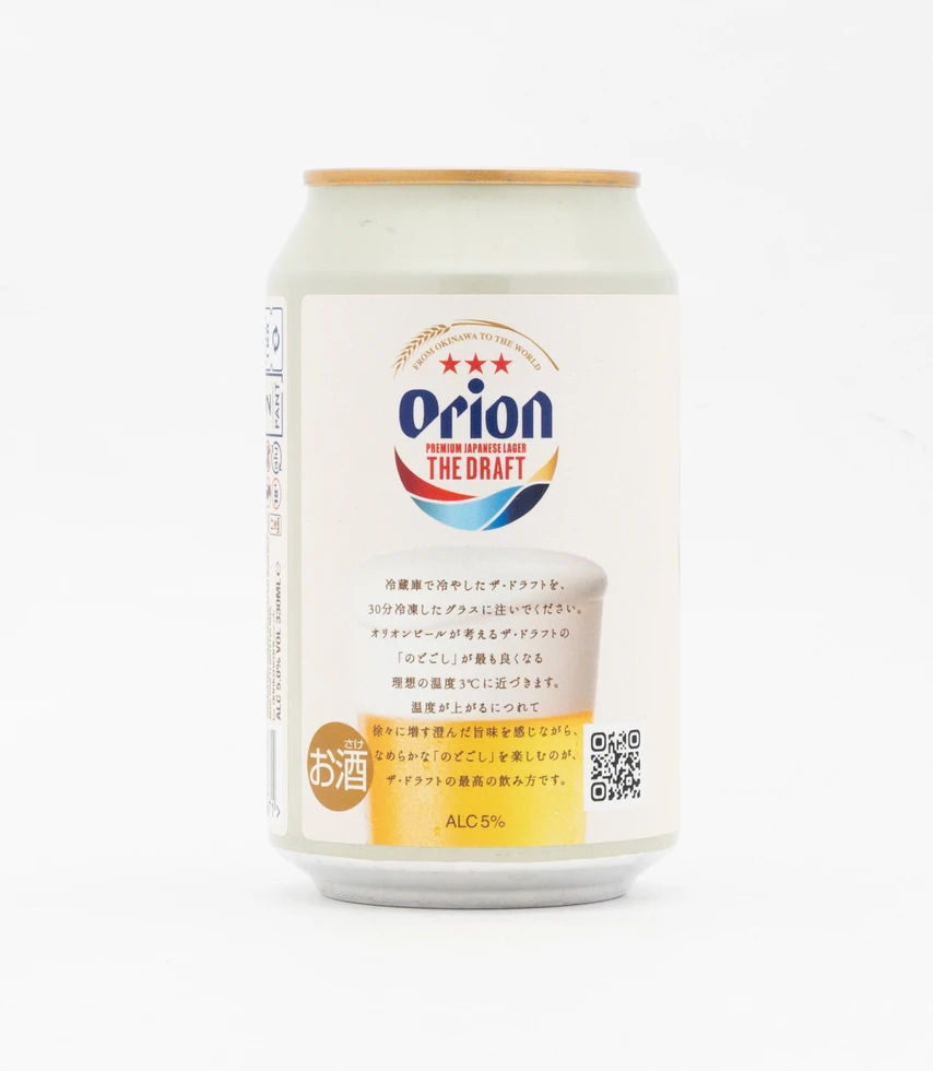
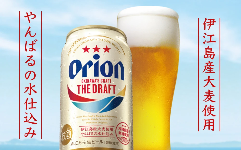
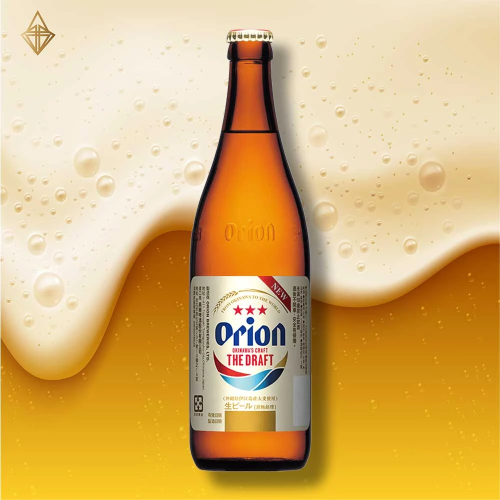
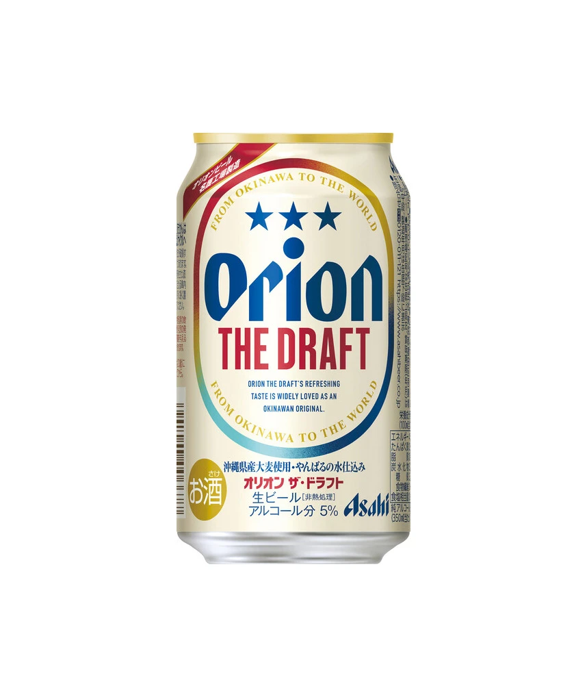
A cylindrical aluminum beverage can stands upright on a white surface, illuminated by soft studio lighting that eliminates harsh shadows. The container features a cream-colored label dominated by the word ‘Orion’ in bold, deep blue serif lettering, positioned directly above ‘THE DRAFT’ in striking red capital letters. Three solid blue stars float above the brand name within a circular border that reads ‘FROM OKINAWA TO THE WORLD’ in gold text. The alternate angle adds gentle depth to the silhouette.
Visual interest stems from the sophisticated color blocking and typographic hierarchy that balances English and Japanese script seamlessly. The metallic gold rim at the can’s top provides a luxurious contrast to the matte finish of the main body, while the circular motif creates a sense of global reach echoed by the text ‘FROM OKINAWA TO THE WORLD.’ Subtle gradients within the oval frame add depth without cluttering the clean, retro-modern aesthetic that distinguishes this specific export packaging.
Brand strategists might analyze this composition to understand how regional products position themselves for international markets through color psychology and bilingual labeling. Packaging engineers could study the material finishes and structural proportions to inform their own cylindrical container prototypes. Illustrators seeking to master product rendering will find the specular highlights on the curved metal surface particularly useful for practicing realistic texture work.