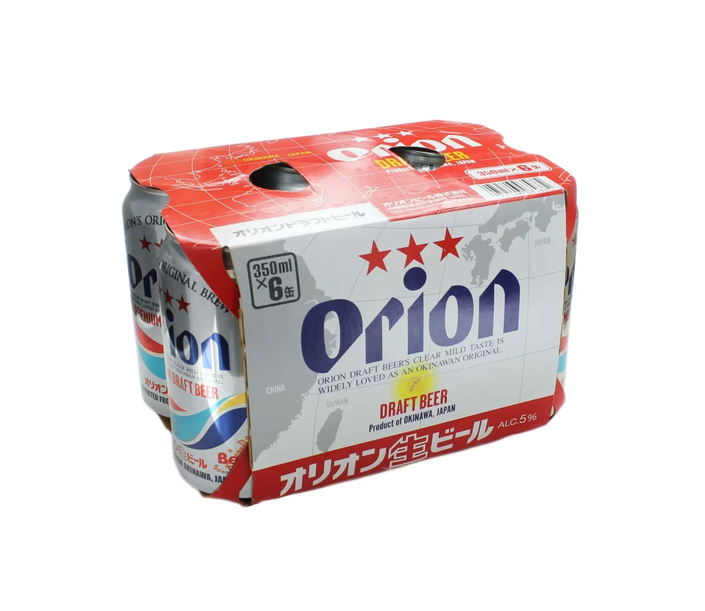
Orion Draft Beer Six Pack Cans
DownloadTopics
Details
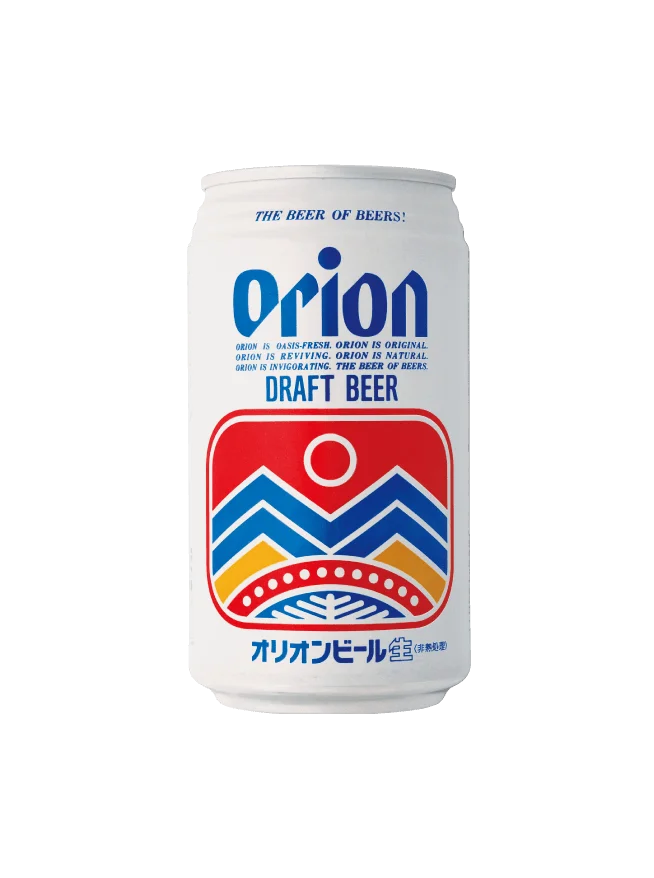
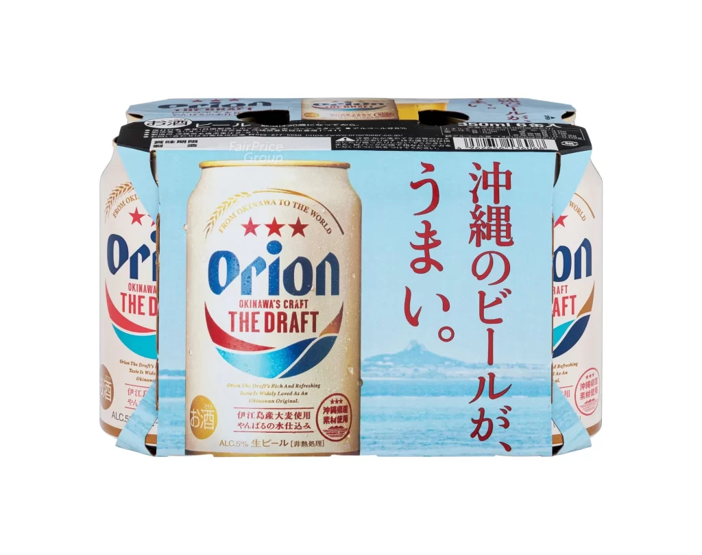
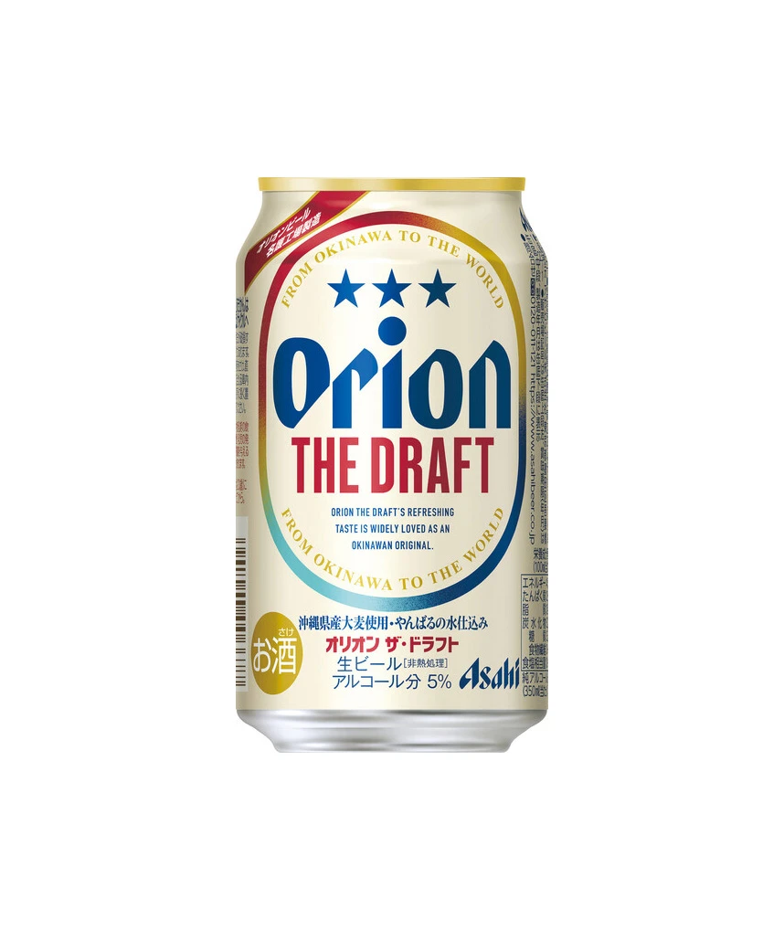
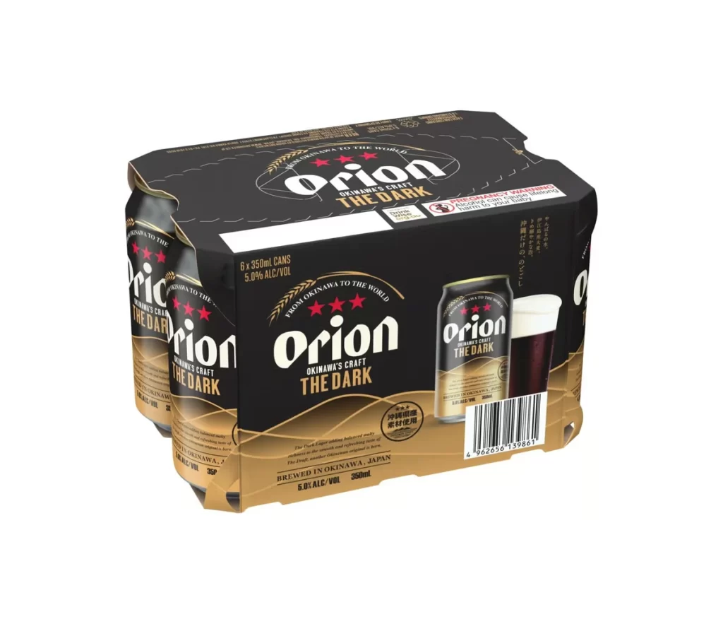
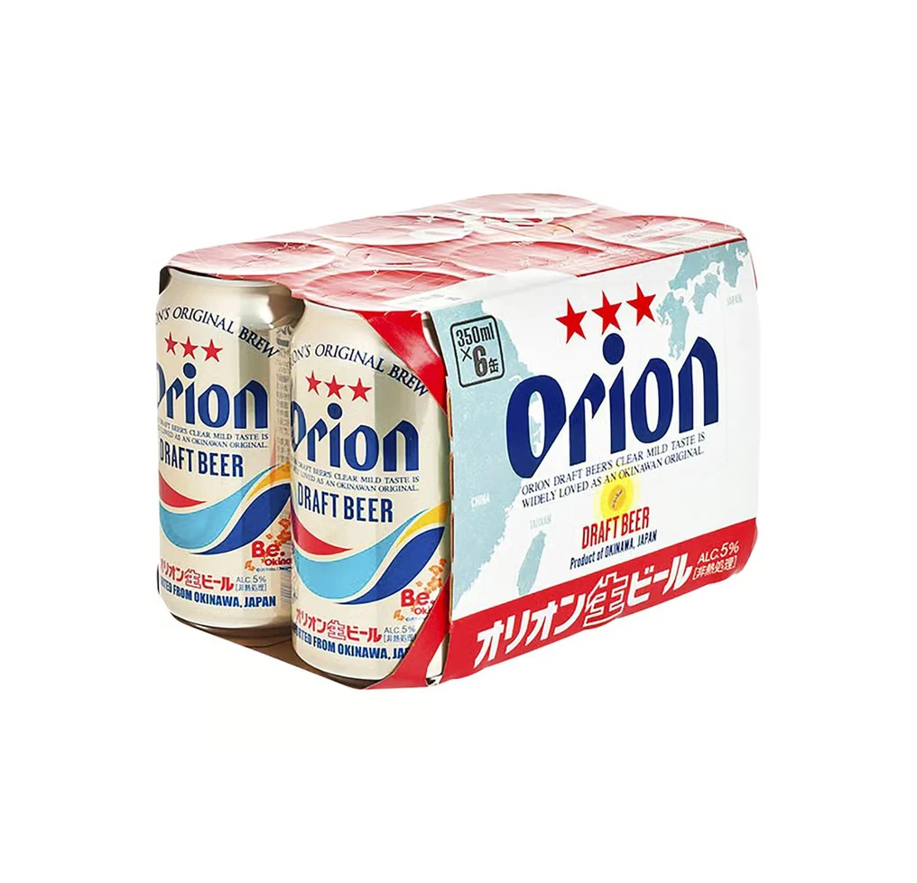
A six-pack of Orion Draft Beer sits at a three-quarter angle, showcasing its red and white cardboard carrier with two circular cutouts revealing the silver aluminum cans beneath. The packaging features bold navy-blue ‘Orion’ lettering flanked by three red stars, with Japanese text reading Orion Nama Beer along the bottom red band and ‘350ml x 6 cans’ indicating the volume and quantity. Soft, even lighting illuminates the product against a clean background, highlighting the subtle world map graphic in gray tones on the carrier’s side panel.
Visual interest stems from the juxtaposition of the vibrant red header against the muted cartographic pattern on the main body of the pack. The metallic silver of the individual cans peeks through the sides, contrasting with the matte finish of the printed cardstock. Designers studying packaging layouts will appreciate how the brand utilizes regional mapping to emphasize its Okinawan origins. You can grab the full-resolution file for free to inspect the fine print and texture details.
3D environment artists modeling convenience store assets or product visualizers creating mockups for beverage clients would find this specific angle invaluable for understanding real-world proportions and shadows. It serves as an excellent baseline for texture artists needing to replicate the specific gloss of Japanese beer packaging or the way light interacts with the carrier’s folds. Anyone working on branding projects involving geographic motifs can study how the map is subtly integrated into the overall aesthetic without overwhelming the primary logo.