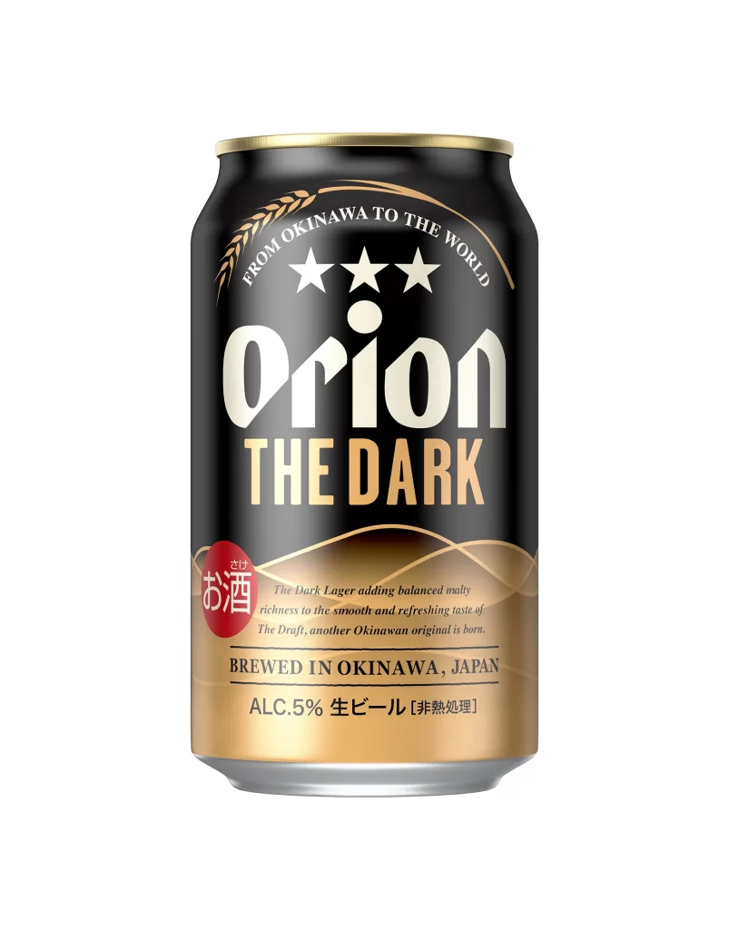
Orion The Dark Beer Can Alternate View
Topics
Details
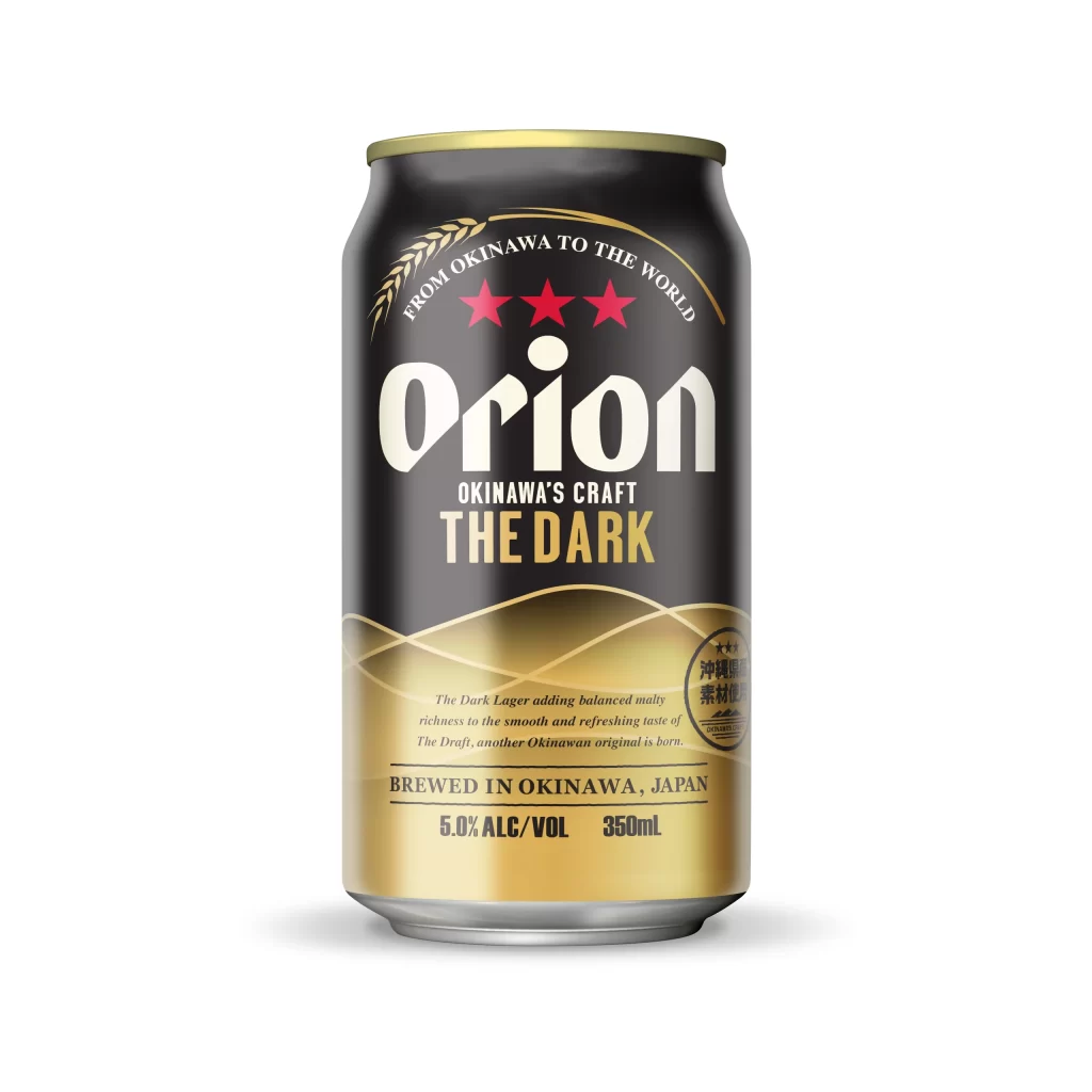
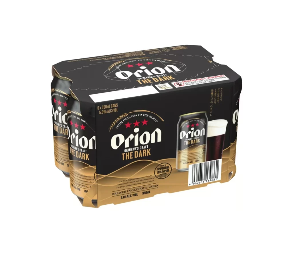
A sleek aluminum beer can displays a sophisticated black and gold color scheme, with the upper portion featuring a matte black background that transitions into a warm metallic gold gradient toward the base. The Orion brand name appears in bold white serif lettering above 'THE DARK' in gold capital letters, while three white stars and a curved wheat stalk graphic adorn the upper section beneath the arched text 'FROM OKINAWA TO THE WORLD'. A red circular badge containing Japanese characters sits on the left side, and the bottom section contains detailed product information including alcohol content and brewing origin, all captured under even studio lighting that highlights the reflective metallic surfaces.
Visual hierarchy emerges through the deliberate contrast between the stark black upper register and the luminous golden base, creating an immediate sense of premium positioning within the dark lager category. The typographic arrangement cleverly balances English and Japanese text elements, while the wheat stalk motif arching over the brand name subtly reinforces the beverage’s agricultural origins without overwhelming the modernist layout. Such careful calibration of color temperature and spatial distribution distinguishes this packaging from conventional beer can aesthetics by emphasizing regional provenance and craft sophistication.
Packaging designers analyzing Japanese beverage market trends would find value in studying how this can balances international branding cues with local regulatory requirements. Beverage photographers might reference the lighting setup that eliminates harsh reflections while maintaining the metallic sheen of the gold accents. Marketing teams developing premium product lines could examine the strategic placement of the alcohol content indicator and non-pasteurized designation to understand effective information architecture on constrained cylindrical surfaces.