Orion Shikuwasa Beer Advertisement
Topics
Details
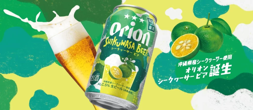
A green Orion Shikuwasa Beer can takes center stage in this advertisement, flanked by a foam crowned glass and fresh shikuwasa citrus against a painterly green backdrop. Floating Japanese copy celebrates the Okinawan citrus used in this specially selected draft beer.
The visual strategy here relies on a high-contrast palette that bridges the gap between traditional beer aesthetics and tropical fruit flavors. By utilizing a matte, almost chalk-like texture for the backdrop, the design creates a tactile quality that contrasts sharply with the metallic sheen of the can and the wet appearance of the citrus. This specific iteration stands out due to its integration of Japanese typography with English branding, creating a layered informational hierarchy that guides the eye from the product name to the specific flavor profile and alcohol content details at the base.
Brand strategists analyzing regional beverage markets would find this layout useful for studying how color psychology is applied to niche fruit-flavored alcoholic drinks. Packaging engineers could examine the interplay between the printed graphic elements and the physical form factor of the 500ml aluminum container to understand label placement optimization. Furthermore, illustrators looking to replicate organic, hand-drawn backgrounds for commercial advertising might study the layering techniques used to create depth without relying on photographic realism.