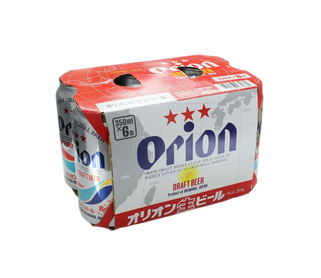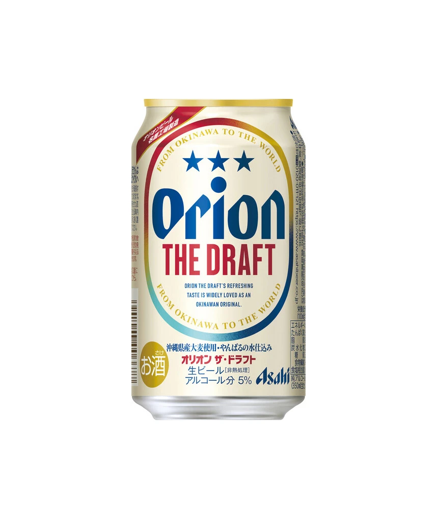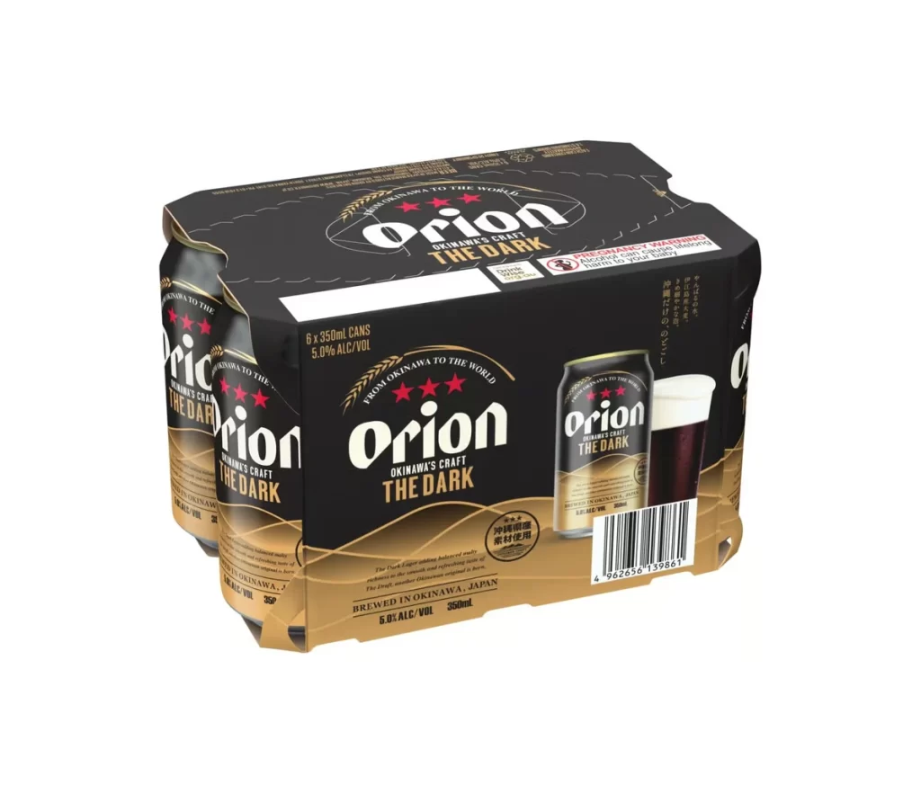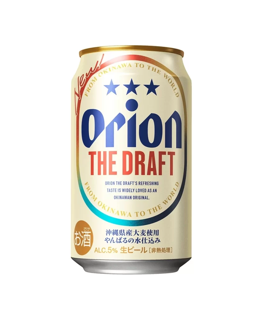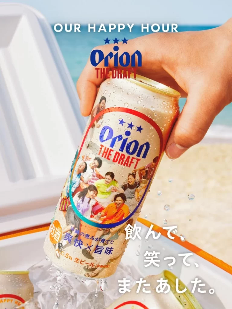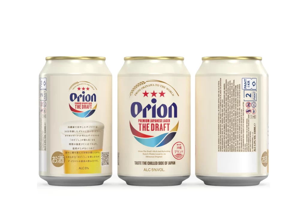
Orion The Draft Beer Cans Front and Back
Topics
Details
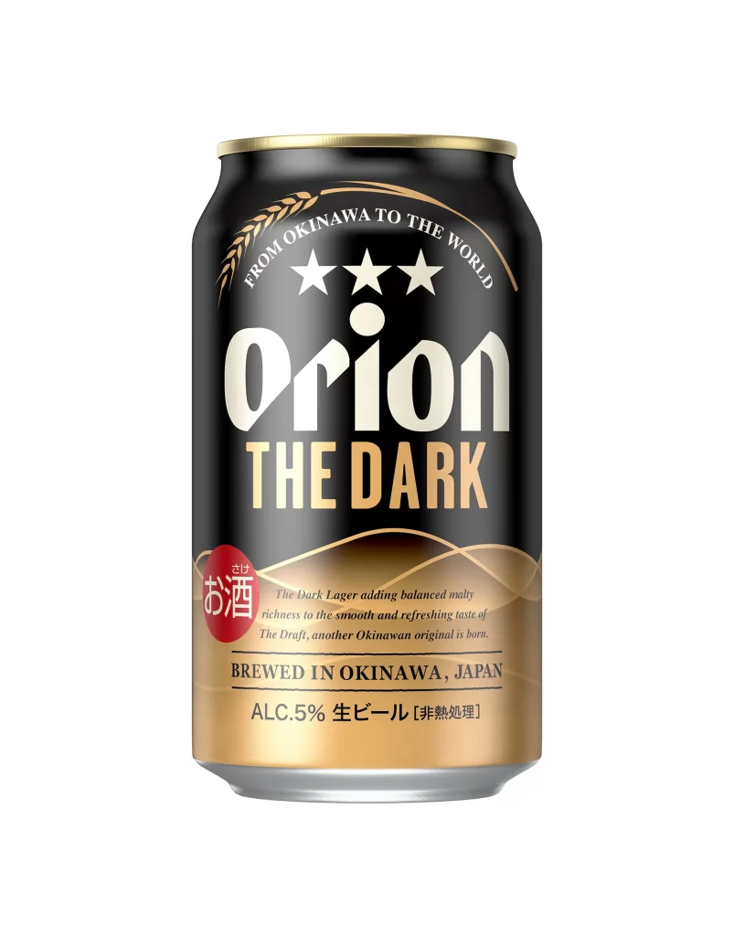
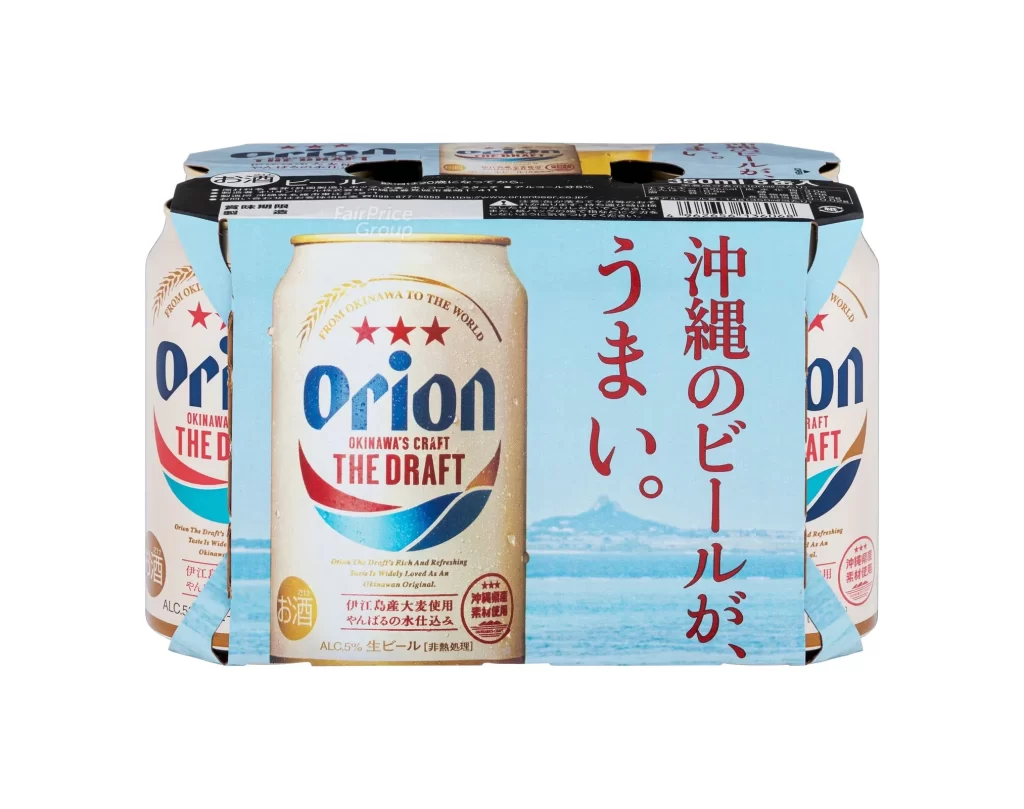
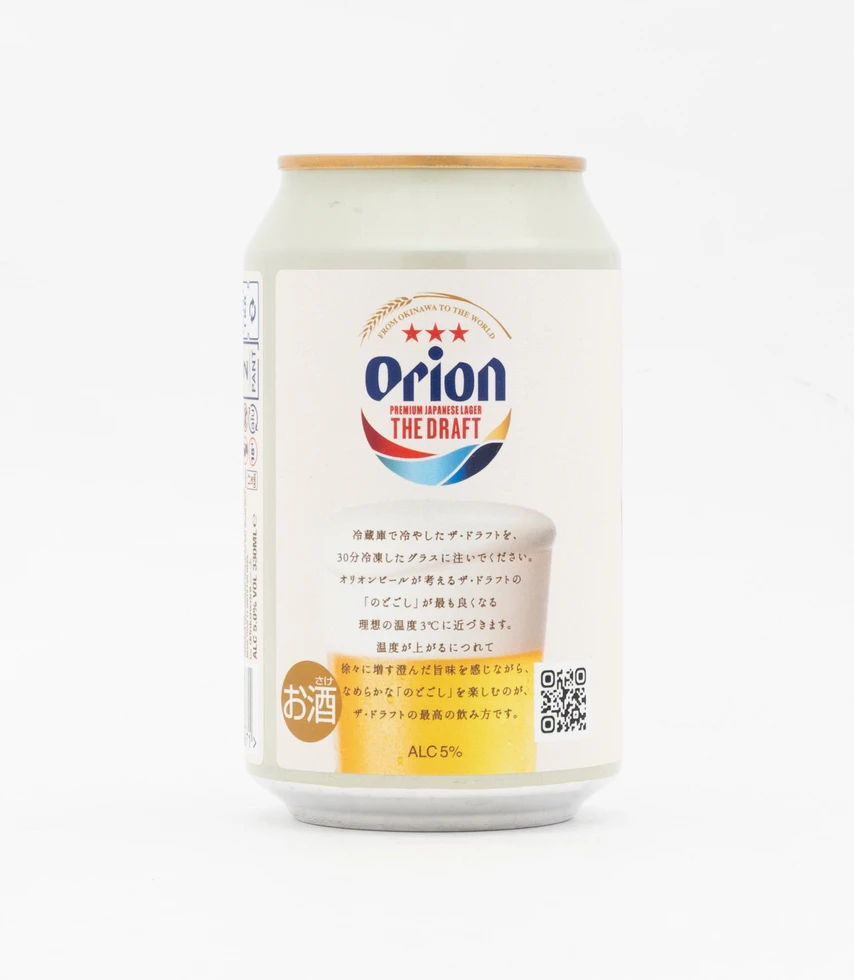
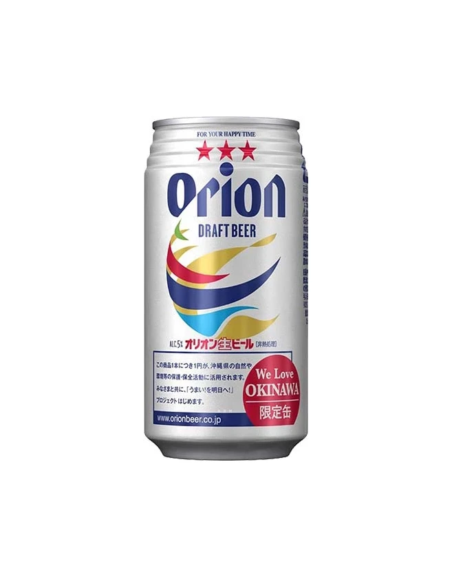
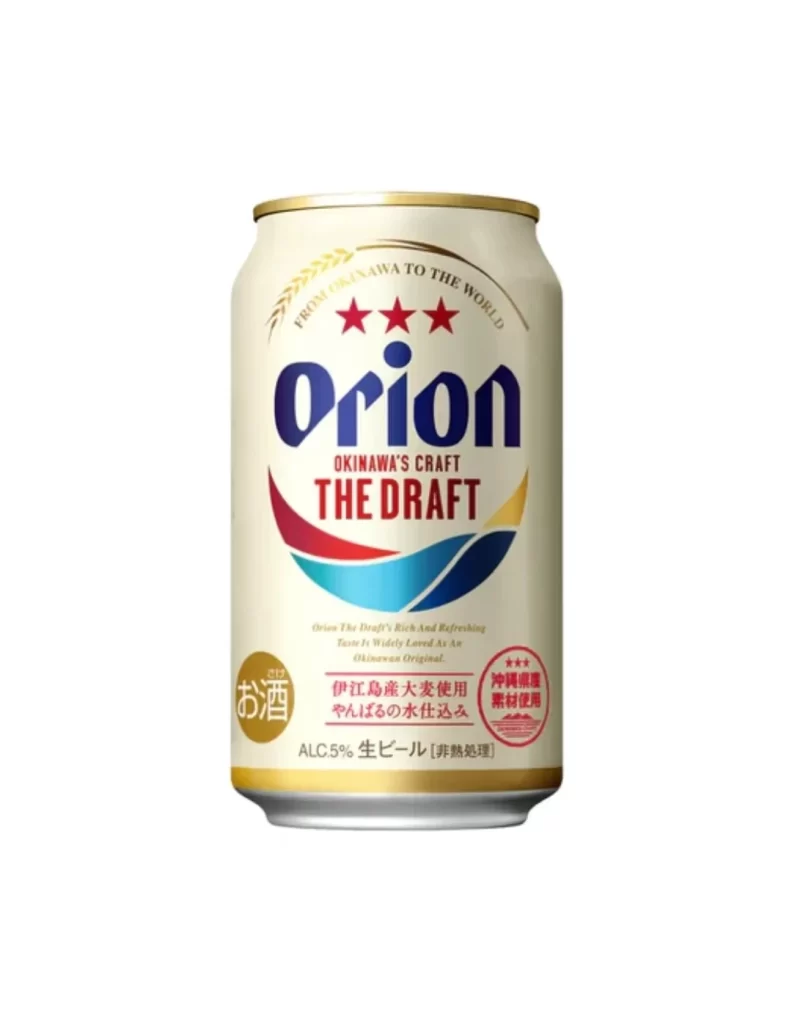
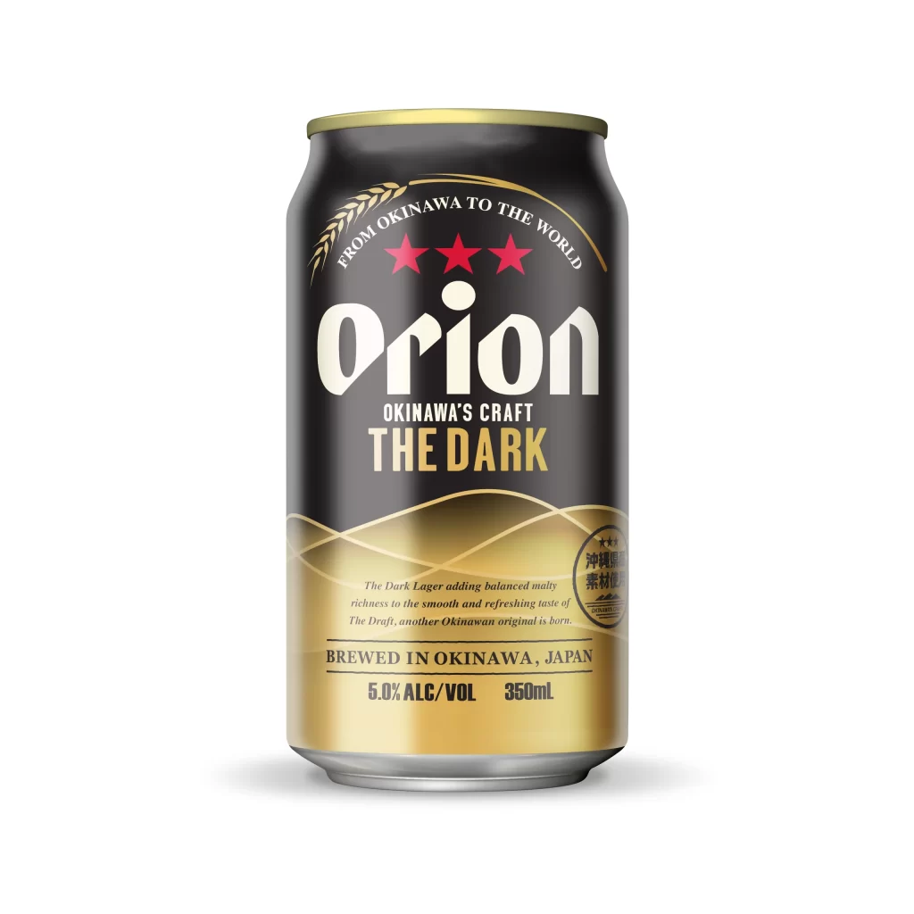
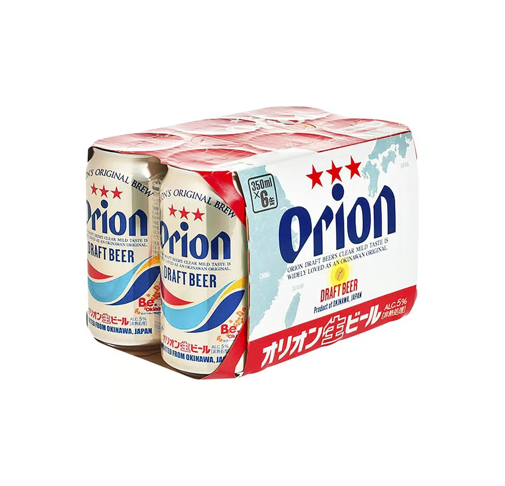
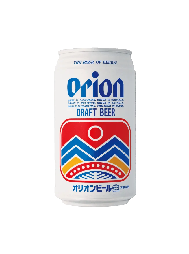
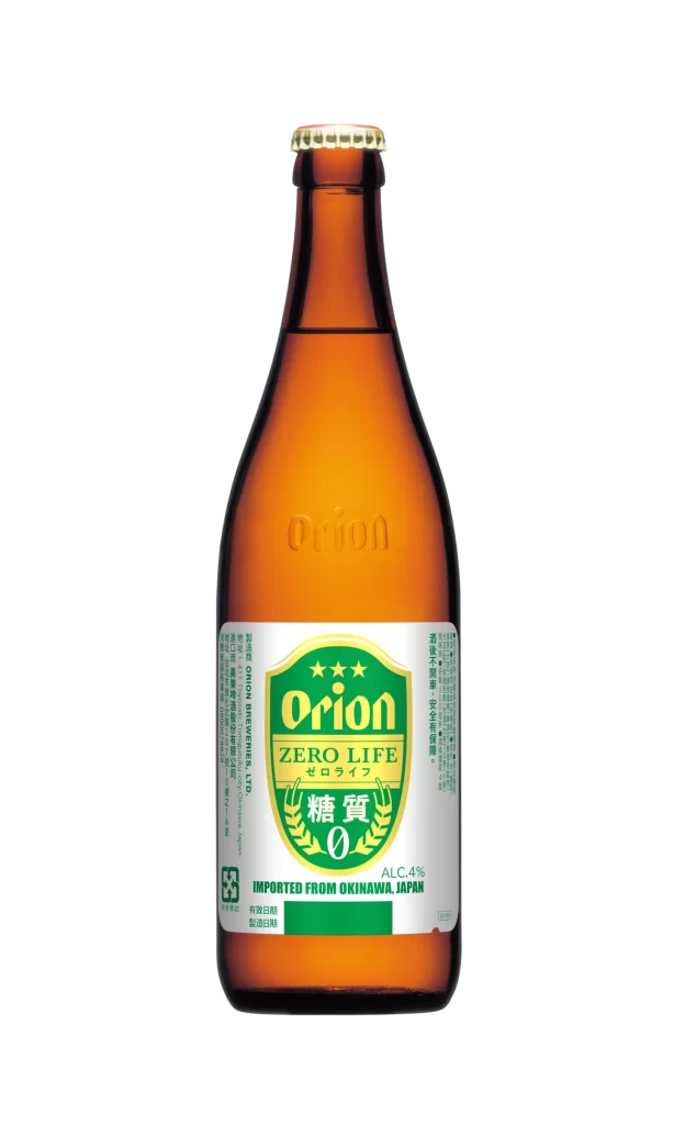
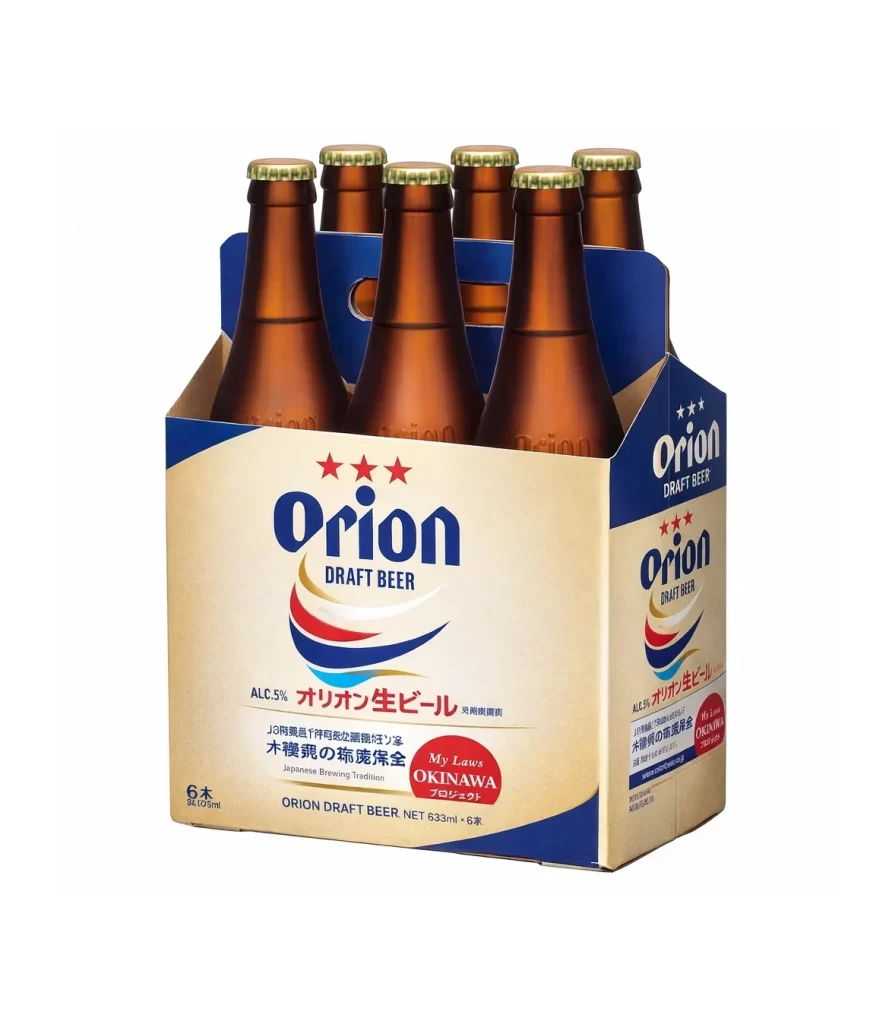
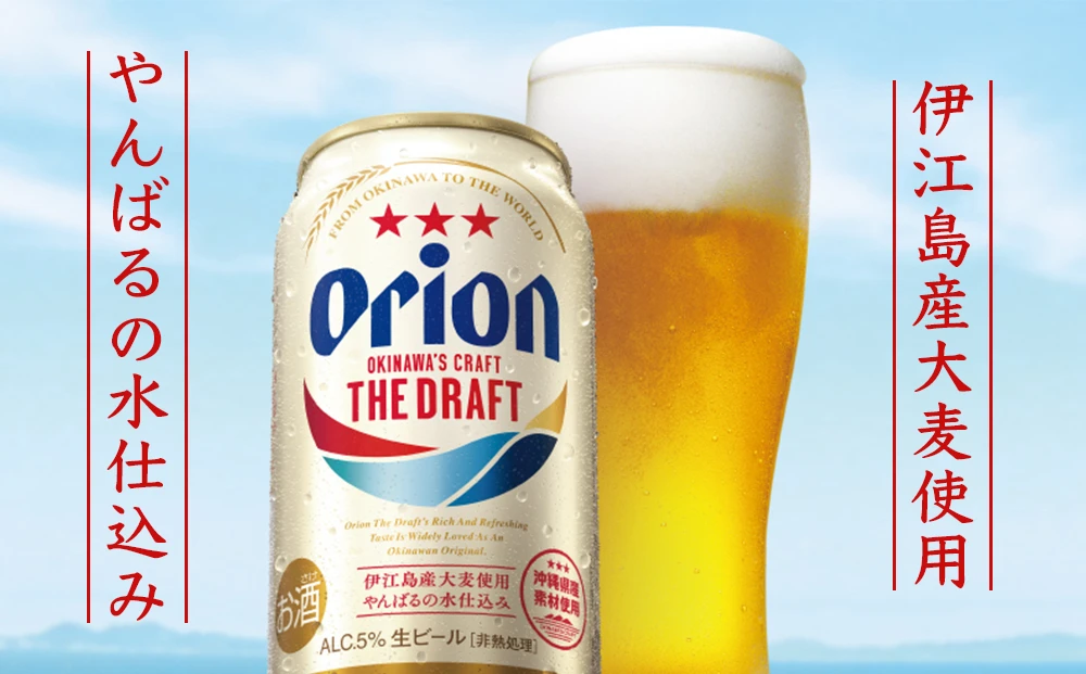
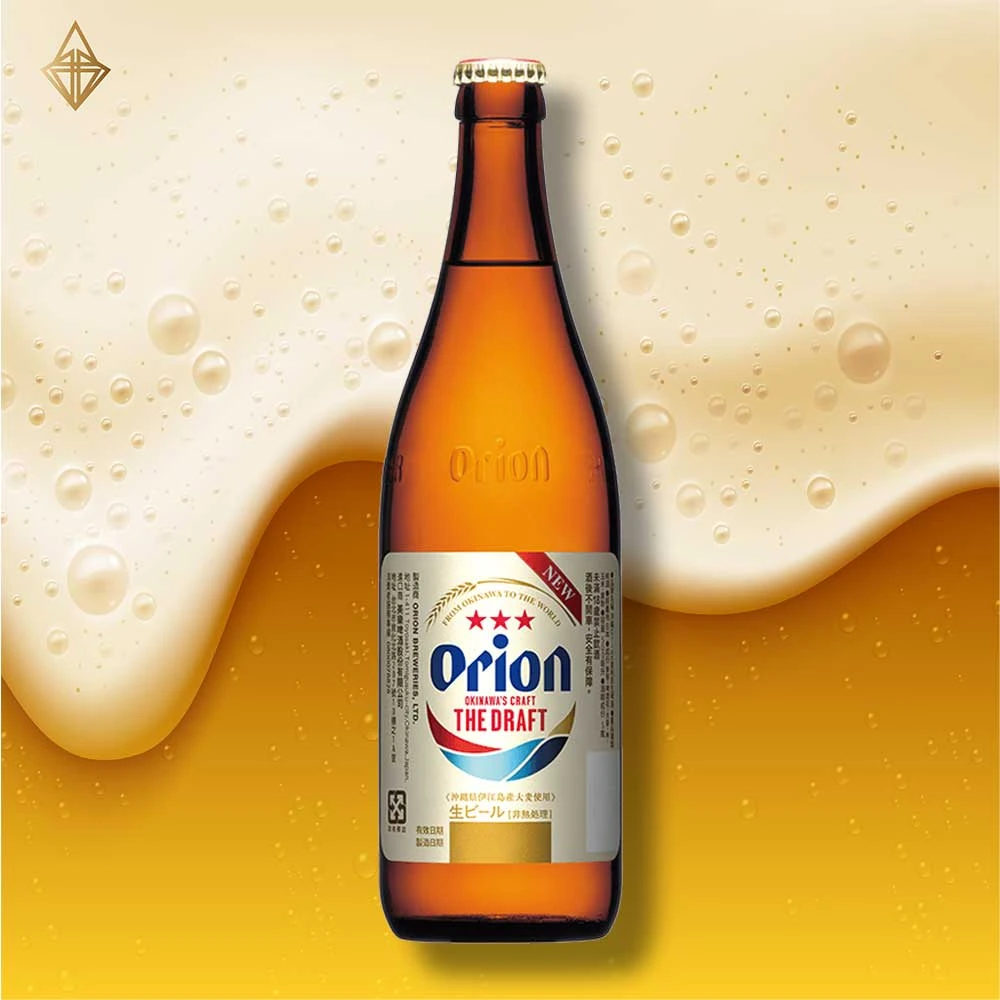
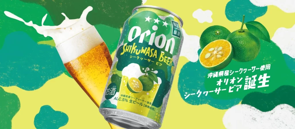
Three aluminum beverage cans are arranged in a horizontal row against a seamless white background, illuminated by soft, even studio lighting that eliminates harsh shadows. The central can displays the primary branding, featuring a cream-colored body with the word 'Orion' in bold navy blue serif lettering, flanked by three red stars and the tagline 'Premium Japanese Lager The Draft.' A curved graphic element sweeps beneath the text in red, white, and blue gradients, while the top rim of each container shows a metallic gold finish. The left can reveals Japanese product descriptions and a QR code over a yellow gradient, whereas the right side presents dense nutritional information and recycling symbols in small black type.
Visual distinction emerges from the sophisticated color palette combining cream, deep blue, and vibrant red accents that evoke both Japanese craftsmanship and tropical refreshment. The typographic hierarchy skillfully balances English and Japanese scripts, with the circular badge containing 'From Okinawa to the World' adding an artisanal seal of origin. Notably, the wave-like swoosh beneath the brand name creates dynamic movement across the otherwise static cylindrical form, while the consistent placement of the 5% alcohol volume indicator anchors the composition at the bottom center.
Brand strategists examining regional beverage packaging trends would analyze this layout for its effective use of bilingual labeling and cultural signifiers. Packaging engineers might reference the specific spatial arrangement of regulatory text versus marketing copy when planning similar aluminum container designs. Marketing teams could study how the 'chilled side of Japan' positioning statement integrates with visual elements to communicate temperature and provenance simultaneously.