Orion Draft Beer Six Pack Bottles
Topics
Details
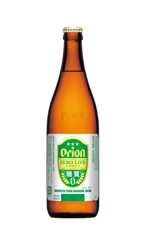
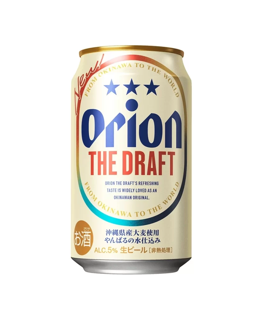
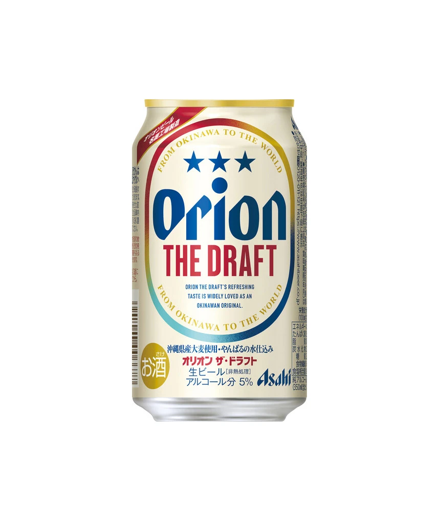
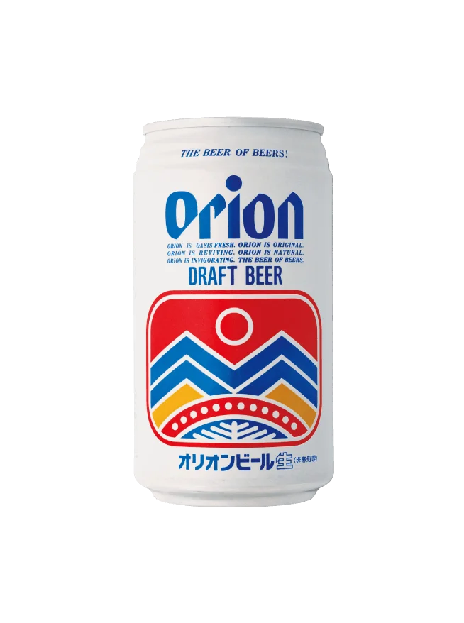
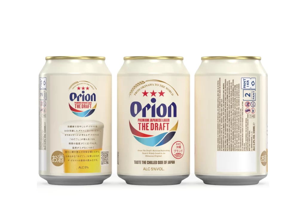
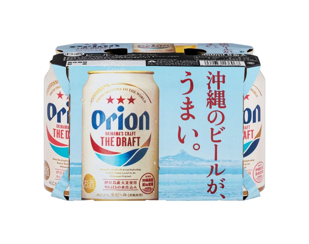
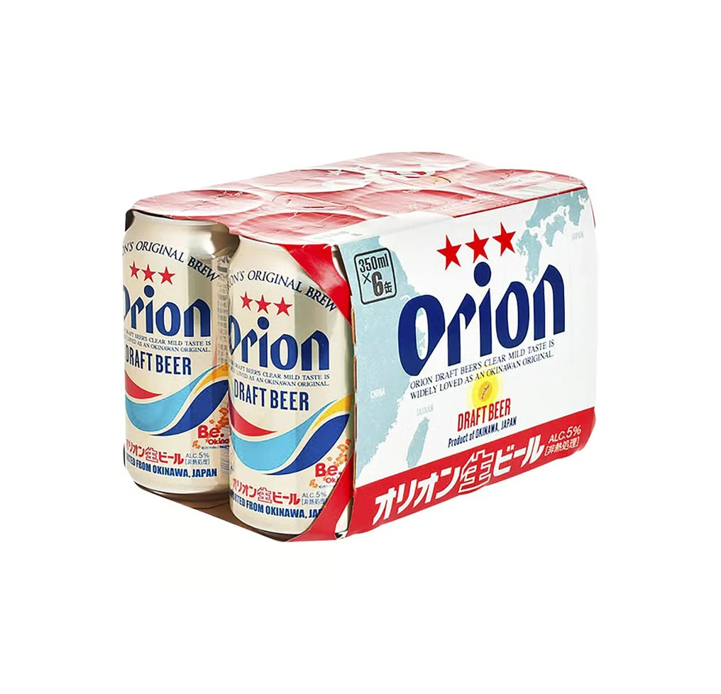
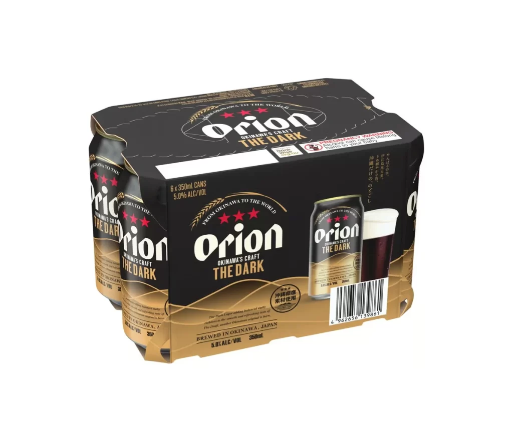
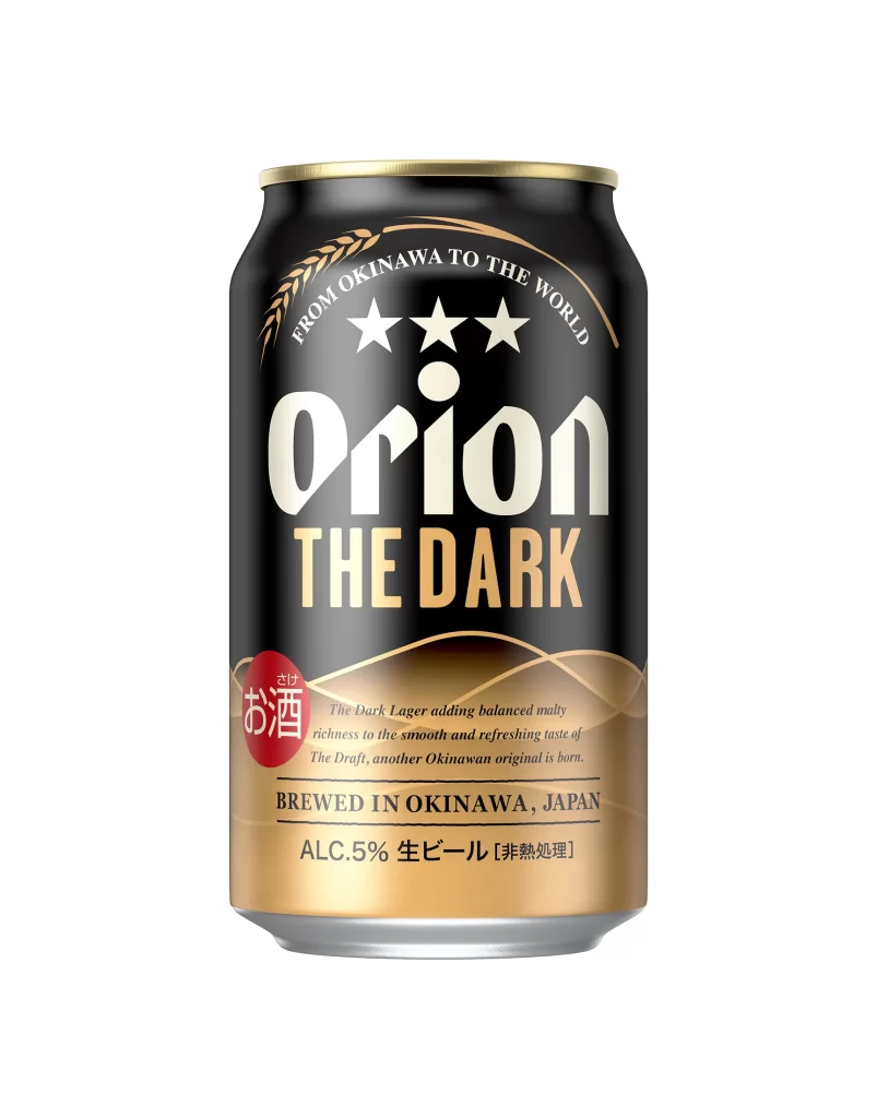
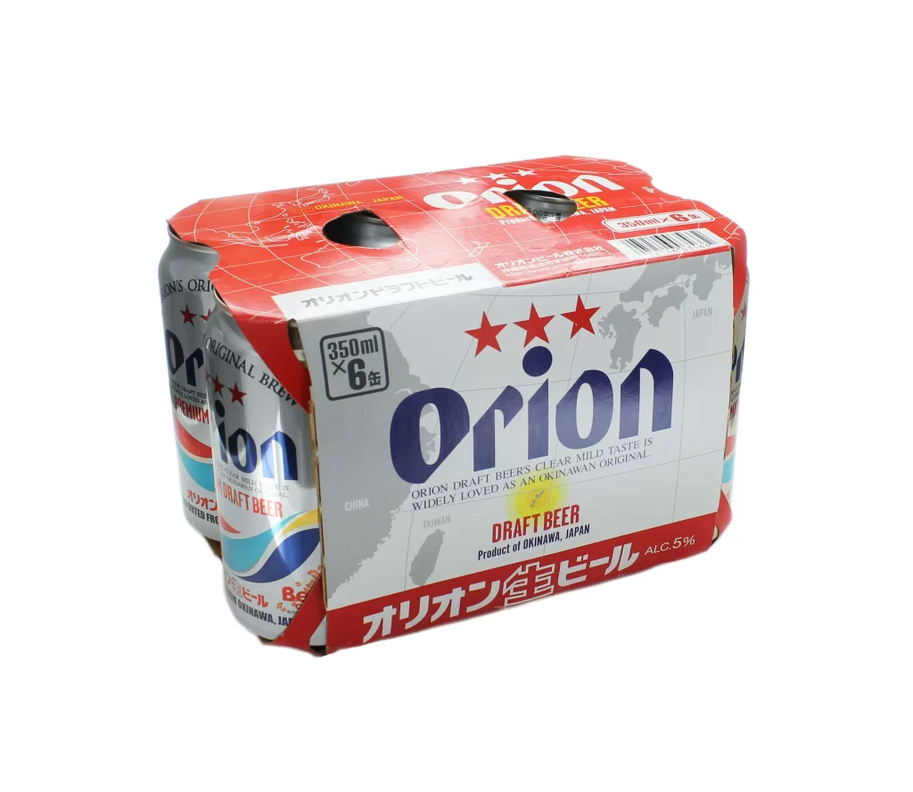
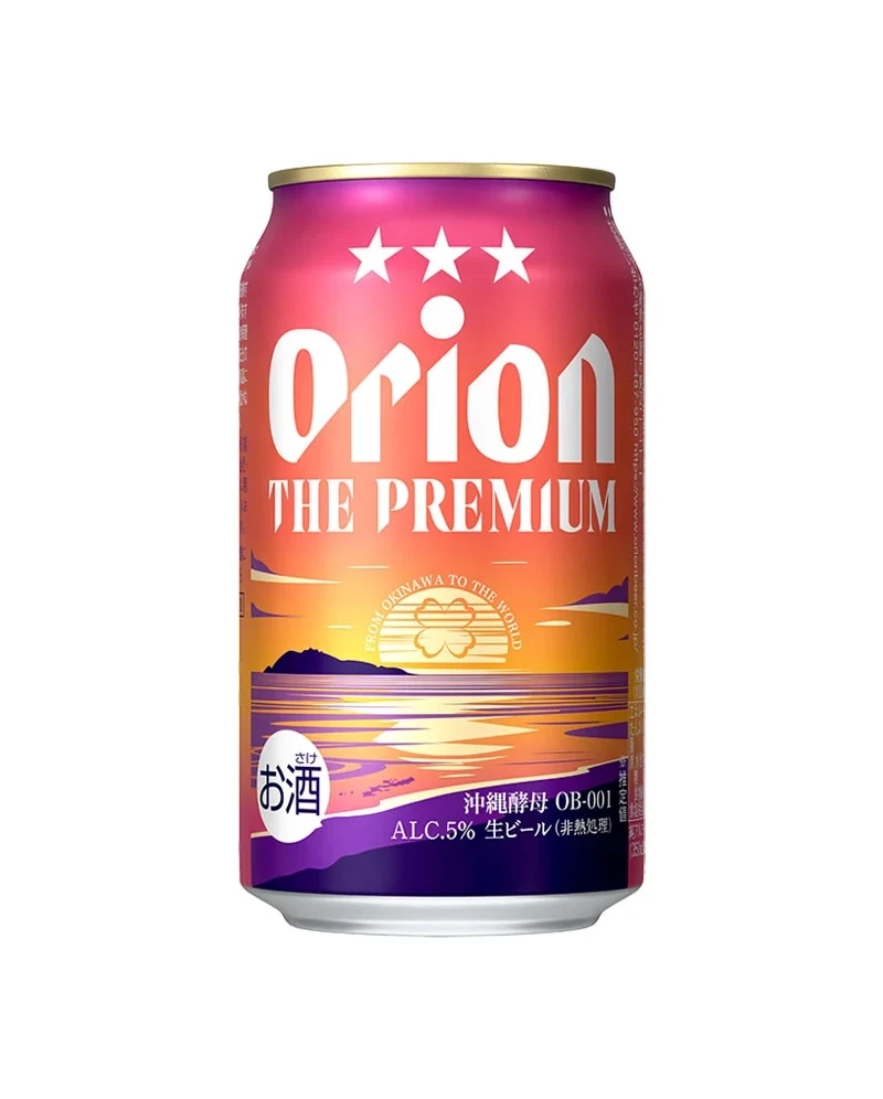
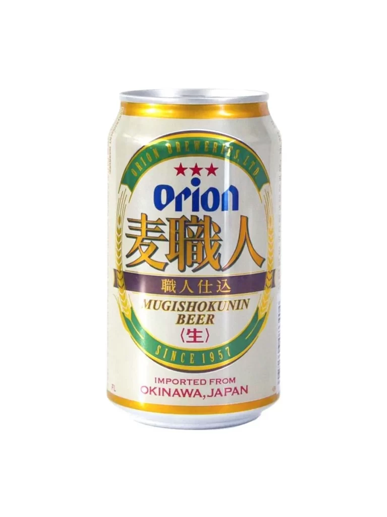
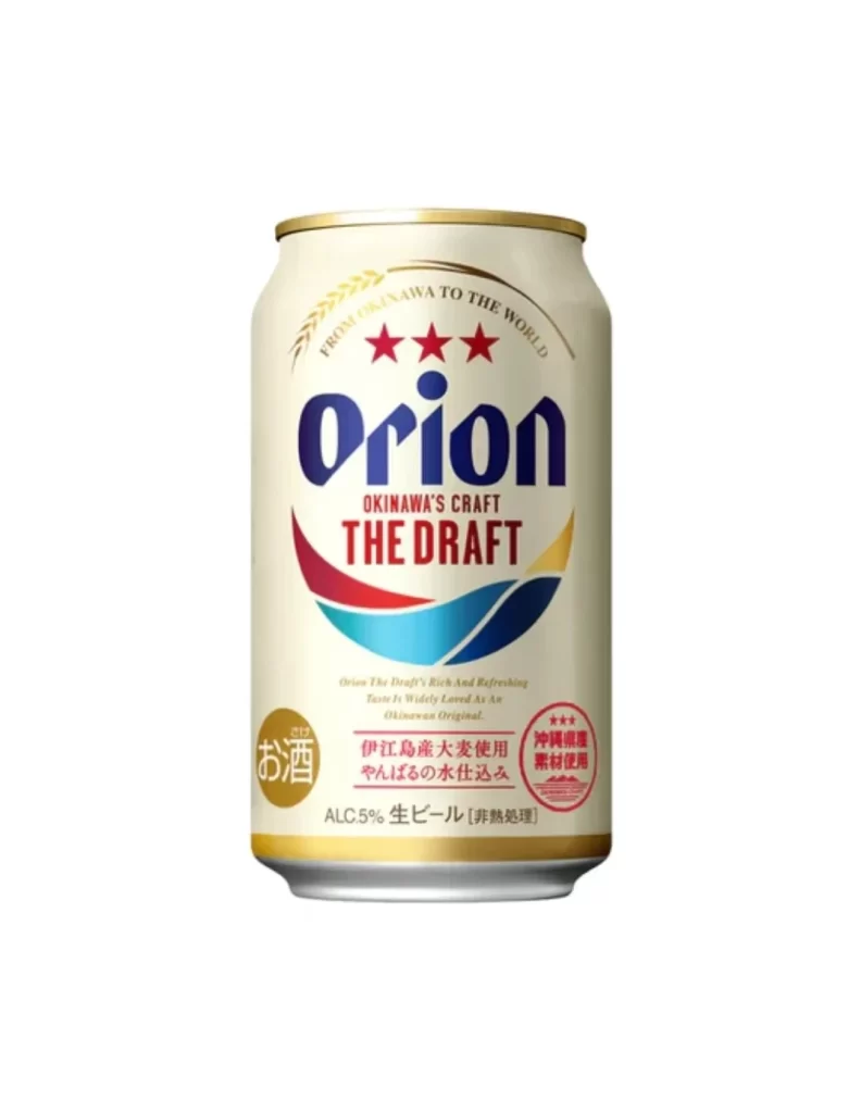
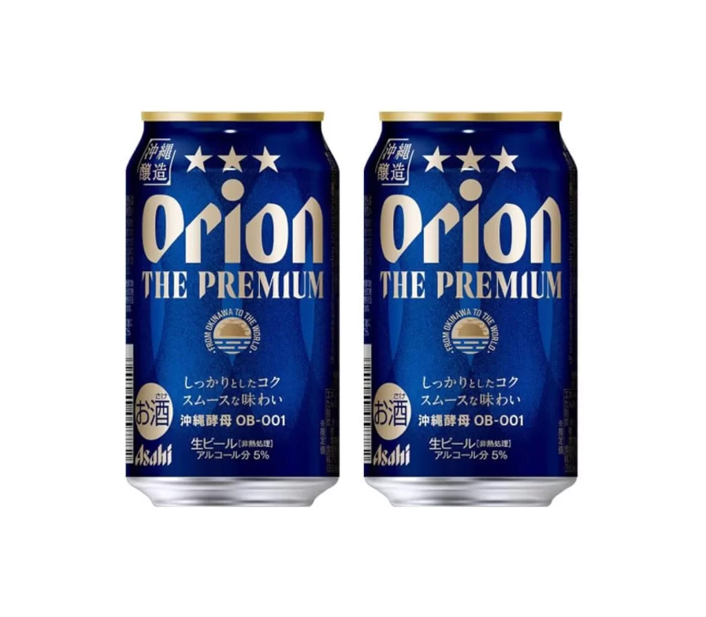
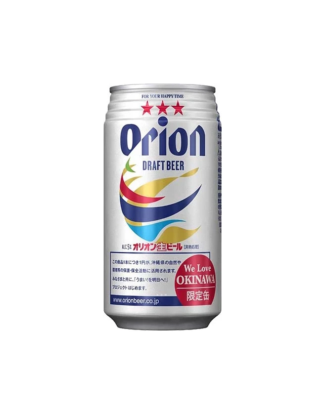
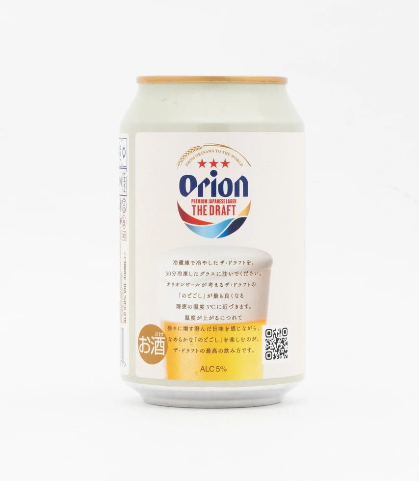
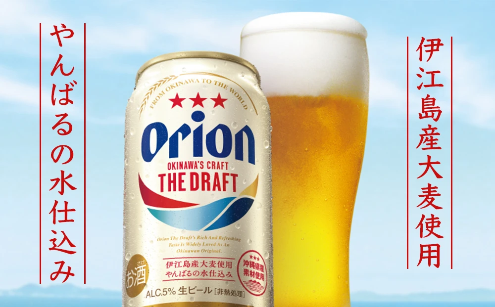
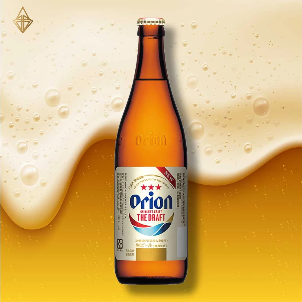
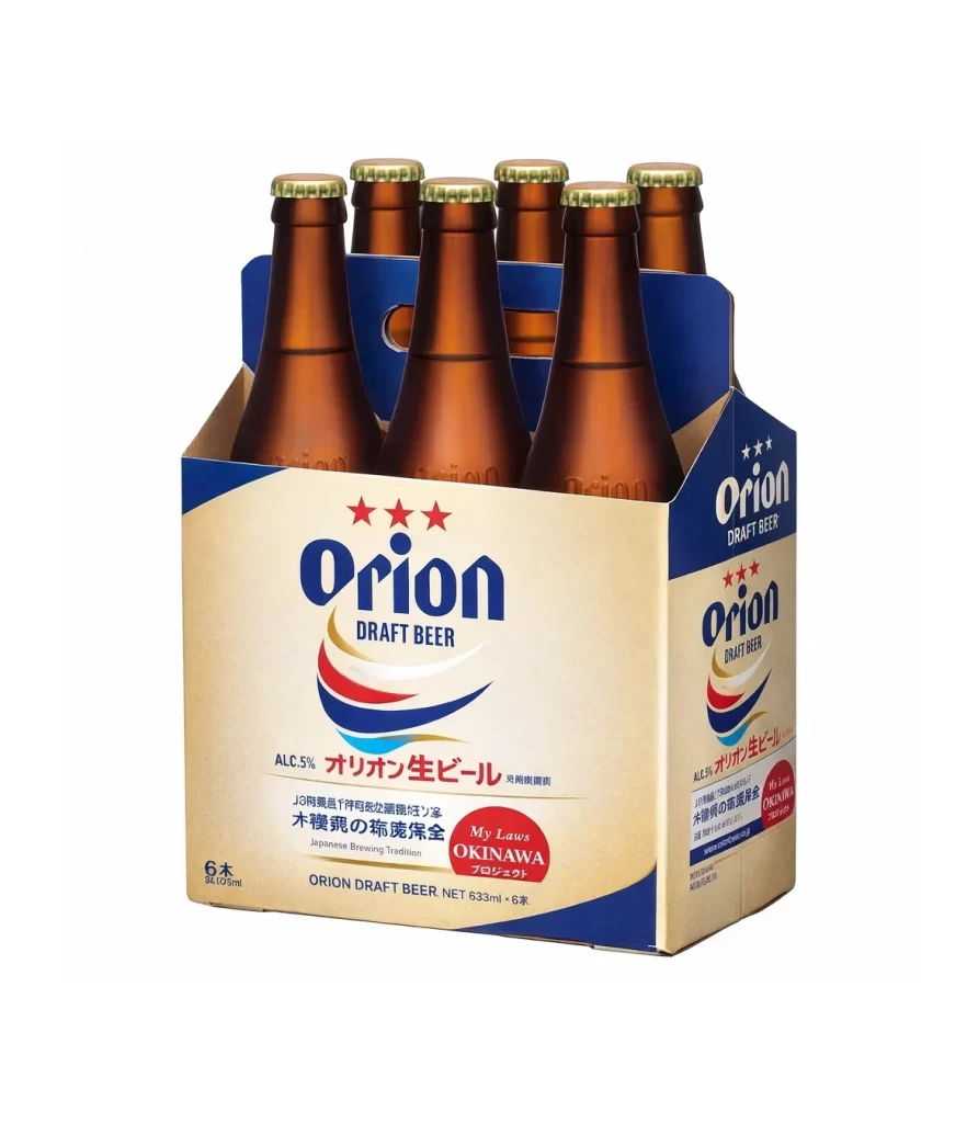
A six-pack of Orion Draft Beer presents a direct, frontal view that reveals the packaging's cream-colored main panel bordered by deep navy blue. The brand name 'Orion' appears in a bold, dark blue serif font above three red stars, with Japanese characters specifying the alcohol content and brewing tradition visible beneath the English text on the white background.
Visual interest in this specific packaging lies in the dynamic, wave-like swoosh of red, white, and blue that underlines the brand name, subtly evoking oceanic themes associated with the Okinawa region. The typographic hierarchy is carefully managed, balancing the heavy weight of the primary logo with the finer print of the regulatory information and the playful, handwritten style of the regional badge. Furthermore, the contrast between the organic, curved lines of the graphic elements and the rigid, geometric structure of the cardboard carrier creates a balanced aesthetic that feels both traditional and accessible.
Product photographers and 3D environment artists can utilize this reference to study how light interacts with translucent glass and matte cardboard textures simultaneously. Branding specialists might examine the layout to understand how to effectively integrate multiple languages and regional identifiers into a cohesive label design without causing visual clutter. Additionally, packaging engineers could analyze the structural folds and handle cutouts of the carrier to inform their own designs for similar beverage multipacks.