Orion Zero Life Beer Bottle
Topics
Details
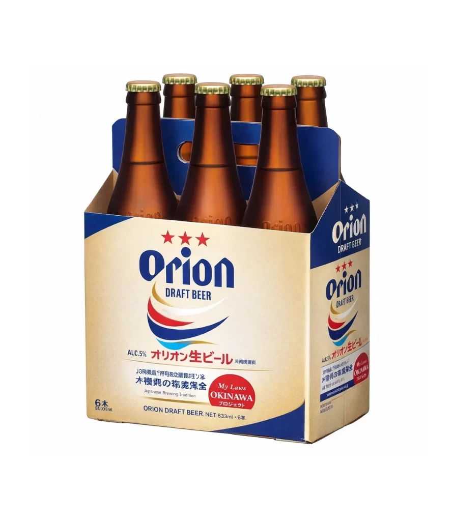
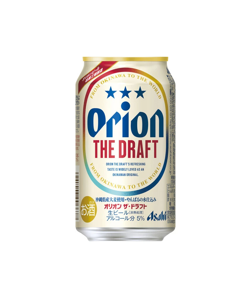
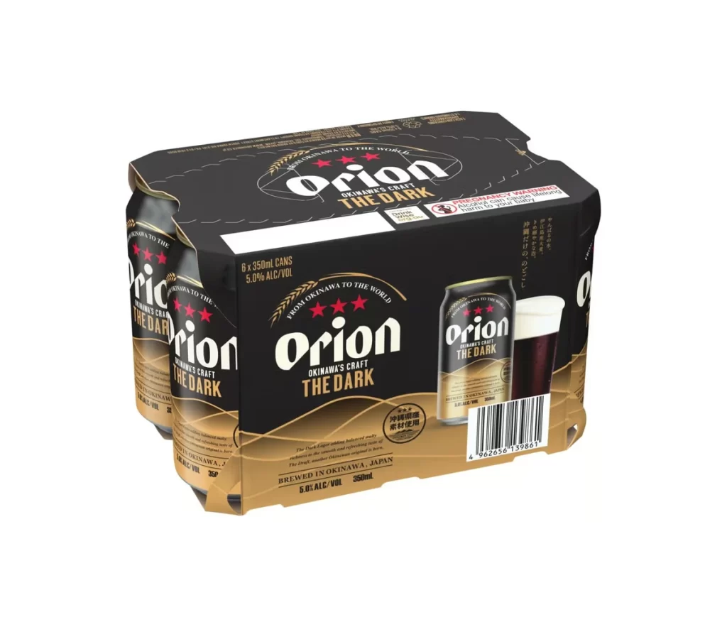
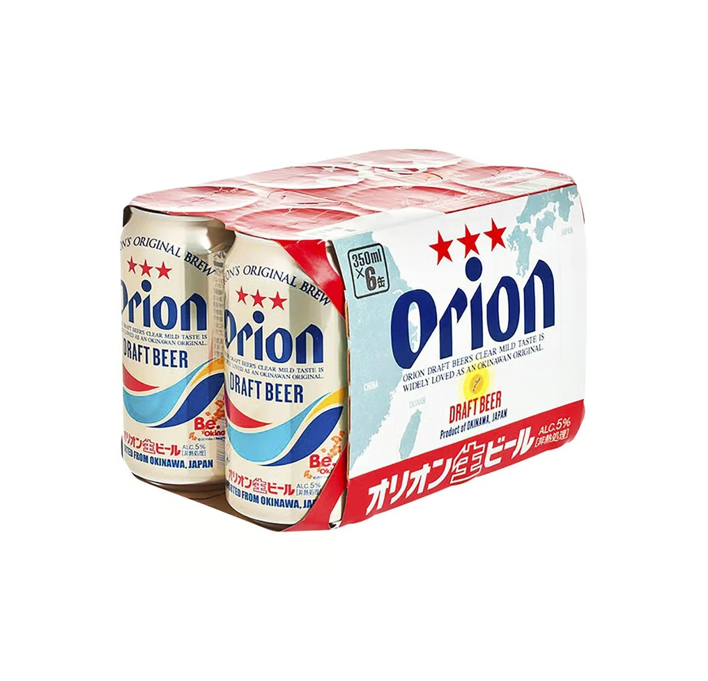
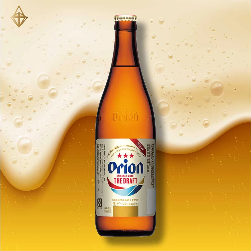
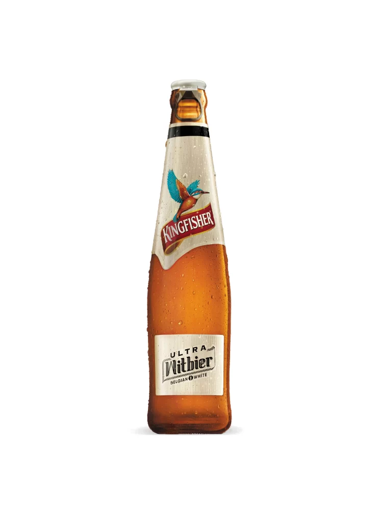
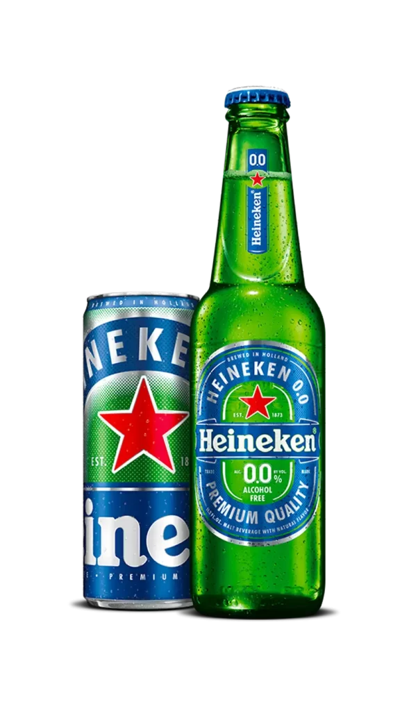
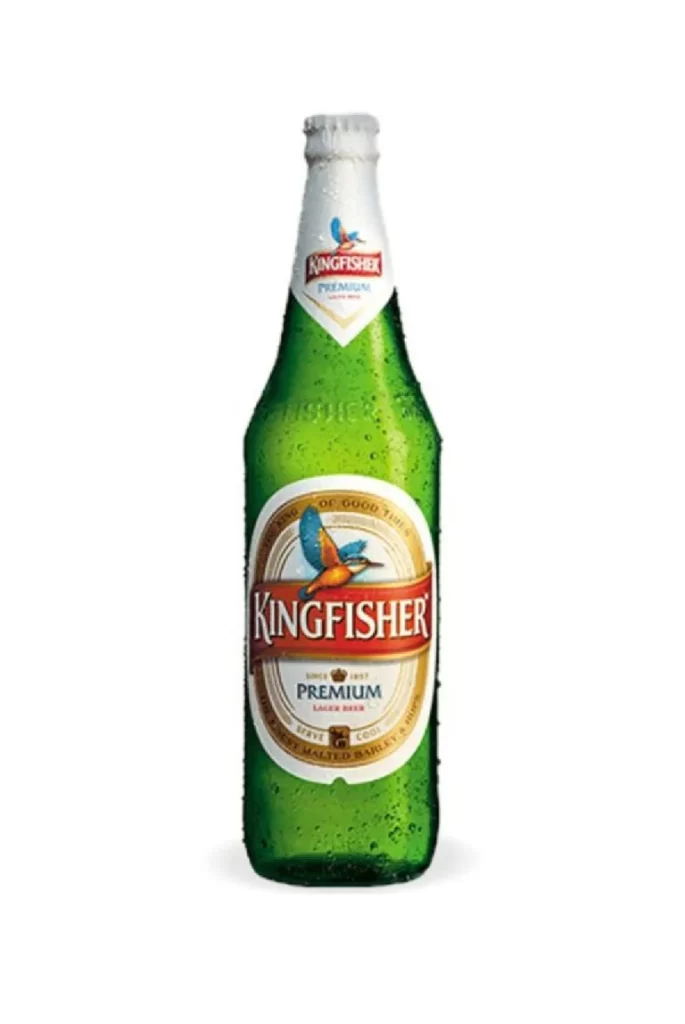
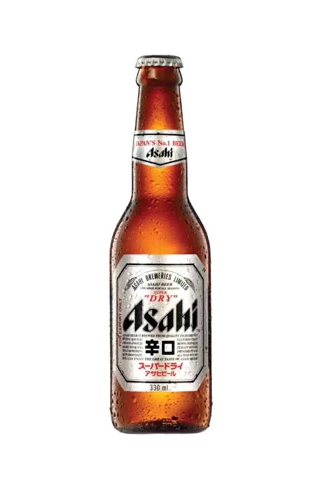
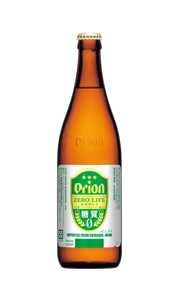
A brown glass beer bottle stands in a direct frontal view, its amber translucency illuminated by even, shadowless studio lighting. The vessel features a gold-capped crown closure and bears a subtle, embossed ‘Orion’ logo on its upper shoulder, while a rectangular label with a white ground dominates the visual field against a white background.
Visual distinction arises from the label’s structured heraldic layout, which employs a strict palette of forest green, metallic gold, and crisp white to signal a health-conscious product variant. The inclusion of Japanese kanji characters for sugar and zero, tanshitsu zero, framed by a laurel wreath motif, specifically targets the domestic market’s preference for clear nutritional communication. This specific design iteration balances traditional brewery aesthetics with modern dietary labeling requirements through its clean typographic hierarchy and emblematic central graphic.
Packaging historians or brand identity analysts might utilize this visual record to study the evolution of zero-sugar beverage marketing within the Japanese brewing industry. Commercial illustrators requiring accurate depictions of Okinawan export goods would find the precise color values and text placement essential for technical mockups. Furthermore, researchers documenting regional alcohol regulations could reference the specific tax and import information printed vertically along the label’s lateral margins.