Orion The Draft Beer Six Pack Cans
Topics
Details
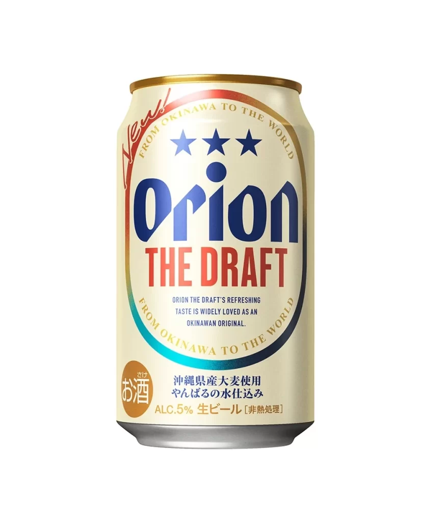
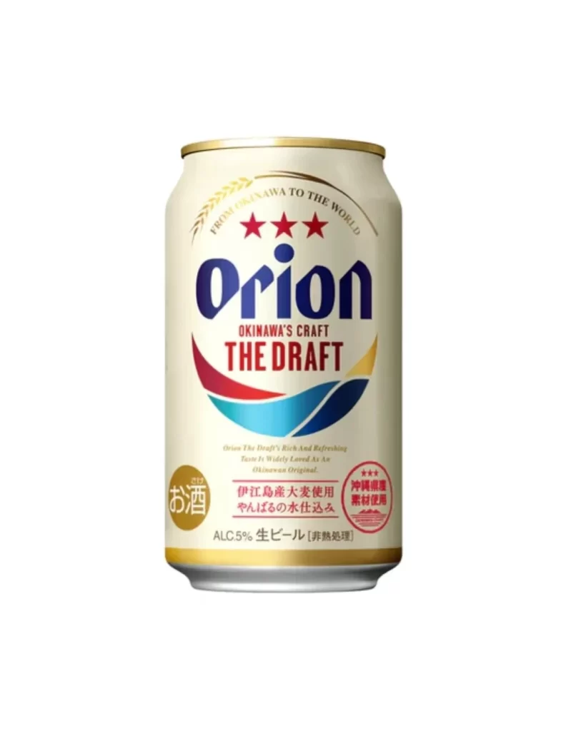
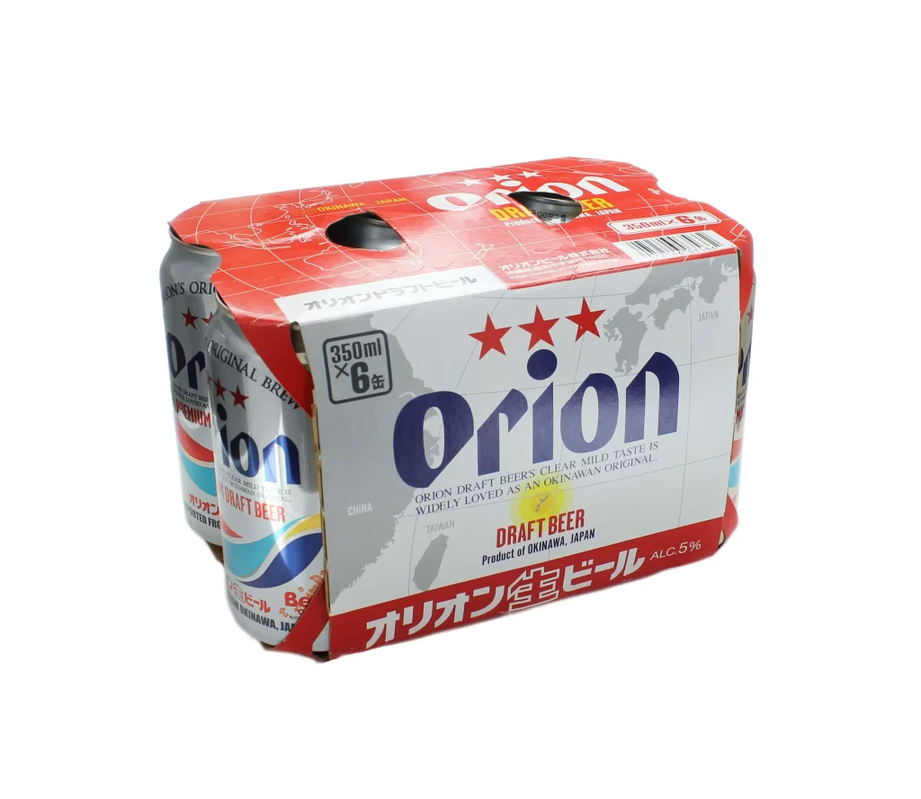
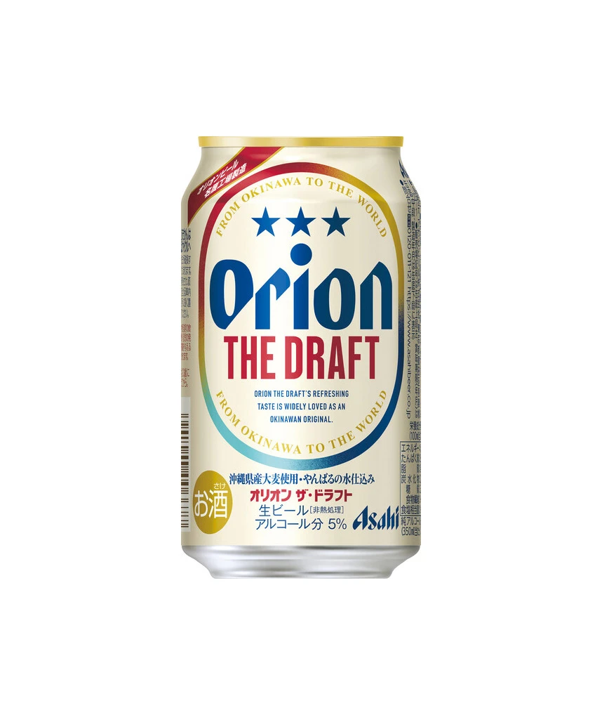
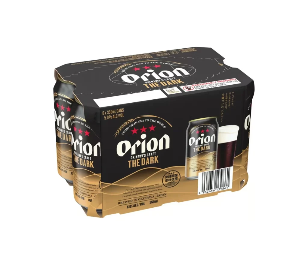
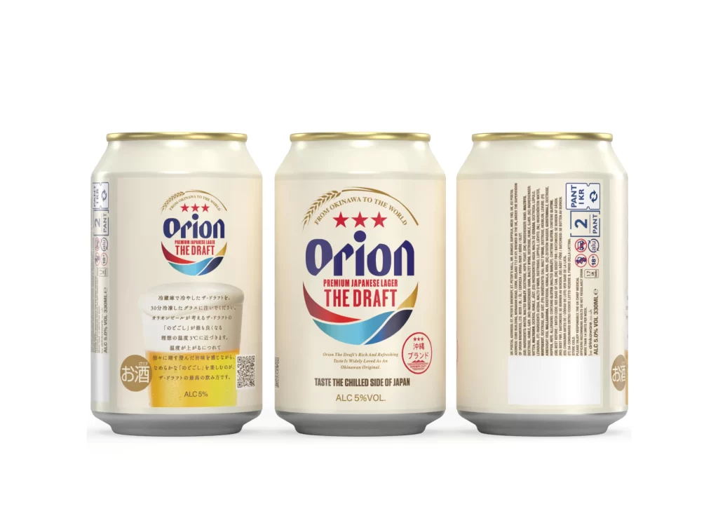
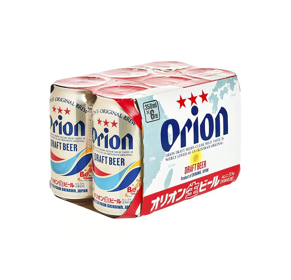
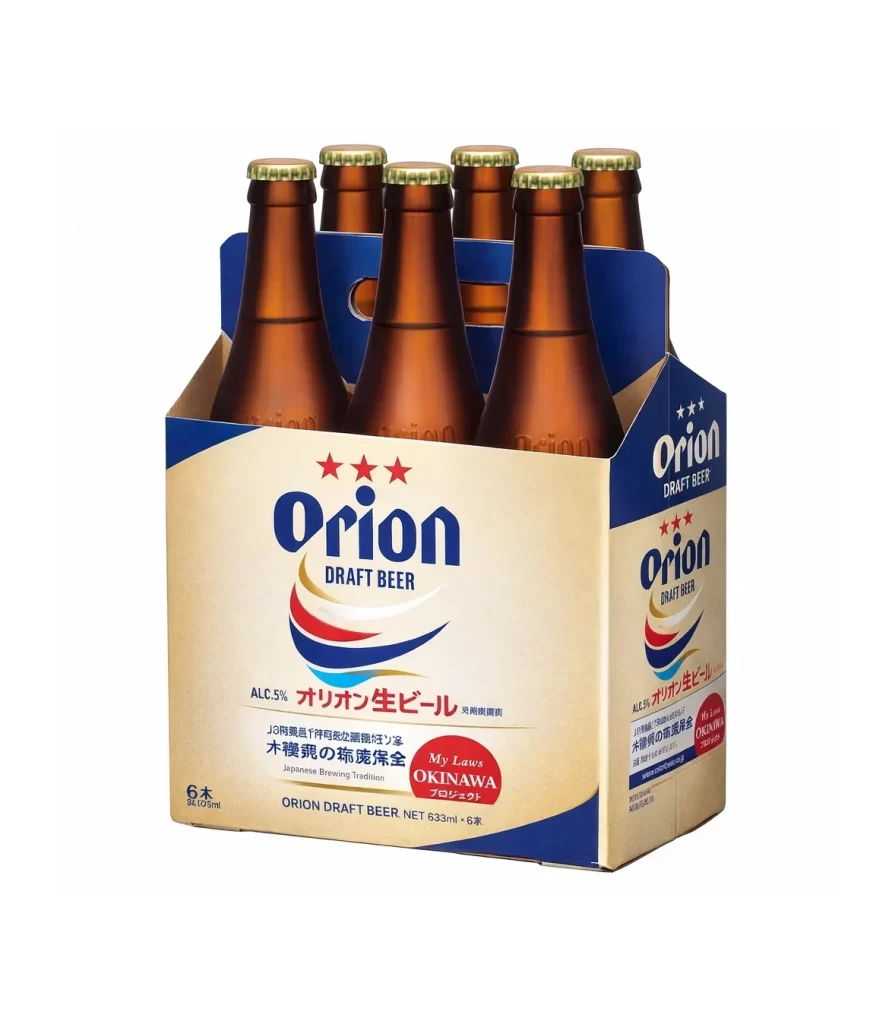
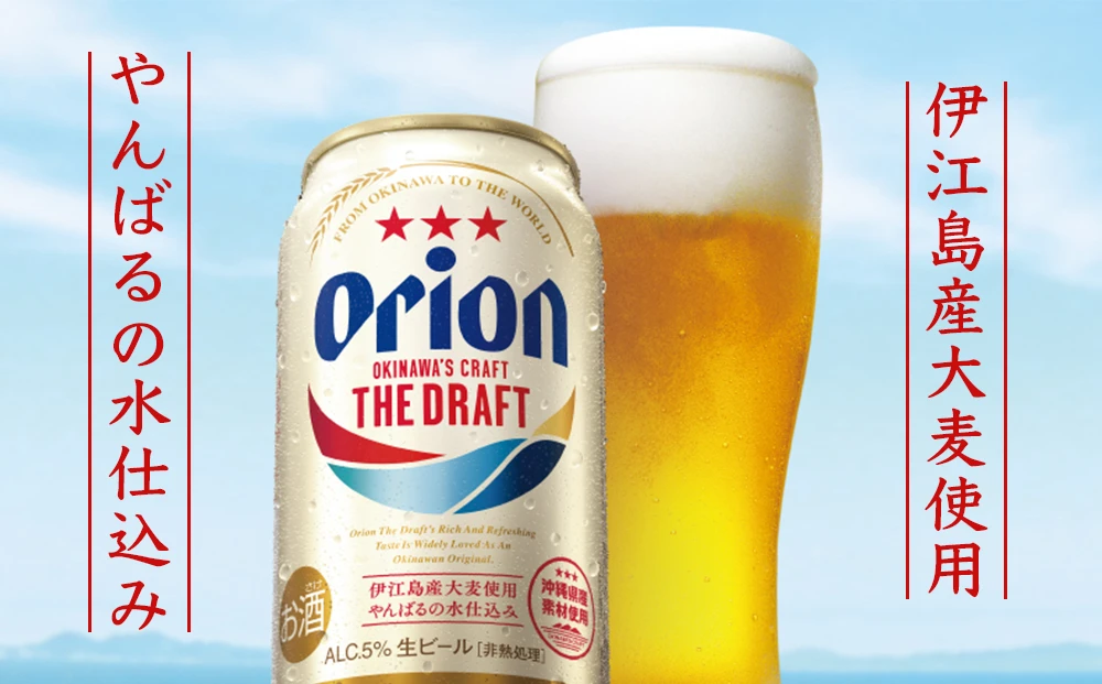
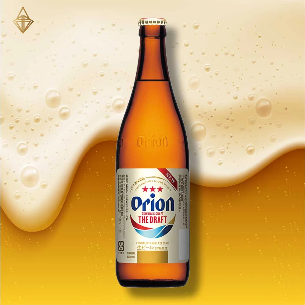
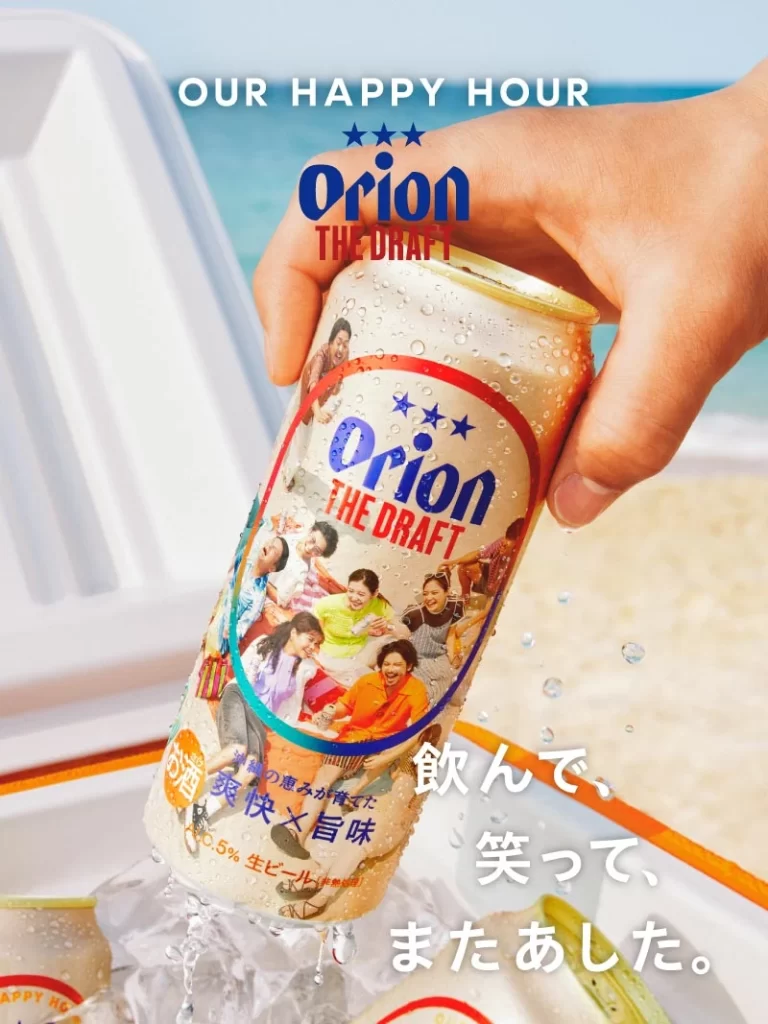
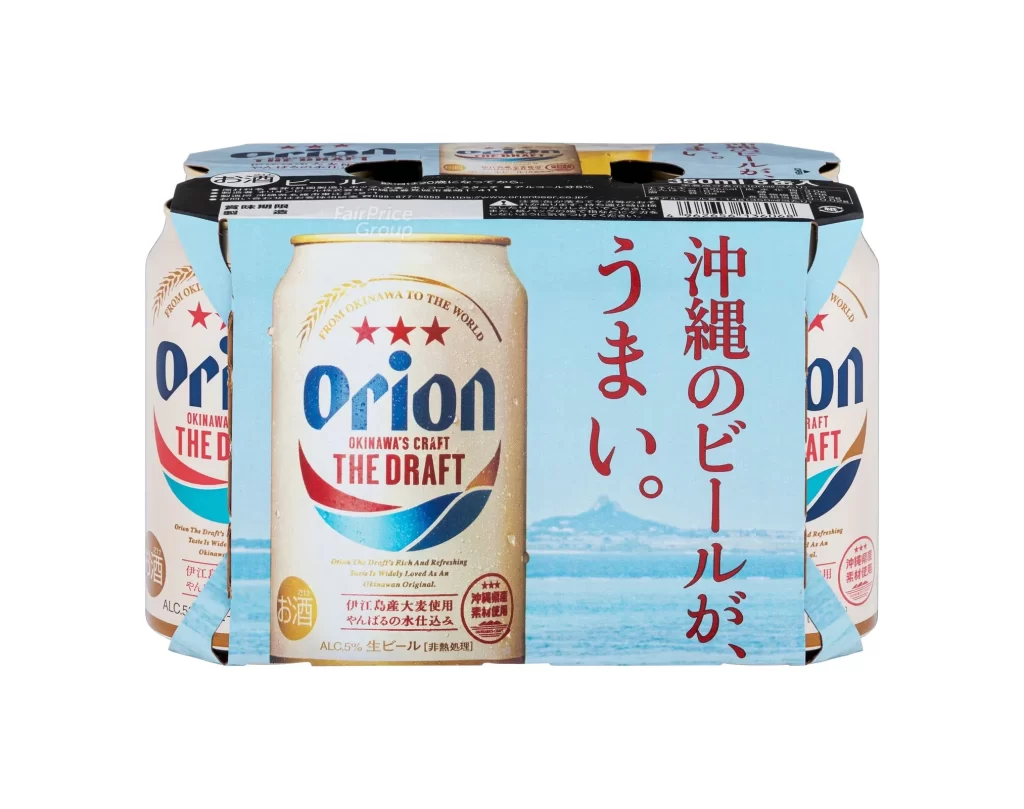
A six-pack of Orion The Draft beer sits on a white surface, bound by a light blue cardboard carrier that features vertical red Japanese text meaning Okinawa beer at its delicious best alongside a faint mountain graphic. The central can displays a cream-colored aluminum body with the brand’s blue ‘Orion’ typography and a red-and-blue wave motif sweeping across the lower half, while two partially visible cans flank it on either side.
Visual interest is driven by the contrast between the metallic sheen of the cans and the matte finish of the surrounding packaging. The inclusion of three red stars above the logo adds a premium touch to the otherwise minimalist label design. Furthermore, the integration of English text with bold, calligraphic Japanese script on the carrier creates a layered cultural identity that distinguishes this regional craft beer from standard international brands.
Product photographers might utilize this composition to study the effective use of negative space in beverage marketing. Branding specialists could analyze the specific color palette to understand how tropical imagery is conveyed through cool tones rather than typical warm hues. Additionally, packaging engineers may examine the structural layout of the cardboard wrap to see how it balances product visibility with informational requirements.