iOS 7 Wallpaper Blue Aqua Gradient
Topics
Details
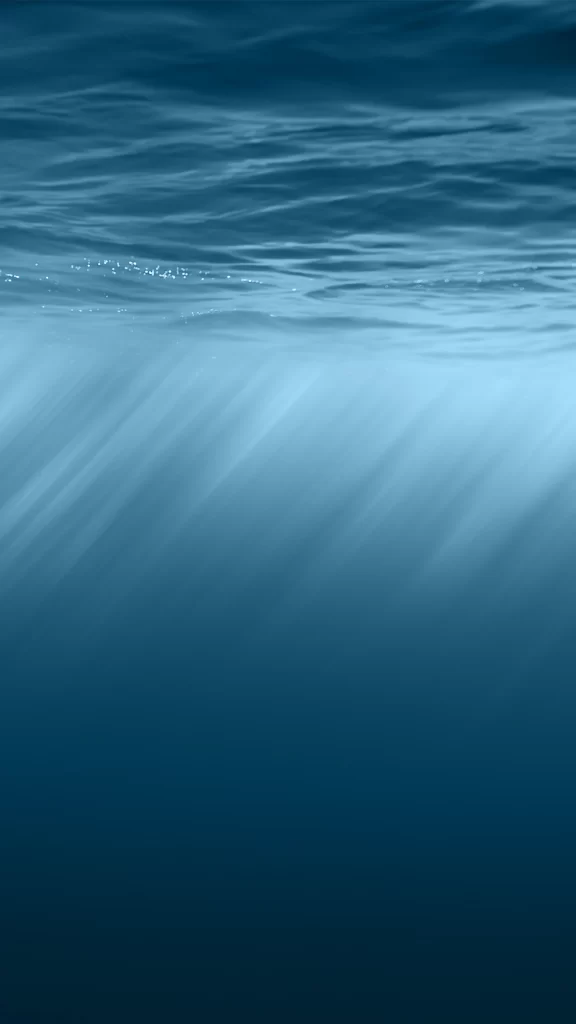
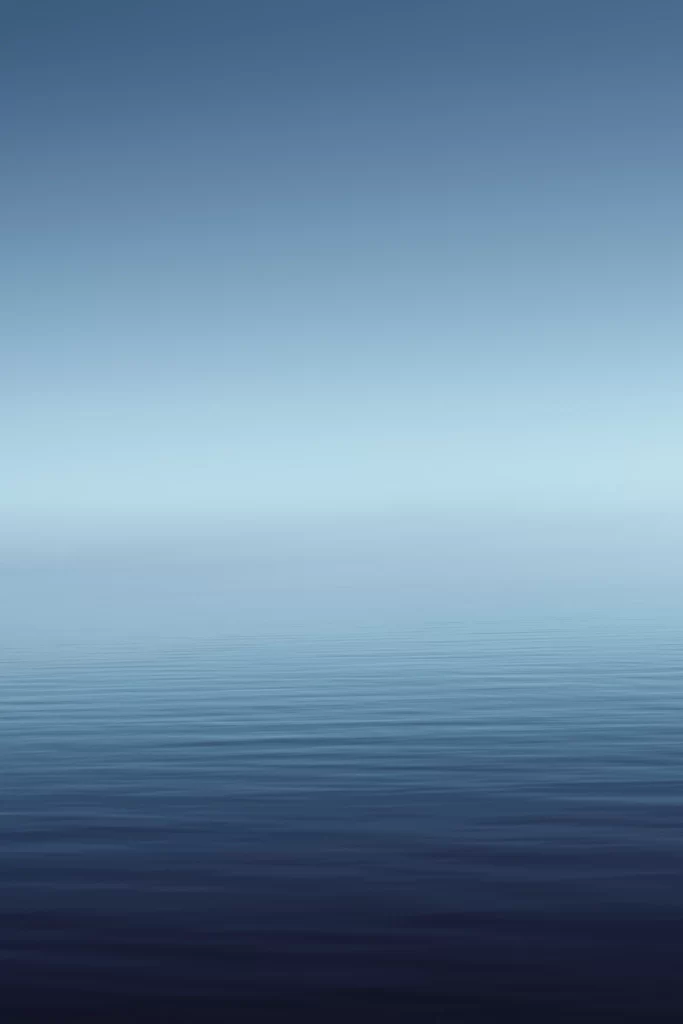
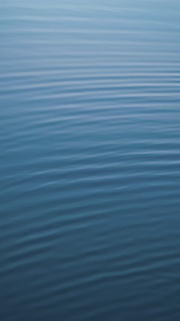
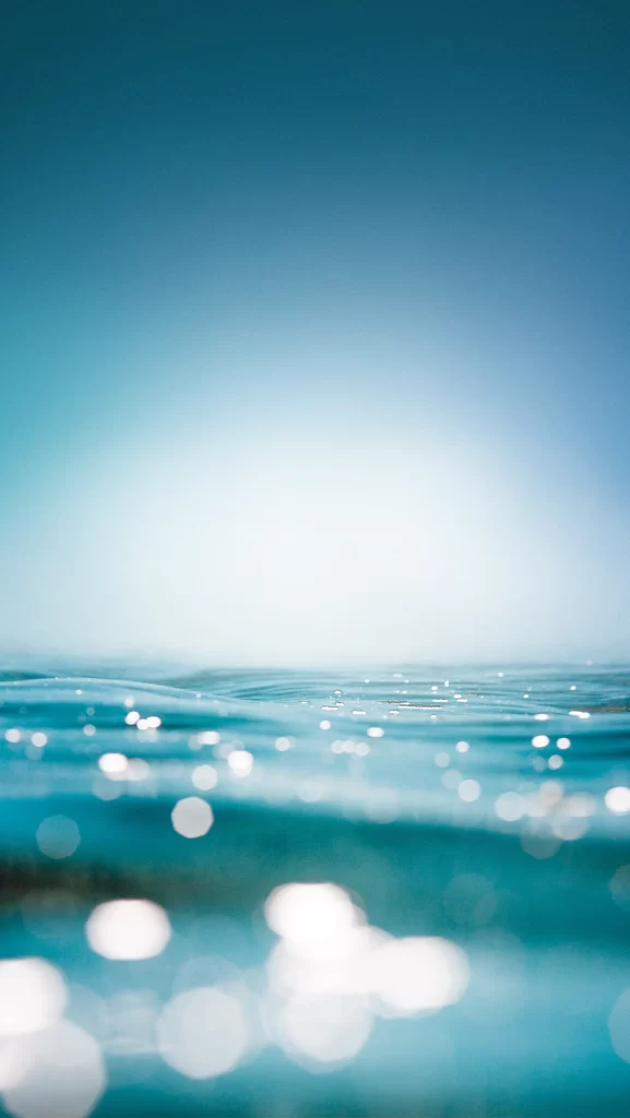
Cyan and deep azure tones dominate the vertical frame, transitioning from a saturated navy at the top to a luminous, almost white horizon line. Gentle undulations of water occupy the lower third, their surfaces catching light in soft, circular bokeh highlights that vary from sharp to heavily blurred. The composition relies on a low-angle perspective that places the viewer at water level, emphasizing the interplay between the liquid texture and the atmospheric gradient above.
Visual interest stems primarily from the deliberate use of shallow depth of field, which transforms specular reflections into abstract geometric orbs rather than realistic ripples. This specific iteration of an aqua gradient distinguishes itself through its minimalist approach, stripping away any distracting elements like shorelines or objects to focus entirely on color harmony and light diffusion. The smooth transition between the cool blue values creates a sense of depth without requiring complex layering or textures.
Mobile interface designers might employ this palette as a foundational backdrop for weather applications or meditation apps where calmness is a functional requirement. UI developers working on dark-mode toggles could reference the specific hex values found in the upper gradient to ensure text remains legible against similar backgrounds. Additionally, branding teams developing identity systems for wellness or aquatic industries may extract the color ratios to maintain visual consistency across digital touchpoints.