iOS 9 Wallpaper Orange Yellow Gradient
Topics
Details
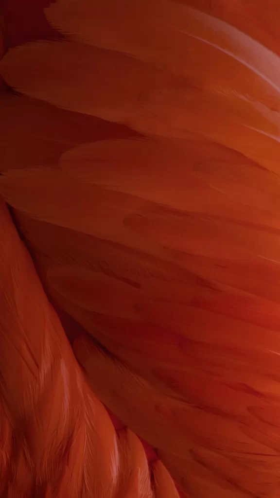
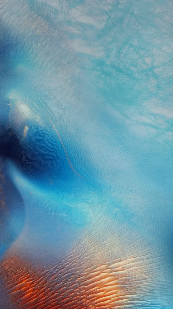
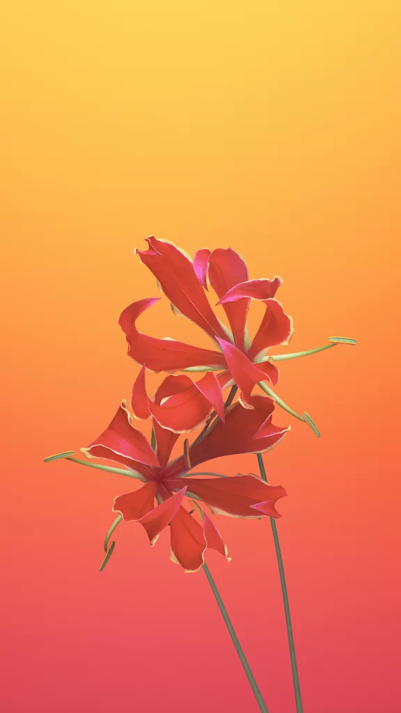
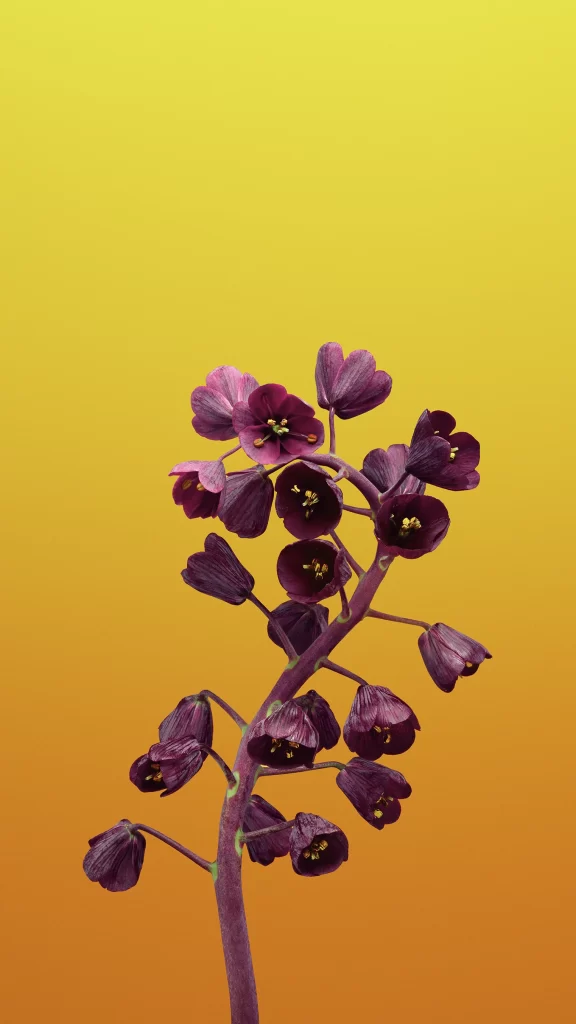
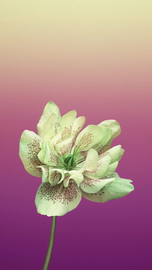
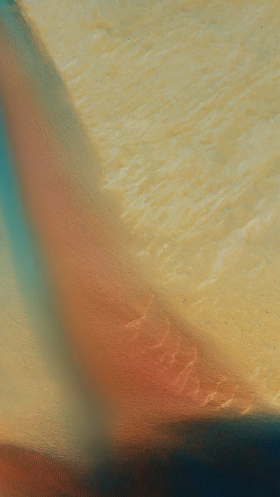
Warm amber and burnt orange hues bleed into a pale, sandy yellow across the upper right quadrant of the composition. A soft, diagonal shadow cuts through the left side, revealing a subtle teal undertone that adds depth to the otherwise matte surface. Fine, rhythmic ridges texture the lighter area like wind-swept sand or brushed fabric, while the lower edge fades into a deep, dark navy void.
What sets this particular gradient apart is its organic, tactile quality rather than a flat digital transition. The interplay between the rough, granular texture and the smooth color shifts creates a sense of physical dimension that feels both calming and dynamic. It avoids harsh lines in favor of a seamless, almost liquid-like flow between the earthy tones.
UI designers might look to this palette when crafting backgrounds for wellness apps or minimalist dashboards that require a soothing yet warm atmosphere. Motion graphics artists could utilize the textural details to add realistic grain to abstract animations. Even interior designers seeking mood board references for accent walls would find the specific balance of these sunset tones quite useful.