iOS 7 Wallpaper Blue Green Gradient
Topics
Details
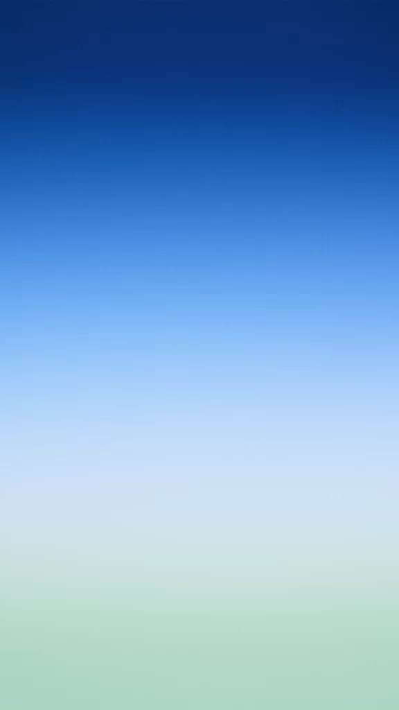
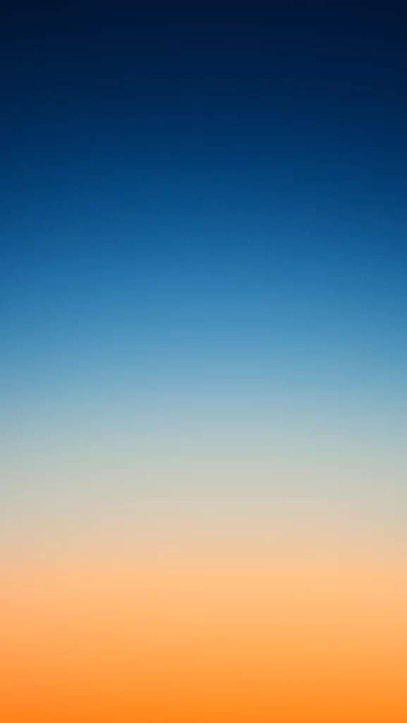
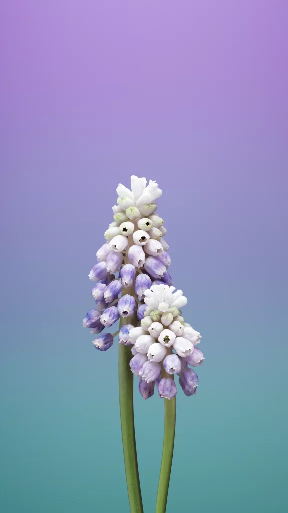
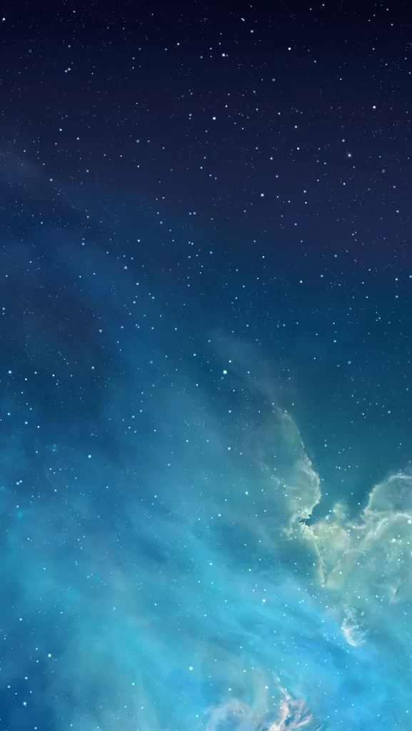
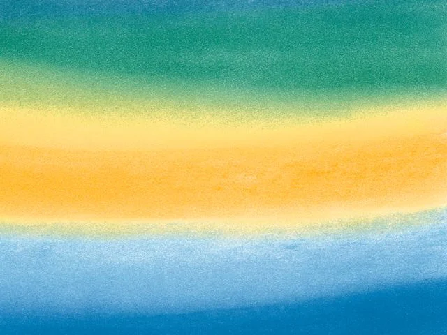
A smooth vertical gradient transitions from a saturated cyan at the top edge through a pale aqua middle section, finally settling into a soft peach tone at the bottom. The composition is entirely abstract with no discernible objects, text, or texture, presenting a uniform field of color that suggests a digital screen capture rather than a physical material. Lighting appears perfectly even across the frame, with the camera positioned straight-on to emphasize the seamless blend between the three distinct color zones.
Visual interest here stems from the specific temperature shift between the cool upper tones and the warm lower register, creating a subtle tension that feels both calming and modern. Unlike harsher digital gradients, this version employs a gentle diffusion that mimics the quality of frosted glass or atmospheric haze. Such a restrained palette avoids visual noise while still providing enough contrast to define spatial boundaries on a display.
Mobile interface developers might employ this as a base layer for app backgrounds where legibility of overlaid text remains a priority. Brand designers working on wellness or technology sectors could adapt these specific hex values for website headers or presentation templates requiring minimal distraction. Additionally, 3D artists environment-mapping virtual skies often seek precisely this kind of soft chromatic transition to establish mood without introducing complex geometry.