KitKat Ice Cream Packaging
Topics
Details
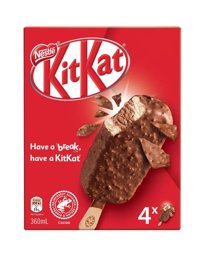
The front face of the KitKat ice cream multipack box features a vibrant red brand background that immediately captures attention. At the top, the Nestle and KitKat oval logos are prominently displayed above the iconic tagline 'Have a break, have a KitKat'. A printed product photo shows a chocolate-coated ice cream bar with one bite taken out, revealing the wafer interior and floating chocolate pieces around it. The packaging also includes a 4-count indicator, energy information (930 kJ per serve), and a Rainforest Alliance seal for cocoa sourcing.
KitKat ice cream represents Nestle's extension of the beloved chocolate brand into frozen desserts. The product maintains the signature combination of crispy wafer and smooth chocolate that defines the KitKat character. This frozen variation offers consumers a new way to enjoy the familiar taste in a refreshing format while staying true to the brand's core identity.
Packaging designers can learn valuable lessons from this snack branding layout regarding color psychology and visual hierarchy. The bold red background creates strong shelf impact that stands out among competing products in the freezer aisle. Strategic placement of logos, product imagery, and certification seals demonstrates effective information architecture that communicates both brand identity and product attributes efficiently.