know. Conversation Starter Box Detail
Topics
Details
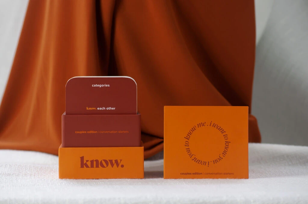
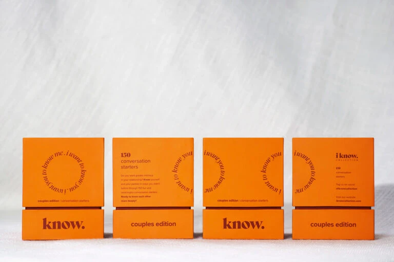
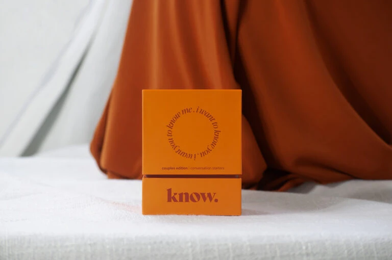
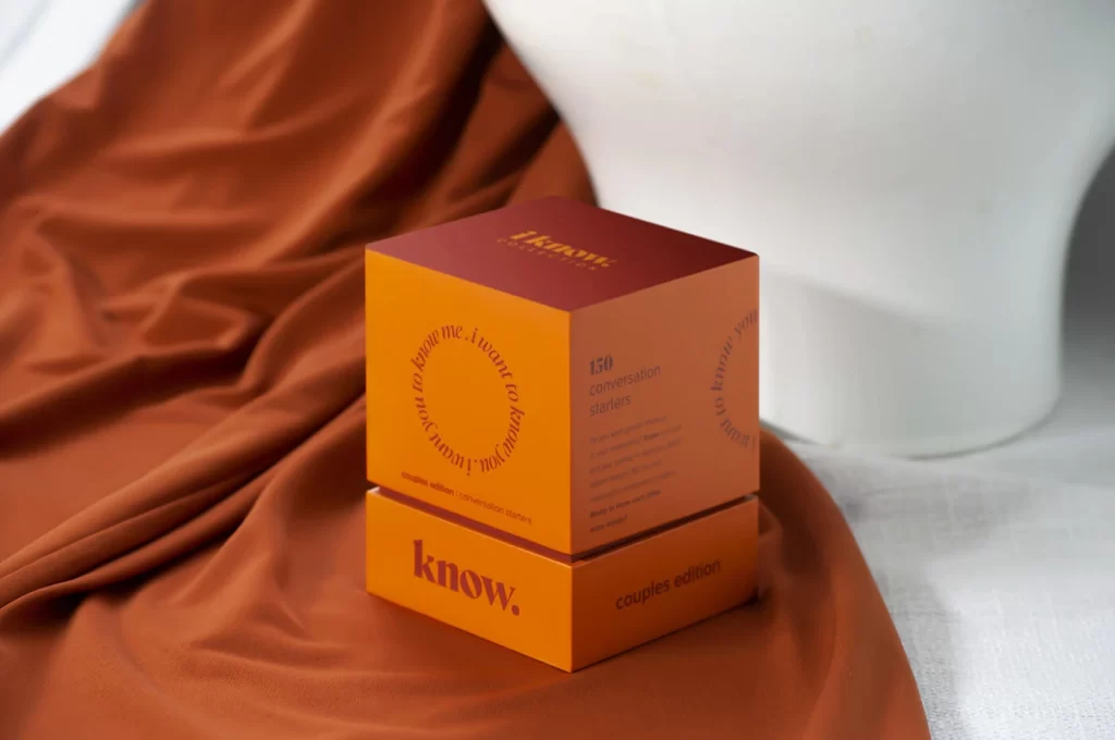
Resting on a folded terracotta textile, the cubic packaging features a striking two-tone color scheme with a deep burgundy top face and vibrant orange sides. Circular typography reading 'I want to know you, I want me to know me' wraps around the front panel, while 'know.' appears in bold serif on the lower section alongside 'couples edition.' A white mannequin bust occupies the soft-focus background, and natural light from the left casts gentle shadows across the fabric's surface.
The visual distinction lies in its monochromatic warm palette and the radial text arrangement that creates movement across flat planes. By stacking the lid slightly offset from the base, the composition reveals both the product title and descriptive copy simultaneously, demonstrating how limited color ranges can establish sophisticated brand cohesion without additional graphical elements.
Packaging designers studying luxury retail aesthetics will find this useful for analyzing how typography interacts with solid color fields. Art directors planning lifestyle photography shoots can reference the fabric draping techniques and prop placement strategies shown here. Brand identity developers might also examine the hierarchical text sizing to understand how to balance decorative and informational content on three-dimensional surfaces.