know. Conversation Starter Box View
Topics
Details
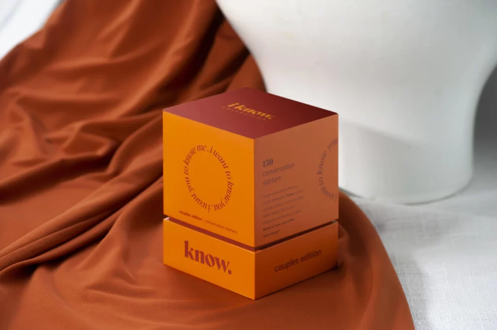
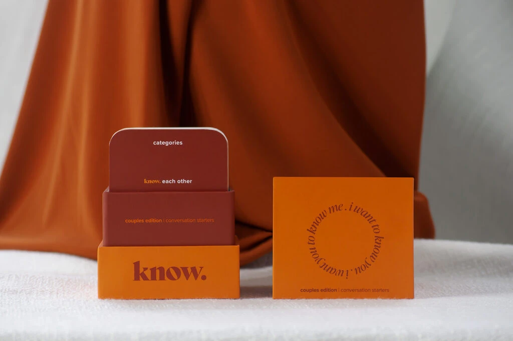
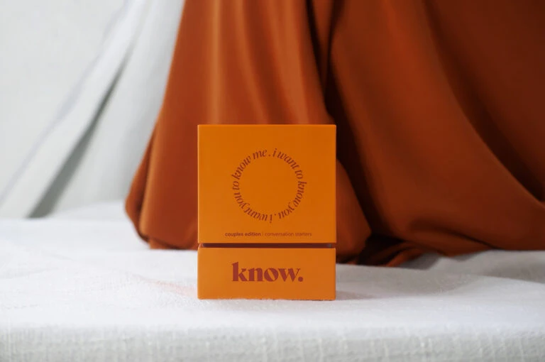
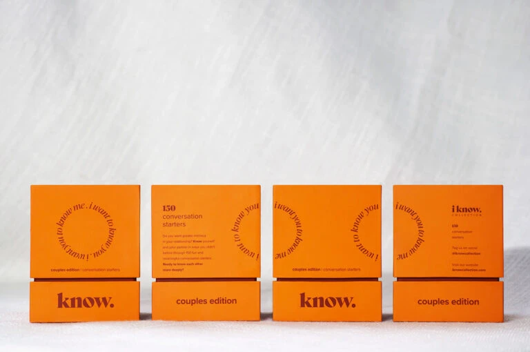
Four orange rectangular boxes stand in a linear row against a pale, textured off-white backdrop, illuminated by soft, even lighting that eliminates harsh shadows. Each container features a vibrant tangerine hue with dark burgundy or brownish-red typography, arranged in a rhythmic alternating pattern between the front and side panels. The composition presents a straight-on camera angle that emphasizes the geometric uniformity of the packaging while revealing circular text arrangements and varying label placements across the sequence.
Visual distinction emerges from the strategic typographic hierarchy and the deliberate use of negative space within the circular text motifs on the box faces. The consistent color palette creates a cohesive brand identity, while the alternating placement of the word 'know.' versus 'couples edition' on the lower panels establishes a visual cadence that guides the eye across the arrangement. Subtle material textures suggest a matte paper finish that complements the bold sans-serif lettering without competing for attention.
Packaging designers examining minimalist branding strategies would study this reference to understand how limited color palettes can maintain visual interest through typographic variation alone. Art directors developing product photography layouts might analyze the spacing and alignment techniques used to create balance across multiple units in a single frame. Students of contemporary graphic design could reference this example when exploring how circular text elements can break the rigidity of rectangular containers while preserving overall compositional harmony.