i know. Conversation Starter
Topics
Details
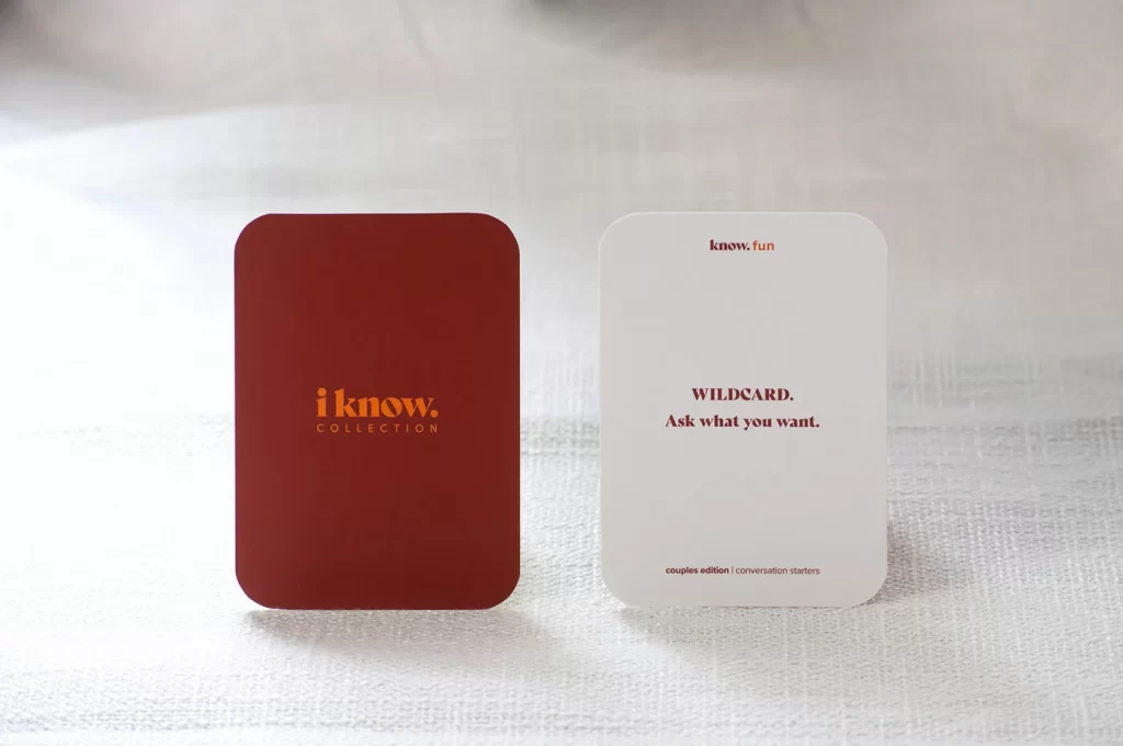
Set against a softly textured white linen surface, two rounded-rectangular cards stand in parallel, bathed in diffused natural light that creates gentle shadows beneath their edges. The left card presents a deep burgundy or oxblood matte finish, featuring the brand name 'i know.' in a bold, lowercase orange serif font with 'COLLECTION' set in smaller tracking beneath it. Its counterpart on the right displays an off-white or cream stock, topped with the diminutive text 'know. fun', followed by 'WILDCARD.' and the directive 'Ask what you want.' in a dark brown or black serif typeface, while the footer identifies this as the 'couples edition | conversation starters'.
Visual distinction emerges from the deliberate interplay between the saturated warmth of the maroon field and the crisp neutrality of the ivory counterpart, creating a sophisticated dual-tone system that balances authority with approachability. The typographic hierarchy demonstrates careful restraint, utilizing weight and scale variations rather than decorative elements to guide the viewer's eye from brand identity to functional instruction. Rounded corners soften the otherwise formal rectangular geometry, suggesting tactile friendliness appropriate for intimate social interactions rather than corporate rigidity.
Product photographers and packaging designers might study this composition to understand how soft lighting enhances material textures without creating harsh specular highlights on matte finishes. Art directors developing lifestyle branding for relationship-focused products could reference the color psychology at play here, where deep reds signal intimacy while clean whites imply clarity of communication. Those crafting physical game components or premium stationery lines would benefit from analyzing how minimal text placement maximizes negative space to convey luxury and intentionality.