know. Conversation Starter Box Design
Topics
Details
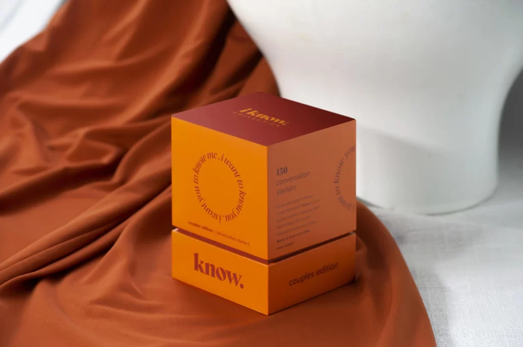
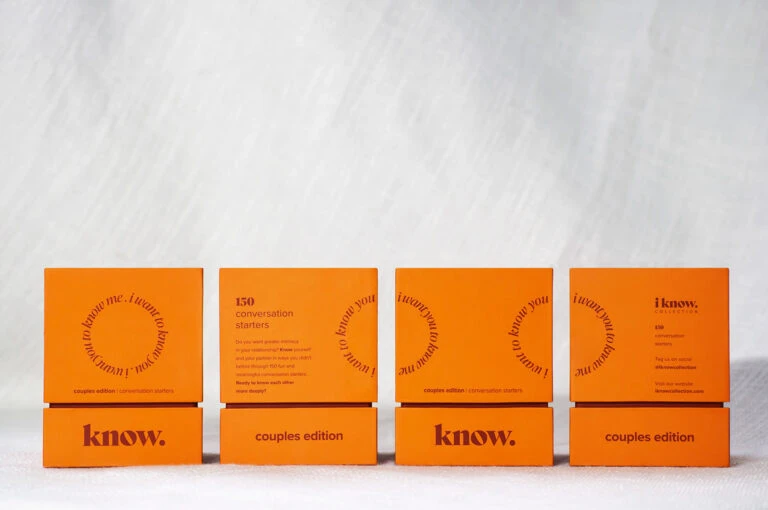
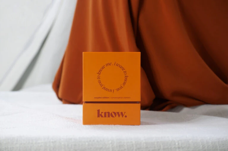
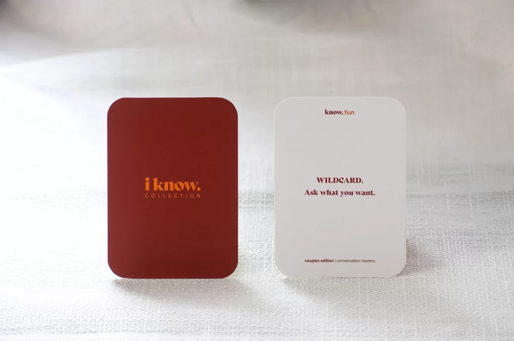
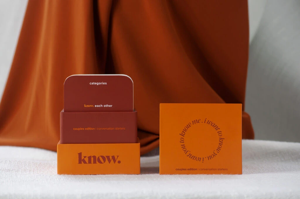
Burnt orange and deep terracotta tones dominate the composition, where a stacked box assembly sits beside its flat lid on a textured white surface. The base layer displays the word 'know.' in bold burgundy serif lettering, while the middle tier reads 'couples edition | conversation starters' in smaller orange text. Above that, a rounded rectangular card shows 'categories' at the top and 'know each other' in mixed colors below. To the right lies an open square lid featuring circular text reading 'i want to know me. i want to know you. i want us to know.' in dark red script against the vibrant orange background, all framed by draped rust-colored fabric creating soft shadows.
Visual hierarchy emerges through the deliberate color blocking between warm earthy hues, establishing clear separation between product components while maintaining cohesive branding. Typography choices create distinct personality layers—the bold sans-serif base conveys stability, while the elegant circular script on the lid introduces intimacy and movement. Material finishes appear matte across all surfaces, suggesting tactile quality that complements the conversational purpose of the item itself.
Packaging designers studying color theory applications in lifestyle products would examine how these specific orange-brown palettes evoke warmth without overwhelming the content. Brand identity developers could reference the typographic contrast between structural elements and decorative text when creating layered visual systems for relationship-focused merchandise. Photographers documenting product arrangements might analyze the fabric backdrop integration technique for softening commercial presentations while keeping focus on packaging details.