La Belle Iloise Sardinaude Lid Packaging
Topics
Details
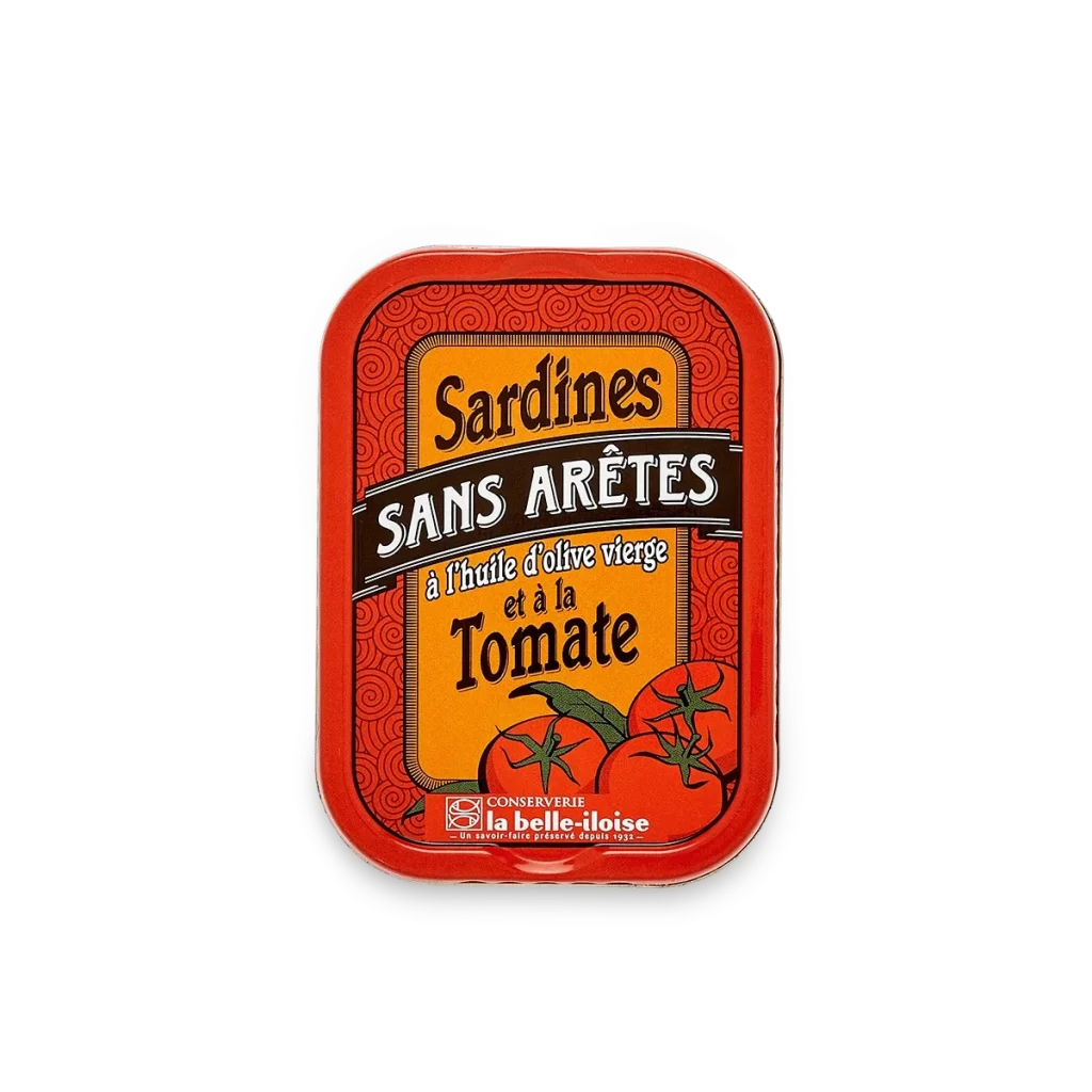
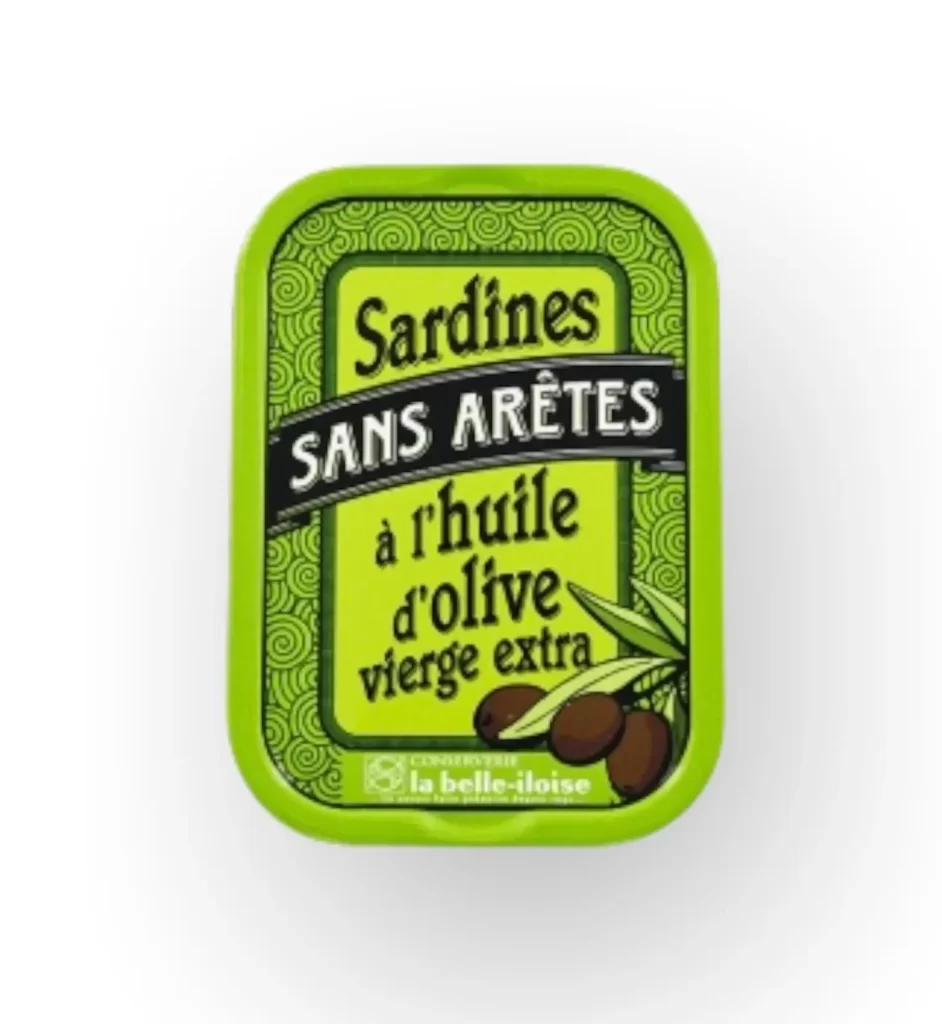
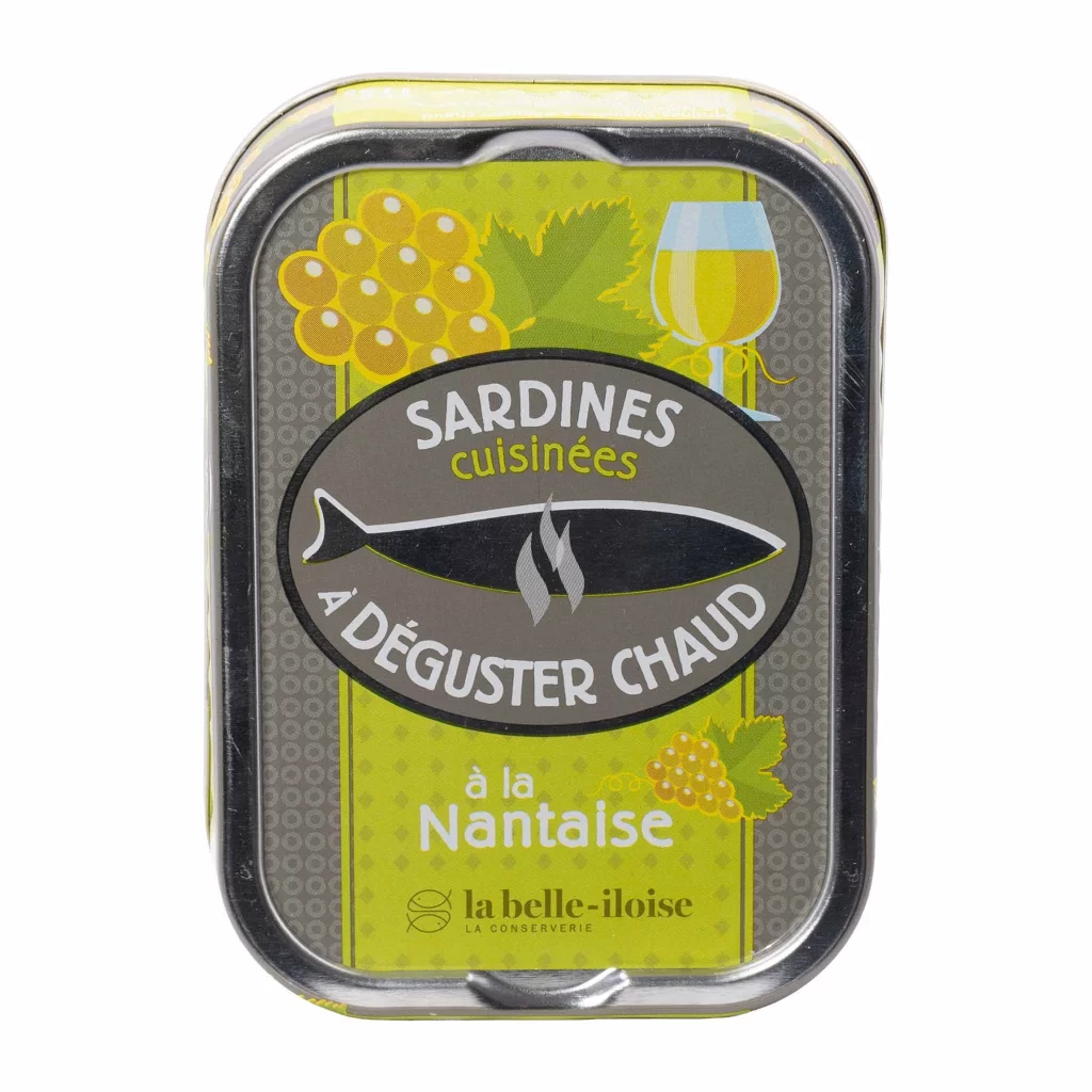
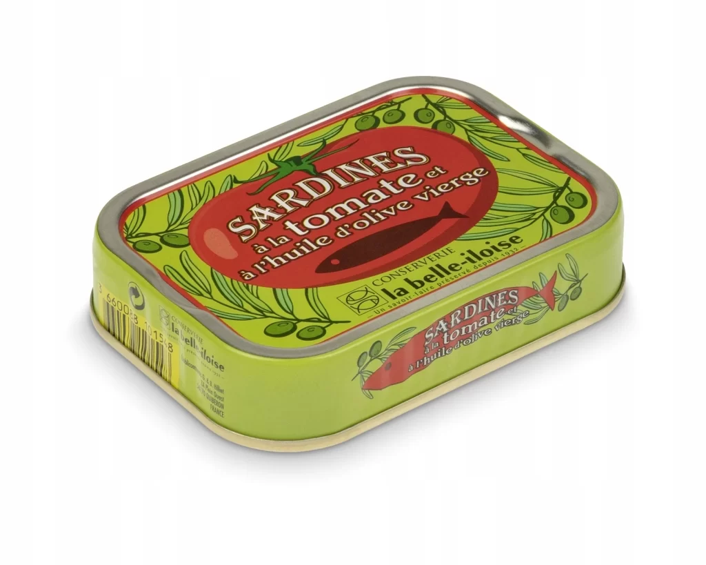
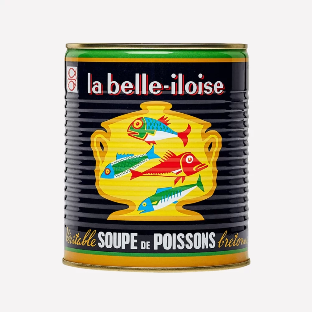
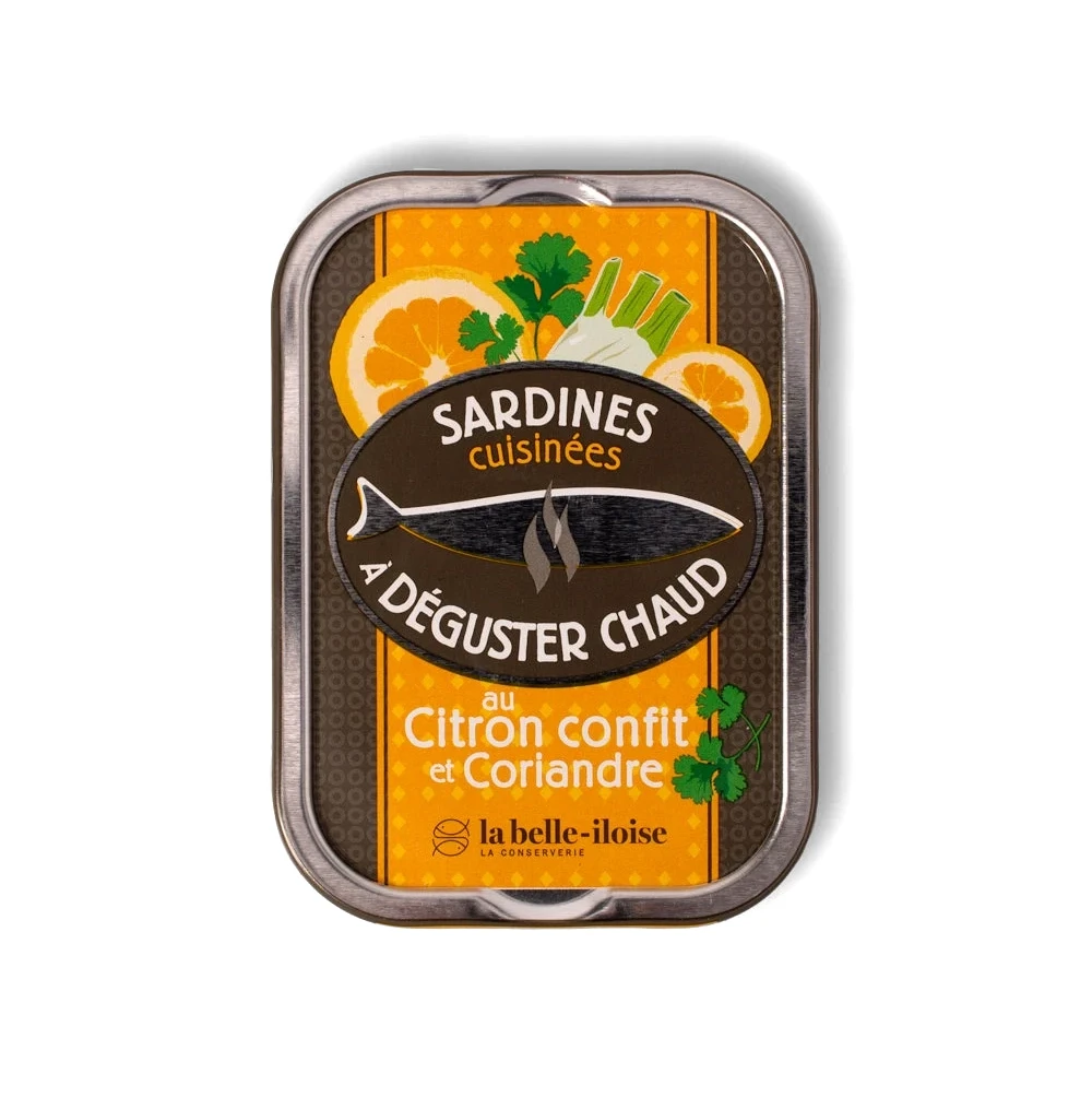
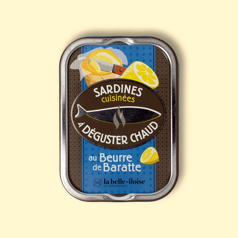
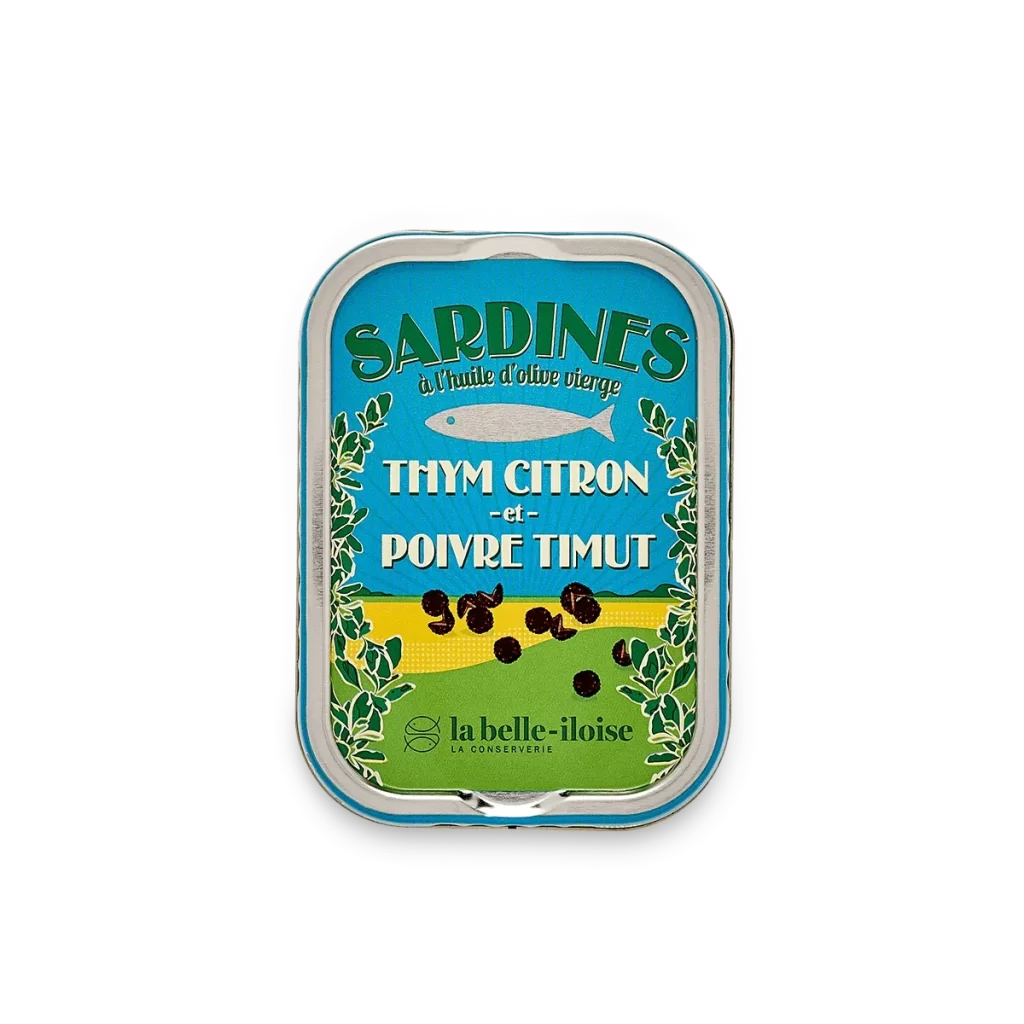
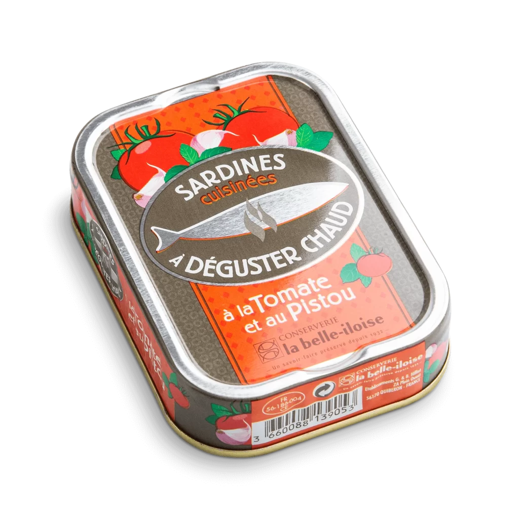
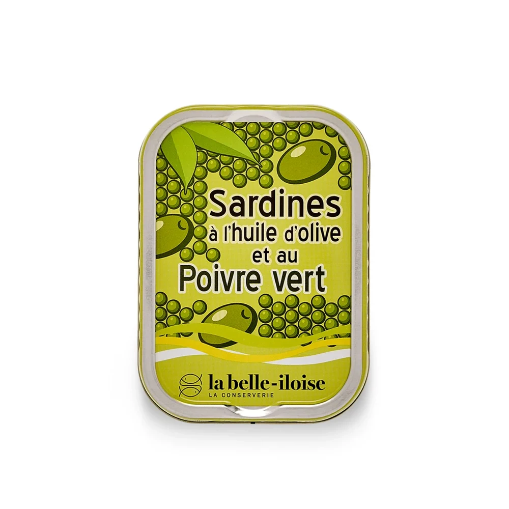
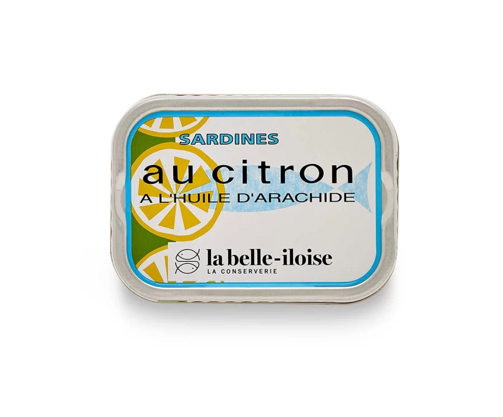
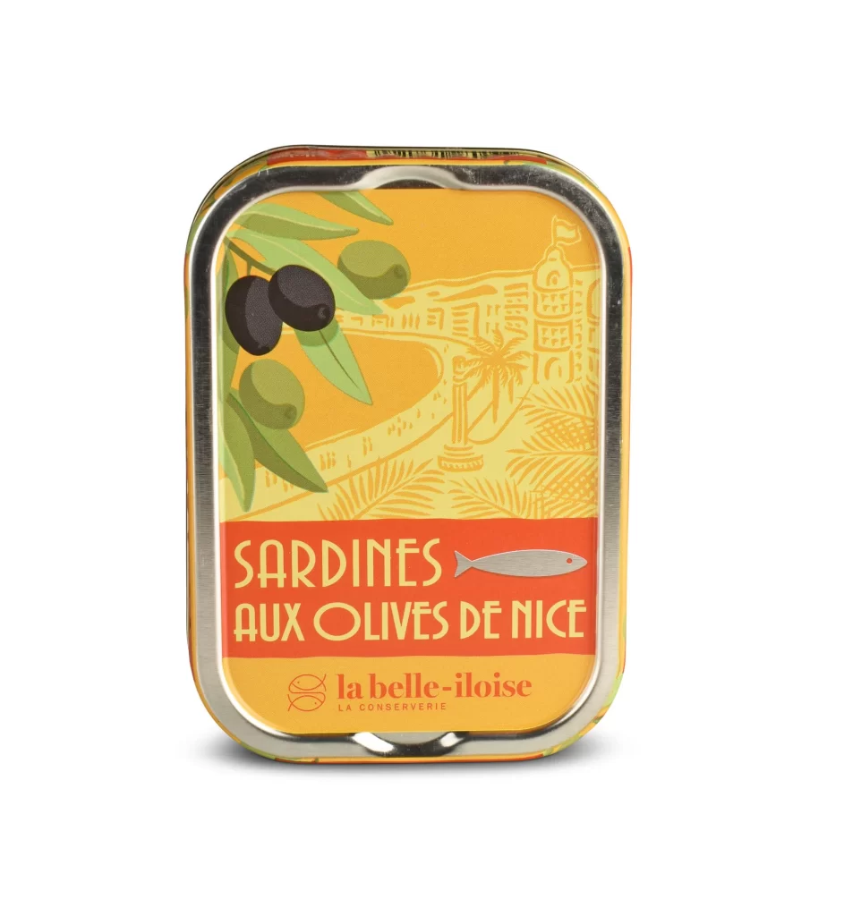
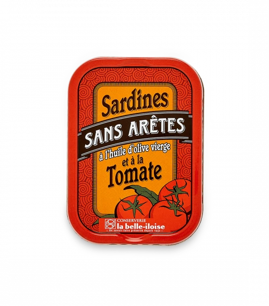
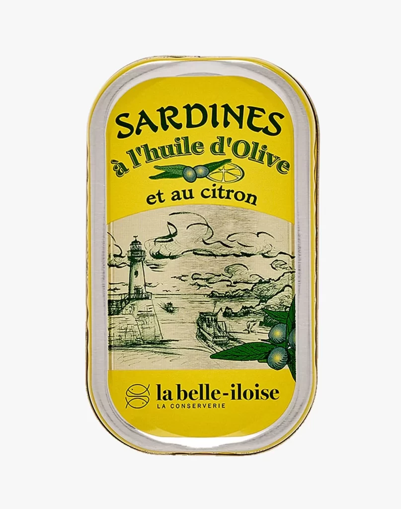
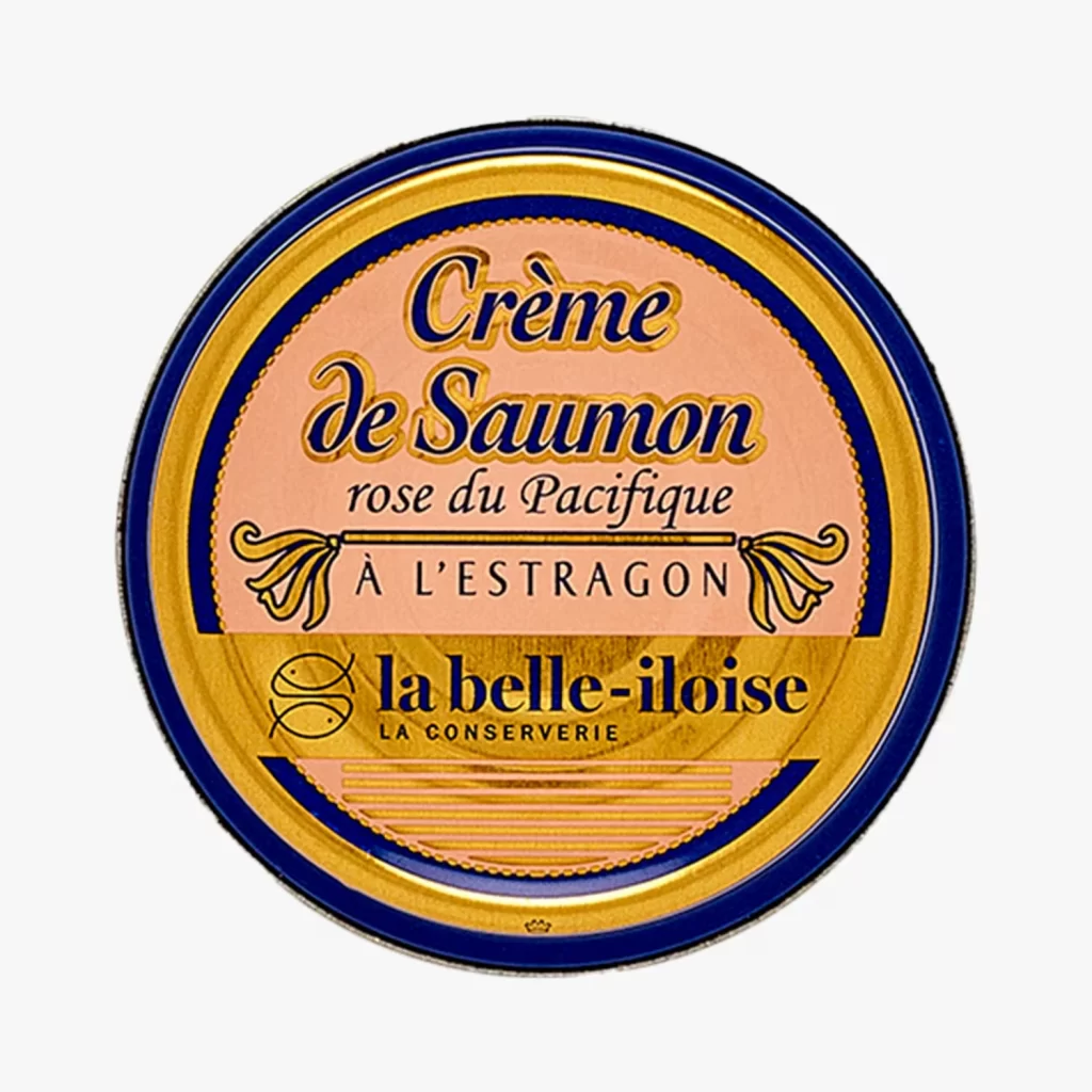
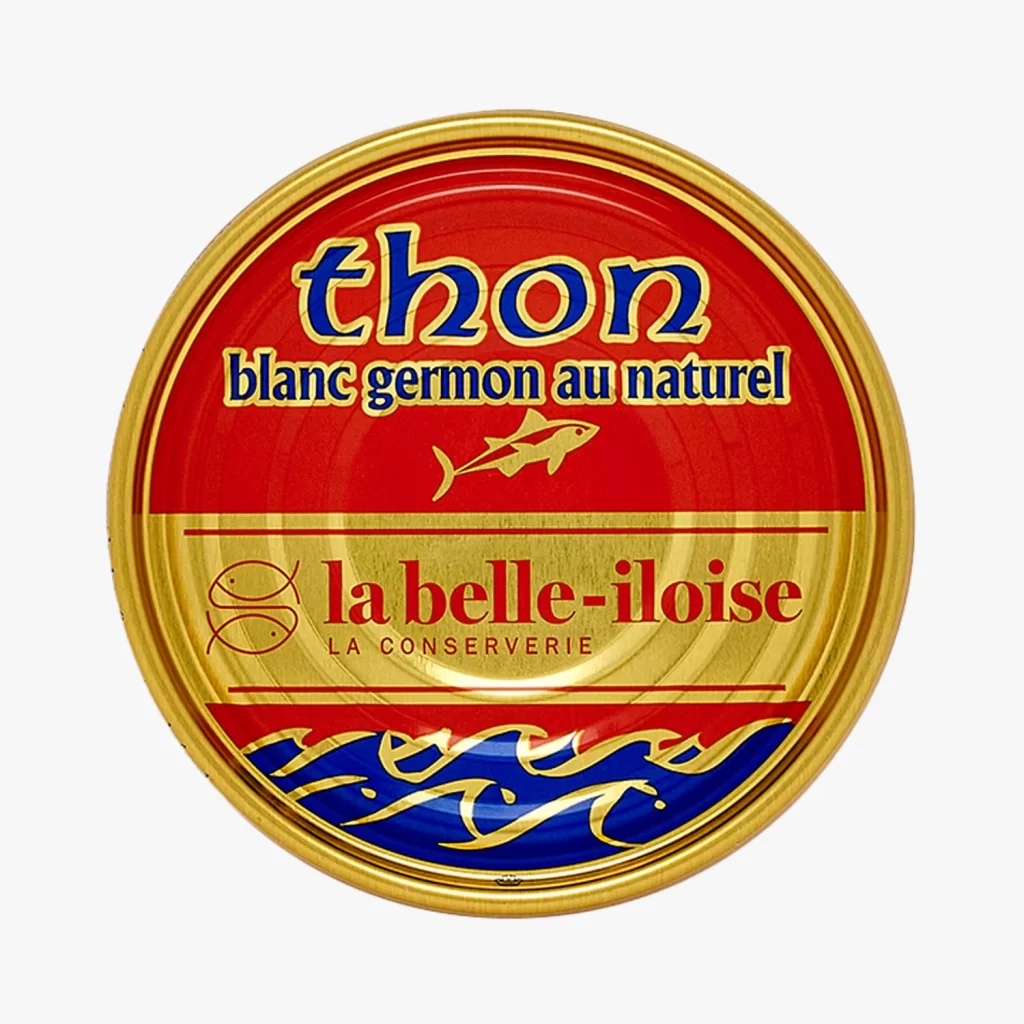
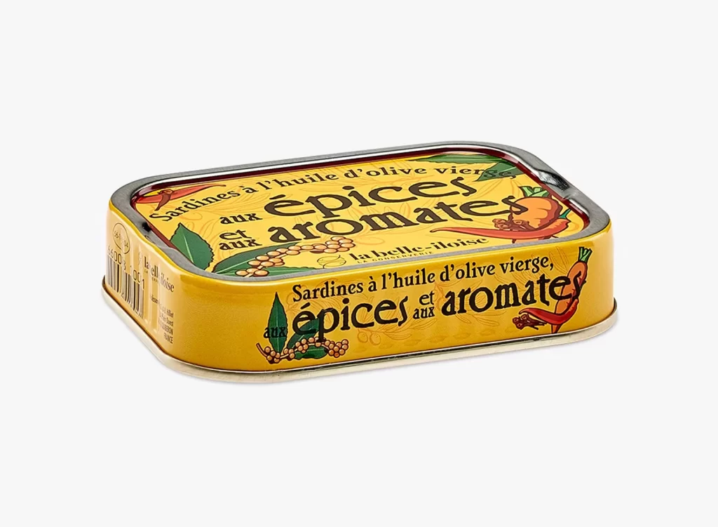
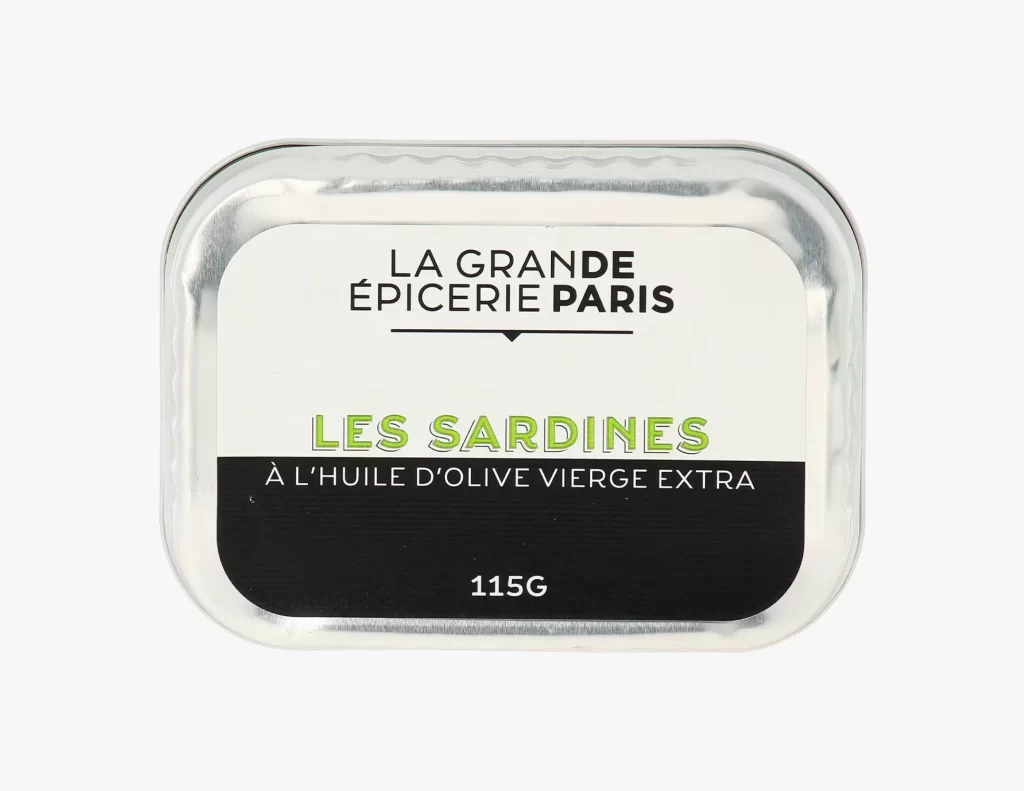
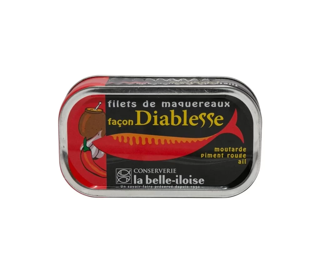
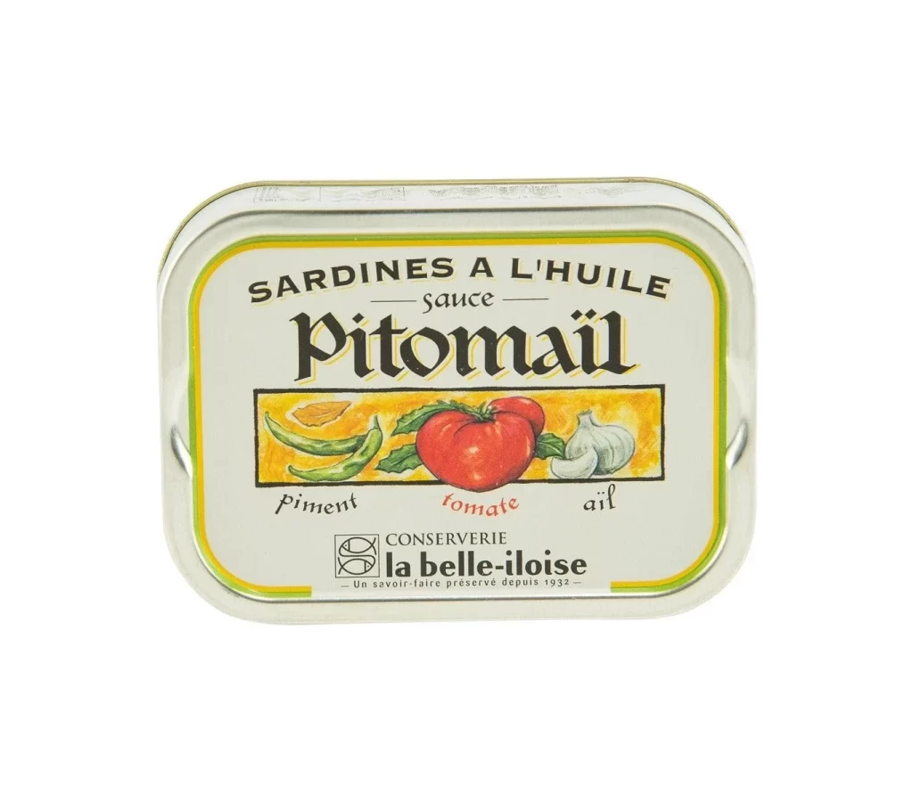
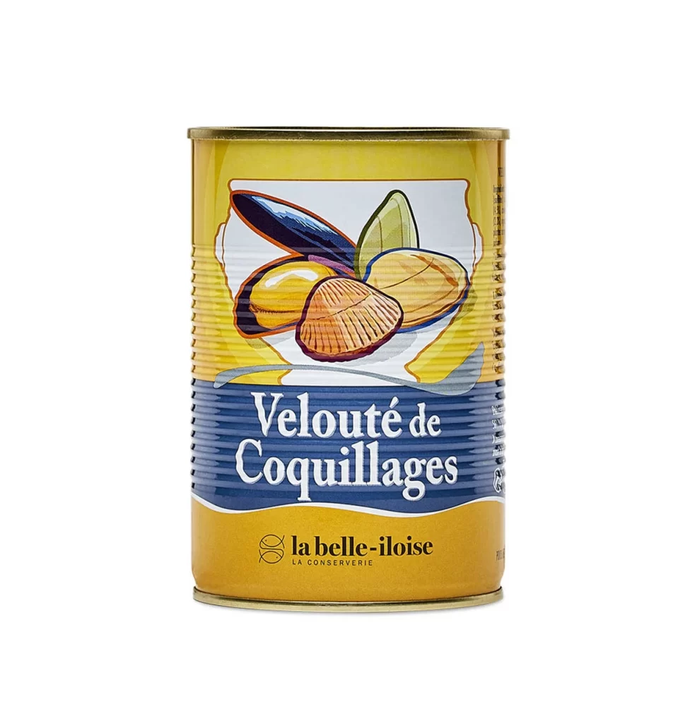
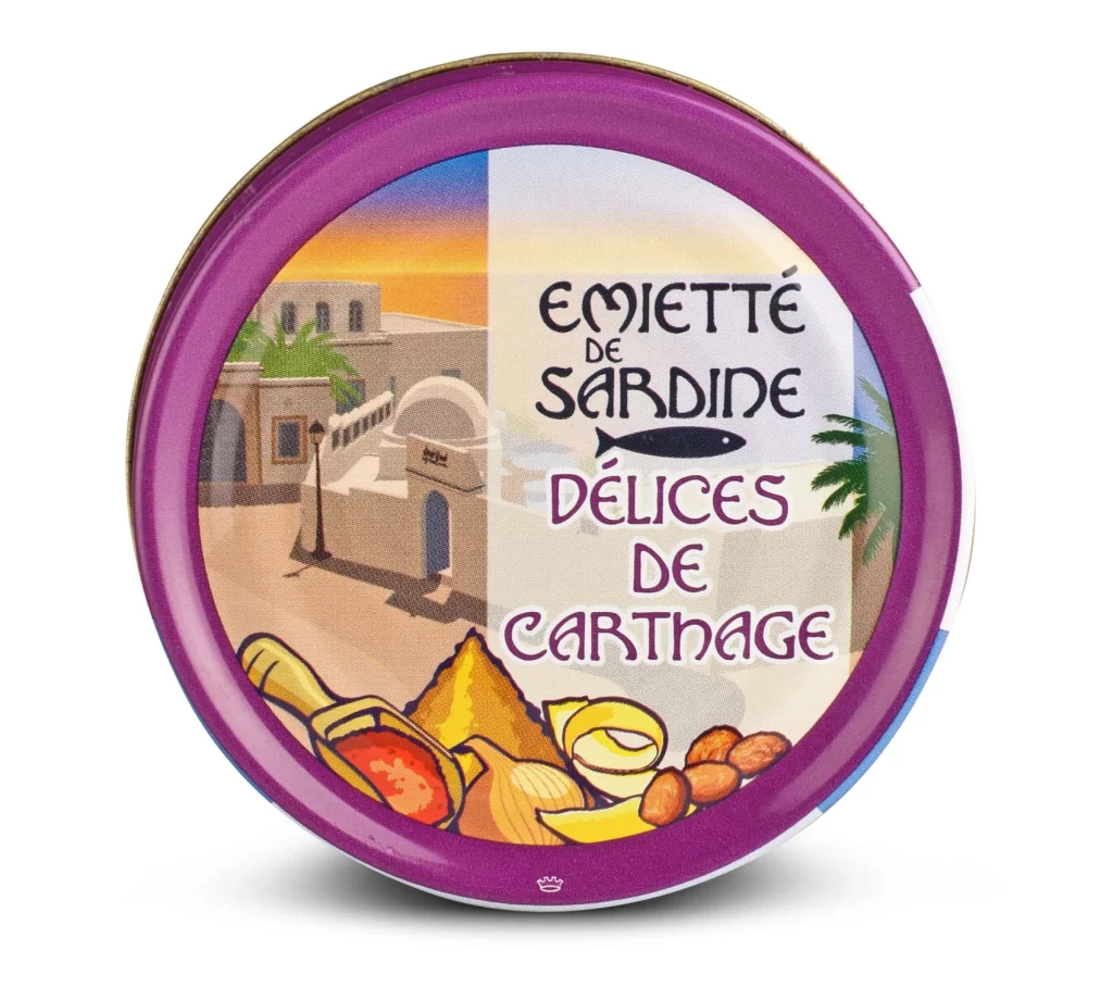
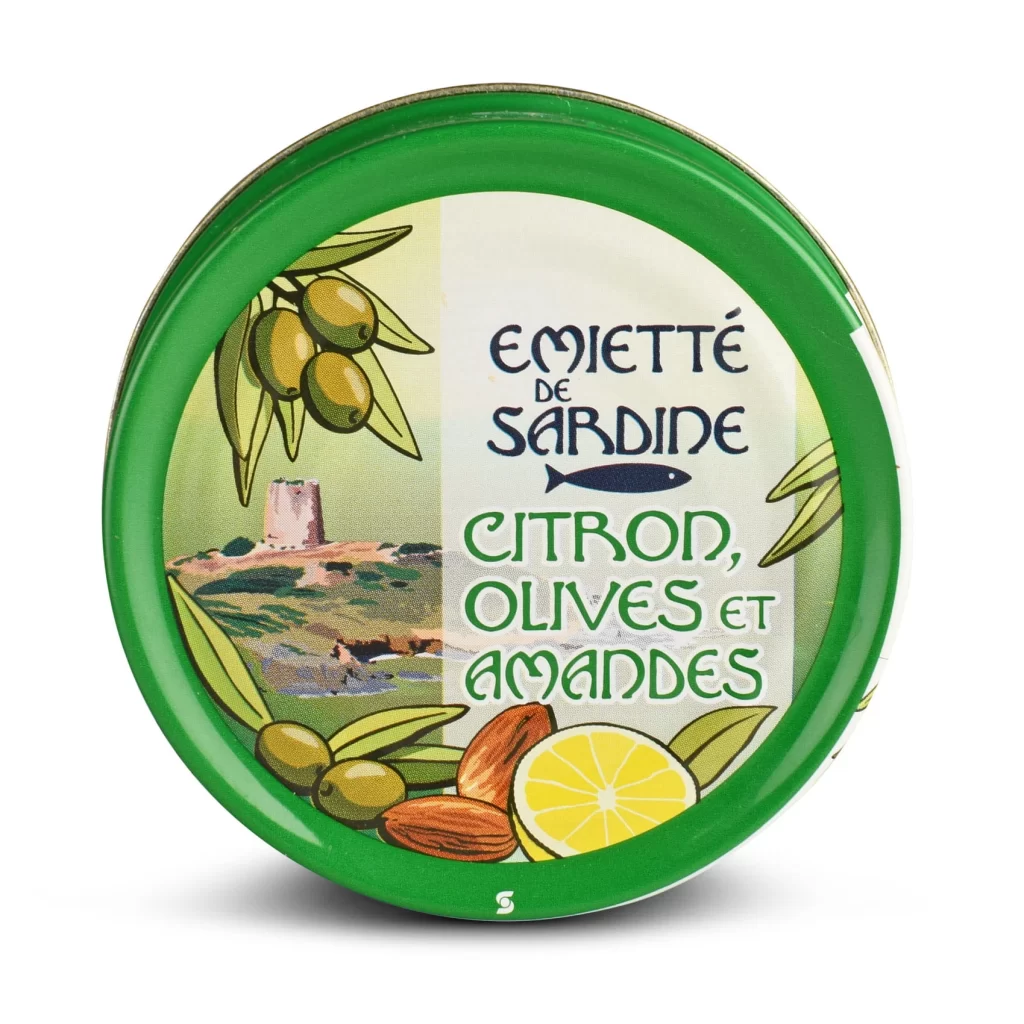
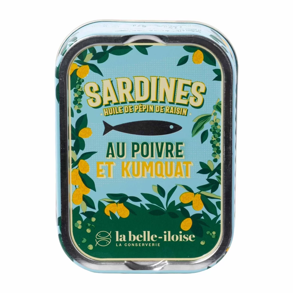
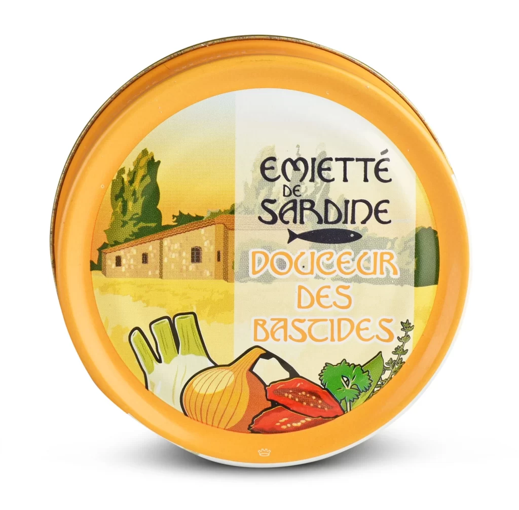
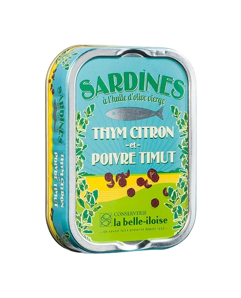
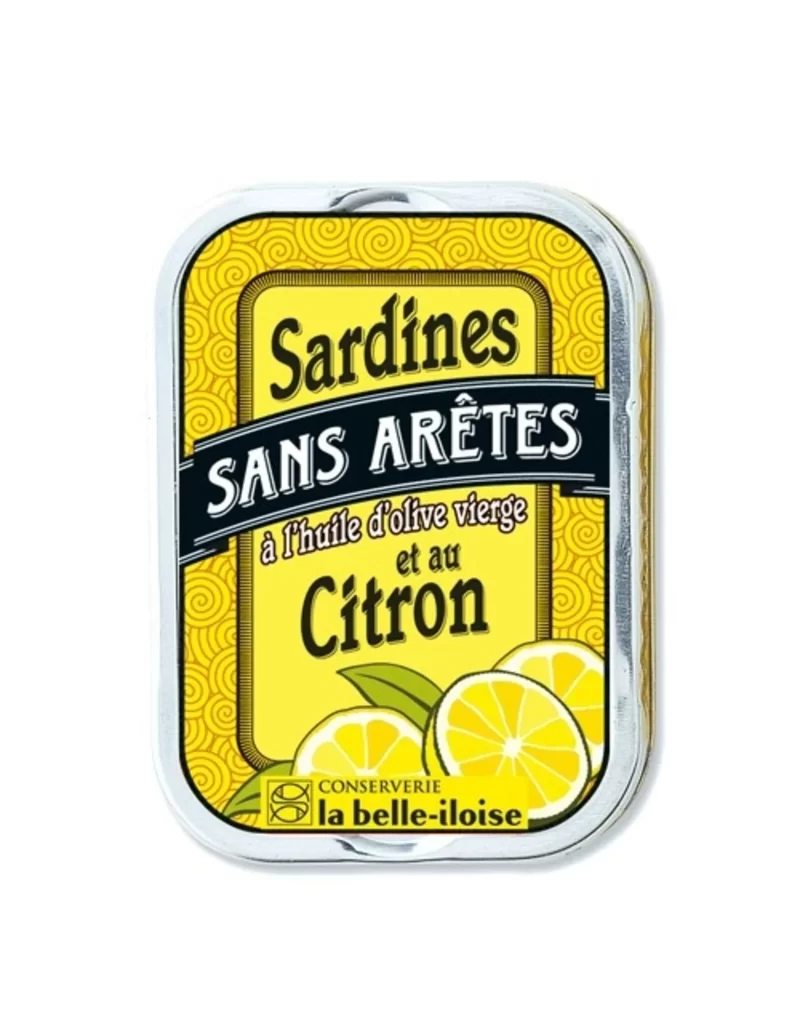
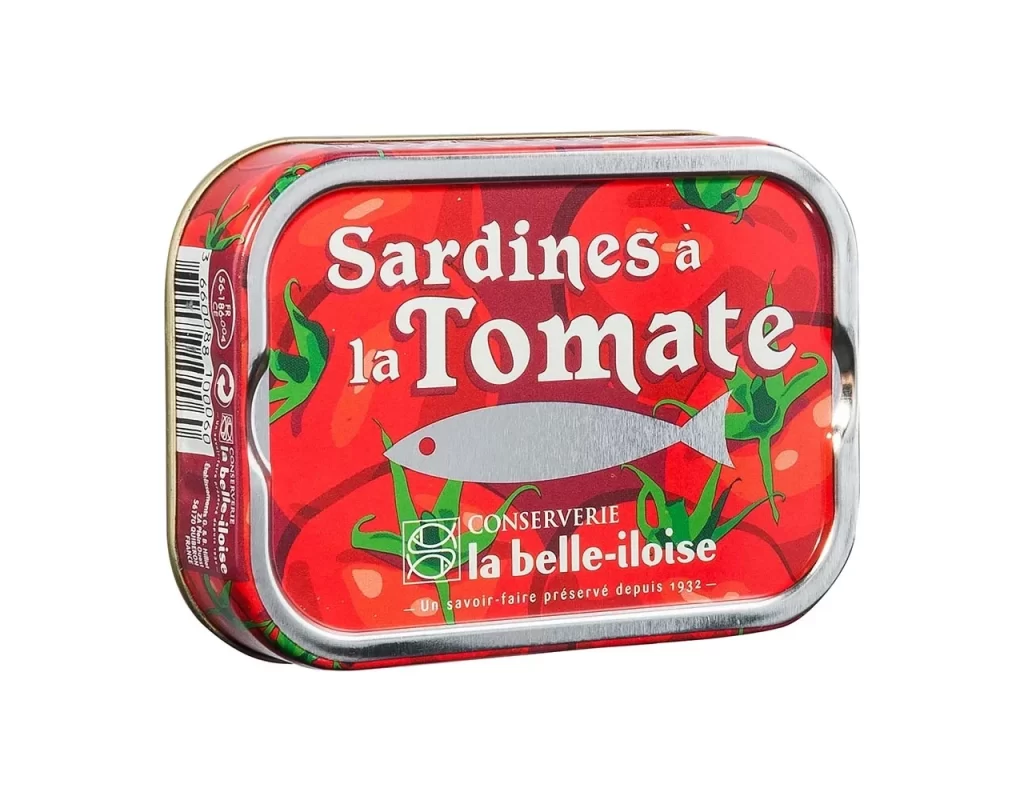
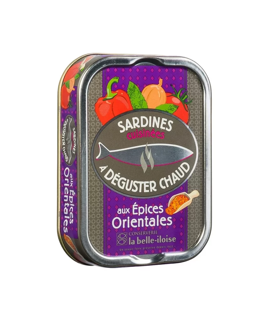
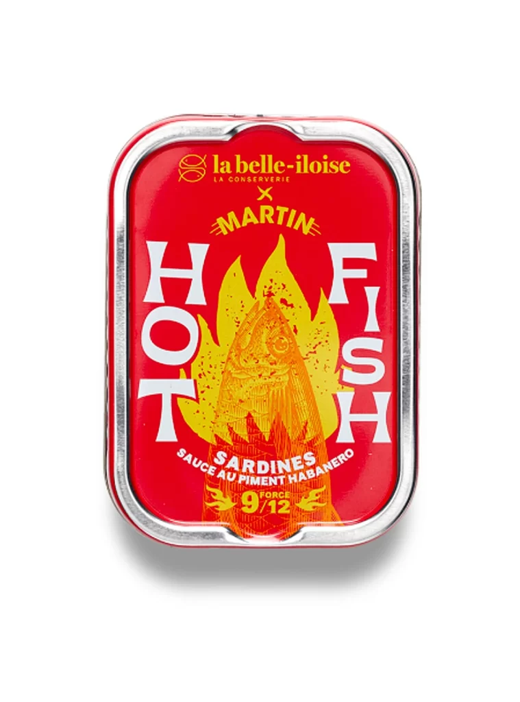
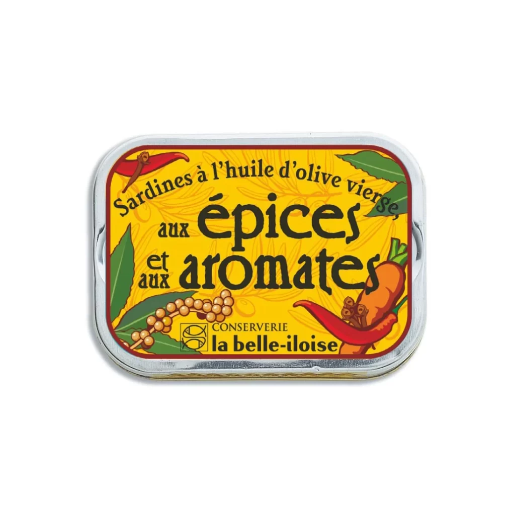
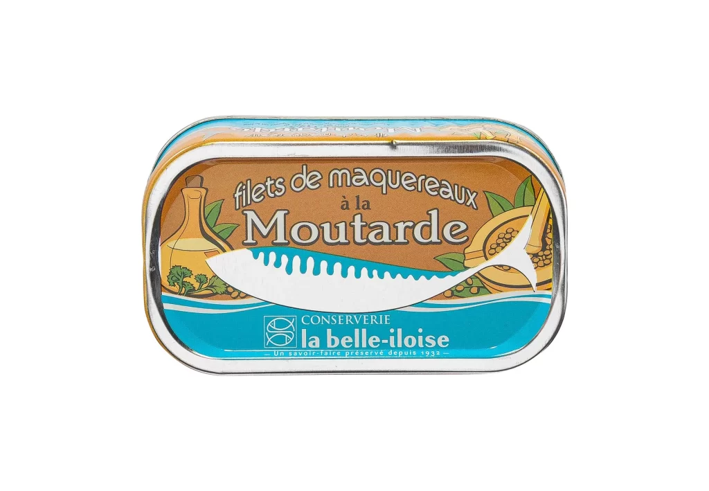
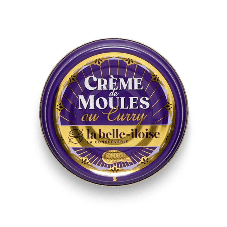
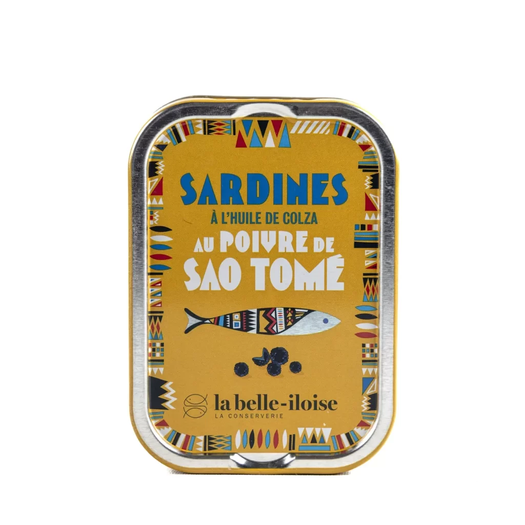
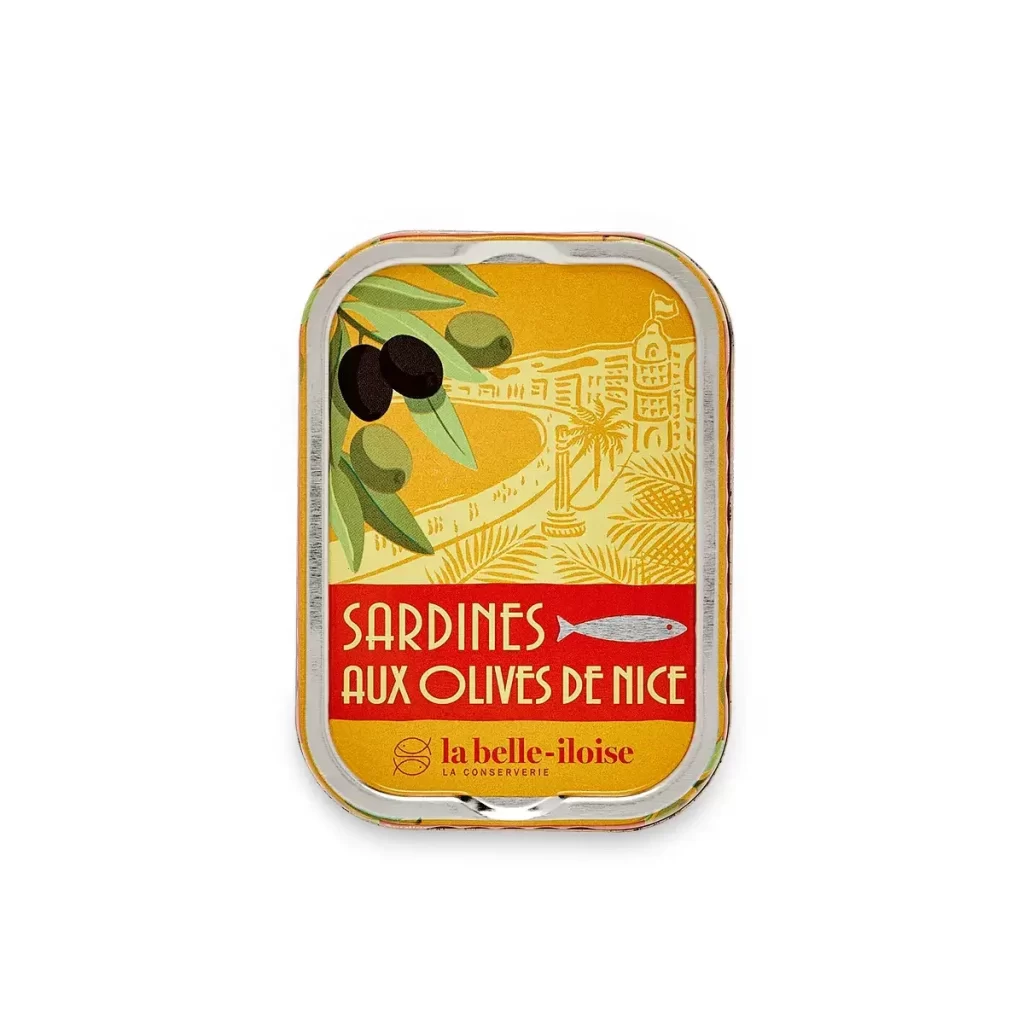
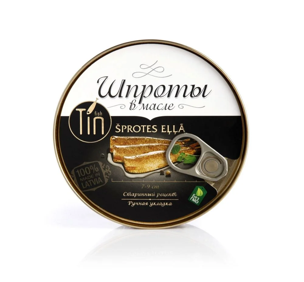
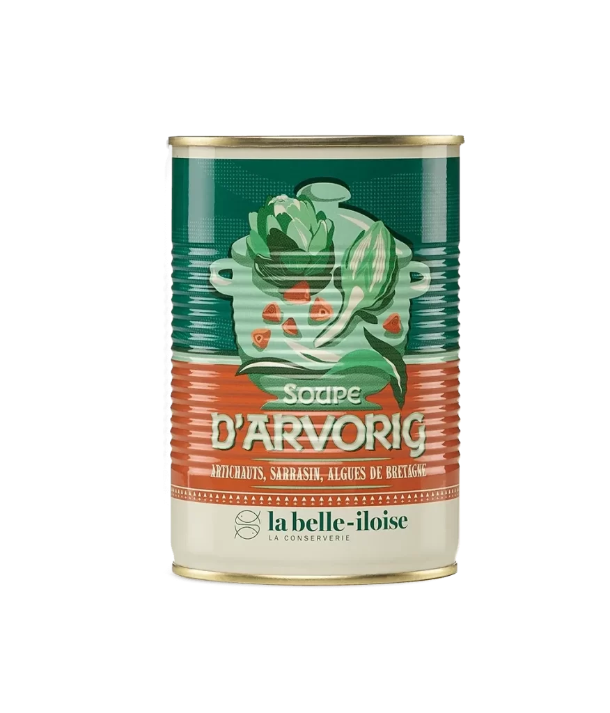
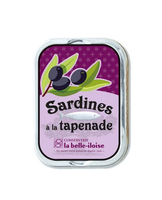
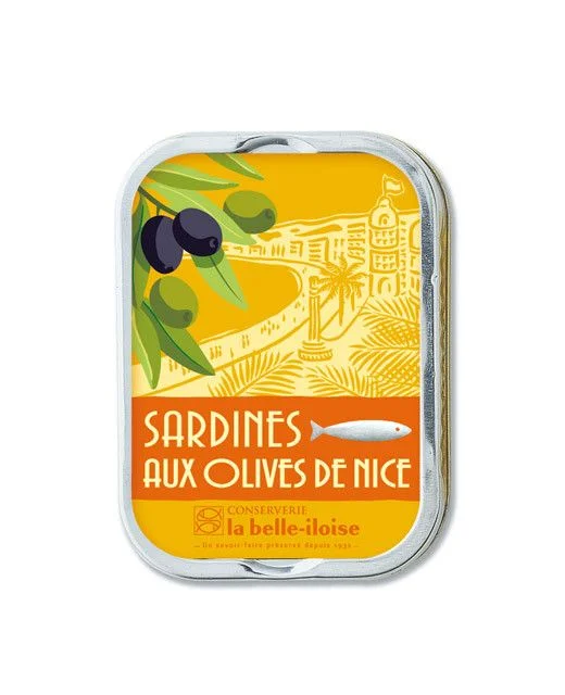
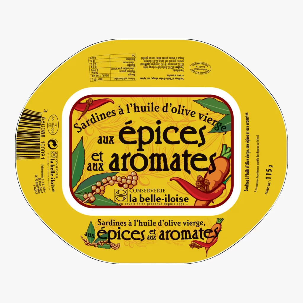
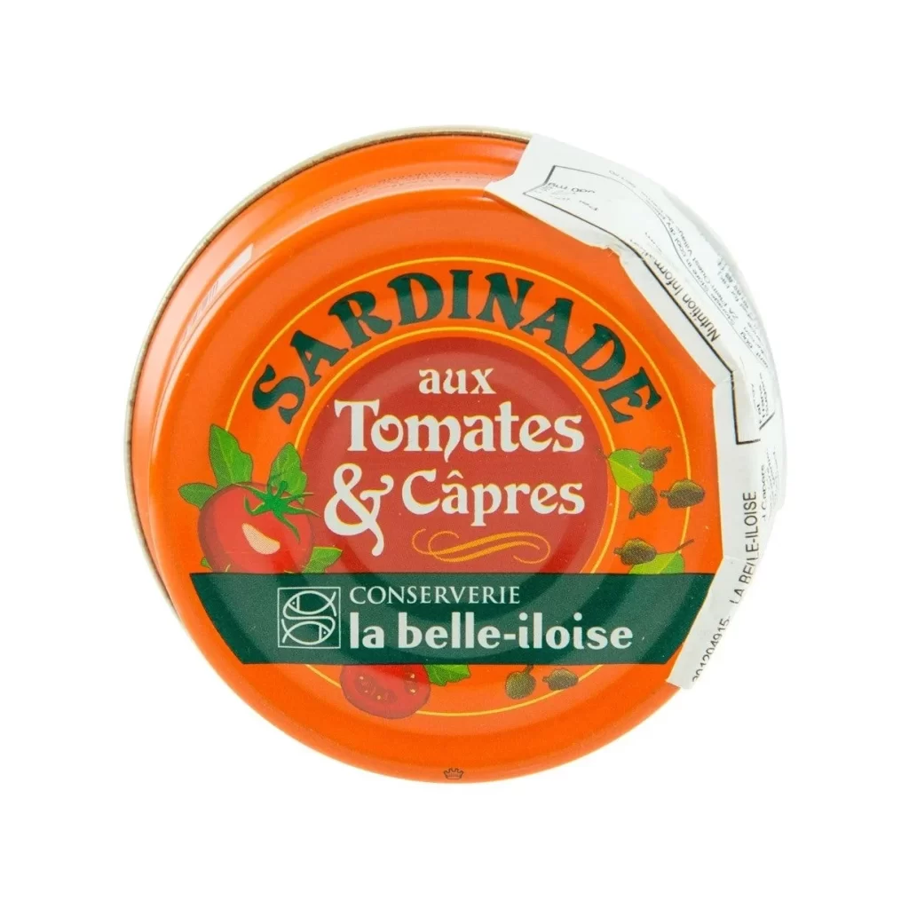
La Belle Iloise prepares its Sardinaude sardine spread by blending tender fish with tomatoes and capers, creating a savory Brittany delicacy. The top-down lid view presents the sealed tin against a clean white studio background. This clear visual framing highlights the cannery's commitment to showcasing premium ingredients and traditional French culinary craftsmanship directly through the product packaging.
The label design features a circular layout with bold, vintage-inspired typography that emphasizes the brand name. Warm color palettes of deep red and ocean blue frame the central illustration style, which depicts stylized maritime motifs and botanical elements. This artistic approach blends classic coastal aesthetics with modern graphic clarity, creating a distinctive visual identity that captures the authentic heritage of the Quiberon cannery.
Designers study such top-down studio photographs as essential packaging design references because they reveal how typography, color, and illustration integrate on a curved surface. The stark white background eliminates environmental distractions, allowing professionals to analyze spatial composition and brand hierarchy. These precise visual assets help creatives understand effective layout strategies for premium canned goods within the competitive gourmet food sector.