La Belle Iloise Sardines Nantaise Packaging
Topics
Details
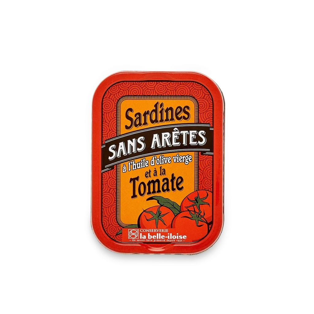
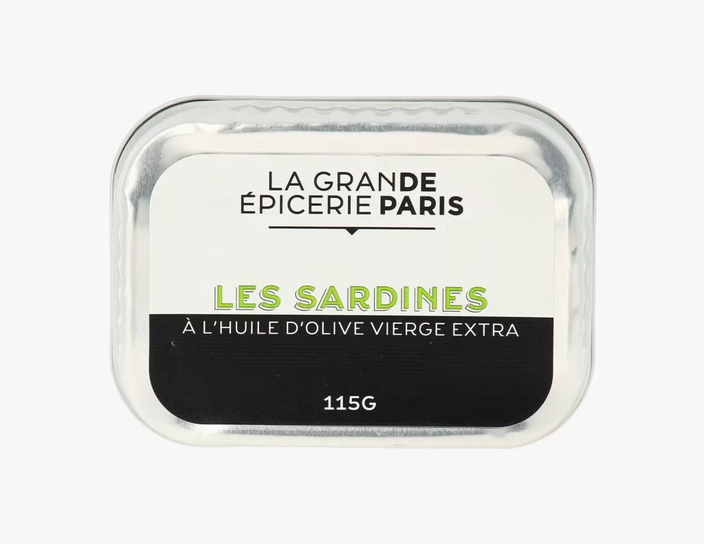
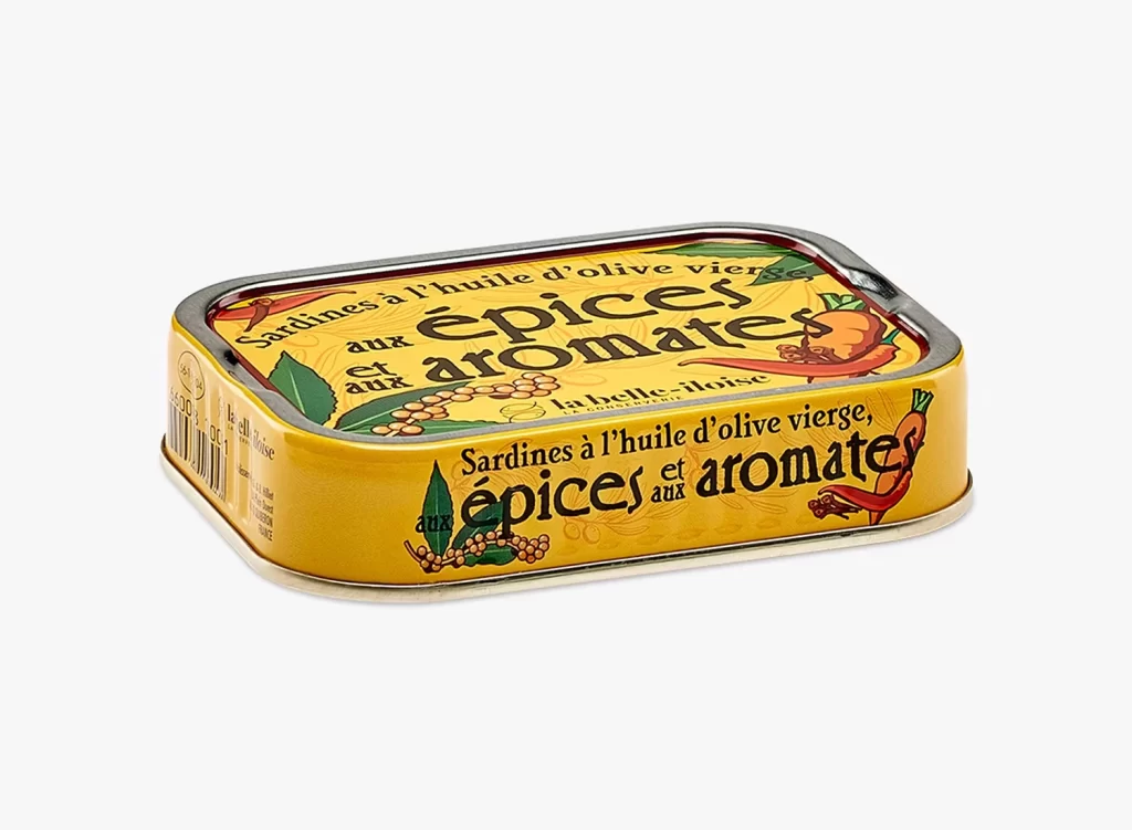
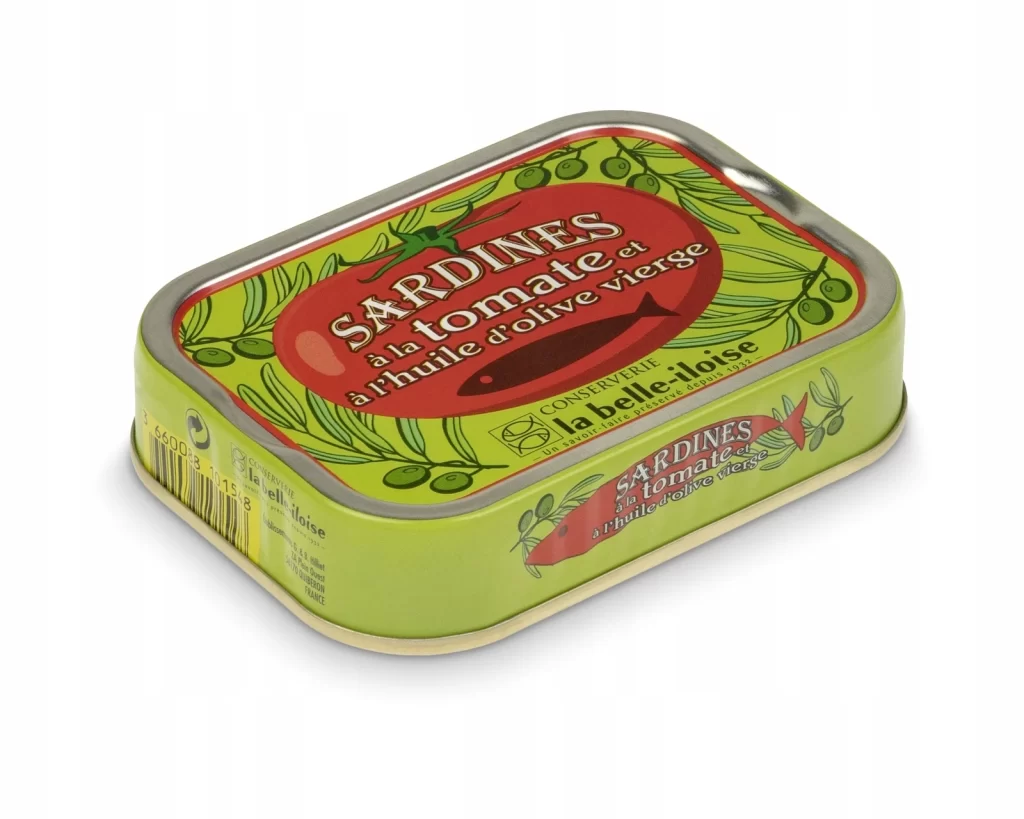
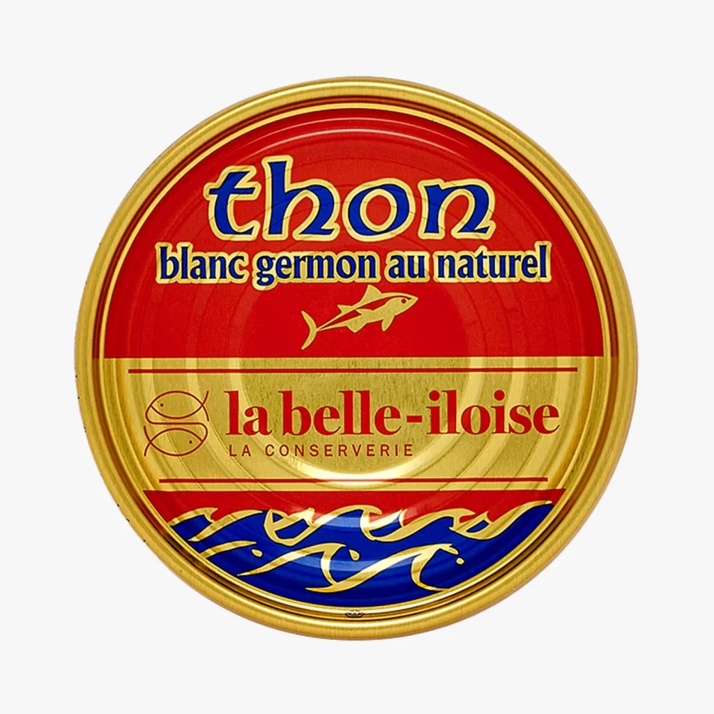
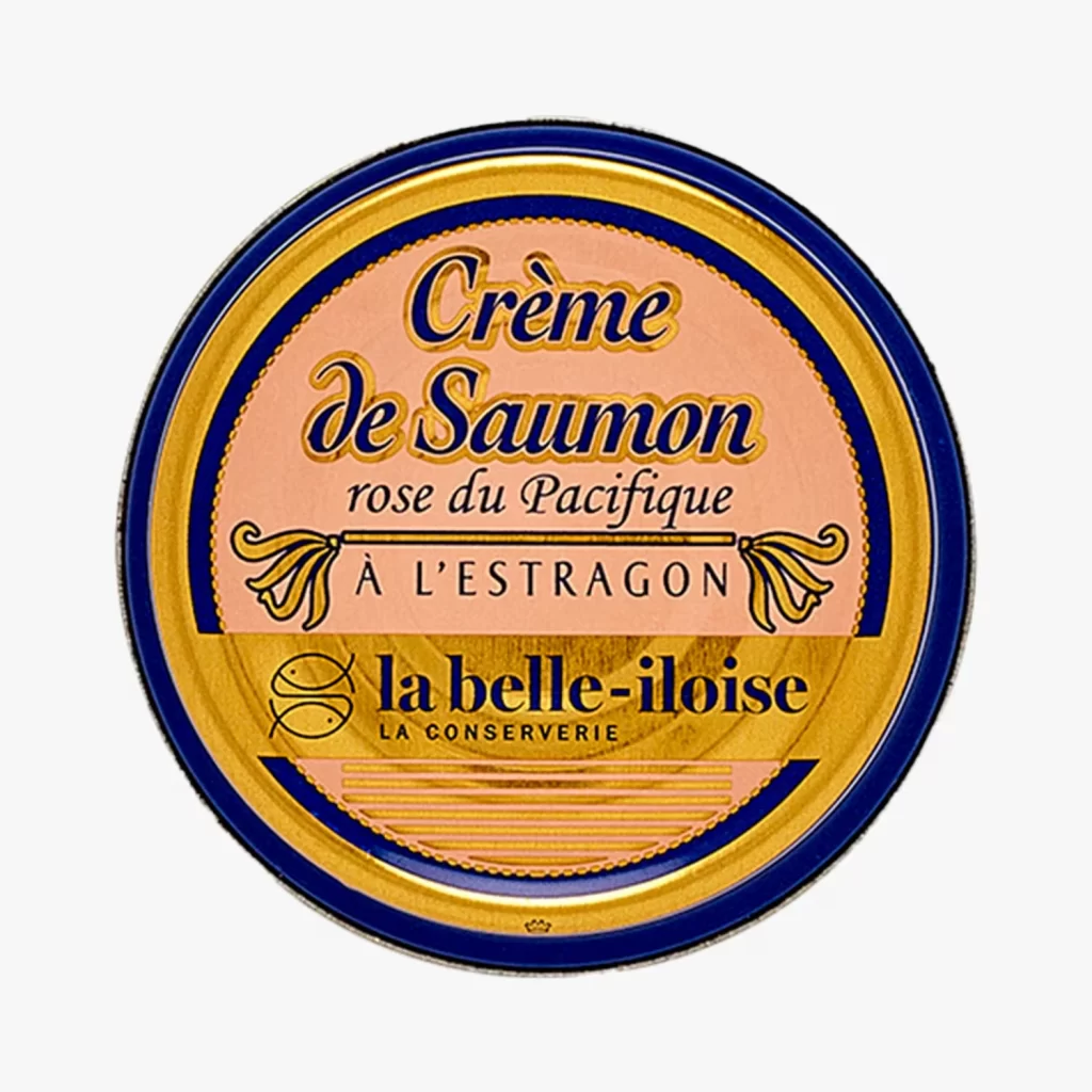
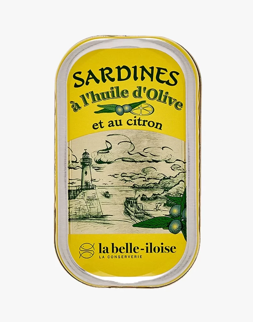
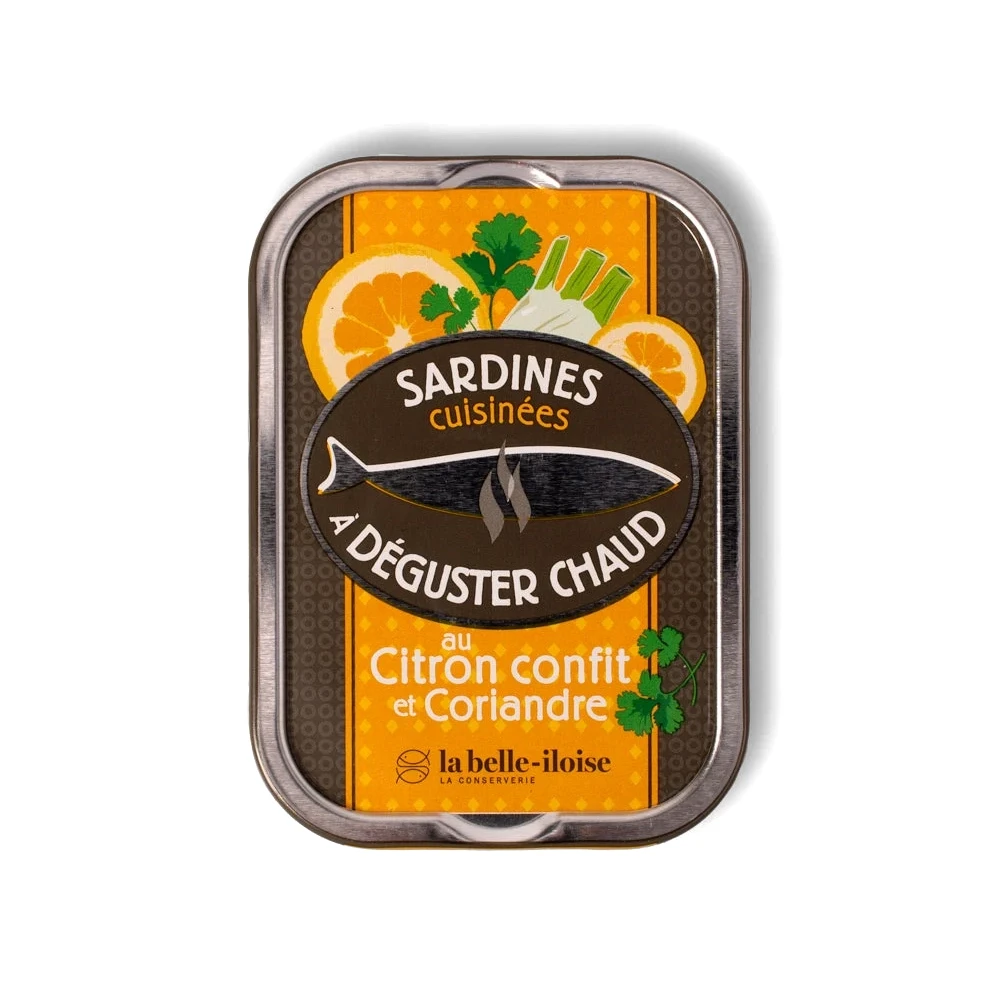
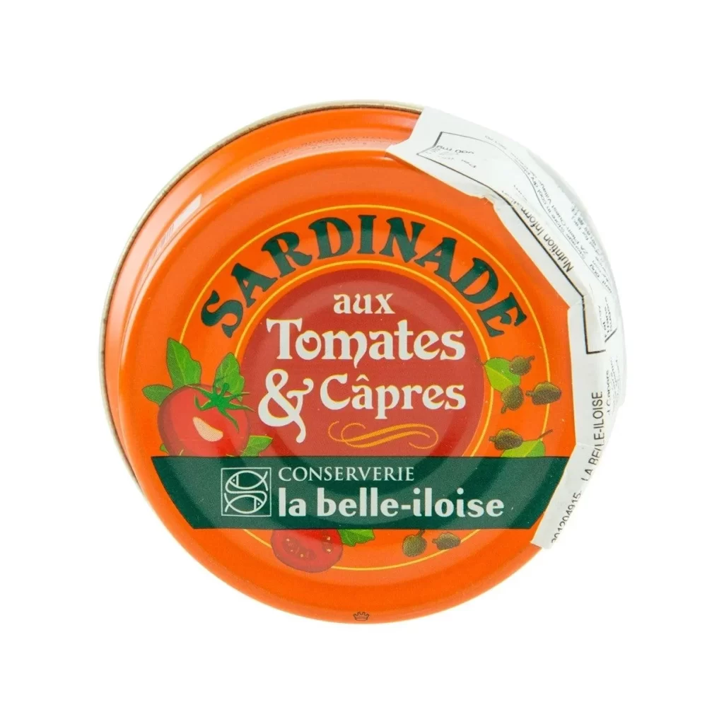
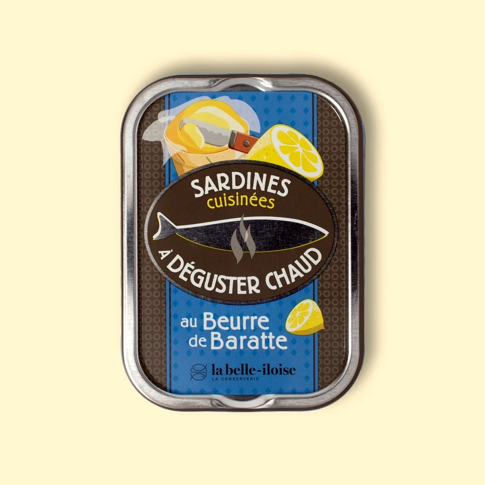
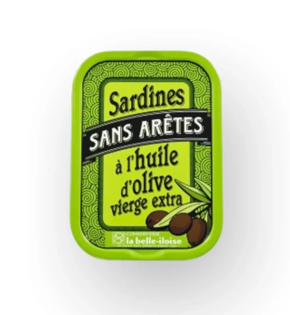
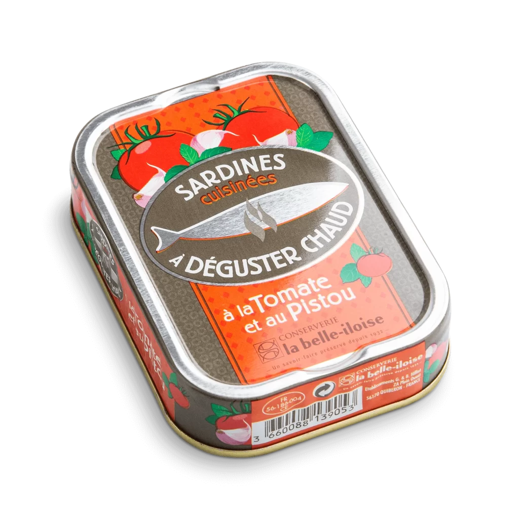
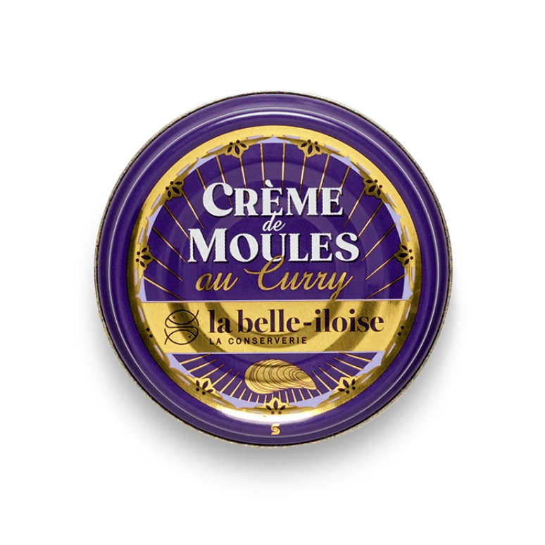
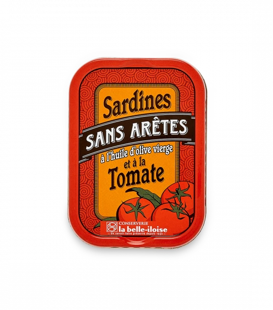
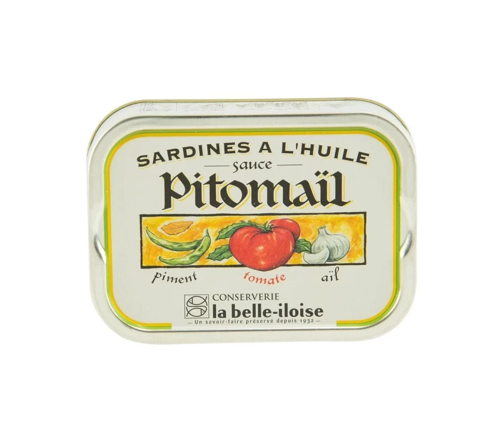
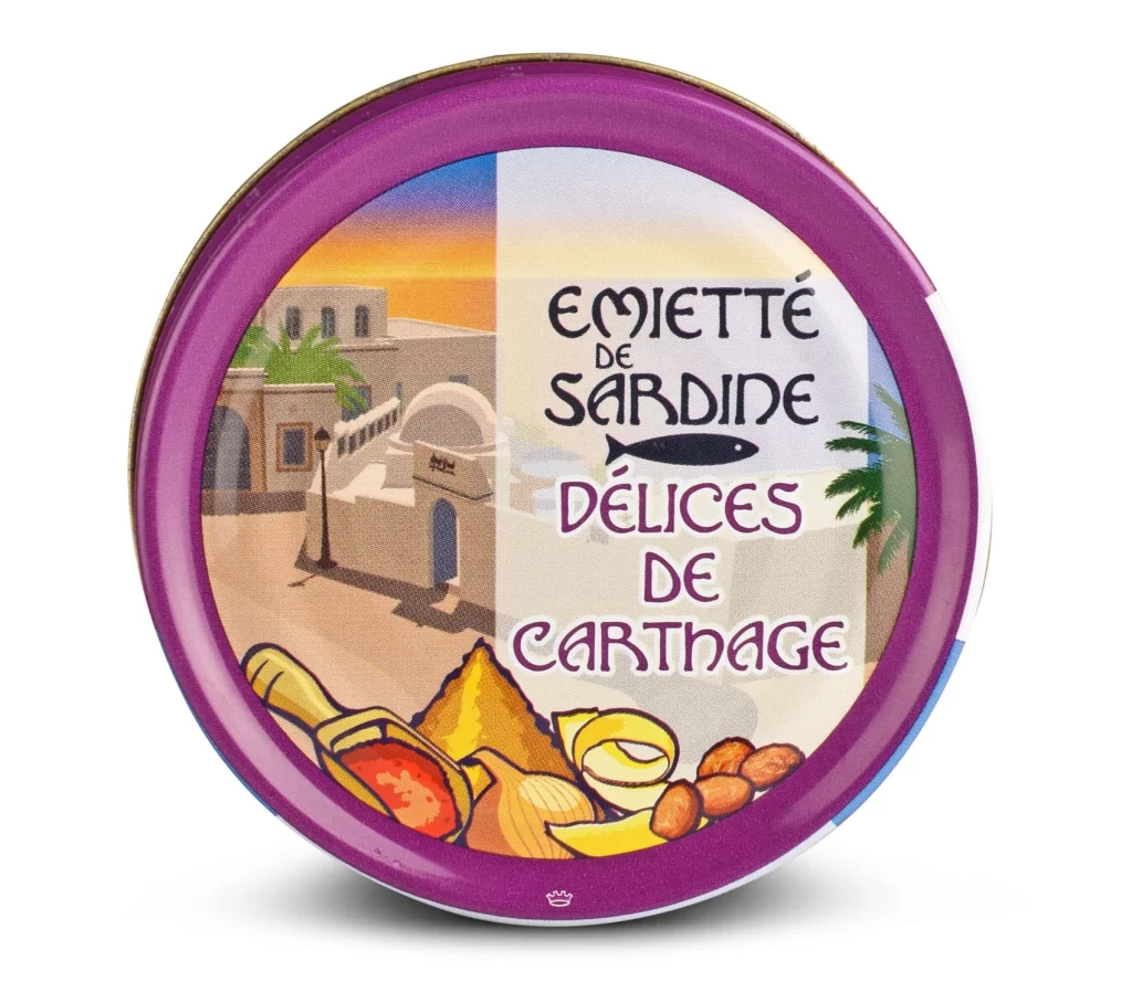
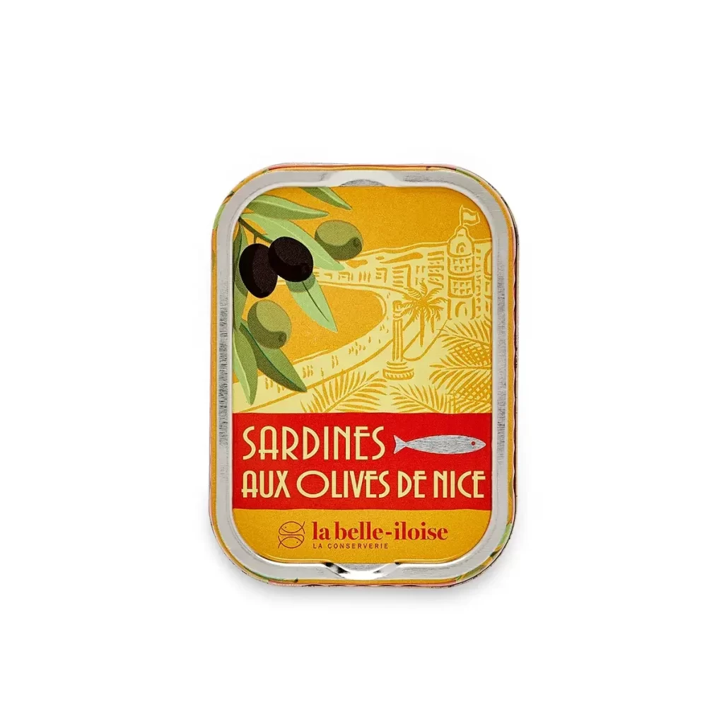
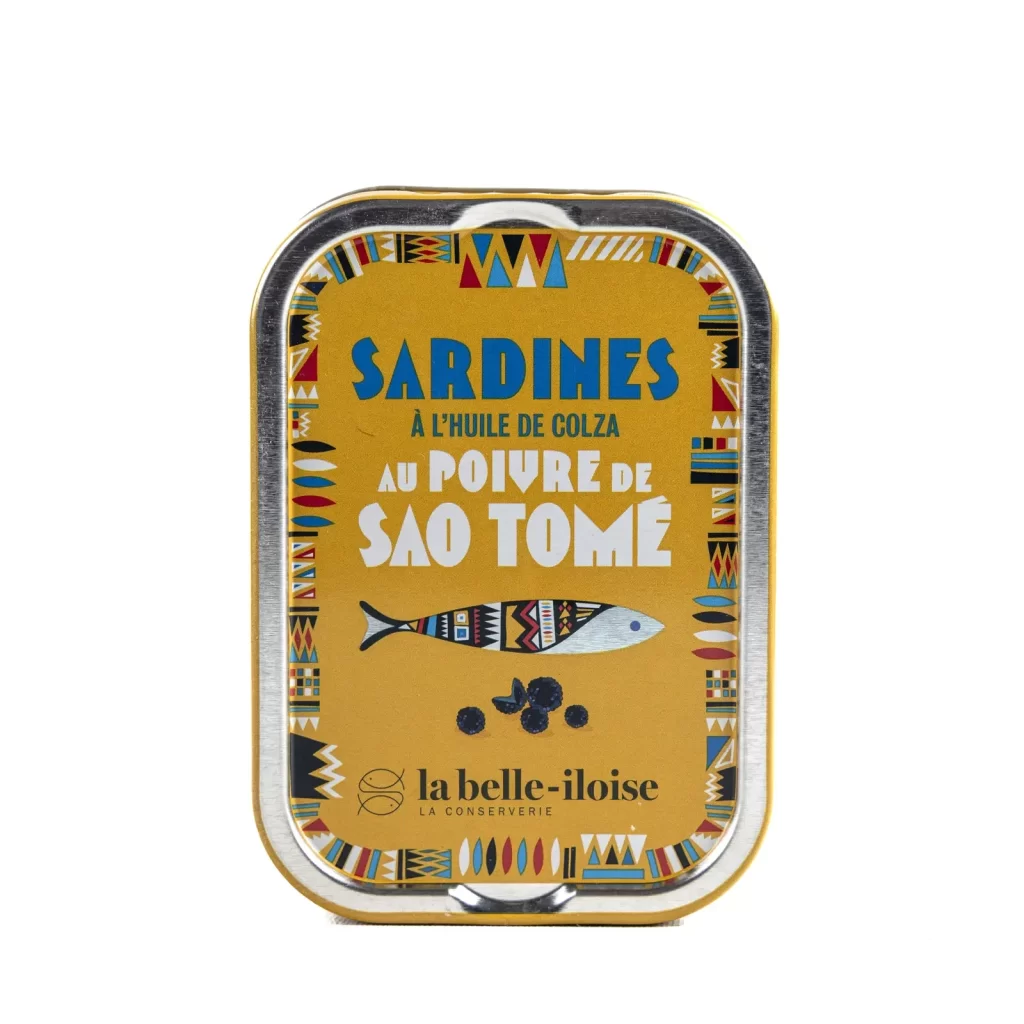
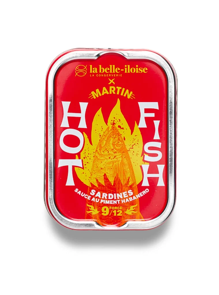
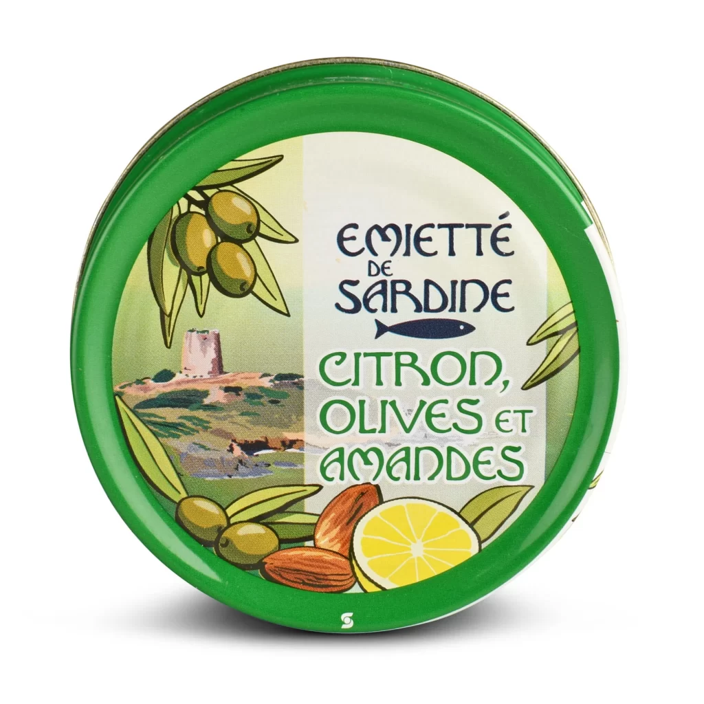
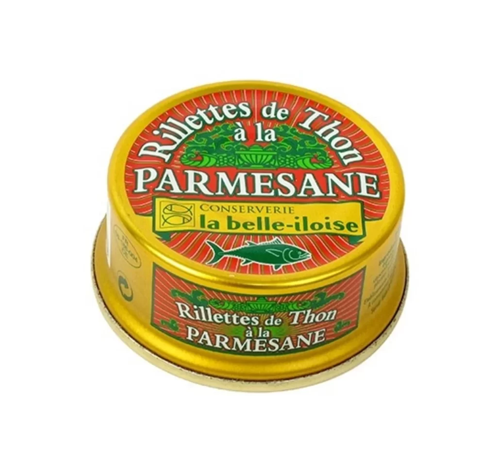
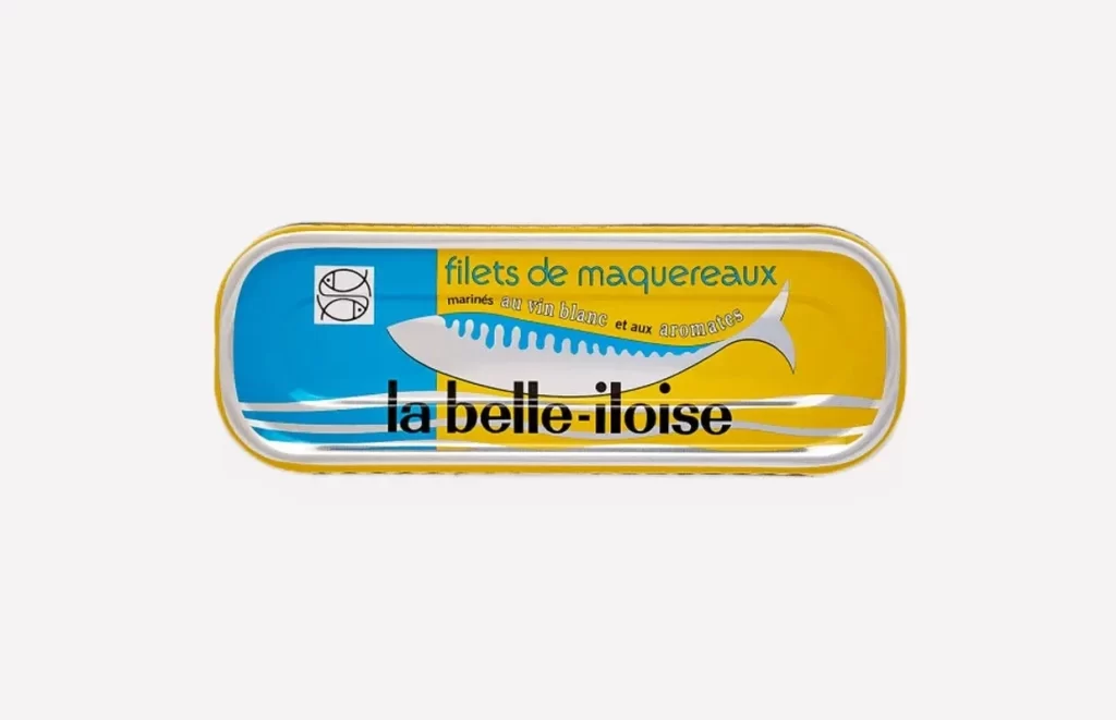
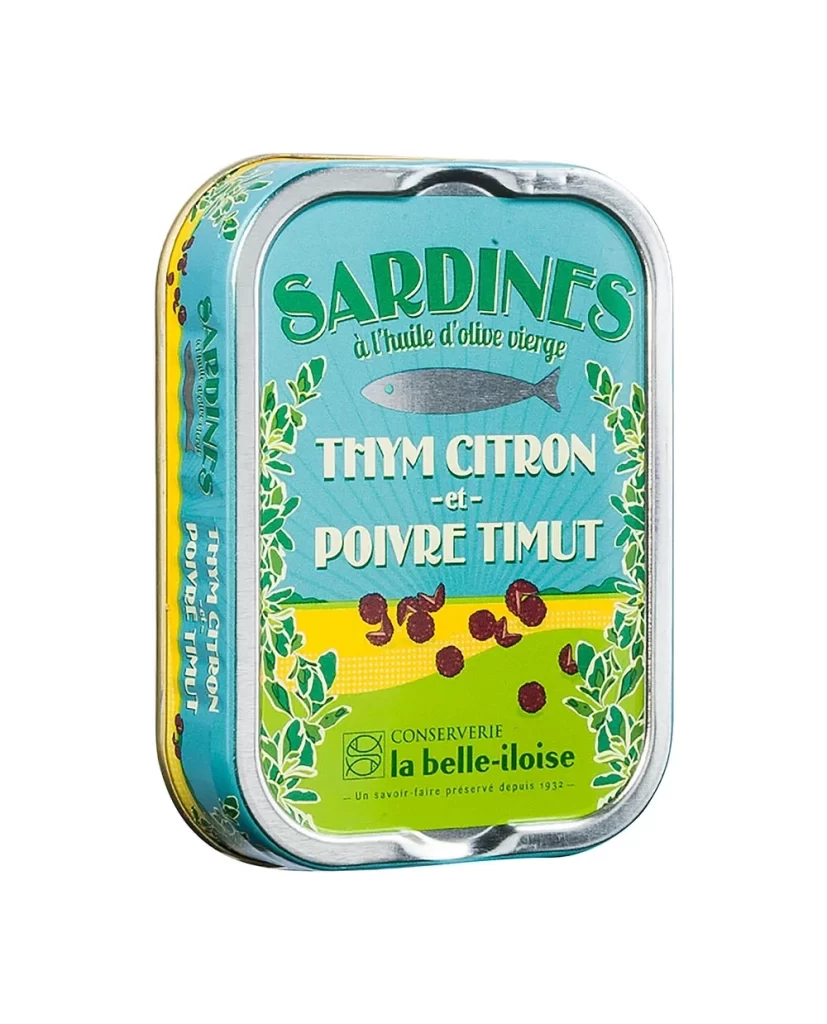
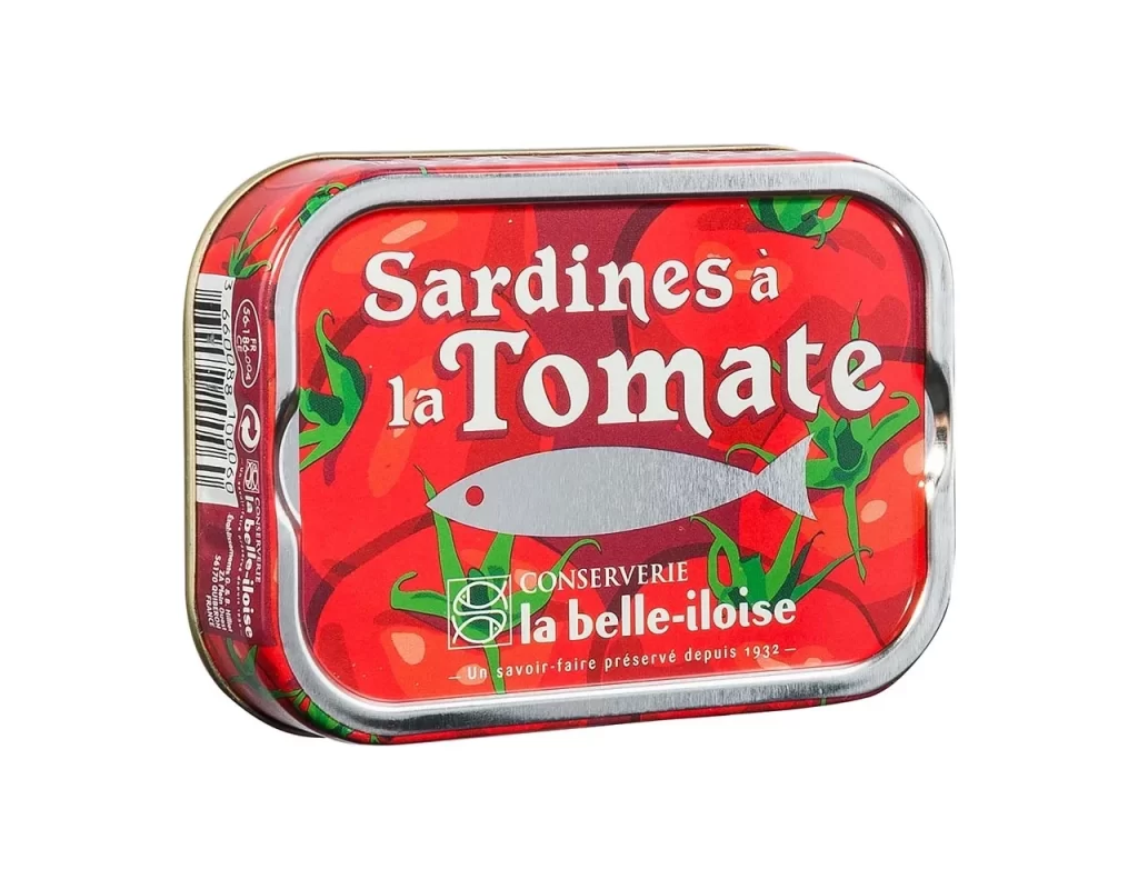
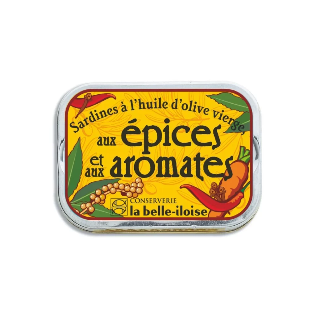
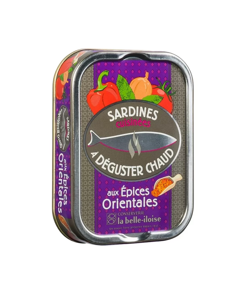
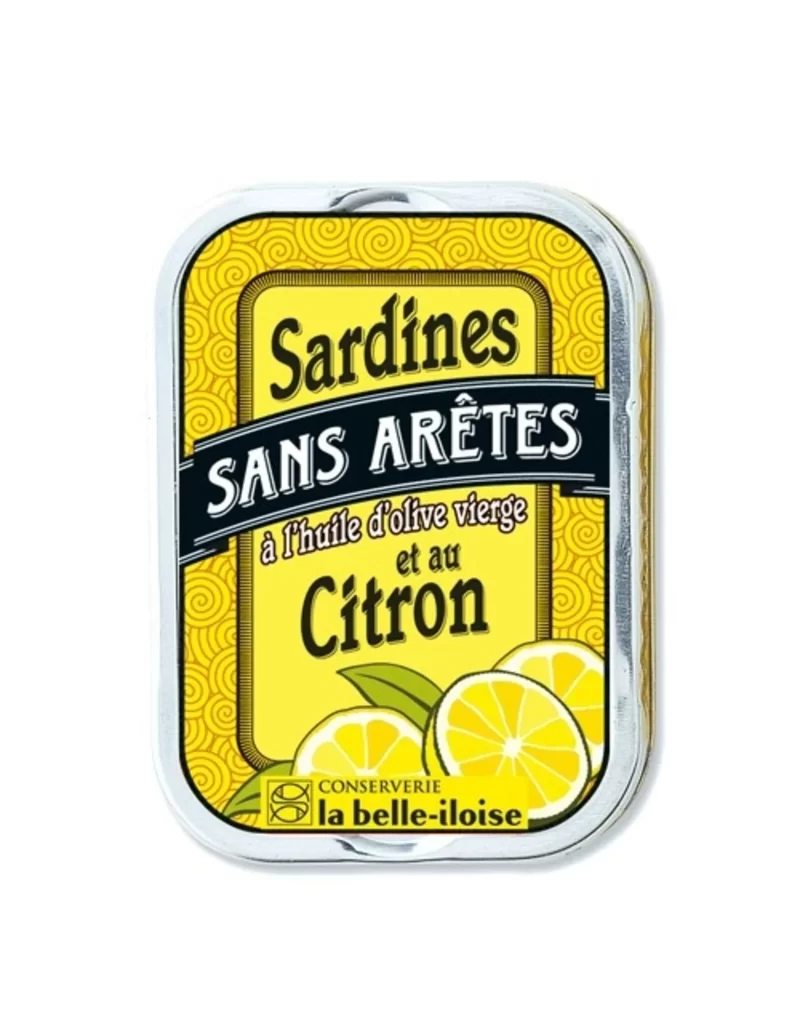
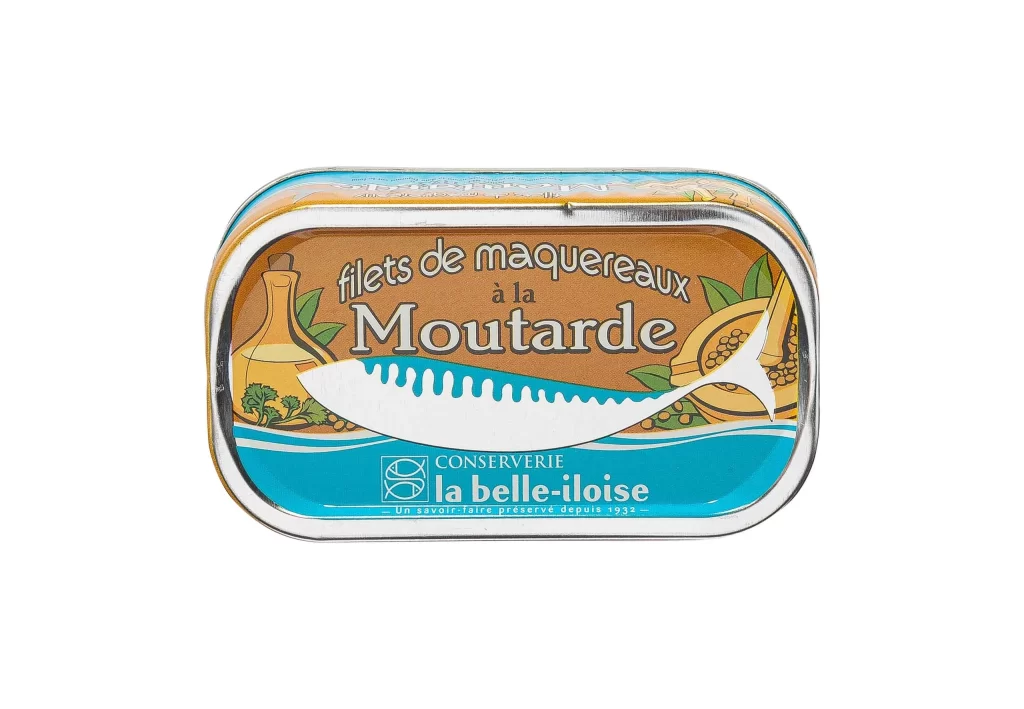
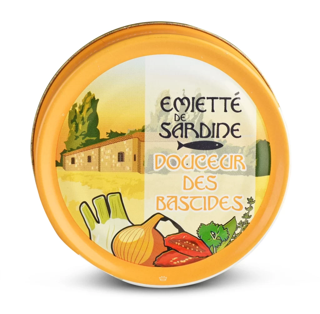
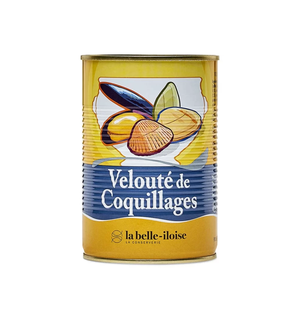
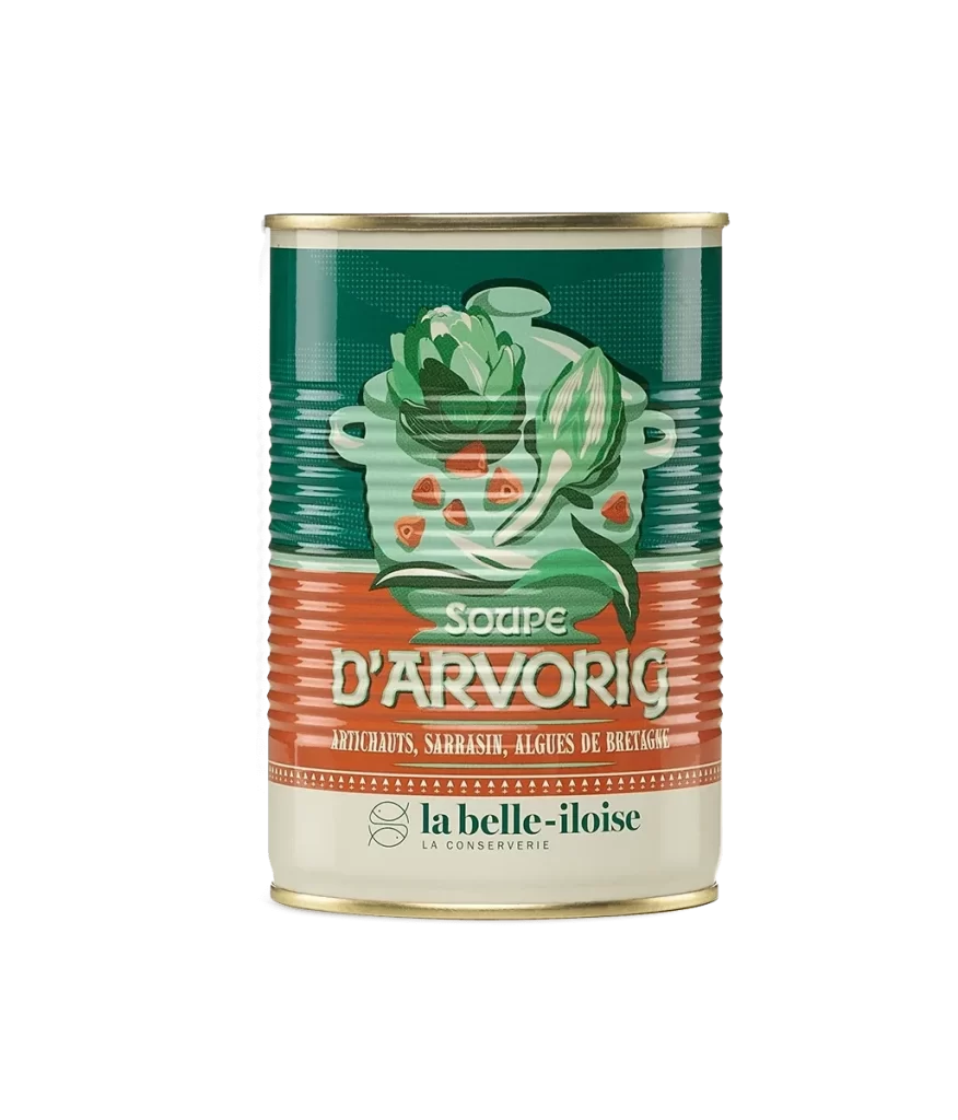
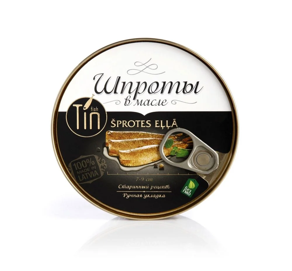
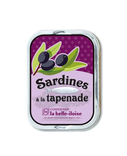
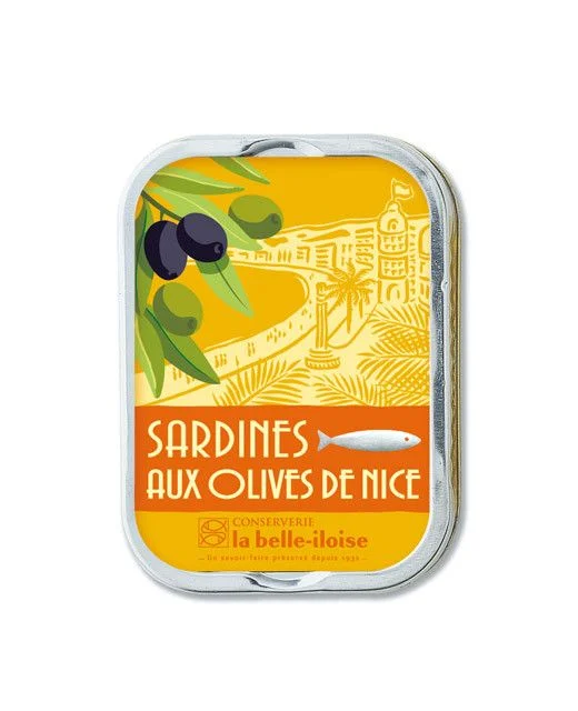
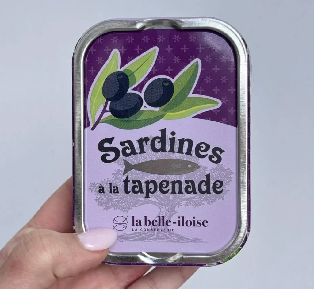
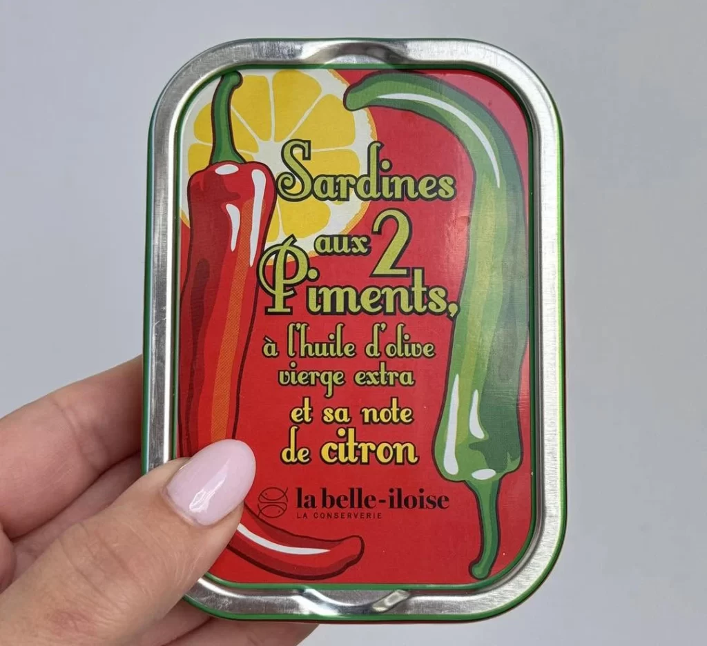
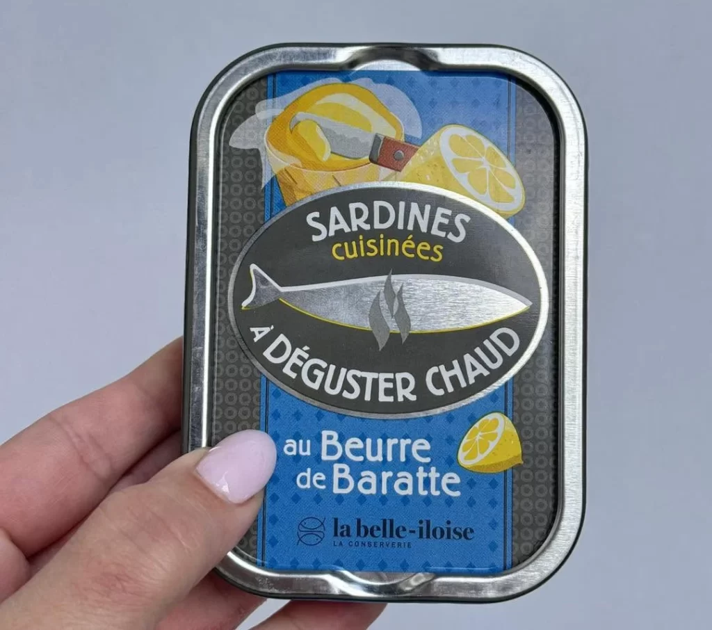
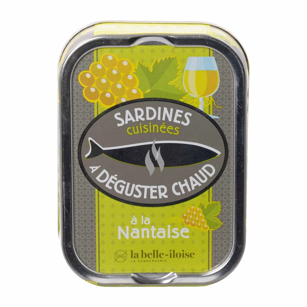
This French cannery presents a cooked sardines a la Nantaise tin from a front view, photographed in a white studio. The product features sardines prepared in a classic Nantaise sauce, a regional recipe with mustard and herbs. The brand specifically marks this as a serve-warm line, encouraging consumers to gently heat the tin before enjoying the rich, savory flavors.
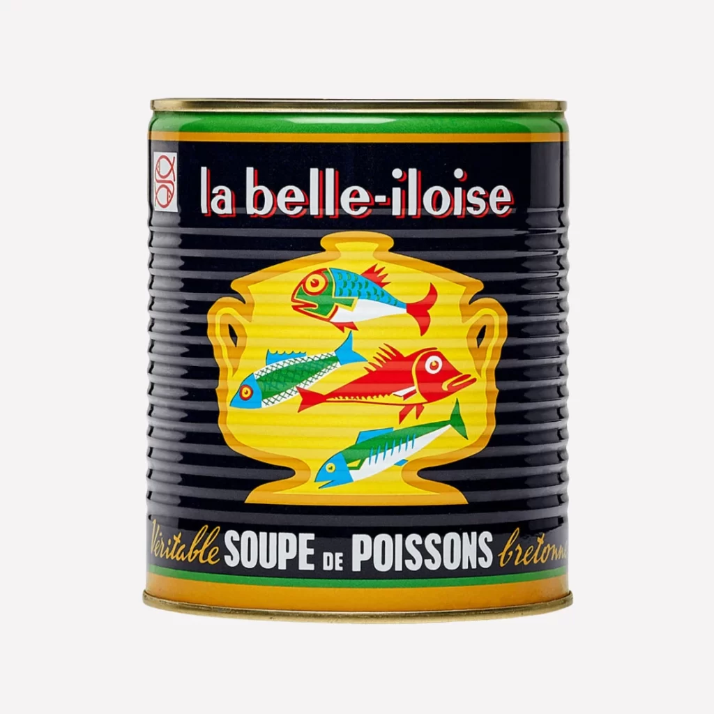
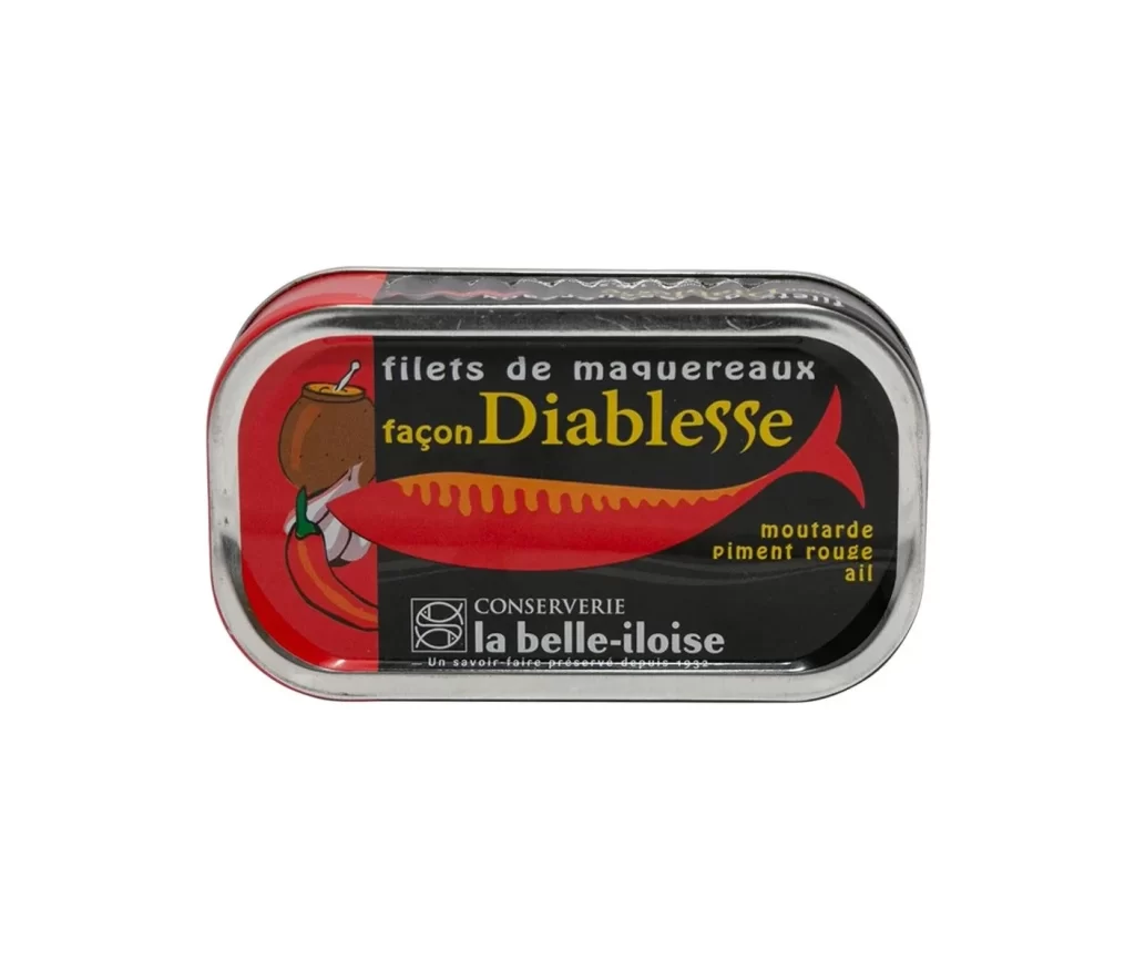
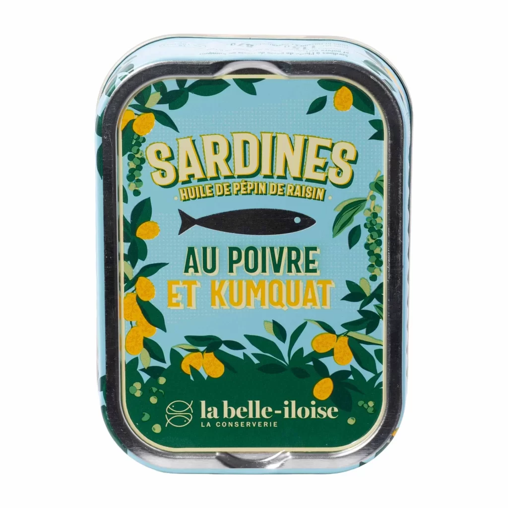
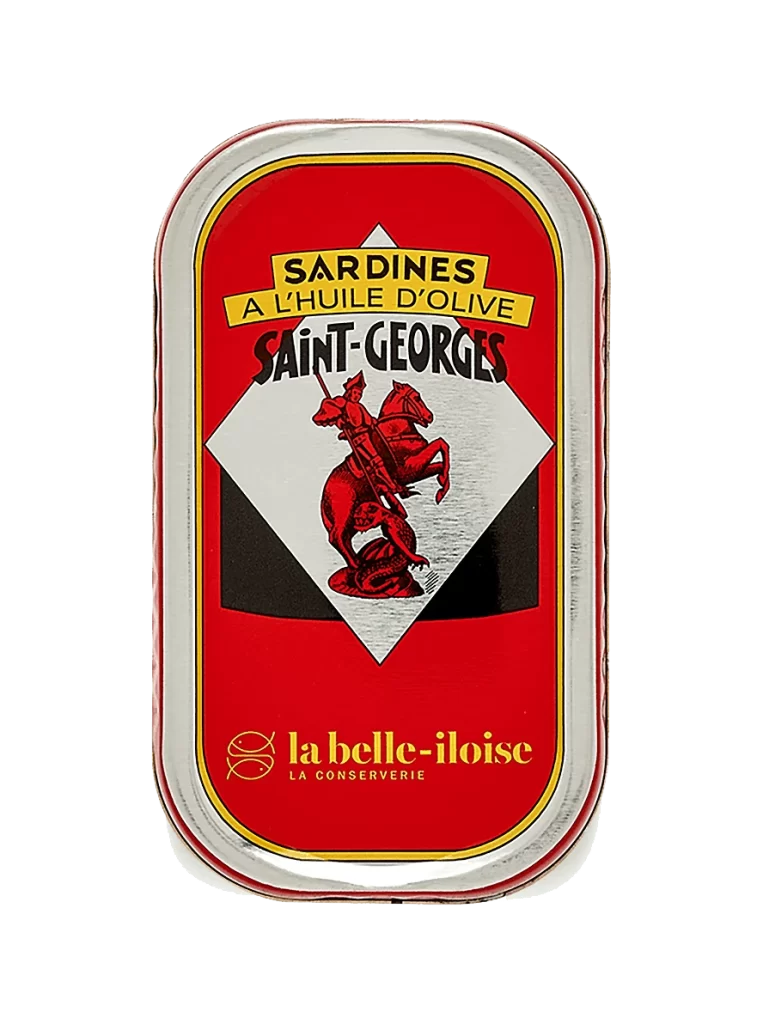
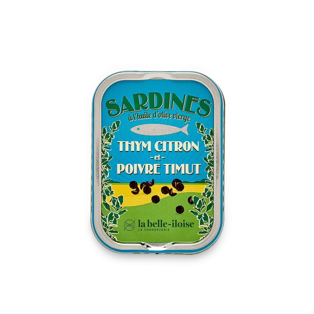
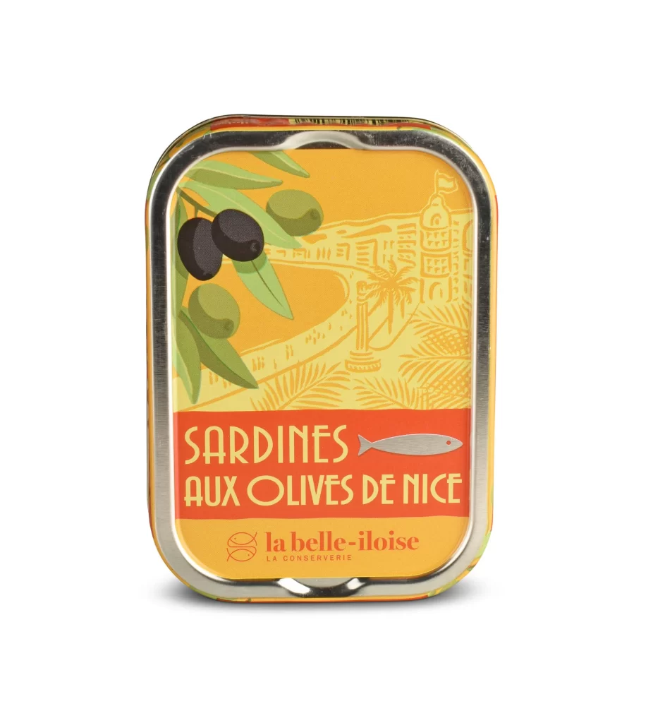
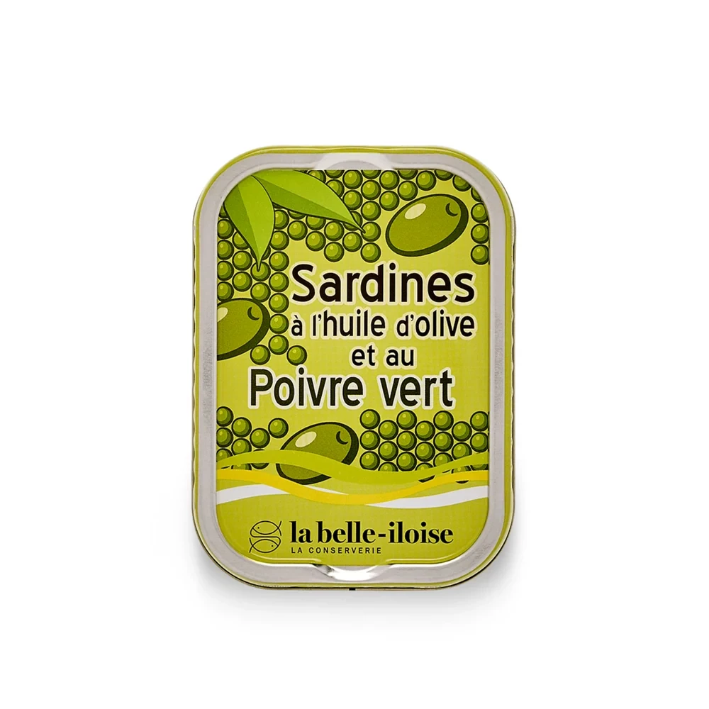
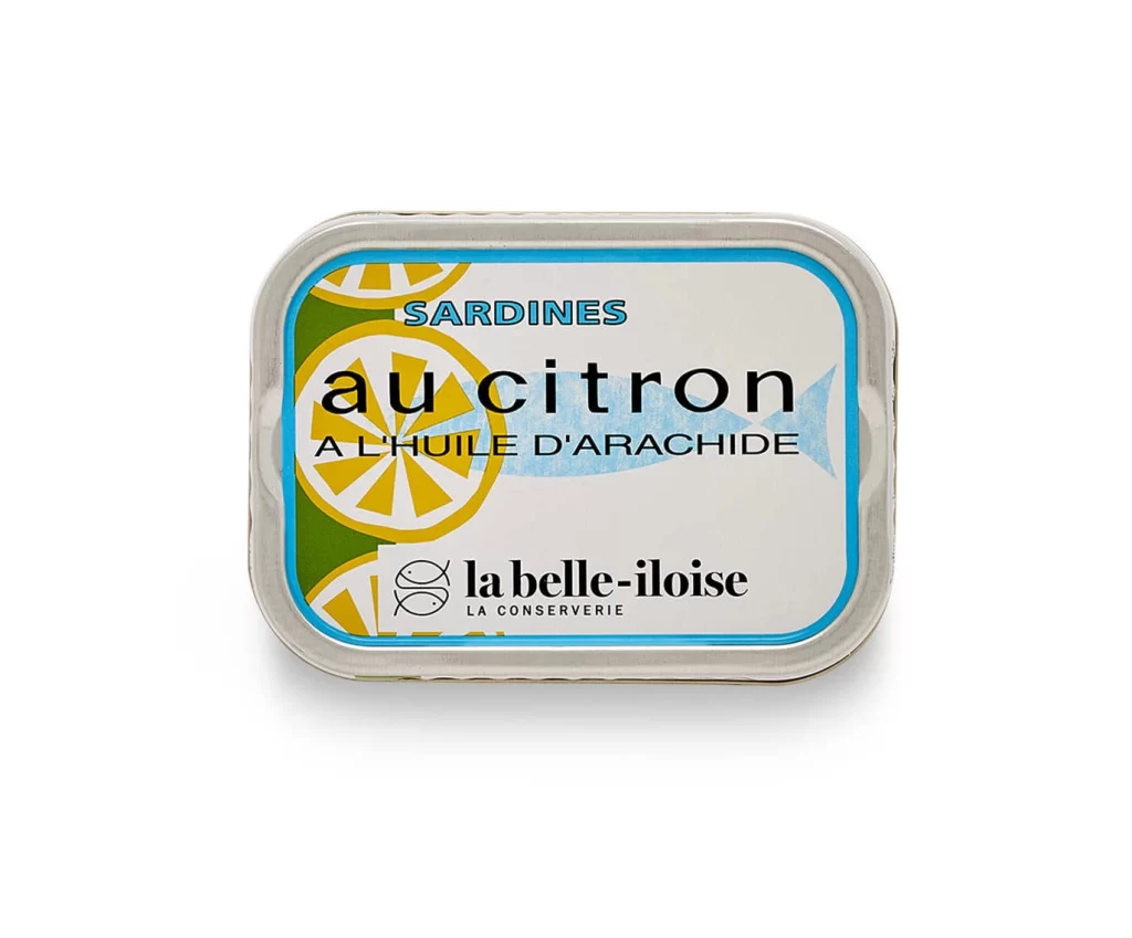
The label design relies on a warm, inviting color palette that reflects its maritime heritage. Typography uses elegant, traditional serif fonts to convey artisanal quality and trust. The illustration style depicts the fish alongside botanical elements, rendered with delicate line work and soft shading. This combination creates a nostalgic yet premium aesthetic that distinguishes the tin on shelves.
Such photographs serve as essential packaging design references because they clearly communicate product hierarchy and brand identity. Designers study these images to understand how to balance typography, illustration, and color within strict spatial constraints. The white studio background eliminates distractions, allowing professionals to analyze the label layout and visual flow for their own consumer goods projects.